[Cool is] the moment of tricky reversal when we see that interfaces are always two-sided . . . the user throws his or her point
of view ventriloquially outward into the realm of information and from there peers inward back through the interface at his or her own
awareness of the information. (Alan Liu, 2004, p. 184)
This key quote from Alan Liu suggests that cool fundamentally involves an awareness of our own awareness. Once that attention is made
self-aware, the next step is obvious (and thetruth banks upon it). If you think something is cool, you'll likely go tell your friends. In this manner, thetruth's
site doesn't exist so much to directly be a storehouse for information; it exists to be a place that people tell other people about. As Dick Pountain and David Robins (2000) suggested, a sense of cool has to spread socially. The beauty of cool is you don't need to explain to someone else why something is cool. Christening something cool
has already served the main purpose of making the christener cool for noticing it.
If cool, digital design flatters attention, it's impossible to talk about cool without thinking about attention, interface, and why multimedia design specifically
grabs attention. These are especially important issues to consider when the information age offers so much competition for our attention. Many writers
have discussed (and rebuked) the idea of information overload, but Richard Lanham (2006) is noteworthy for his attention to the role of rhetorical training
in how to navigate information deluge. Under these conditions, Lanham noted: "Filtering thus becomes central. And here is where style comes in.
We keep striving for 'pure information,' but the more information we have, the more we need filters, and one of the most powerful filters we have is the
filteration of style" (p. 19). This is not criticism on Lanham's part, though he recognizes the statement could be controversial as he suggested "we will
have to embrace a traditional enemy, stylistic self-consciousness" (p. 115). Lanham's argument comes down to the idea that we no longer have an economy
of goods or "stuff." Every bit of information and individual text must compete for the scarce resource of human attention. Making this situation even trickier
for designers is the fact that cheap and accessible design tools have turned, to some extent, everyone into a potential designer. People are paying attention to style,
so the call to use it effectively is louder than ever.
With digital texts, the interface plays a central role in grabbing attention, though there has been debate over exactly how it should do so. Authors such as Donald Norman
(1990) and Alison J. Head (1999) (and many others) have both argued that the interface should remain practically invisible to the user. From this point of
view, the interface can only get in the way of Lanham's (2006) self-awarely impossible "pure information." Some of the earliest critiques of the invisible interface came
from Cynthia L. Selfe and Richard J. Selfe (1994), who argued that, in fact, a rhetorical and critical perspective should be brought to the interface. Anne Frances
Wysocki and Julia I. Jasken (2001) specifically suggested that "interfaces are thoroughly rhetorical: Interfaces are about the relations we construct with each other—how we perceive and try to shape each other—through the artifacts we make for each other" (p. 33). Therefore, the interface need not be
invisible; in fact, the interface must be crafted with awareness that an audience will see it, will care about it, and will be persuaded by it. After all,
as Lev Manovich (2001) argued about the computer interface, "We are no longer interfacing to a computer but to a culture encoded in digital form" (p. 70). In
other words, navigating to a website is never a simple visit to glean information. A site's interface can offer insight to a cultural world view that the
reader either accepts or rejects as worthy of their time or reflective of their own values.
The basic aesthetic of thetruth.com seems to recognize that it's broadcasting cultural preferences the second the site loads. It's worth noting that the
site undergoes a major redesign quite often. Past versions have been bandwith hogs with the presence of many Adobe Flash-based windows displaying shifting animations, text scrollbars, and
giant image maps linked to even more Flash-based applications (the site uses a Robots Exclusion Protocol that
makes it impossible to access these previous versions). More recent versions of the site have dropped the excessive Flash and focused more carefully
on cross-browser compliance. This is the new cool as many designers drop the problematic Flash for alternatives (including HTML5).
The evolution of the site's design is relevant considering the importance of interface to digital cool. As Liu (2004) suggested,
cool does not describe primarily or even equally the external realm that information purveys. Rather, its primary reference on the Web is the Web itself. Cool is the code . . . for awareness of the information interface—as if at the moment of cool we stared not through 'windows' toward the content of information but at the gorgeousness of stained-glass windows themselves. (p. 183)
Is thetruth.com a "gorgeous" site? That's a fairly subjective qualifier, but the site is certainly clean with its liberal use of white space, strongly
contrasting primary colors, and geometric grid layout that clearly delineates the various content sections. In a world long gone postmodern (or
even postpostmodern) this design scheme might even seem pretty uncool. But as Liu noted, "At core, the aesthetics invoked here [in cool design] is
modernist. Cool is only cool if 'fitted' into a functionally clear, total design" (p. 211). Ask any web surfers with savvy eyes for design and they
will tell you a page "sucks" the more it clutters with background images, blinks with needless animations, or violates the preferred rules of typography.
truth's site, while saturated with interactive multimedia, keeps the interface simple and familiar. The fact that previous versions sucked by the evolving
standards of Web design only highlights how much the organization is aware of their interface's role in producing cool.
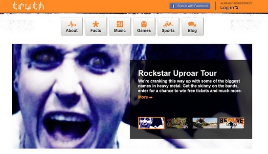
With an orange banner and a relatively small, white logo, the blue "Sign in with Facebook" button stands out the moment the page loads. Though such
a sign-in is common on many current sites, thetruth particularly highlights this participation from the start with its starkly contrasting color scheme.
Under the banner, the website's top fold is dedicated to a large slideshow that highlights particular features of the site's three main categories:
music, games, and sports. Scrolling down, it's apparent that the site's games are available in the iTunes app store, and there's a div container that only fills if the user has Facebook social plug-ins enabled. This emphasis on social media continues throughout
the site as users discover an Instagram feed of images, a feed of Facebook comments referencing them, Facebook "like" buttons embedded under almost every infographic or blurb,
and a link to their Twitter page.
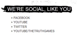 Most tellingly, the social media sites are gathered under the heading "We're Social, Like You." This attention grabbing use of the
second person identification is the first of many examples where the site seeks to have the audience reflect upon themselves from the interface's perspective at the expense
of looking too closely at the site's content.
It's no coincidence that social media receives such high priority across the site. S. Michael Halloran (1982) suggested that ethos presented solely as an "ethical" or "moral" appeal
is a simplification that robs ethos of the word's Greek roots in habit and space. Likewise, Nedra Reynolds (1993) suggested ethos should encompass "the individual agent as well as
the location or position from which that person speaks or writes" (p. 326). In other words, a more complex view of ethos must account for its "spatial and social emphases" (p. 327).
Subsequently, digital cool actually fulfills the spatial possibilities inherent in the classical notion of ethos. To feel cool is to self-recognize the coolness of inhabiting and embodying
a space (be it physically or virtually).
However, the web in general problematizes the sense of embodied gathering that comes with the public address of pre-digital and pre-print eras. Although we can assume that
others are simultaneously browsing the same site as us, web surfing is still primarily an incredibly lonely activity. On any participatory site (social network, blog, wiki, or
bulletin board) a person primarily finds traces of people having been there before. However, although the direct socialness of the Web is often absent, participating in the
habits of social media ("liking" "plus one-ing," reblogging, commenting, etc.) becomes the source of cool self-awareness. If the truth is cool, then as teens "like" or reference
them on Facebook or Twitter, they leave traces of their own coolness while simultaneously perpetuating thetruth.com as a cool destination.
Therefore, beyond aesthetics, thetruth has what Wysocki and Jasken (2004) called a "generous interface" (p. 29), meaning the interface offers multiple ways for a visitor
to interact with the site and hopefully stay there. Along with the nods to social media, a site visitor can play some Flash-based games, watch videos about
pop culture icons and activities, listen to music, comment on truth's blog, and more. As Teena A. M. Carnegie (2009) wrote,
New media requires action (clicking, scrolling, dragging, typing, sending, receiving, downloading—to name a few). By converting these actions to interactions, new media actively involves
and engages the user in using, playing, exploring, experimenting, discovering, and sharing. High levels of interactivity produce high levels of engagement,
exemplified in experiences of immersion and captivation. (p. 166)
So in an economy of attention, saturating a site with multimedia (therein giving the users
more to do) will keep the users inhabiting the space for a longer period of time. "Rhetorically," as Carnegie suggested, "higher levels of interactivity" will
"produce higher levels of acceptance, making the user more disposed to persuasion" (p. 166). At the same time, a site that is trying to convey a message cannot allow too much interactivity. Carnegie noted,
Although [some sites] afford the user some power to manipulate the interface to match his or her interests by altering the appearance and navigational starting points for paths through the
Internet, the user's choices remain contained. The options are predetermined by the commercial and political interests of the corporations or organizations
who create them. As long as the user's interests and needs fit within these other interests, the user will feel empowered and engaged. (p. 168)
It's true, no matter how interactive thetruth.com may be, this is not the heyday of Myspace where HTML customization allowed for a lot of control over how someone's profile
page could look (even if this control sometimes lead to garish disasters). truth's site does not allow alteration to its appearance or navigation; truth
controls the master aesthetic. But they need to control these aspects of the interface in order to preserve the clean and functional feel that is so
imperative to their own corporate and organizational needs. By offering their games, interviews, and music, they invite the users to see their own
interests reflected and therein ignore the deeper levels of control that might overthrow the cool balance they try so hard to maintain.
However, in the end, is there really anything special about this site that seems to demand attention? I suggest: not really. Yet, in some way, that might
be precisely the reason it does. Visitors' narcissistic sides are stroked on every page, and isn't that what increasingly all our most common websites
do? We're welcomed by name from our saved logins. Purchasing suggestions are made based on our customer history. Outlook and Gmail save our
personalized backgrounds. Pinterest is essentially a curated shrine to the digital self. "The domain of information [difference] lies between too little
and too much information" (Taylor, 2001, p. 110). If thetruth were too different from the sites teens already used, then there would be considerable risk
in noticing its cool (because there's nothing worse than telling someone something is cool and being told you're wrong). thetruth doesn't grab attention
by standing out; it grabs attention by fitting in just enough. If that doesn't sound cool, then you've never noticed how cool groups of people seem to
all look remarkably similar (I'm a unique rebel like everybody else). How does it break the mold? Well, if you were a teen seriously looking into anti-smoking organizations,
would you prefer this site? Or this one? Or
this one? Wow . . . they're all just trying so hard (except that site made with tables).
By encouraging participation (both socially and within the site itself) as a core component of their web place, thetruth ultimately highlights Liu's (2004) notion that "cool is an ethos or 'character' of information—a way or manner
of living in the world of information" (p. 184). Information found on the site (or information that visitors post to social media sites) is not nearly as important as the ethos
constructed by the site's mere existence and networked place amongst social media. After all, music festivals, video games, and sports interviews have no direct connection
to convincing teenagers not to smoke. However, they are identity markers that are frequently discussed and shared across all areas of a typical teenager's world (and tap the hedonistic spirit that cool must emobdy). By focusing on
these areas of entertainment, presented in a sleek, modern aesthetic that is familiar and holistic, thetruth commands its viewers to browse its pages and see themselves reflected
with each interactive and self-validating click.


 Most tellingly, the social media sites are gathered under the heading "We're Social, Like You." This attention grabbing use of the
second person identification is the first of many examples where the site seeks to have the audience reflect upon themselves from the interface's perspective at the expense
of looking too closely at the site's content.