Brand Loyalty: Who is Behind This Cool Place?
. . .

. . .
Despite the focus on popular entertainment and social media, let us not forget that this is actually an advocacy site to discourage teen smoking. After all, Alan Liu (2004) referenced the 1998 editorial policy of Netscape's infamous "What's Cool" page: "A cool site can't be so aloof that it fails to address its subject matter. The overt mission of a site is to communicate its message quickly, effectively, and playfully" (as cited in Liu, 2004, p. 185). The first sign of an anti-smoking agenda is found in the right sidebar of the front page where visitors see thetruth's basic philosophy: "We love smokers. Heck, we love everybody." thetruth is not waging a battle against people who smoke because they're not going to attack the very people they hope to change. This tactic conforms to Liu's notion of the interface's ventriloquist point of view which wouldn't work under these conditions. When we stare at information that insults or belittles us, there is less chance that we will throw our point of views back out from the screen and note our own awareness of the information (the fundamental requirement for cool to work its self-validating function).
Heck, thetruth isn't even telling people not to smoke. In one of the more interesting "About Us" blurbs, they challenge the viewer not to read the next sentence. At which point you immediately read the next sentence ("See what we mean?"). The blurb continues, "We're not here to tell people not to smoke, because, well, it doesn't work." This short 32-word blurb might be the coolest and "truest" piece of information on the whole site. Although the site does offer a number of reasons not to smoke (see the next section), they are simultaneously suggesting that their purpose is anything but telling someone not to smoke. Such an order doesn't work (or it works as well as Nancy Reagan's infamous "Just Say No" anti-drug campaign). By acknowledging that such tactics don't work, but by simultaneously suggesting teens shouldn't smoke, thetruth directly highlights the paradox of information cool. We're going to give you information in a stylish and fun manner that you can share with friends (information takes on an ethos); at the same time, we acknowledge that it won't work (the concept of information is subverted because information that could be useful is treated as basically useless).
Under another "About Us" subtitle, "Not For the Adult Mind," a blurb reads, "Truth is hard for someone over 30 to understand. The adult world is much different from ours. Our values are different. Our goals are different. If adults don't get what we're saying and how we choose to say it, then it's probably OK." Before a visitor can stop and wonder why thetruth isn't pushing their mission harder, these words (again) evoke the cool stance that makes such a question irrelevant. The words act as instant validation—a reaffirming nod that the teen is cool for being there in a place that adults simply can't understand. The blurb focuses on fueling the cool of rebellion against age and authority. Another blurb addresses this fact directly. Labeled, "Rebellion Is Not a Bad Word," it suggests that smoking is "just following orders" from the Big Tobacco companies. The accompanying picture, a boy who appears to be tagging a brick wall with graffiti, creates a connotative association that would make Roland Barthes proud. thetruth isn't giving any orders; they're not being pushy (note they're not even a dot org because organizations are so very uncool). They don't even need to define what these different "values" and "goals" are. The visitor fills in the blanks as they're invited to see themselves reflected in the interface.
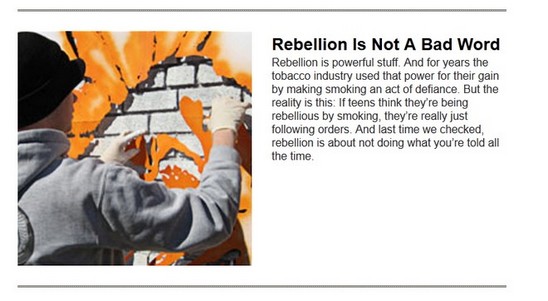
I've already touched on thetruth's need to counterbalance the rebellion and hedonism of smoking with their own hedonistic touches (the extreme sports and music), but deep-rooted rebellion also needs an enemy; in this case, the enemy becomes the shadowy figures behind "Big Tobacco" who are presented as evil primarily for being adults. On one hand, this is the most obvious, tried and true tactic thetruth could possibly use. However, as with all things cool, there is a more complicated psychology going on here. With the blurb, "If adults don't get . . . how we choose to say it, then it's probably OK," thetruth subtly shows its cards. This is the closest the site gets to saying: it's not what we're saying, it's how we're choosing to say it to you in a way others might not "get." The graffiti artist picture is no accident. Nancy Macdonald (2001) argued that the graffiti subculture is a prime example of youth using a cool medium of communication where the actual content (and identity of the communicator) is trumped by the mere fact that expression is happening in a manner that others will not understand. Although artists choose a "tag" (to represent their graffiti persona) and leave messages, taggers like Proud 2 suggested "You can sum up graffiti in two words, 'I am.' That's basically what it is, 'Look at me,' it doesn't matter if you look at me in a negative or positive way, but 'Look at me.' When you strip it down, graffiti writers are literally honored for nothing more than being" (as cited in Macdonald, p. 314).
Additionally, many taggers from Macdonald's (2001) study suggested that the appeal of being a tagger amongst fellow taggers is how participation alone erases or trumps the other aspects of the self. Macdonald explained how graffiti speaks for the individual artist: "freeing you from the features or factors that might normally hold you back. In this liminal world, an 'idiot' can be 'alright'" (p. 313). Other taggers explained how a weirdo can be respected: "He's a bit of a weirdo, but he's alright, he gets up and that. That's why I respect him, because I see him all around" (as cited in Macdonald, p. 313). So not only does graffiti taunt those who can't read it (most often adults), it becomes a stand-in ethos for the artist that is more important than any other aspect of who they are. Digital ethos works similarly. Like graffiti artists leaving behind a tag that signifies them without really identifying them, thetruth has erected this website where their own "About Us" page tells absolutely nothing about who they really are. The entire site operates as their "tag." It's cool, it's anti-conformity, it's rebellious, and it says everything they want you to know about them simply for being there while simultaneously masking anything problematic.
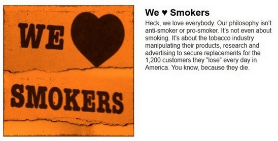
What could be problematic? Asking teens to rebel against people over 30 is a tricky feat when the members behind the organization are those exact 30+ people who just don't understand the truth. This is an easily fixable problem—fill that "About Us" page with coolness that makes no reference to this fact. The "About Us" page is primarily an exercise in folksy charm (the use of "heck"), hip sarcasm ("And last time we checked, rebellion is about not doing what you're told all the time"), and dark humor (the tobacco industry has to replace its customers "You know, because they die."). Check out the Board of Directors page for the American Legacy Foundation (the people behind truth). Those aren't high school yearbook photos. truth even goes so far to claim, "We don't have money or influence." The ALF financial statements might suggest differently. As I mentioned in the introduction, the tobacco industry itself has even pledged 13 million dollars in funding to keep truth running. But a visitor isn't going to find links to the ALF on this site (though the connection is mentioned on a separate FAQs page). So there's an ethos problem here, correct? thetruth offers up very little information about who they are and ethos strongly depends on this information. Right?
Well, it used to. In a study of ethos in political discourse websites, Barbara Warnick (2007) suggested that people most often judge a website based on appearances, attribution, and probabilities. Although the identity of a site's author is one consideration, it's only one, and ranked fairly low at that: In a survey of 2,684 people who evaluated two web sites then ranked ten categories of evaluation criteria, only 8.8% of them ranked "Identity of Site Operator" as their main criteria (Fogg et al., 2002). "Name Recognition and Reputation" faired only slightly better at 14.1%. The criteria chosen most often (at 46.1%) were "Design Look," followed by "Information Design/Structure" (28.5%), and "Information Focus" (25.1%). These findings are even more interesting when paired with a study by the Princeton Survey Research Associates. In phone interviews with 1,500 Internet users, 80% said that trustworthiness of the site was most important to them. Yet, knowing who owned the site was important to only 32% of them, and being able to find out important facts about the site was favored by only half of the participants (Princeton, 2002).
Warnick (2003) suggested that these results are problematic, and I would imagine, she would call for ways that online research can overcome people's tendencies to disregard traditional ethos over aesthetics and information design. This may be a noble goal but ignores what the thetruth has learned about how little their credibility matters.
