Then there's the matter of that name. Obviously, when an organization calls themselves "truth," they are highlighting a desire to come off as a knowledgeable and credible source
by drawing upon the passionate emotions evoked by such a powerful word. Their URL is actually "thetruth." The addition of the definite article sets this truth off as more meaningful
or the implied winner amongst competing versions. The implication is that this is THE truth—unproblematic in its capability of being understood or transferred. This is truth
of an a priori and essential existence. This was the truth à la Plato (1997): "when the mind's eye rests on objects illuminated by truth and reality, it understands and comprehends them,
and functions intelligently" (p. 990). At the same time, they do not capitalize their name, perhaps because a bold capital would seem too pushy. We're the truth, the only truth,
but don't fear the TRUTH.
thetruth does, despite all I've mentioned, provide facts about the dangers of tobacco consumption. The second link on their navigation bar is simply labeled "Facts" and takes
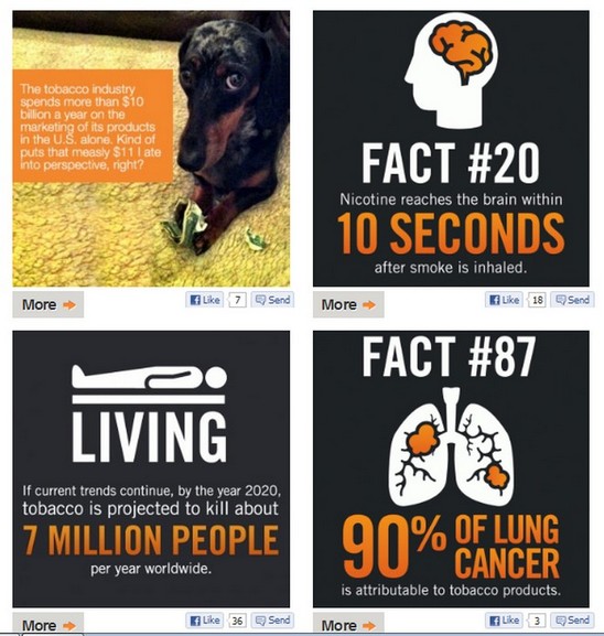
the visitor to an image gallery of infographics with short statistics about smoking dangers and mortality rates. The infographics share an orange, white, and black color
scheme and are artfully designed for simplicity and quick absorption. Each fact is numbered (though they seem to appear on the page in random order) and there are hundreds of them.

Why the vagueness? There's some interesting design when it comes to this page. The images load four at a time (taking up most of the screen on an average
monitor size) immediately followed by a "Load More" link. That's if you make it to the "Load More" link since every image has a potentially distracting "More" link which
simply opens the infographic in a larger size (along with a comments section and the option to post to Facebook). Clicking the "Load More" link reveals four more infographics
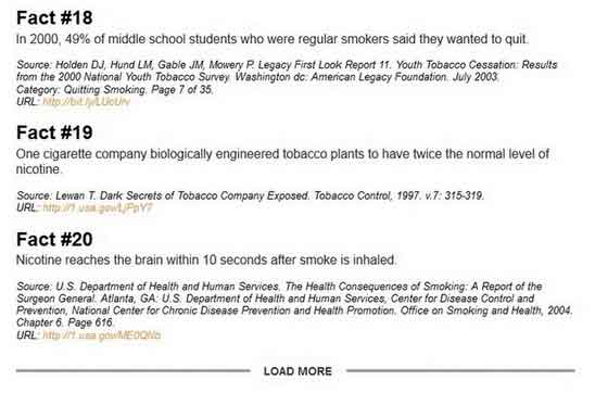
followed by, again, the option to bring up more. Each time you load more, there is very important information that is getting pushed further and further down the page. Underneath
the images is thetruth's "Fact Bin" which stores all the citation information. It is, to be fair, a quality fact bin which includes the source of the information
and a URL to the original site. But do visitors ever get there? The functionality of seeing more images necessarily pushes the citations further down the page where many users
may never know they are there.
OK, so there are 235 facts (I checked). All the citations are listed in a row at the bottom of the page, but there's no way to quickly jump to a specific
source. Sure, someone could do a Ctrl-F search, but should they have to (and 90% of computer users don't know this shortcut)?
Although there is a citation filter to find facts by subject matter, there is no way to quickly access a specific number. Maybe I shouldn't complain. In fact,
a version of the site back in 2008 had no citations of its "facts" at all (this is impossible for me to prove due to the site's Robot Exclusion Protocol, but
I bet thetruth will give me a pass considering their history of citation problems). Before October 2012, the citations also had a "load more" button (as seen below
in my old screenshot) which brought up six citations at a time. So if you wanted the citation info of fact #127, it would haven taken 21 clicks. Now, the page
still loads the citations in bunches as a user scrolls down the page but without the need to click a button. However, the footer appears a few seconds before the next batch load, and some users
might think the page is done. These design features could easily be written off as a simple usability problem. Yet, considering all I've said about thetruth's careful design, I'm hesitant to let them off the hook that easily.
After all, the citation could easily be loaded under the infographic when you open it on the larger page. It would seem that this reliable
source of the truth strives to make a user's fact checking process as difficult as possible.

But you know the answer by now. Facts are not thetruth's main agenda. Heck, they've told you just as much. The facts have been paraded around in countless other anti-smoking
campaigns and teenagers continue to light up. Interestingly, these infographics don't even strive to use pathos in the obvious ways. There are no graphic images of black lungs on
this site. There are no pictures of people still smoking through a tracheotomy incision. There are no vanity-targeting close-up photos of the facial wrinkles that develop on
long-term smoker's faces. Pathos and logos, it would seem, are not available (necessary?) means of persuasion if you're cool enough. However, thetruth does like the idea of reason;
it's right there in the organization's title. But facts are not their main agenda. They recognize that it's much cooler to subvert the notion of information's usefulness at all.
Alan Liu's (2004) notion of cool's ethos against information can be trickier to understand than its contradictory flipside, but Liu provided a key example in the long-defunct site,
Paul's (Extra) Refrigerator. Paul's refrigerator was equipped with a variety of remote sensor devices that were linked to a Web page that allowed visitors to track its temperature,
light, and contents. Sites like this represented an early wave of "ultra-tech" cool sites that used advanced technology to bring the mundane to the Web (Liu also referenced
the famous Amazing Fishcam!). Liu wrote,
Paul's extra refrigerator is cool because it literalizes the way in which a cool page converts information into something that, though nothing but information, is finally as impervious to the transmission of information as the white door of a refrigerator—the very blankness of which becomes in common use
the tablet for a secondary layer of nonfunctional information (photos, children's drawings, magnet poems). (p. 189)
Nobody really needed to know the intimate details of Paul's extra refrigerator (or what was up with his main one), but that's why it was so cool. The site represented pure
information that, although useful in some form, was ultimately useless to anyone browsing by. This uselessness of useful information ultimately celebrates the mere fact that
the information can be interfaced with. We have the technology. If we build it, they will come. Similarly (if not so literally), thetruth presents their facts because they can.
They can't make any claim to an anti-smoking agenda if there isn't some semblance of anti-smoking information present. But just like Paul's refrigerator's temperature, content
value of the information is easily ignored because the context surrounding it suggests that merely looking at it is its raison d'être.
Who knows—maybe some of the site's visitors do find use in the site's facts about the ills of smoking. This possibility doesn't change the fact
that thetruth itself seems to celebrate how potentially useless the information is by not citing its sources (in the past) and by making it difficult
to navigate through (when they clearly know how to make a usable website). Even their discussion of the "Fact Bin," where all the citations load, uses the
ironic detachment of cool to downplay the facts' importance. Why are the facts good? "Because we do all the work for you." What does the visitor get? "Raw
facts to tickle your cerebral crevices or for world domination. You decide." Doing the research yourself? Not cool. That would encourage too much investment.
And what are the facts for? They're certainly not pitched as facts to help someone stop smoking. Just in case visitors bother to care, thetruth keeps the
detachment going by giving them an absurd reason for having the knowledge. Ultimately, it's the uselessness of this potentially useful information that
is highlighted, especially if the visitor arrives at the facts after watching some videos or playing some games (which the home page encourages by showcasing
these items while simultaneously burying the "Facts" link). How can the boring (in comparison) and broken navigation of the Facts section hope to
compare?
As useful as Liu's (2004) notion of an ethos against information can be, this ethos can be illuminated further by pairing this notion with another term from
classical rhetoric—that of the exordium. In discussing elements of organization, Cicero (1960) placed the exordium as the first choice in
arrangement followed by narrative, partition, confirmation, refutation, and peroration. As any composition teacher who asks students to write a "hook" or
"snappy" introduction knows, the exordium is designed to guide the reader into an arugment and make them "well-disposed, attentive, and receptive"
(Cicero, 1960, p. 41). As Christine A. Hult and Thomas N. Huckin (as cited in Carnegie, 2009) suggested,
As most commonly understood, exordium refers to the beginning or commencement of a speech or piece of writing.
. . . In contemporary writing handbooks, the rhetoric of the introduction has been reduced to the selection of effective devices, including the personal
anecdote, the detailed description, the interesting quotation, the intriguing problem, the insightful analogy, and the provocative
statement. (p.171)
Although these techniques may be tried and true (if not bordering on cliche) in a student's academic essay, Teena A. M. Carnegie (2009) pointed out that "The assumptions
behind such advice ground the introduction in the practices of oral and print media. It is assumed the audience will hear or read linearly, and this
limits the rhetorical impact of the exordium to making a good first impression" (p. 171). But what if the reader isn't reading linearly? And why should good
impressions be limited to the very beginning of a piece that is often long forgotten by the time a reader delves further into an article? Questions like
these lead Carnegie to suggest that, though new media has an exordium, it's no longer the literal introduction—it's the interface itself. Carnegie
wrote:
Like the warp in a woven fabric, the interface as exordium is ever-present throughout a new media composition. Instead of making
a good first impression, the exordium works continually to engage the audience not simply in action but in interaction. As users experience higher
levels of interactivity, they experience higher levels of empowerment: they become senders and creators of messages and content. They experience higher
levels of control: they choose between options and customize the interface to reflect their tastes, if not interests. (p. 171)
Carnegie's reworking of Cicero for digital texts works well with much of what I've already said. If "cool" involves that self-flattering attention to an
interface, then it makes sense that a well-designed interface serves a more encompassing role of the print essay's introduction. Each new page, new click, and
new interaction is a re-invoking of what initially captures us as readers of a well-crafted print introduction. The interface itself constantly
brings the excitement of plunging into a text with its promise of new ideas and new possibilities. And that excitement potentially never ends. As long as the interface continues to
please us, that good first impression permeates the entire digital text, and according to Carnegie (and perhaps Cicero if we could somehow evoke him), leaves
the reader in a continual disposition of attentive openness to persuasion.
At the same time, truth takes this idea of the digital exordium to the extreme in its pursuit of cool ethos. Instead of hoping their interface will
disposition the visitor to be persuaded by their content, the interface is the argument. In other words, as evidenced by their loose adherence to traditional means
of logos, pathos, and ethos, truth is betting entirely on interface design. thetruth is pure exordium with only a hint of
argumentative content. If we return to the organization's original goal, they (wisely) figured out that previous campaigns dedicated to
curbing teen smoking were not working. So why not try something radically different? However, their tactics ultimately raise (at least) two questions. One, do
these tactics actually prove persuasive? Two, is cool symptomatic of larger cultural contexts that those of us concerned with digital texts and rhetorical effectiveness should be
worried about?


