Joseph Cheatle – Iowa State University (formerly Michigan State University)
Genie Giaimo – Middlebury College (formerly The Ohio State University)
Candace Hastings – Texas State University (formerly Texas A&M University)
Christine Modey – University of Michigan
Abstract
To date, there is very little critical engagement with the field of data visualization in writing center studies. This project critically engages with data visualization practices for large text-based data sets; we use Voyant, an open-source web-based application, to conduct corpus analysis on session notes from writing centers located at four institutions. Visualizations created from the corpus analysis help us represent our data and provide new ways of making sense of large amounts of information. We focus on a corpus of around 2 million words and four types of data visualization (Cirrus, Table, Collocates Graph, and WordTree) to make arguments about the larger field of writing center studies. We also address the value of cross-institutional work for writing center studies, particularly related to documents (e.g., sessions notes) that are often under-utilized at individual institutions.
Keywords: Voyant, corpus, cirrus, table, collocates graph, word tree, writing center
Introduction
Writing centers are large data repositories that collect client registration information, tutor information, session information, client surveys, and more. Because it is difficult to analyze large amounts of data in productive and meaningful ways, data is often stored away, unaggregated and unused. However, Web 2.0 offers “many new applications that can help us visualize and, literally, see and experience information in new ways” (Sorapure, 2010, p. 59). In particular, “data visualization uses aesthetic means to represent information, gain insight, and enable discovery” (Haskal, 2013, p. 921). Cynthia Selfe and Richard Selfe (2013) contended that data visualization tools make sense of large amounts of information and are used as a means of data mining; they are now becoming used more frequently for heuristic purposes in academic disciplines. Free interactive visualization tools, such as Voyant, are opening the field of information visualization (infovis) to diverse users and, as a result, “infovis [is] increasingly viable as a medium for organizing, exploring, analyzing, and creatively deriving meaning from the deluge of information that we face in our everyday lives” (Sorapure, 2010, p. 59). For writing centers, data visualization offers the opportunity to help us use our data to think about our programs and practices in new ways. Furthermore, data visualization allows writing centers to both discover and communicate; data visualization provides a heuristic for communicating writing center work that moves beyond what Neal Lerner (1997) called the “bean counting” often required for reportage and assessment to external bodies.
Derek Mueller (2012) provided a model for our work by tracing the thematic content of the Conference on College Composition and Communication (also known as CCCC or 4Cs) Chairs’ addresses throughout the organization’s history through data visualization (in this instance, word clouds). This method of utilizing data visualization for tracing linkages enriches our sense of perspective and knowledge through inquiring into associate patterns from many sources. There is value in what Mueller termed “network sense” because data visualization can help with disciplinary pattern-finding and discerning nuances in our field. Other models include Google Books Ngram and Voyant’s own examples.
As part of a cross-institutional research team that comprises personnel at four institutions, we conducted corpus analysis on session notes—a document commonly written post-session in writing centers across the country—in the text analysis program Voyant. Large data sets, such as the ones we use, are helpful for understanding the field of writing center studies and for making comparisons between institutions. The members of our research team include Genie Giaimo (Director at The Ohio State University’s Writing Center), Christine Modey (Faculty Director of the Peer Writing Consultant Program at the University of Michigan), Candace Hastings (Director of the University Writing Center at Texas A&M University), and Joseph Cheatle (Director of the Writing and Media Center at Iowa State University and former Associate Director of the Writing Center at Michigan State University). Our first project (Giaimo et al., 2018) explored how large institutionally specific data sets allowed us to conceptualize the work that we do as administrators and that tutors do in our centers. Here we focus on data visualization of our aggregated data to explore writing center studies writ broadly. We argue that visualizations of data can help us think about writing centers in new ways, beyond the unaggregated and two-dimensional data we normally collect.
We contend in this project that analytical tools such as Voyant can help us to find overlap not only in adjacent fields, but also within local contexts, such as across different institutions and their writing centers and writing programs. Using a tool such as Voyant makes analysis of large data sets feasible by providing both static and interactive visualizations (Sherman & Johnson, 1990; Ware, 2004). Stéfan Sinclair, Stan Ruecker, and Milena Radzikowska (2013) and Colin Ware (2004) noted that visualizations can be helpful for showing patterns from filtering, sorting, grouping, and rearranging the data in new and interesting ways. These visuals can tease out information that is not readily apparent and also help researchers with hypothesis formation as a starting point for additional research and examination (Ware, 2004).
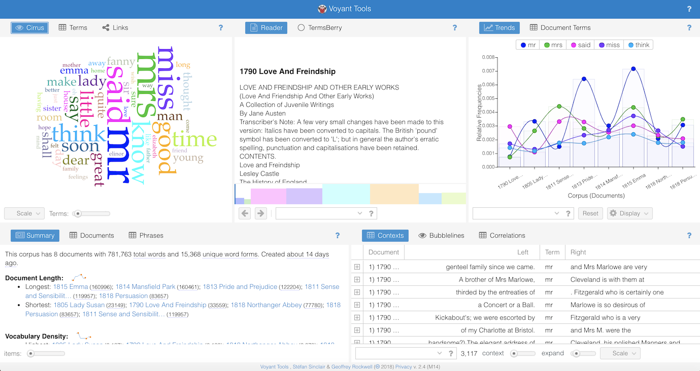
Voyant provides extensive explanation of the tools and visuals of the platform: https://voyant-tools.org/docs/#!/guide/start. The above screenshot is an example of what Voyant generates when users upload a corpus, either by typing or pasting text into the main text box or by uploading one or more files. Voyant includes a default skin (configuration of tools) of panes that includes five tools:
- Cirrus
- Reader
- Trends
- Summary
- Contexts
The tool in each pane can be exchanged for an alternative tool or be expanded by clicking on the edges of the pane. If our readers want to explore Voyant’s features, but are not yet ready to examine their own institutional data, we are offering a small corpus of 6,000 words drawn from our institutions for you to use; additionally, Voyant offers much larger existing corpora on Jane Austen (Project Gutenberg’s collection of eight novels by Jane Austen) and William Shakespeare (Project Gutenberg’s collection of 37 plays from William Shakespeare).
Four pages of this webtext contain examples of data visualization tools and visuals that inform our individual centers, our four centers collectively, and writing center studies more broadly. The functions include the following:
- Cirrus: Provides top terms from a corpus depicted as a word cloud
- Table: Provides a view of corpus term frequency
- Collocates Graph: Shows a network graph of higher frequency terms in the corpus that appear in close proximity
- WordTree: Shows how words are used in phrases within the corpus
The data set analyzed in each of these four sections is a combination of session notes from four writing centers—three in the Big Ten and one in the Big 12—University of Michigan, Michigan State University, Texas A&M University, and The Ohio State University. The corpus is roughly 2 million words and contains session notes from each center collected over 2 years. (Although definitions of corpus analysis are broad and range from method to theory to paradigm, Alan Partington, Alison Duguid, and Charlotte Taylor, 2013, suggested that corpus linguistics is a methodological paradigm that can help facilitate understanding of the way language is used in action.) Despite each site having a different number of stored session notes, each site limited its number of notes to comprise roughly 500,000 words, so as to keep the corpus evenly split among centers.
We begin by discussing our methods and sharing examples of the client report forms for each institution. We then provide four examples of data visualizations from Voyant using our combined institutional data, along with background about each visualization and implications for its use in writing center studies. Next, we provide a small corpus of 6,000 words in an embedded version of Voyant that allows you to explore the same tools that we use in this webtext. Lastly, we include a conclusion that gestures towards new directions for data visualization in writing center and composition studies.