About
Information visualization, often understood as a process that transforms data into insight, relies on user understanding (Pousman, Stasko, & Mateas, 2007). Yet, in assuming that all datavis users have expert knowledge, we ignore a critical and relatively large contingent of casual users that engage with both data and information visualization. Zachary Pousman, John Stasko, and Michael Mateas (2007) developed a heuristic for casual infovis that focuses on a “wide spectrum of users from experts to novices” (p. 1149). Their heuristic understands the users of datavis, as well as datavis itself, as diverse and multi-faceted. Datavis, in their estimation, can be both personally and analytically relevant. Word clouds, which are one of the most common visualizations on the internet (Sorapure, 2010, p. 63), are best understood as a casual infovis tool. Although not incredibly precise or useful for analytical purposes, word clouds offer meaningful visualizations of data to practitioners and scholars in a number of fields. Furthermore, they are perhaps one of the most commonly used visualizations for constructing meaning that is personally relevant, such as mapping out and visually representing a dissertation chapter.
Word clouds are like a Swiss Army Knife; they fulfill many different purposes. They have been used to trace academic conversations (Ahearn, 2014; Haskal, 2013; Mueller, 2012); establish learning outcomes (Skiba, 2013); encourage pre-reading strategies (Bandeen & Sawin, 2012); and facilitate writing assessment (DePaolo & Wilkinson, 2014; Jayashankar & Sridaran, 2016). They are an accessible and quick way to engage in data analysis and visualization, and are often used for pedagogical purposes. Yet, because of their user-friendliness and simplicity, they do not require much knowledge of data analytics. In turn, they report out relatively surface-level findings from large text-based data sets. Because of their ubiquity in academic and professional settings, word clouds warrant explicit examination and their use and function within writing research and assessment requires direct articulation.
Relatively few empirical studies have been conducted on word clouds (Felix, Franconeri, & Bertini, 2018). Although there have been a number of variations in the structure of word clouds including font, word-to-space ratios, word placement and word embedding, among others, word clouds have a largely aesthetic and social impact on viewers: “word clouds are often used more as an emotional experience [rather] than an analytical tool” (Felix et al., p. 657). Because word clouds are simultaneously widely used and under-studied, we explored how the word cloud (Cirrus) function in Voyant—the open-source and web-based program we used to perform the text analyses reported on in this webtext—impacts viewers. Unlike AntConc and other corpus analysis tools common in linguistic studies, certain Voyant tools, such as the word cloud, are geared toward a more novice user population. Although a word cloud can have a visceral impact on viewers, the visualization is exploratory, rather than correlative. For considering large-scale assessments, word clouds may lack the communicative precision required for data shared with administrators, for example. However, because of their aesthetic appeal and relative user-friendliness, word clouds are a useful tool for engaging in personal and communal meaning making. In what follows, we provide three versions of a word cloud with different word counts—75 words, 175 words, and 275 words (the Voyant word cloud accomodates between 25 to 500 words in a visualization)—to explore how different figurations of word clouds affect interpretive scope and engagement.
Examples
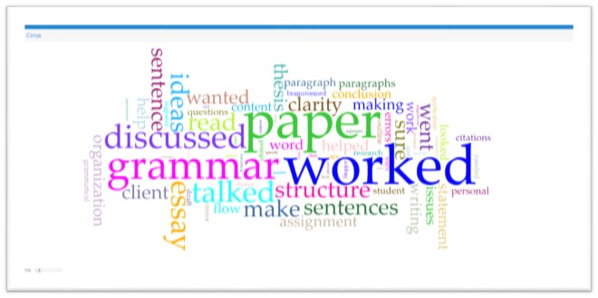
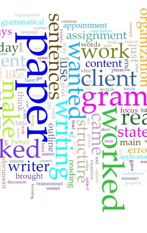
In Figure 7, the 75 most frequently occurring words in the corpus are visualized. Stop words were included in the data set; the practice of parsing language filler prior to analysis and visualization, however, might be useful in some circumstances. In Voyant, users can scroll over each unique word to identify the word count. Each word is seemingly proportionate to its number of occurrences in the data set; however, the number 1 and number 2 most frequently occurring terms, “paper” and “worked,” while relatively similar in size (Figure 6), are quite different in word count. “Paper” (19,104) is referenced nearly twice as often as “worked” (10,075). Spatial layout and the size of words can impact how readers interpret these visualizations; they are not an exact tool with which to show proportions or frequencies. Similarly, colors, such as the bright blue for words such as “talked” and “flow” are more difficult to read than deeper colors such as the royal blue of “worked.” Color, then, also affects how words are emphasized and affect readers’ understanding of the relative relationship between words.
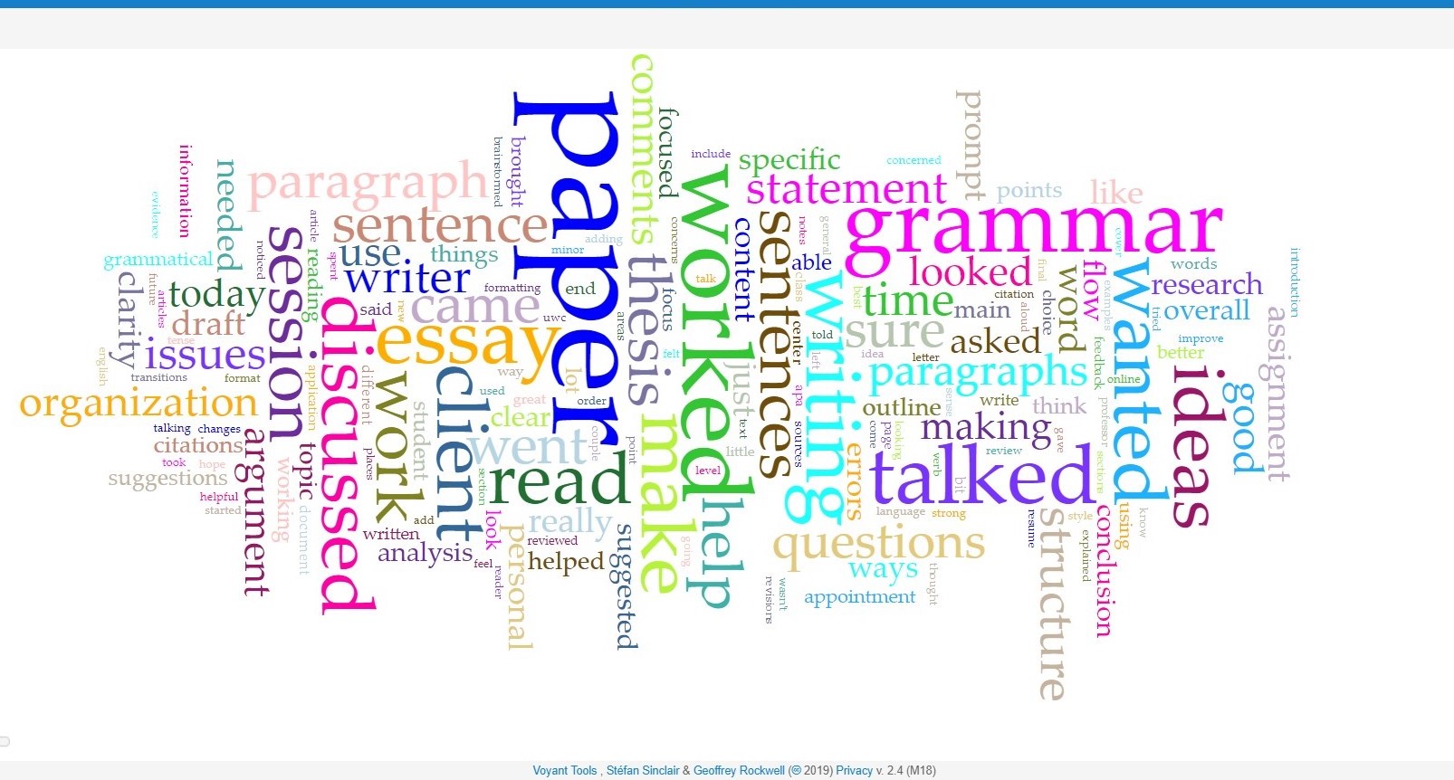
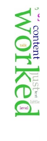
With the addition of 100 extra words, the visualization requires more time spent on interpretation (Figure 8). Small words are harder to read, and the vertical placement of text affects engagement. In this visualization, the top four terms, “paper,” “worked,” “grammar,” and “talked,” all seem relatively similar in size and overshadow many other key terms. Furthermore, embedding less frequently occurring and therefore smaller words, such as “talk” and “level,” in a frequently occurring and therefore larger word, “worked,” (Figure 9) adds to the visual complexity of the model, if not the causal explanation for word placement choice. Additionally, the word cloud randomizes with each refresh, therefore word placement within the visualization seems arbitrary.
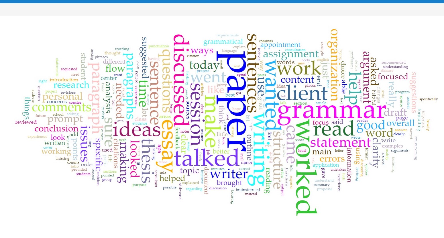
With a word cloud that contains many words (Figure 10), the reader is able to get a more bird’s eye view of what is going on in session notes and the ways in which tutors conceptualize their work and practice. While the more frequently occurring terms are still front and center, there are a lot of smaller words on the periphery of the visualization that are just as important to writing center work such as those made more promiment in Figure 11: “requirements” (top left), “brainstormed” (bottom center), and “understand” (bottom right). As this word cloud expands, it visualizes the kinds of micro-level thoughts and actions that occur in writing center work. Although they are hard to read at times because of color and placement choices (randomly selected by the program), word clouds are flexible and aesthetically affecting, which is useful for low-stakes engagements, such as tutor trainings or class-based discussions.
Implications
As critics note, word clouds are “a one trick pony” (DePaolo & Wilkinson, 2014, p. 44). They are not customizable on Voyant beyond the number of displayed words and, because of this limitation, they cannot stand in for more empirical and text-based data analytic tools. Voyant's word cloud visualizations are limited to surface level and, sometimes, decontextualized finding. Therefore, word clouds are a useful visualization for low-stakes interactions rather than for administrative purposes and external audiences. In the end, we need to consider how data visualization is utilized by novices, experts, and those in between to suit particular methodologies and findings, to fit into different rhetorical contexts, and to connect with different audiences. Although imprecise, difficult to decipher, and, at times, visually misleading, word clouds serve a vital purpose among such a wide and nuanced constellation of data visualization models.