Icons, loops, and overlays
When words are not good enough
Captioning is typically viewed through a correspondence lens: words stand in for sounds. The captioner identifies salient sounds and attributes verbal meaning to them. Not every sound is captioned, of course. But every sound deemed significant enough to caption is transformed into words—verbal meaning—that follow well-established stylistic and semantic conventions.
The process of translating across modes, substituting words for sounds, isn't without tension, difference, or remainder. Consider the seemingly straightforward process of transcribing speech sounds into captions, copying them directly from a production script, or cleaning up the errors in an autocaptioned YouTube video using DIYCaptions.com. While speech sounds seem to present a simple scenario in which each uttered word corresponds to its conventionally-accepted written counterpart, transcribed speech is routinely distilled, standardized, and formalized (see Zdenek, 2015). Captions tend to flatten speech by removing the subtle and varied identifiers of voice. For example, captioned speech is only inflected with manner identifiers when the speech is presumed to be unavoidably or rhetorically marked—e.g., sobbing or drunk speech, thick accents, impersonated speech. Otherwise, captioned speech is routinely distilled down to the bare essentials—i.e., the uttered words themselves—and presented through the prism of grammatical formalization and the well-worn conventions of standard spelling.
Although captioned speech provides an accessible means of conveying meaning to readers, it also strips speech of voice and embodiment. All voices end up "sounding" the same when read through the caption track. Even speech marked as drunk with a manner of speaking identifier may look completely sober—that is, presented in standard written English. When a captioner adopts nonstandard spellings or explicitly marks a speaker's accent or pronunciation quirks, these moments stand out in a sea of disembodied speech captions (and may have implications for race, class, and disability when only some speakers are marked as different in their speech captions). How to rhetorically embody speech in captioning, while making it accessible for timed reading, remains an ongoing challenge.
Sustained sounds offer another challenge. A sustained sound is a sonic event that continues indefinitely, indiscretely, or for longer than a few seconds. Captions, especially nonspeech captions, are not usually on the screen for more than a few seconds, but many sustained sounds last much longer. Captioners must routinely indicate with the resources of language that some sounds continue in the background or throughout a scene. A train rumbling over the tracks may need to be captioned at the beginning of a scene (using a present participle to indicate ongoing action) and again at a later point (using a "[sound] continues" caption). A sustained sound may also need to be stopped in the caption track (using a "[sound] stops" caption) if it's not clear to viewers from the visual context that a sustained sound has terminated. Sustained sounds, when captioned, inaugurate sonic timelines that often need to be tracked by captioners and kept in short-term memory by caption readers. Why? Because sustained sounds cannot be sustained in the captions. They are transformed into one-off captions. That rumbling train sound is recontextualized as one or maybe two nonspeech captions even through the train serves as the continuous sonic ground for the scene inside the train. Captions also tend to equalize all sounds in a film or television show by lifting every captioned sound onto the same sonic plane and thus blurring the distinctions between foreground and background, ground and figure, ambience and keynote. Or, to put it differently and albeit reductively, all sounds become figures on the caption track.
We have assumed that words are always up to the task of providing access to complex, multi-layered soundscapes. Are they? From its inception, captioning has been informed by an unexamined logophilia, a faith that sound is reducible to linguistic meaning, that full meaning can be read off the surfaces of sounds and their contexts, and that words can adequately account for those meanings with little or no remainder, even under constraints of space and time. But ambient film sound is not only about meaning but also about affect and function (cf. Ceraso, 2014, p. 102–103), which cannot easily be extracted from the sounds themselves or converted into simple linguistic expressions.
R. Murray Schafer's concept of the keynote provides an instructive example. According to Schafer (1977), a keynote sound is an "anchor" and "ground" for the meaning of a soundscape (p. 9). It "exists only to give the figure [sound] its outline and mass" and around which "everything else takes on special meaning" (p. 9). Examples of keynote sounds include the background buzz of city life outside the windows of a high rise apartment, the "sound of the sea for a maritime community" (p. 272), the vibrational rumbling of a train car's interior, and the pulsing electronic hum of the engineering deck on Star Trek: The Next Generation. Keynotes have the potential to make a "deep and pervasive influence on our behavior and moods" (p. 9) when they "have imprinted themselves so deeply on the people hearing them that life without them would be sensed as a distinct impoverishment" (p. 10). Schafer studied natural soundscapes, but keynotes are also produced in film sound through the use of background music, stock sounds, Foley sounds, and the natural ambience of the filmed environment (as when speech sounds bounce off the hard marble surfaces of the U.S. Capitol during a live news interview with a senator). Importantly, keynotes "may not always be heard consciously" and yet "cannot be overlooked" (p. 9). The challenge for captioners, then, is to try to convey—in a few words at most—the embodying, affective, deep influence of keynotes (which are themselves complex amalgamations) when that influence may not be recognized or understood consciously, when a few words just won't do, or when captions threaten to turn keynotes into signals (which is what sometimes happens when mood music is captioned as a series of verbatim music lyrics).
Can (or should) we disrupt the hegemony of language in captioning? What non-linguistic or alternative resources are available to convey visual meaning for sonic events that are hard to caption, such as sustained sounds and keynotes?
Experiments with sustained captioning
The following experiments visualize the sustained quality of context-defining sounds differently, using icons and movie loops drawn from the aesthetic universe of each narrative. Even as the added layers call attention to themselves instead of sitting obediently at the bottom of the screen, they have been designed to blend seamlessly, and may be more meaningful and less obtrusive than traditional (scene-covering, bottom-centered) captions.
Heart monitors and dramatic heartbeats offer a compelling case study to explore new methods of captioning sustained sounds. Medical dramas rely on rhythmic EKG tones to convey important information about a patient's status, especially in an emergency. The tones externalize what is happening to the patient internally: the supremely fit athlete in Gattaca (discussed below), the hospital patient in cardiac arrest or flatlining. When the heartbeat fluctuates in meaningful ways, captions alert readers to changes that may be visually salient only part of the time (because the camera is focused on the patient, not the EKG monitor, and the viewer is assumed to have aural access to the sustained sounds).
During the fitness test scene in Gattaca (1997), Vincent Freeman (Ethan Hawke) fakes the heartbeat of an athlete to avoid being exposed as a genetic fraud at work, a "borrowed ladder" who has been pretending to possess the prerequisite traits for his position as an astronaut. In this sci-fi world obsessed with eugenics through perfected techniques of in vitro gene selection, biology is destiny. Parents are engaged in a genetic arms race, preselecting for desirable traits in their offspring in order to help them compete with the genetically modified offspring of other parents. Employers ignore laws against genetic discrimination, testing biological samples of hair or skin to screen job applicants (genetic profiling) for the "right kind of people." "No one exceeds his potential," says the Director (Gore Vidal) of the Gattaca Aerospace Corporation where Vincent works. But Vincent, a so-called "in-valid" who was conceived naturally without the aid of genetic preselection, has been faking it. To gain entry to Gattaca, he has assumed the identity of Jerome Morrow (Jude Law), a world-class athlete until a failed suicide attempt left Jerome paralyzed. Samples of Jerome's hair, skin, blood, and urine provide cover for Vincent during random screenings.
To cheat the astronaut's fitness test, Vincent prerecords a long audio sample of Jerome's heartbeat and uses a device while running on the treadmill to substitute the slow and steady rhythm of Jerome's heartbeat for his own very rapid heartbeat. A doctor monitors the electrocardiogram (EKG) waves of all the astronauts running at a bank of treadmills. Detectives arrive at the fitness facility to question the Director about a murder that may expose Vincent's true identity. We can feel the pressure on Vincent to perform to his potential or be exposed. We know that he was born with a weak heart and we can see him struggling to hide his pain while running. Is he going to have a heart attack? How far is he willing to go to fulfill his dream of flying into space? At the end of the scene, Vincent is almost caught when his faked heartbeat is momentarily replaced on the monitor and over the speakers with his true [HEART BEATING FASTER]. When he returns alone to the locker room, he collapses, [GASPING], and we finally understand the full extent of his performance.
Source: Gattaca, 1997. DVD. Original captions.
The rhythmic, steady sounds of the heartbeat (one beat per second in this clip) define and sustain the context, which is initially established by the lingering shot of the EKG wave and the doctor's interpretation ("Jerome, Jerome the metronome"). As the heartbeat sounds are repeated consistently throughout the scene, they provide an ironic counterpoint to the Director's confident boast that no one exceeds their genetic potential. But the rhythmic undercurrent is not sustained by the captions. The steady heartbeat is captioned only once, unhelpfully, at the beginning of the scene as (HEART BEATING). To visually sustain Jerome's heartbeat throughout the scene, I created a mask in Adobe After Effects to isolate the EKG wave, placed it into a new pre-composition, and applied a time remapping effect to create an endless video loop. Frame-level editing was required to produce a seamless loop. I then inserted the loop into the main composition as a new layer, and resized it into the lower left of the video (example 1) and across the width of the video frame (example 2).
Source: Gattaca, 1997. DVD. Custom EKG movie loop was created by the author in Adobe After Effects and added to the official captions.
Source: Gattaca, 1997. DVD. Custom EKG movie loop was created by the author in Adobe After Effects and added to the official captions.
Similar to an EKG wave, the countdown clock or bomb timer also carries tension and drama across multiple modes—visually and aurally. Viewers are expected to hear the timer counting down—one beep per second—and feel the tension in the absence of any visual reminder of how much time remains. The question for caption studies is whether the timer should be visualized throughout the scene for those viewers who do not have access to its sustained, tense, repetitive beeping. In the first episode of Touch ("Pilot," 2012), for example, a teenage boy in Baghdad has reluctantly strapped a suicide bomb to his chest. The time remaining on the countdown is momentarily visible in captioned speech and as a timer on his cell phone (which is connected by wires to the bomb). "A bomb—in one minute and 34 seconds," he says to the caller. We repeatedly glimpse the green digits of the timer on his phone, particularly during the final twenty-five seconds when he has helpfully turned his phone's screen to the camera and the countdown is at its most intense. Will he stop the clock in time?
Source: Touch, "Pilot," 2012. Netflix. Original captions.
Could this scene benefit from additional visual cues—perhaps a timer styled to resemble the actual timer on the bomber's phone? I experimented with a countdown clock in the lower right corner of the screen, using a timecode effect in After Effects and styling it to match as closely as possible the timer on the phone (Digital-7 typeface, green fill color lightened to increase the color contrast, masks to exclude hours and milliseconds). I originally intended to start the timer and let it run throughout the phone call, but I quickly discovered that the timer only appears to be counting down in real time. In actuality, the phone's counter is adjusted slightly during cutaway shots. In order to precisely match my countdown clock to the timer on the phone, I ended up with five separate timers. To avoid too much repetition, I did not add a timer during the final thirty seconds of the countdown, because, as one would expect in a tense countdown scene, the timer is most clearly visible on the bomber's phone as time is running out.
Source: Touch, "Pilot," 2012. Netflix. Custom countdown timer was created by the author in Adobe After Effects.
Placing a countdown clock in the lower right of the screen obviously changes the meaning of the beeping sounds in this scene. A beep is not a number. If equal access for all is the professed (but misunderstood) goal of captioning, then we have failed to provide access to the timer's beeping when we turn beeps into numbers. Indeed, by providing full access to the time remaining on the clock (instead of only partial and incomplete glimpses of the phone screen), we could actually be decreasing the amount of tension that viewers are expected to experience. How much time is remaining? I can't see the timer on his phone! Did it just say 01:37? A timer in the lower right removes doubt as it compromises the scene's dramatic tension. Perhaps an EKG wave or a countdown timer is not necessary or sufficiently helpful in these examples. Yet I want to open the door to the possibility of alternative (non-linguistic) solutions to hard problems in captioning. Of course, any option needs to be designed and tested in consultation with a range of real viewers, especially viewers who are deaf and hard of hearing. First, however, we must consider the radical possibility that sounds might be visualized for accessibility in multiple, even non-linguistic, ways.
Icons, symbols, and other visual elements can potentially augment (or replace) repetitive captions for sustained sounds. Consider the chase scene in Blade Runner (1982), when Deckard (Harrison Ford) is hunting a replicant through the crowded, dystopian streets of downtown Los Angeles in the near future. The scene is a cacophony of sights and sounds: people yelling in a foreign language (what Deckard calls "cityspeak"), machines hissing, an automated cross walk announcement, and pouring rain. Only the cross walk sounds are captioned on Netflix.
Source: Blade Runner, 1982. Netflix. Original captions.
In this scene, "cross now" is repeated ten times by an automated voice; "don't walk" is repeated seven times. All 17 crosswalk announcements are captioned, and these are the only sounds captioned in this scene. The "cross now" sequence includes five almost identical captions:
AUTOMATED VOICE:
Cross now. Cross now. Cross now.
Cross now. Cross now.
Cross now. Cross now.
Cross now. Cross now.
Cross now.
In contrast to the sonic richness of the scene, this sequence of captions (as well as the sequence of "don't walk" captions that follows) feels reductive, unnecessarily repetitive, and distracting. The soundscape is more than the crosswalk announcements. Because the three middle captions are identical ("Cross now. Cross now."), viewers can also easily miss the moments when one caption is replaced on the screen by an identical caption. I wondered whether the crosswalk captions could be captioned differently. Is there be a better way than simply repeating the same words over and over?
What if instead of repeatedly captioning the words spoken by the automated voice, we used the stylized crosswalk symbols that appear in the movie, bringing them down from the top of the screen where they are only momentarily visible? These symbols (as captioned icons) could then be made to flash in unison with the automated announcements. These icons could convey the meaning of the scene while reinforcing its visual aesthetic too.
Source: Blade Runner, 1982. Netflix. Custom flashing icons were created by the author in Adobe After Effects.
Icons and overlays can call attention to the sonic contexts of communication and provide additional meta-level information about sound. (An example of meta-level information provided by current captioning guidelines would be speaker identifiers because they don't describe sounds per se but information about sound.) By sonic contexts, I have in mind the technologies and communication channels (e.g., text messaging), the temporal shifts (e.g., flashbacks, flashforwards), and the sonic spaces that shape and inform the exchange of meaning and affect. For example, Wayward Pines (2015) uses a soft, bluish lens filter for flashback scenes. Captions can support these temporal shifts with corresponding shifts in caption styling. Or, consider a more fundamental transformation of the caption layer. When Kevin Smith is telling a story on The Late Show with Stephen Colbert about a text message conversation with his daughter—presumably reading real texts from his phone, commenting on those texts, and talking quickly—the captions tend to blur together. In other words, the function of each utterance—which text message is Smith's, which is his daughter's, which utterance is Smith's commentary—is not clearly disambiguated in the stream of seemingly identical captions.
Source: The Late Show with Stephen Colbert, August 26, 2016. CBS. Clip and captions pulled from CBS's official YouTube channel.
Typically, a caption's function will be indicated with one or more basic conventions: parentheses or brackets for non-speech sounds; all caps, colons, preceding hyphens, and/or screen placement for speaker identification; italics for off-screen speech; quotation marks for reported speech; musical notes for lyrics. In the absence of these conventions, we assume that the default caption is a speech caption, and we rely on visual clues on the screen to figure out who is speaking. These clues may be unavailable or difficult to find when viewers' eyes are focused almost exclusively on reading captions. (In one eye-tracking study, Carl Jensema, Ramalinga Danturthi, and Robert Burch [2000] found that their twenty-three deaf subjects "gazed at the captions 84% of the time" [p. 5].) What if the functions of specific utterances could be enhanced visually? If Smith's story could be presented through the lens of a text-messaging phone app, the function of each of his utterances—the main role played by each utterance—could be understood immediately.
Source: The Late Show with Stephen Colbert, August 26, 2016. CBS. Custom text message captions were created by the author in Adobe After Effects.
This approach to visualizing text messages on the screen is not new. A number of movies and television shows have treated text messages in similarly creative ways. Granted, text messages do not need to be captioned (unlike the alerts or vibrations that announce the receipt of a text message), but they do make instructive examples for caption studies. When on-screen text matters, when it is fully integrated into a TV show or film from the start, when it is visualized on the screen as part of the production process (instead of handed off to third parties), then we can expect it to be stylized to fit the scene and the functions of the text. We can expect it to be fully integrated. In an ideal world, captions would be treated with as much care as these other types of on-screen text.
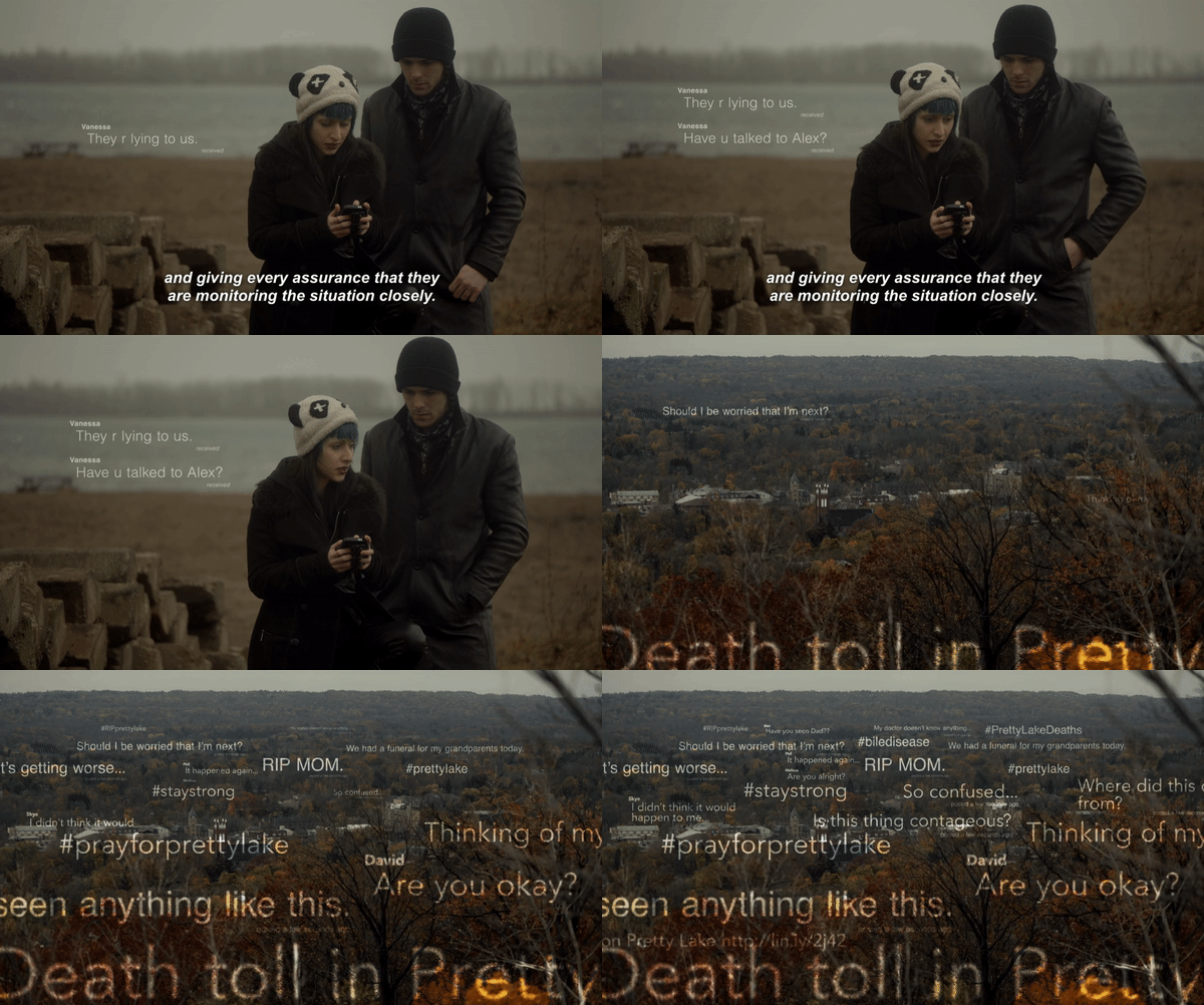
Source: Between, "School's Out," 2015. Netflix. Unenhanced example of multiple text messages filling the screen.
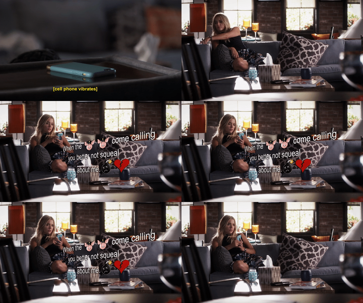
Source: Pretty Little Liars, "New Guys, New Lies," 2016. Netflix. Unenhanced example of text message with emojis (pig, broken heart, and bomb) visualized on the screen.
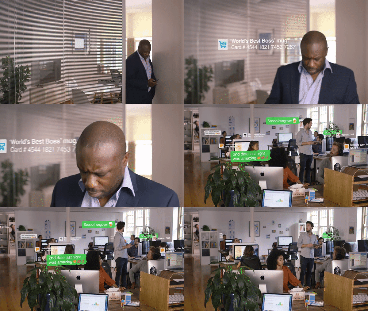
Source: Firefox Encryption. Excerpt from web commercial. 2016. Unenhanced example of animated text messages.