Introduction
Why experimentation is needed in caption studies
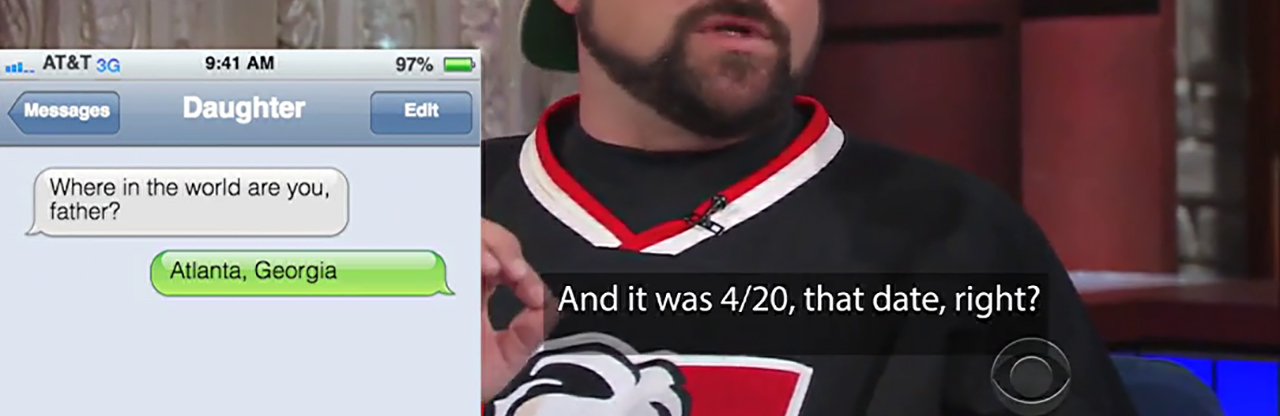 What if captions provided more information about the sonic grounds and contexts of communication: the technologies, temporal shifts, and sonic spaces through which speech and other sounds become meaningful? As Kevin Smith reads text messages from his daughter on The Late Show with Stephen Colbert (2016), those messages might be visualized to indicate their function at a glance, thus making it easier for caption readers to distinguish the text messages he is reading from his commentary about them.
Letterforms in captioning tend to be uninspiring and aesthetically lifeless. They are often dumped onto the screen in bottom-centered alignments. Captioning guidelines tend to be simplistic and decontextualized. Despite the technical and social constraints that currently limit visual design options for captioning, particularly in the U.S., a very small number of studies have explored the potential for designed captions to animate meaning and create richer, more accessible experiences. In these studies, captions begin to come alive with movement, effects, typography, emoticons, texture, dimensionality, size, color, and even avatars and icons to accompany speaker identifiers (see Hong, Wang, Xu, Yan, & Chua, 2010; Lee, Jun, Forlizzi, & Hudson, 2006; Rashid, Aitken, & Fels, 2002; Rashid, Vy, Hunt, & Fels, 2008; Vy, 2012; Vy & Fels, 2009; Vy, Mori, Fourney, & Fels, 2008). With the important exception of Janine Butler's (2017) research on embodied captions, scholars in rhetoric, technical writing, and multimodal composition have yet to explore the experimental potential of captioning to provide better access. Animated captions offer an alternative in which the dynamic presentation of meaning—a fusion of form and content—can potentially enhance the experience without either sacrificing clarity or giving way to over-produced and over-designed caption tracks that intrude more than inform. Put another way, animated captioning and kinetic typography hold the promise of embodying meaning and "'giving life' to texts" (Strapparava, Valitutti, & Stock, 2007, p. 1724).
In simple terms, kinetic typography is "text that moves or otherwise changes over time" (Lee et al., 2002, p. 81) to make it "visually as well as verbally expressive" (Brownie, 2015, p. 3). Previous research on animated captioning usually starts from the assumption that kinetic text can communicate meaning more effectively than neutral, unadorned text. Referring to the uses of animation in newspaper headlines and advertising slogans, Carlo Strapparava et al. (2007) contend that "beyond the pleasantness, affective animations can increase the memorizability of text and, in particular, the semantic consistency between words and animations has a significant role in the memorization of headlines" (p. 1719). According to Matthias Hillner (2005), "motion has become a tool for seduction. Kinetic information hunts us down, whilst we are increasingly drawn to it" (p. 167). Joonhwan Lee et al. (2006) argue that kinetic typography can "enhanc[e] emotional qualities of text communication using its dynamic and expressive properties" (p. 41). Quoc Vy et al. (2008) suggest that current approaches to captioning music "provide little information"—e.g. the "listing of the song title and/or appearance of a music note icon" (p. 609)—but can be enhanced by "visualiz[ing] the elements of music that are used to convey mood. These include emotion, pace, beat, volume and the instrumentation" (p. 610). In the context of poetry, Jonathan Aitken (2006) makes a similar argument about the power of animation: "kinetic typography seems to offer a new dimension to poetry generally and haiku particularly. With its capacity to imbue meaning into written content, kinetic typography can enhance and strengthen poetic meaning" (p. 61). In other words, researchers have turned to animated text as a potential solution to the limitations they have attributed to traditional, linguistic text/captions.
Emotion has been a popular focus of this research (e.g., see Malik, Aitken, & Waalen, 2009; Rashid et al., 2008; Strapparava et al., 2007; Vy et al., 2008). Emotions are assumed to be visible to others and thus can be animated. They can be read off the (able) body, presumably, and communicated. When text can be animated to mimic how the body presumably moves as it experiences a primary emotion, it will be more meaningful to viewers than unadorned text, or so the argument goes. In one study, for example, researchers used a small set of primary emotions and generated a set of text animations that could be automatically rendered: hopping text for joy, palpitating text for fear, trembling and blushing text for anger, swelling text for surprise, and deflating text for sadness (Strapparava et al., 2007, p. 1722). These effects are based on how bodies presumably and visibly react when scared or angry, for example. But the similarities among the effects (e.g., how does trembling differ from palpitating?) make it hard to know whether viewers can match effects to emotions outside of a specific context in which the effects might not be necessary anyway.
Deaf and hard of hearing viewers have offered mixed reactions to examples of animated captioning. Three criticisms are worth mentioning here. Users have suggested that 1) animations aren't necessary when emotions can be gleaned directly from speakers' facial expressions, 2) some animations seem childish or amateurish, and 3) some animations take too long to process and thus can feel overwhelming. I would add that these studies also tended to ignore the rhetorical dimensions of captioning, the ways in which linguistic and design choices are (or should be) tied to specific interpretative contexts. The studies understood captioning narrowly in terms of a verbatim model that didn't take into account the inevitability of selection and interpretation on the part of a well-trained captioner (see Zdenek, 2015). Instead of focusing on specific contexts or problems in which enhanced captions might prove helpful, studies tended to generalize. In attempting to build master frameworks and automated systems for integrating animations into captions across entire programs, researchers didn't account for the ways in which enhanced captioning might address specific and highly situated problems.
Despite these criticisms, enhanced captions hold promise, if only to remind us that very little has changed in the composing and design of captions since the advent of closed captioning in 1980. Can we open up closed captioning to greater complexity and experimentation? Can we upend (or crip) practices and assumptions that haven't changed in thirty years? Crip theory unsettles our entrenched assumptions. It "questions—or takes a sledgehammer to—that which has been concretized" (McRuer, 2006, p. 35). Disability studies and queer theory generate what Carrie Sandahl (2003) called a "productive reciprocity" (p. 25) Crip theory is located at the intersection of these disciplines. In particular, both share a "radical stance toward concepts of normalcy; both argue adamantly against the compulsion to observe norms of all kinds (corporeal, mental, sexual, social, cultural, subcultural, etc.)" (Sandahl, 2003, p. 26). "Both 'cripping' and 'queering,' as interpretative strategies, spin mainstream representations or practices to reveal dominant assumptions and exclusionary effects" (Lewis, 2015, p. 47).
Can we dance on crip theory's radical edge, chipping away at the concretized assumptions, values, and norms of captioning? What problems would be called out by a severe critique of captioning? What new assumptions and practices might develop? Or, to use a different metaphor, what new products would be created if we baked captioning into our video productions and pedagogies instead of treating it only as an add-on, afterthought, simple legal requirement, or technical problem?
Animated and creative captioning might begin to address a number of hard problems in captioning that cannot be solved easily through conventional methods:
- Distinguishing multiple speakers in the same scene;
- Signaling sonic dimensionality along two main axes: near/far sounds and loud/quiet sounds (i.e., the problems of distance and decibels);
- Clarifying the nature and meaning of sustained or repetitive sounds (i.e., the problem of duration); and
- Reinforcing the meaning of sound effects, ambient sounds, and music.
These problems suggest a number of research questions that motivate my own experiments and may provide a framework for other researchers:
- How can we better integrate closed captioning in film and TV contexts?
- How can we create a closer connection between visual and verbal meaning in closed captioning?
- Can we use animation, text effects, typography, screen placement, color, graphics/icons, and dimensionality to convey meaning not only through words and content but also through formal features of visual design?
- How can we assess the quality and legibility of these experimental forms with a range of viewers, especially deaf and hard of hearing viewers?
In what follows, I begin to address these hard problems in captioning through novel, highly situated solutions using a variety of experimental techniques. I follow Yergeau et al. (2013) in arguing for a disability studies perspective on multimodal composition, a perspective that 1) highlights the ways in which "multimodality as it is commonly used implies an ableist understanding of the human composer," and 2) suggests how multimodality might lead to more accessible technology futures for everyone, but especially users with disabilities. This perspective offers an antenarrative for captioning (Jones, Moore, & Walton, 2016), a way to begin to challenge the official narrative of captioning as objective transcription and captioners as glorified typists. Disability is one thread in an "antenarrative" of technical and professional communication (TPC) research, according to Natasha Jones et al. (2016, pp. 211–12):
Although TPC scholars have long been exploring issues of inclusion, the collective contribution of this work has gone largely unnoticed, (over)shadowed by the dominant narrative that technical communication is most concerned with objective, apolitical, acultural practices, theories, and pedagogies. The official narrative of our field indicates that TPC is about practical problem solving: a pragmatic identity that values effectiveness. But this is not the whole story. The narrative should be reframed to make visible competing (i.e., a collection of nondominant) narratives about the work our field can and should do.
What does it mean to reframe technical communication research around inclusion, universal design, and accessibility? What if accessibility was not treated as an aside or an objective and straightforward process of "providing subtitles for all sounds" (McKee, 2006, p. 335) but had the potential to be transformative? What if we didn't simply argue for the importance of closed captioning but treated it as a significant variable in our multimodal analyses and productions? I contend that the richness of closed captioning can serve as a laboratory for exploring a range of questions at the intersections of reading, writing, sound studies, multimodal composition, and accessibility.
My own experiments were initially inspired by the artistic subtitles in Night Watch, a 2004 Russian horror movie. In an unusual move, director Timur Bekmambetov "insisted on subtitling [Night Watch] and took charge of the design process himself," as opposed to having the Russian speech dubbed into English or leaving the subtitling process to an outside company (Rawsthorn, 2007). He adopted an innovative approach: "We thought of the subtitles as another character in the film, another way to tell the story" (Rosenberg, 2007). Alice Rawsthorn (2007), design critic for the New York Times, called the subtitles "sensational" and cited a film critic who called them "the best I have encountered."


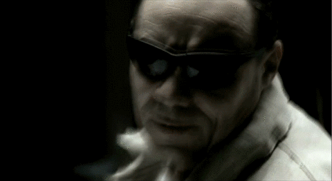

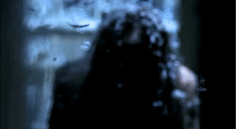
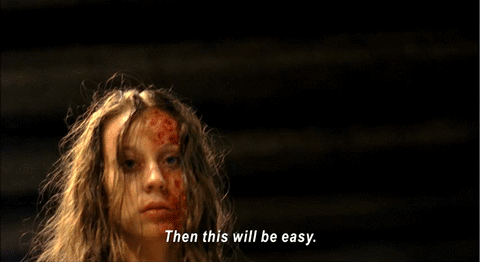
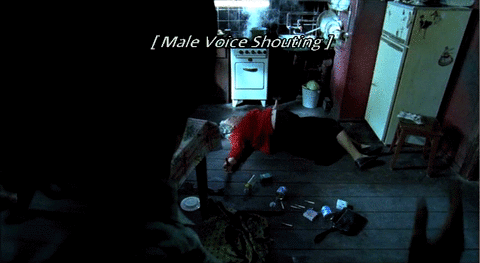
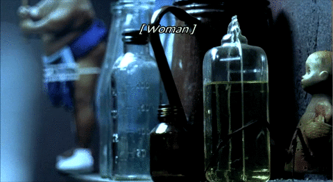
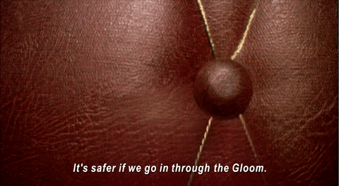
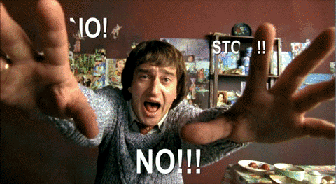
Source: A compilation of ten animated GIFs from Night Watch. 2006. DVD. Bazelevs Production.
Most of Night Watch's subtitles are standard and unobtrusive: pop-on style, bottom-centered alignment, white letters, sans serif typeface. But in a number of key places, the subtitles come alive, blending form and content in innovative ways that make sense within specific contexts. When the subtitles become dynamic and responsive, meaning is conveyed not simply through the words themselves but in how the words are visually presented—what they are made to do, how they dynamically move and transform, how they visually support the narrative. Night Watch's subtitles put closed captioning on notice. They embody the dream of universal design advocates that captioning can be—but has not yet been—"an integral element in the communication of [the directors'] creative vision" (Udo & Fels, 2010, p. 208).
In 2016, I received a Faculty Fellowship from The Humanities Center at Texas Tech University to produce forty examples of animated captions while building my (admittedly still limited) skills with Adobe After Effects. Popular clips from movies and television shows served as my canvas to fashion alternative and supplemental forms of sonic accessibility. My experiments are likely to be (and were intentionally created to be) controversial and disruptive. I hope they spur a larger conversation among caption readers and producers about potential futures. I hope they also call attention to and challenge norms, especially institutional and pedagogical arrangements that place captioning outside of the creative process. While I do not report here on users' responses to my experimental captions, I value their feedback and plan to report on usability tests in a later article.
The remaining sections of this webtext are organized by type of intervention. Each intervention type or approach confronts a different set of hard problems. My solutions move from least disruptive to most experimental:
- Meta captioning: How embedded captions can normalize accessibility. Meta captioning is my name for a form of activism that makes captioning more visible and normal by placing captions on every screen, including screens only glimpsed in the backgrounds of other screens. Meta captioning reminds us that captioning is usually hidden or not recognized as an important element of design. By arguing for the increased visibility of captioning on public and private screens, meta captioning also raises up and opens the door for the experimental forms of captioning to come.
- Typography and color: How simple choices can aid speaker identification. UK subtitlers already leverage the power of color to address a sometimes challenging problem in captioning: distinguishing multiple speakers. In addition to color, I offer the idea of character profiles on the caption layer, which are composites of type, size, and color selections that are associated with and, ideally, embody each character.
- Icons, loops, and overlays: When words are not good enough. We move into more experimental territory with the possibility that meaning might be conveyed by non-linguistic means. Using icons and loops can help address another hard problem in captioning: managing sustained or continuous sounds. Because they tend to reduce continuous sounds to one-off captions, words are not very good at indicating the continuous nature of some sustained sounds.
- Baked-in captioning: Why norms must be continually critiqued. The most disruptive and experimental forms of designed captions integrate accessibility into the aesthetic universes of the programs themselves. These experimental captions reinforce the meaning, function, and feeling of music, ambient sounds, and sound effects, all of which remain ongoing challenges in captioning.
- Conclusion: Imagining different futures for captioning. In the conclusion, I argue for experimentation and disruption to the status quo, while acknowledging the limitations of an experimental attitude.