'La Ligne Juste'
It will always be difficult to convey in words the qualities that make a cartoon’s style—from its characters all the way down to its lines—unique or compelling or demanding or uniquely suited to a particular kind of content.[1] For example, both Chris Ware (2004a) and designer/author Chip Kidd (2001) have tried to explain what they value in Charles Schulz’s Charlie Brown comics. Both Ware and Kidd began by looking at the cartoons themselves, and even at the lines that make up the cartoons, attempting to explain how Schulz so aptly matched and mixed style and story. And both appealed, implicitly, to our vision: They claimed we needed only to look attentively to see Schulz’s voice in his lines and to see how others fail to bring Charlie to life. Ware pointed to unfinished sketches left behind by Schulz, just scribbles on notebook pages that even in their unfinished state (Ware argued) evoke the style and spirit of Schulz’s Peanuts gang (p. 67). Drawn by anyone other than Schulz, Ware said, Charlie “always comes out looking so wrong, a lurid joke, like someone dressed up at a costume party” (p. 66). Kidd made much the same point about reprinted pages from a 1950s Tip Top Comics version of Charlie Brown that was not drawn by Schulz. Kidd said that the manifest failures of that comic illustrate “how deceptively simple Schulz’s style is” and also that Schulz’s style is “impossible to copy.”[2] Something about Schulz’s lines, from Schulz’s hands, both men have argued, is essential to making Charlie Brown be who he is and mean what he means. The motivated sign-making begins, they have suggested, with the impossible-to-capture qualities of the cartoonist’s lines.
Drawing Charlie?
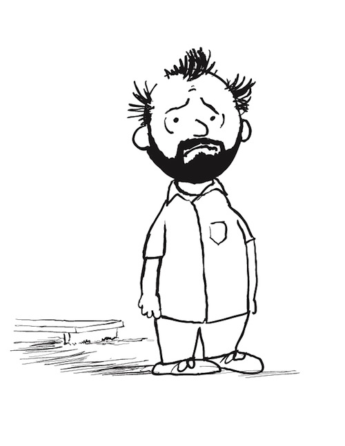
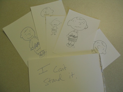
In search of further insight into the power of Schulz’s lines, Kidd’s (2001) richly visual Peanuts: The Art of Charles Schulz had done what many fans of many kinds of artists do: It has looked into the artist’s processes and toolbox. Kidd's book explained what kind of drawing paper Schulz worked on, how he scripted, when the lettering went on, when the cartoons went on. The book even included this charming bit of trivia about Schulz’s exact tools:
He used a 914 Radio, and relied on these pen nibs so much that when the company announced it was going out of business, he bought the entire remaining stock. The hundreds of boxes saw him through the rest of his career. (n.p.).
Over the course of his book, Kidd suggested at least three loose periods in Schulz’s Peanuts drawing: an early period, which Schulz himself said had a “harshness” and lacked “warmth” (n.p.); a middle period of development and maturity; and a late period in which Schulz, because of shaking hands, began to draw more slowly and less cleanly. Kidd praised even the final period: “Rather than harming the strip, this actually made the linework even more expressive. . . . Due to Schulz’s discipline and mastery of technique, the gradually wavier lines never looked like a mistake—they were a natural, effective design choice" (n.p.). Kidd included a Schulz quote suggesting that Schulz himself took something like a fan’s pleasure in seeing his lines emerge from those 914 Radio nibs: “I am still waiting for that wonderful pen line,” Schulz said,
that comes down when you are drawing Linus standing there, and you start with the pen up near the back of his neck, and you bring it down and bring it out, and the pen point fans a little bit, and you come down here and draw the lines this way for the marks on his sweater. (qtd. in Kidd, n.p.)
All of this interest in penwork suggests, again, how important even a line can be to a comic—so important that, Kidd (2001) implied, as the line style of Charlie Brown’s world changed, so did the character of that world. The distinctive voice in a line is that irreplaceable quality of the hand that is drawing, joined to the pen, joined to the paper, and so on down to the day and hour when the drawing was made.
Kidd (2001) and Ware (2004a), in their appreciation of Schulz, have written of his lines in the way that some writers speak of le mot juste. Schulz’s linework may not be the best linework for all contexts. It would be the wrong linework in some contexts. He probably even had weak line days, and, like everyone, his set of available semiotic resources must have been bounded in part by his own artistic limitations. But in the world of Charlie Brown, Kidd and Ware (and many others) have told us, Schulz’s linework is just right—essentially la ligne juste, a visual storytelling analog for le mot juste. Scott McCloud (1993/1994) has said that all lines (not just Schulz’s lines) have “expressive potential,” that
by direction alone, a line may go from passive and timeless—to proud and strong—to dynamic and changing! By its shape it can be unwelcoming and severe—or warm and gentle—or rational and conservative. By its character it may seem savage and deadly—or weak and unstable—or honest and direct. (pp. 124–125)[3]
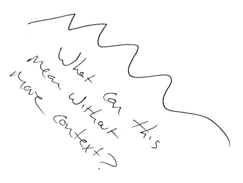
And McCloud (1993/1994) drew these different lines along with his explanatory text, then showed their deployment in several comics, persuasively demonstrating how line styles can fit and amplify the content of a comic. Even so, he is only partially correct. La ligne juste does what it does only in context; there is no fundamental meaning to a line style. To get “savage and deadly” lines (McCloud, p. 125), the artist must join those lines to content that evokes the savage and the deadly. Wedded to other content, those same lines might read as whimsical and awkward, or bland and pedestrian. Theo Ellsworth’s (2010) robots would not be nearly so strange if they did not live in the woods. Bryan Lee O’Malley’s (2010) hipsters would take on different kinds of significance if they were working in corporate cubicles and attending business seminars. A line style itself, or a cartooning style itself, can provide crucial elements of meaning for comics, but lines and cartoons on their own mean little (or nothing) until they are activated by and in context. Significance begins at the level of the line, but only if the line is given a context in which to signify. As McCloud (1993/1994) himself has said, comics come to life through the juxtaposition and ordering of multiple bits of visual data that have been brought together so that they can communicate together (p. 9).
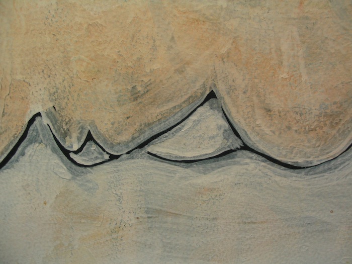
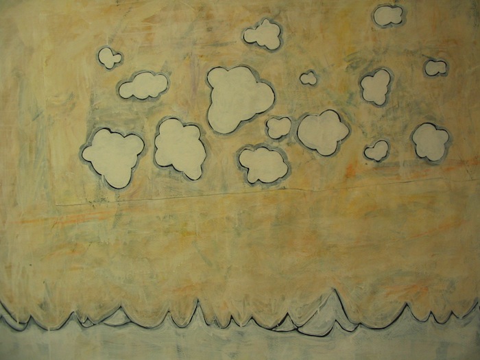
A Squiggle, Nothing More
Formal Traits
Because significance in comics emerges from the whole set of juxtaposed images and not from any single image alone, it is important to avoid the mistake of assigning meaning to a line style or drawing style without considering the full context in which it is deployed. Other narrative-driven media similarly tempt critics into the kind of reductive reading that turns formal traits into automatic ciphers for narrative meaning. Film studies students, for example, learn that a high angle shot (looking down from above on a subject) tends to suggest that the subject of the shot is vulnerable, whereas a low angle shot (looking up at the subject) tends to dignify or empower a subject. Yet those shots do not always mean those things, any more than a jagged line in a comic will always evoke danger.
Dave Monahan’s (2006) excellent “Camera Angles” tutorial (from his Looking at Movies DVD) made this point clear by examining a scene from Stanley Kubrick’s (1980) The Shining. The wife, Wendy (played by Shelly Duvall), is in danger from the husband, Jack (played by Jack Nicholson), but Monahan showed how, in the scene where Wendy discovers her danger, Kubrick used a combination of low angle shots, lack of information about the environment, and story context to evoke Wendy’s vulnerability to Jack’s madness. This is roughly opposite of the conventional wisdom about low angle shots, but Monahan’s reading is undeniably correct (and a testament to Kubrick’s skill and style as a filmmaker). Because conventional shot-angle wisdom says Wendy must be empowered in a low angle shot, an inexperienced critic might tax his brain mightily trying to find a way to explain how Wendy is empowered in the scene. But he would be making the mistake of reading the formal trait as if it were a clue for decoding, rather than considering how the formal trait operates in—is activated by and in—the context of the scene.
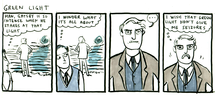
Similarly, beginning literature students (often aided and abetted by imagination-killing reliance on Spark Notes) sometimes want to assign symbolic meanings mechanically, without reference to story context. Green must mean money. Or maybe springtime. Yellow must mean money (gold!). Or maybe sickness. In a much discussed scene from F. Scott Fitzgerald’s (1925/1995) The Great Gatsby, the narrator espies Jay Gatsby standing in his yard at night, reaching out across the water and toward a green light that turns out to be shining at the end of the dock belonging to his long lost love, Daisy Buchanan. Spark Notes (2013) reductively opines:
Situated at the end of Daisy’s East Egg dock and barely visible from Gatsby’s West Egg lawn, the green light represents Gatsby’s hopes and dreams for the future. Gatsby associates it with Daisy, and in Chapter 1 he reaches toward it in the darkness as a guiding light to lead him to his goal. Because Gatsby’s quest for Daisy is broadly associated with the American dream, the green light also symbolizes that more generalized ideal. In Chapter 9, Nick compares the green light to how America, rising out of the ocean, must have looked to early settlers of the new nation.
When students rely on this kind of gloss, they end up asserting, without adequate (or, sometimes, any) proof and logic, that the scene where Gatsby reaches for the light has some ill-defined something to do with the hopes and dreams of Americans, as if that vague, unsupported (by them) assertion explains anything about the novel, its characters, or the scene. The Spark Notes (2013) gloss on the text makes the entire context of the scene just drop away, so that any of the light’s possessive attributes being highlighted by Fitzgerald (1925/1995) are submerged beneath speculation about the possessive attributes he might be highlighting. What is it about trembling toward a dock light that is supposed to evoke the early European colonists? How is that metaphor interesting and complex and embedded into the narrative, if that is the metaphor Fitzgerald has given us? In what sense is this dock light supposed to be “guiding” Gatsby, and toward what possible end? If we restore the context, we get the nosy, nosy narrator spying on his neighbor, his neighbor acting quite strange, and—in the context of the larger narrative—a scene from the life of an awfully creepy stalker. How warped must a man be to reach trembling toward an estranged lover’s house in the middle of the night? How scary is a guy who buys a palace across from his ex-lover’s estate under an assumed identity with the explicit goal of homewrecking the ex-lover’s family? The scene becomes much more interesting in context, and, with context in mind, it becomes much harder to assert that the green of the light must obviously symbolize something as nebulous as every man’s hope for prosperity.
Kate Beaton's Gatsby, from Hark! A Vagrant
Concatenation
Charles Schulz’s lines (or Ellsworth’s or O’Malley’s or your favorite toddler’s) are more interesting in context, too. Roland Barthes (1961/1996), who normally wrote about images in isolation (even when he was writing about film), noted in passing how some meanings emerge only in the composite: “Naturally, several photographs can come together to form a sequence . . . ; the signifier of connotation is then no longer to be found at the level of any one of the fragments of the sequence but at that . . . of the concatenation” (p. 24). In another text, Barthes (1964/1996) pointed specifically to the importance of concatenation for “cartoons and comic strips,” in which individual words and images are part of “a more general syntagm and the unity of the message is realized at a higher level, that of the story, the anecdote, the diegesis” (p. 41). This notion that meaning arises from concatenation (a notion which can be profitably extended to any complex narrative) is fundamental for interpreters of sequential media like film and comics. Encountered outside of Peanuts, observed without foreknowledge of the strip or of Charlie Brown’s place in culture, neither Charlie nor Schulz’s lines would contain the significance that Kidd (2001) and Ware (2004a) assign them. Even setting aside the significance that accrues to Charlie because of his fame, the meaning of Charlie is established not by the linework alone but by the linework joined to Charles Schulz’s sensibilities as a storyteller, gag writer, and character designer. Charlie’s significance emerges from the concatenation of Charlie (a “chronically depressed child,” as Lev Grossman (2004) once called him)[4] with the formulaic restraints of the newspaper strip, the chosen settings, the child’s-eye point of view, the repeating gags (the kite tree, the football, the baseball games, the little red-haired girl), and the other characters (the preternatural dog, the bully, the losing baseball team, the kid with the blanket, the filthy kid, the frustrated musician), and (no doubt) the linework. Significance emerges when Charlie (looking and acting as he does) meets Linus (looking and acting as he does) on the pitcher’s mound at the end of another lost game. It is even fair to say that the significance of Charlie begins to emerge, pretty strongly, by the end of the first Peanuts strip, with the punchline “Good ol’ Charlie Brown. . . . How I hate him!” (Schulz, 1950/2004, p. 1). But that significance does not come from the line style alone, as significant as the lines certainly are.
The First Peanuts Comic

If the first necessary point in an analysis of how comics say what they say is that the figures and lines on the page all speak, the second is that nothing on the page speaks alone.[5] Elsewhere, I have included several straightforward teaching exercises, and all of these, in a sense, are designed to help students experiment with and talk about the juxtaposition of visual elements. All of them are meant to prompt thinking about the complex ways that even subtle juxtapositions can alter the meaning of concatenated bits and pieces in a composition. Meaning for comics (and films and novels and other complex texts) arises, as Barthes (1961/1996) suggested, at the level of concatenation. As the meaning of a film angle emerges from its use in the context of the film, and as the significance of a literary symbol depends on how it is used inside the text itself, the meaning of Charlie is not in Charlie’s lines alone but in the concatenation of elements that makes up Charlie’s world (and Charlie’s relationship to readers).
As I have argued above, the style of the images matters, without a doubt. Style is integral to the work’s voice and meaning and focus. But the meaning of the visual style arises from its integration into the work (or from audience expectations), not from its intrinsic qualities alone.[6] The complexity of the whole page (rather than of the individual image) is one important reason why Ware’s (2008) Rusty Brown comics are more demanding than Theo Ellsworth’s (2009) “Norman Eight,” even though Ware’s drawing style (somewhere further to the right than Ellsworth’s style on McCloud’s stylistic pyramid) is arguably simpler than Ellsworth’s. Ware’s comics tend to include a greater number and complexity of juxtapositions, even in single panels, and he creates a more complicated reading experience by integrating his iconic figures into emotionally fraught situations and building his panels into visually rich pages that contribute significantly to his storytelling.[7] La ligne juste gets its power from integration into the cartoon, which gets its power from integration into the comic; concatenation is key. Everything on the page speaks, all at once, and comics can help students enter into a conversation about how that rule might be applicable not only to visual compositions but also to a complex composition of any kind.
[1] It’s like dancing about architecture. It’s like singing about cake. It can be done, but it’s not quite the building. It’s not quite the cake. It is also why looking at a comic's form is so difficult.
[2] Kidd uses no page numbers in this volume.
[3] The unusual punctuation for McCloud’s (1993/1994) quote is the end result of combining text from several sequenced comics panels.
[4] Grossman (2004) on The Complete Peanuts: “The first volume (1950–52) confronts us afresh with what a brilliant, truly modern and totally weird idea it was to create a comic strip about a chronically depressed child” (p. 72). (The Complete Peanuts is a reprinting of all of Schulz’s work, designed by Seth and scheduled to be published volume by volume over more than a decade.)
[5] A metaphor for the concept: Water is water everywhere, but it takes on a meaning it would not otherwise have when it is part of a glass of water. The glass is a glass. The water is water. But they mean something different when they are a glass of water, together. Significance depends on concatenation.
[6] I argue above with McCloud’s (1993/1994) suggestion that certain line styles just intrinsically mean something, even when divorced from context. I might similarly have argued with the way Will Eisner (1985/2008), in Comics and Sequential Art, suggested that certain visual moves will necessarily express certain meanings. See, for example, his “Micro-Dictionary of Gestures,” which featured a number of poses, in silhouette, labeled as anger, fear, joy, and so on (p. 102). These would be useful for a practitioner trying to think about the significance of poses, for certain, yet they are not certain to mean, in every context, what Eisner said they mean, any more than a high angle shot, in cinema, always means that the featured character is in danger. Gunther Kress and Theo van Leeuwen (2006) ran a similar (and similarly worthwhile) risk of overgeneralizing when they explored the significance of visual composition. When they discussed the way new information tends to appear at the right, for example, they established some good, general rules (pp. 179ff), yet those rules will be of only limited value in decoding something like Chris Ware’s most complex pages.
[7] Ellsworth, in his other works, has produced some dazzlingly complicated images and pages, and it pays to look closely at his details. Yet, even at his most complex, Ellsworth’s pages (like most comics pages compared to Ware) do not demand the same kind of close attention as Ware’s do on first reading.


