Teaching Comics, Teaching Writing
Below, I describe a small set of straightforward classroom exercises that might (all together or not) follow from and reinforce study of the comics-related ideas explored throughout "Perspicuous Objects." Each builds on comics and comics theory, and each is designed to ease students into close analysis of visual rhetoric. Each in its own way is meant to help students learn to describe their own visual work and the visual work of others, in part by learning to look more closely at what Richard Lanham (1993) might have called the at of comics, and to avoid or grow past what Rich Rice and Cheryl E. Ball (2006) called "unremediated schmoozery" in the use of visuals.
Now, Draw Yourself Again
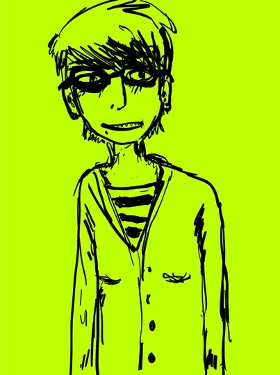
(Click to see Haley's second drawing, along with a few notes.)
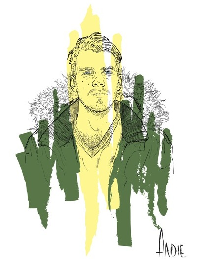
(As above, click to see the second version and notes.)
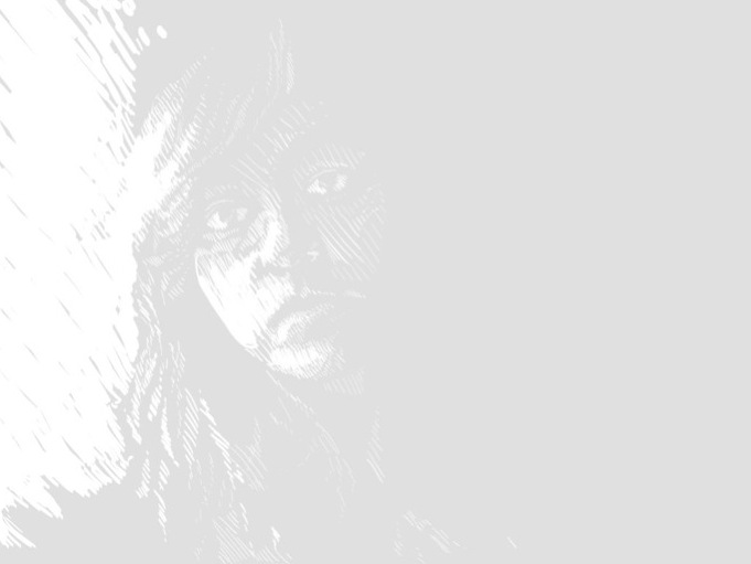
(Click to see the second version and notes.)
Stylistic Inventories. The personal voices and perspectives of comics artists tend to be expressed more or less clearly in their visual work (as I argue in other sections of "Perspicuous Objects"); for teaching visual communication, the blatant presence of personal voices is one important advantage that comics have over many other common visual forms. It rarely seems that a cartoonist is trying even a little bit to be objective; the form itself, as Scott McCloud (1993/1994) has argued, demands the use of telling distortions and simplifications. With cartoons, there is rarely the problematic sense, as with photographs, that the image ought to be telling the unfiltered truth; all cartoonists are fabricators and embellishers—consciously, obviously so. For that reason, it is not difficult to place the work of several cartoonists side by side and stage a discussion about the different kinds of possessive attributes the cartoonists are highlighting in the subjects and objects they choose to draw. It is relatively simple to ask students to look at how one artist’s depiction of human beings differs from another’s—how the focus of one artist’s visual analysis of the world differs from the focus of another artist's. Such a discussion might easily expand to include not only human figures but also the visual qualities of spaces and settings, and of the objects in those spaces; the discussion should certainly touch on the ways that texts, lines, and other objects on the page affect the meaning of the drawn figures. It may be relatively difficult to put the key differences into words, but beginning with a written inventory of what is actually on the page—images and lines and traits of images and lines, along with key written elements—will give students the raw data they need to make a case based on very specific evidence, and, if all goes well, to begin to talk about how specific sets of stylistic choices serve the unique texts in which they appear. Ideally, these sorts of lessons could carry over to analysis of visuals in more mundane documents, where overall context and deployment can be just as subjective, though not so obviously subjective.
Doodled Self Portraits. To help students think further about the selective, analytical nature of cartoons and comics, teachers might ask them to try building their own analytical images—by drawing, by staging photographs, by altering images with photo-editing software. Those images might be deliberately focused and analytical, aimed at conveying specific ideas, somehow, but it is also possible to ask students to create less deliberately focused analytical images and then to try to explain what they have done. For example, students might draw themselves in whatever doodling styles they have developed during their years of scribbling in the margins of notebooks. (This will be easier for some students than others, and—especially if done in class—the best artists in the group will need to be given a time limit and a reminder that this is their habitual doodle drawing, not their most accomplished portraiture.) After sketching, either in small groups or as a class, students can look at the different kinds of possessive attributes emphasized in their different drawing styles, and they can speculate about how this drawn style might fit into a narrative. That step is important: It asks students both to notice the embedded analytical traits of their own doodling styles and to see how, even at the level of doodling, drawing can analyze and present the world in quite different ways.
Second Portraits. A productive next step for the doodling exercise might ask students to draw themselves using a second, different line style—maybe choosing one of the line styles McCloud (1993/1994) suggested in Understanding Comics, maybe simply choosing a different point on McCloud's stylistic pyramid, maybe imitating the line style of a classmate, maybe imitating a comics artist the class has considered, or maybe using some combination of the above. The second style will often be much harder to produce, but it will result from the conscious, current choices of the image maker. The second set of drawings will provide not only another group of images to analyze but also a practical experience trying to invent effective expression with visuals. Trying to draw in a second style may also make students aware of the limits of their own semiotic resources—of how their limited experience with drawing and looking at drawings and trying to express anything through drawing means, naturally, that there are few visual moves they can make easily (unless they have rare and well-developed artistic skills). This is a chance for students to more fully appreciate the complexity and difficulty of the work done by visual communicators of all kinds, and it is at the same time a chance to understand that they can, within limits, begin using some of the tools deployed by more sophisticated visual communicators.
Other Drawings. One potential drawback to self portraiture can be the sense that the portrait (and its followup) ought to be doing some serious self-expression, or that self-drawing is too uncomfortably revealing of self-image. That might add a welcome layer of complexity, in some cases, but it might also be a distraction. For that reason, a teacher might choose to ask students to draw someone else in the class, or someone fictional, or just anyone. A teacher might also ask students to draw human figures (or personified human-like figures) representing specific states of mind or specific situations or specific ideas. The variations are practically limitless, each with its own potentially productive (but potentially distracting) complications.
Staged and Altered Photographs. Close study of comics and cartoons may also work as useful scaffolding for studying the rhetoric of photography and other less obviously subjective visual forms. If we can ask how Charlie Brown is affected by his immediate context, we can also ask how a front page news photo is affected by its context—the headlines, the stories, other images, the visual design, even the paper's reputation. If we can talk about how cartoonists choose details to include and emphasize, then we can talk about how photographers do the same. As in comics, there are perspicuous objects in news photos and billboards and all sorts of visual messages; all photographers and designers are amplifying by simplifying, though often in more subtle ways than comics artists. As a result, students can apply what they have learned from the careful reading of comics to the staging of photographs. Some students may find camerawork less intimidating and personal than cartooning, in fact, but such work can still demand that they mindfully select what will be seen in their images—how, in effect, their images will function as focused, analytical compositions. Students might experiment with amplification through simplification in a photograph, controlling what their viewers see, and how much of it, in order to imbue an image with deliberate focus and analytical commentary. Students might also experiment with changing the meaning of a photograph using even the simplest tools provided by photo editing software—subtle color shifts, added lines or highlights, cropping, and so on. What happens, they can ask, with the change of an angle, the movement or substitution of an object, the alteration of facial expressions? How can one squiggly line, one added object, one subtle shift change everything?[1]
Mise en Scene Experiments
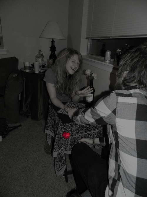

Text-and-Image Juxtapositions. Staging, manipulating, and then purposefully juxtaposing photographs to other texts can be a manageable way to experiment with the power of context to change the meaning of an image (and the power of an image to change the meaning of its context). For example, students could consider the ways that different kinds of images would add different kinds of meaning to a given essay (one of their own, or maybe one that the class has read together). Building from an understanding of the analytical, focus-making qualities of cartoons, such a discussion can look closely at what a given image is saying in the context of an essay—how it is supporting or supplementing or even pushing back against the essay's argument.[2] Students can use the critical vocabulary they acquire while studying comics to explain how their own images are contributing (or not) to their own writing; they need not fall back on the vague assertion that images accompanying essays are good to include because they give readers something exciting to see on the page.
Image-and-Image Juxtapositions. Students might also do some purely visual juxtaposition and concatenation, combining a single image with a series of second images in order to produce different concatenated meanings. A child playing in one image, joined to an explosion in the second, suggests danger. That same child joined to a picture of a graduating senior suggests the process of growing up. Students might experiment, as Madeleine Sorapure (2006) has suggested, with specific visual figurative language by making, for example, metaphorical or metonymic juxtapositions. And they might try some more ambitious concatenation, using more than two images, whether those images are produced by themselves or provided by someone else—as with David Staley’s (2010) "visual chord". They might start with a series of images illustrating an action or a moment in a story and then add, subtract, or rearrange images to alter the apparent meaning of the sequence. This kind of assignment might be designed to teach Scott McCloud's (1993/1994) six standard comics transitions, which can all be approximated with a camera, but it will gain even more power if students are required to unpack and experiment with what McCloud called non sequiturs—which are the domain of visual figurative language.
Self Analysis. More traditional writing assignments can be built around the tension between the visual and the textual, of course. Most obviously, if our goal is to make students more comfortable explaining what is happening in their visual compositions, then it makes sense to have them try to write about what they meant to communicate in their own partly (or mostly) visual compositions. Meta-accounts of the work they do with visuals will give them a chance to explain their intentions and to exercise their new vocabulary for visual analysis. Actually requiring students to deploy concepts like concatenation and criterial aspect in their writing invites them to think hard about what those concepts have meant to their visual composing process.
Analysis of Others, Translation of Others. Similarly, students can show (and increase) their grasp of visual analysis by writing analytical essays about the synergy of visual style and other types of content in other people’s work, not just their own work. For example, they might be asked to use their new vocabulary in service of an analysis of a published comic, at the level of the panel or a series of panels or a page or the whole work. And we might ask our students to attempt a translation of a portion of a comic—a page or a few panels—into prose. The translation would require close attention to all the details used in the comic and to the style of the comic, and the completion of the translation would ask students to confront the sorts of meanings that comics visuals convey easily but that prose may say only with difficulty and at length. They would have to grapple in such essays with the way some comics artists pack paragraphs worth of significance into a few concatenated images.
[1] It is beyond the scope of "Perspicuous Objects," but the language of filmmaking and film studies—especially its grammar of camera angles and distances—can be useful for this sort of photo-based exercise.
[2] Craig Stroupe modeled something like this in his "Visualizing English" (2000) and "Rhetoric of Irritation" (2004) articles, particularly in his reading of Gregory Ulmer's (1992) "Metaphoric Rocks" essay on Florida tourism.


