What is Universal Design?
The Center for Universal Design (University of North Carolina), charged with
"a mission to improve the quality and availability of housing for people with
disabilities," defines it as "The design of products and environments to be
usable by all people, to the greatest extent possible, without the need for
adaptation or specialized design." If our "products and environments" can be
thought to be writing courses and the Web sites designed to be used with them,
then the definition is quite apt. (The Center has compiled an illustrated list
of seven Principles of Universal
Design, which can be helpful to anyone setting up a product to be used by
someone other than its creator.)
As David Rose explains ("Universal Design
for Learning Associate Editor Column," JSET E-Journal, Vol. 15.1, Winter
2000), the difference between assistive technology and universal design is that
the former focuses on an individual adapting to a rigid curriculum, while the
latter focuses on curriculum designed from its inception to be flexible and
inclusive.
Why Use Universal Design?
There are many practical reasons to embrace universal design (universal accessibility)
as a concept when you plan your writing course and Web materials.
According to Webaim.org
(Web Accessibility in Mind, Utah State University), "an estimated 20 percent
of the population in the United States (40.8 million individuals) has some kind
of disability, and 10 percent (27.3 million individuals) has a severe disability."
It makes sense to expect some of them to show up in writing classes on campus
and on the Web. Universal design can help assure that the information and communication
opportunities students need is available to all of them. (In the physical world,
ramps, automatic doors, and wide rest room stalls were intended to help people
in wheelchairs, but they also benefited parents with children in strollers and
other people carrying or transporting things around town.)
At its most basic level, Web accessibility is a civil rights issue. Depending
on where you work, Web accessibility may be a requirement. Section
508 of the Rehabilitation Act requires access to the Federal government's
electronic and information technology, (including information procured for Federal
Web sites) on or after June 21, 2001. On the State level, as of February 2002,
sixteen U.S. States had developed their own policies related to Web accessibility.
For links to these policies, see State Policies
Relating to Web Accessibility (from WAI). In New York State, for example,
State agencies are required to provide persons with disabilities access to information
on the Web that is equivalent to that available to persons without disabilities.
(See Technology Policy
99-3 Universal Accessibility for New York State Web Sites.)
The World Wide Web Consortium's (W3C) Web Accessibility Initiative (WAI)
contains guidelines, techniques, training resources, and other information about
the details of Web accessibility. Here are some commonly found items and some
reasons for optimizing them for accessibility:
|

Look familiar?
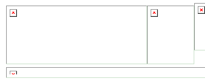
Here's an example of part of a Web page using graphics across the top - a
common design. This snapshot was taken while waiting for those graphics
to load. They have no alternative text - all you see are red X's - so the
visitor must wait until they load in order to select something to click
on. Visually disabled visitors - or those who have turned off images in
their browsers - will never know what these images might have contained.
|
- If all the photos, navigation buttons and other graphics on your Web site
have appropriate "alternative text," then visually disabled students accessing
their colleagues' notes via a text browser will be able to reach them without
getting completely lost or frustrated. Likewise, students reaching the site
over their old 80486 computer and a 28K modem (who may turn off graphics to
increase page-loading time) will be able to bypass the graphics to reach a
desired page. Repeat visitors who may be in a hurry to click through to a
page on your site won't have to wait for all the navigation images to load
in order to identify where they link to - the alt text will tell them.
- If a chart or graph has an accompanying description with a brief narrative
analysis of the data it contains, that enhancement can help make a difference
to many people who can see the chart but may have difficulty interpreting
it at a glance. For a visually disabled person, if the narrative is missing,
so is the point of the chart.
- Tabular data should include table and column headings and a summary. It
makes it easier for every visitor to understand the logic of the table, especially
someone listening to the text being read aloud by a device.
- If you post an audio or video clip with captions or a transcript of the
text, then everyone will be able to get to the information the clip contains,
even if they don't have the correct plug-in, or perhaps have a hearing or
visual disability.
- You (or whoever posts your pages) should routinely validate each page when
it's published, and test it in at least one popular browser and screen configuration
other than the one you may have used while creating it. This step can help
eliminate unpleasant surprises when you encounter your carefully designed
page looking less than beautiful in other people's environments.
It's usually easier to know about these issues before you've posted large numbers
of inaccessible pages to a Web site. An example from the physical world might
serve to illustrate this point.
A few years ago, a strip mall developer in a town in upstate New York deliberately
crashed his front-loader into town hall. It seems the town officials had refused
to grant him a certificate of occupancy for his tenants because the new sidewalk
running in front of the mall was not "up to code." It was about twelve
inches shy of width requirements for accessibility. Desperately needing to lease
the space of the finished mall, he tried the front-loader approach. Luckily,
no one was hurt, the developer paid his fine and damages, widened the sidewalk,
and the mall opened.
Universal Design is a broader concept than Web accessibility, but Web accessibility
is a necessary part of Universal Design. When you build (or enhance) your Web
site, you can help bring your work to its full potential by making sure that
your class materials are accessible. You help people blend in, you don't unintentionally
keep people out, and you may spark students' brains by offering them an unexpected
perspective.
