Discussion
Website Structure
Along with the profiles created by protestors, the structure of the Disability March website also conveys messages about disability that will be considered in the following section. One goal of this webtext has been to consider how web accessibility puts a particular and separate inflection on the linguistic and visual rhetorics employed by the creators of a digital performance. An analysis of the Disability March and the ways it represented disability would, therefore, not be complete without consideration of the website's overall structure and accessibility.
Before proceeding, it must be noted that the Disability March website was built using existing WordPress templates. On the one hand, the template allowed the organizers to quickly establish the protest and invite large-scale participation. On the other hand, as an out-of-the-box solution, the website also had shortcomings when it came to certain accessibility measures. The following critique isn't necessarily meant to blame the organizers of the Disability March or even to call out the recent turmoil in accessibility endeavors at WordPress (Rietveld, 2018), but rather to point out the ways that inclusivity can be hindered by the structures so commonly built and used. Organizers in the future may need to think carefully about the kinds of tools they select, recognizing as Mia Mingus (2011) has noted that disability is hardly a monolithic experience; rather, people experience disability in very different ways depending on their intersectional identities. Tools purporting to be universally accessible may, on closer consideration, prove to be inadequate for people with specific needs. Social justice advocates and organizers clearly face difficult choices, and this webtext merely aims to point out some of the considerations that may go into determining whether a tool's affordances outweigh its limitations, or vice versa. The following, therefore, constitutes a brief accessibility review of the Disability March website.
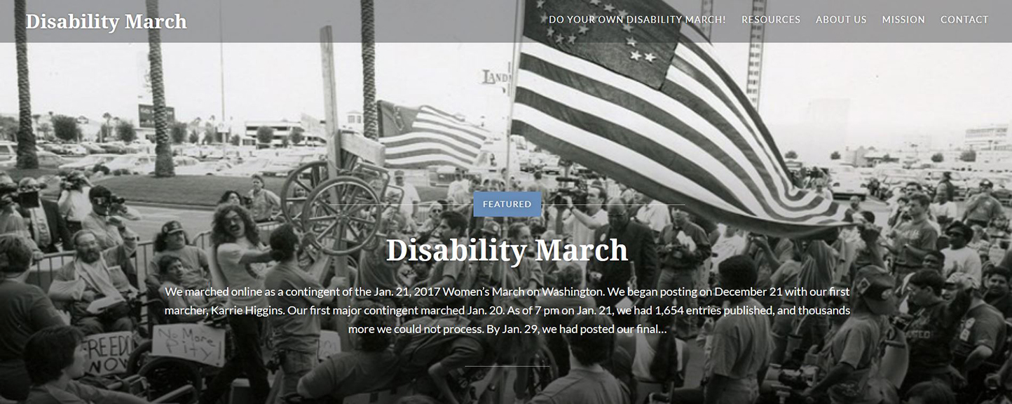
First, let's begin with a brief description and orientation to the Disability March website: On its homepage, the site presents profiles in montage—each containing an image and a preview snippet of the statements made by individual protestors. The site places substantial weight on visual components of each profile, allowing participants to visibly register their involvement in the protest as embodied individuals. The header image for the website also captures in visual form the context for the protest. The image shows the 1994 ADAPT protests in black and white. Protestors appear in wheelchairs and on foot, some unfurling an American flag that has been reconfigured with the stars in the shape of a wheelchair. The image includes references to American values like patriotism and public assembly as well as signaling opposition and resistance. It evokes iconoclasm and tradition, misfit and mainstreaming, and provides a complex context for all of the protest profiles (Sonyahuber, 2016).
While the header image suggests the themes underlying the Disability March, the website's homepage provides little actual written explanation contextualizing the protest. Instead, it invites readers to quickly dive into individual stories since much of the overall context is hidden from view on subsequent or linked pages. From a usability standpoint, the uncontextualized homepage proves problematic as a non-sighted reader may struggle to grasp the overall layout and meaning behind the individual profiles.
The overall navigation for the website likewise poses problems. Below the header, protest profiles automatically display in sets of nine with additional profiles available upon selecting "Older Posts" at the bottom of the page. JavaScript is used to provide temporary recall of the reader's place in the profile listing, so after navigating in and out of profiles, the user is returned to the top of the page once more. For this reason, navigating to older posts is generally cumbersome unless profiles are opened in separate tabs—potentially an undesirable set-up for those using assistive devices to navigate the site.
For users wishing to navigate the Disability March with screen readers, accessibility features are incorporated such as "Skip to Content" links, menu items with keyboard focus, and alt-text descriptions for at least some images. However, navigation can be difficult in other places. For instance, the user must tab through the entire top menu to reach certain sub-pages in the navigation hierarchy. This navigation would have been less unwieldy if menu options had been replicated in a sidebar once the user reached a particular page, but they were not. Headers are also used inconsistently, as important divisions are sometimes signaled by changes in font size and style. Some words are also rendered in all caps to lend emphasis, even though screen readers will mistakenly spell these words out letter by letter. Non-descriptive links are sprinkled throughout the site, inviting users to "Read More" rather than explaining what the link leads to for those who are navigating through the text with a screen reader. Navigating with the keyboard, users are not able to select the option to follow the WordPress blog in question, and navigation is sometimes hindered or obscured by the ads that come with the hosted WordPress site.
Other inconsistencies in accessibility appear within individual profiles. While some 47% of profiles include alt-text describing images, some of these descriptions are quite minimal, and the remaining 1,500 profiles do not have alt-text. Admittedly, these choices come down to individual protestors and the detail they chose to provide. However, readers using assistive devices would likely struggle to take in the website, not only for the lack of alt-text but also the unwieldy navigation in sections of the website. Considering that blind involvement in the protest appears to have been minimal, these structural details again suggest the difficulty of capturing a full spectrum of disabled experience within a single site. In the end, each of the aforementioned accessibility shortcomings communicates something about the desired audience and participant in the Disability March—and, often enough, that person is presumed to be able-bodied.
Accessibility Highlight Video: Hyperlinks (Transcript)
