Visualizing translation with the Language Services Department at the Hispanic Center of Western Michigan
At the core, translation is about relationships—relationships between translators and clients, community members and organizations, people and their languages, experiences, and histories. All of these relationships can be further emphasized and more intricately understood by writing scholars through data visualization processes that highlight the importance of cultural–rhetorical work as central, rather than tangential to, contemporary writing practices. Collaborating with translators who engage in the multi-layered practice of language transformation, we argue, can help writing studies researchers to further understand visualization as a set of integrated rhetorical strategies with ethical and material implications.
In this section, we share our visual methods and our data visualizations to argue that a translation framework helps researchers attend to the ethics of visualization processes (e.g., decontextualized data, constrained computational logics) that we mentioned in the Disciplinary Approaches section. Such an approach to data visualization triangulates the multi-layered rhetorical activities and actors involved in collecting, curating, transforming, and representing datasets across alphabetic and visual forms. Specifically, a translation moments framework emphasizes pauses in visible activity to consider linguistic and cultural navigation, as well as material and physical resources and relationships embedded in translation activities. All of these components, we argue, are important yet often-overlooked elements of data visualization.
Study design and research questions
In this section, we focus specifically on how we used data visualization to both represent the intricate, multilingual and multimodal work of translation and to guide our collaboration with each other and with a team of 44 translators and interpreters over the course of three years (we document many other parts of this project elsewhere; see Gonzales, 2018; Gonzales & Turner, 2017).
As we recorded the translation activities described in our Introduction, and as we coded the strategies that translators engaged in to navigate translation moments (e.g., deconstructing, gesturing, storytelling), we also collaborated to develop visualizations that illustrate these rhetorical translation strategies. The goal of this collaboration was both to create visualizations that illustrate the intricacies of translation and to employ visual methods that would allow us as researchers to emphasize the labor and the ethical considerations embedded in our collaboration. At the core, what we present are data points and rich descriptions that of various visualizations that we developed as we traced and studied translation activities along with our participants.
The outer nodes are labelled for roles of those involved in this project.
Each node that collaborates with another node is connected with an arc.
Each arc size is determined by the number of collaborations across nodes.
We (the authors of this webtext) worked collaboratively while also collaborating with our participants to ensure that we were representing translation work in accurate and ethical ways. Creating visualizations that represented the work of translators in a way that was understandable both to the translators themselves and to the various publishers with whom we've worked to share this project in both academic and non-academic venues required a constant negotiation of values among stakeholders involved in the project. For example, while the translators themselves often referenced translation as a complex, layered, and recursive process, many publishers' specifications required that we simplify our visualizations as much as possible to ensure clarify for readers. In these instances, we had to develop visualizations that both honor translators' perspectives while also adhering to publishing specifications and accessibility standards.
To the left, we use a chord diagram to visualize some of the connections between translators and their community, between the community and researchers, and between us researchers and stakeholders in our publication process. All of these relationships influence the processes and activities of translation work and should be embedded and highlighted in data visualizations related to translation research. It's important to note that as collaborators with the Language Services Department, we brought in different skill sets and backgrounds to the organization. These factors played a significant role in how we navigated translation and collaborative design with other members of the organization. For example, Heather has experience in visual design and worked with the Language Services Department as a designer and consultant, while Laura worked as a translator and translation project manager. We thus approached this research project from different yet complementary angles that also echo the collaborative nature of writing, research, and design practices that are becoming increasingly common in writing studies. In the end, the data visualizations that we publish emphasize only the translators' activities and the tools and strategies involved in translation, what this chord diagram highlights are the relationships and negotiations that are often erased from finalized, published visualizations. By taking time to create visualizations that represent these frequently hidden elements of translation, we seek to continue answering the questions posed by this special issue:
What does data visualization—as method, tool, and/or practice—allow us to see, identify, and pinpoint?
What does data visualization potentially obscure?
In the sections that follow, we provide other examples of how our project worked to highlight often-erased elements of visualization work.
How visualization was used to study translation
The translation activities that we recorded for this project took place in a small office, where translators worked on individual computers while also frequently engaging in conversations and moving around the office to discuss or think through ideas as they completed their work. Using visual methods to study translation in this context required that we both pay attention to what translators were doing on their computer screens and how they were interacting with each other and with their surrounding space. To visualize translation activities, we thus first used screencast recordings that captured how translators coordinated digital resources (e.g., digital translation tools, online dictionaries) to successfully translate information. For example, Video 1 below illustrates what is known as a "mirror translation," which consists of translated documents that identically match the design, layout, and formatting of the original text (Gonzales & Turner, 2017; Pym, 2003). As the video illustrates, to accurately complete a translation project, translators have to not only transform words, but also adapt seals, logos, images, and other visuals across languages. This work requires that translators have some basic understanding of visual design while also understanding what information is critical in their translated documents. Although the goal of mirror translations is to make it so that a reader can understand how visuals and text correlate in both the source language and target language, translators still have to decide if and when to resize, reshape, and adapt images, numbers, logos, seals, and other elements to ensure that information is accessible across languages and audiences for specific purposes.
Video 1. Screen recording of a mirror translation
To complete mirror translations, translators in the Language Services department have to restructure highly personal data (e.g., birth certificates). The visual representation (including logos, seals, and other visuals) of that personal data is constrained, having to correspond to the hundreds of different government agencies that issue the documents submitted by clients to the Language Services Department. While the screencast video illustrates the process through which a mirror translation is completed on screen, what this video does not illustrate is the multiple conversations that often take place as translators complete this work.
Video 2. Beyond the screen recording
In Video 2 below, Sara, the former director of the language services department, explains that translators not only translate information across languages, but also localize these translations for specific communities. Translation in the language services department entails the manipulation of information, the altering of visual designs, and addressing cultural and technical knowledge. This work happens quickly and consistently, which is why it was important to us to develop visualization strategies that allowed us to both acknowledge the labor embedded in translation and to make a broader argument about why this work is intricate, rhetorical, and multimodal.
In addition to screencast recordings, to ethically represent translation activities as complex cultural–rhetorical practices, we also had to combine practices of data visualization with translation-based visualization processes. This was especially the case when designing a visualization of translation moments, where we sought to illustrate the various rhetorical strategies that translators engaged in to navigate pauses in their translation activities.
When Laura compiled data for this project, she did not just clean or structure a spreadsheet of translation strategies and activities. Instead, she had to deconstruct, negotiate, and tell stories from Spanish to English, as well as English to Spanish, to ensure that she was understanding translation activities experienced by her participants. These deconstructions were not singular, and they were not with the sole purpose of fitting data within logical constraints. Instead, that data work occurred so that participants, funders, and editors would have access to the graphical representations that came from her work.
After collecting and analyzing data, then sharing that data with her participants for workshopping and feedback, Laura already had an idea of what visualizing translation moments and translation activities could look like, but she wanted to create a visualization that would be representative of translators' work and also accessible to broader academic and non-academic audiences. Recognizing that translation encompassed multi-layered strategies like storytelling, gesturing, and reading aloud, Laura wanted to show an overview of translation activities that emphasized not just visible digital activities with long pauses in the translation process, but also the depth of rhetorical activity happening within those paused moments. While Laura was sketching possible visualizations for translation moments and translation processes, she asked if Heather would collaborate to visualize the data she had collected about translator activity.
Heather read Laura's data, sketches, and drafting. Heather considered the structure of translator activity data and what limitations or constraints computational software like Tableau or D3 would entail. Because we frequently iterate projects together, both of us decided to repeat data representations with different data structures. The purpose of Heather's repetition was to identify what each version could reveal or conceal about translation.
We worked back and forth to select an appropriate visualization. Instead of Heather deciding which type of visualization was most appropriate based on design principles of clarity and accuracy, she involved Laura in the interpretation process. Because Heather has a background in visual design, she collected visual sources and examples of visualizations and mocked up three prototypes (shown below with their accompanying email description from Heather to Laura) to help Laura understand what each visualization would emphasize and obscure so that they could decide on a prototype together. When those graphical representations obscured the recursive nature of translation moments by presenting them as discrete events, we had to sketch, repeat (or iterate), and negotiate different representations. Through this back and forth, we were able to select an appropriate model, and to come to a more robust understanding of translation considering different dimensions like duration and intersections, instead of just frequency and type.
Sketching, repeating, and negotiating in data visualization
We (the authors) went through several iterations to design various versions of what became a static visual in Sites of Translation (Gonzales, 2018, p. 22) and an interactive version illustrating translation moment activities below. These data visualizations are intended to both illustrate complexity and simplify the process of translation for readers of our work. As our email interactions illustrate, creating visualizations of translation processes required recursive negotiation among us two as researchers, our participants, our collective community, and our histories. As the email excerpts below suggest, we sketched, repeated, and negotiated various versions of this visualization to arrive at a version that was representative of the work of our participants while also adhering to various press' publication standards. The goal of including these email conversations along with various versions of our visualizations is to, once again, emphasize the labor and consistent negotiation that goes into both data visualization and visual methods more broadly.
Please click on each of the following tabs below for both the visualization drafts and corresponding emails for what ultimately became Figure 3 in Sites of Translation:
Prototype 1. Heather to Laura figure description via email:
In this diagram, you'll see a horizontal axis to denote the "complete" translation process. I have represented translation moments using bars that start at the baseline of the horizontal axis and go up along the implied y axis, which represents time. So, I have translation moments here at different heights to depict amount of time a translation moment took, but I'm not sure if that is what you are looking for? Or are translation moments not discrete time events, but kind of rhetorical moments like you say that shift action, so maybe they should all be the same size? You will also see general translation processes (i.e the movement from translation moment to translation moment) represented with arrows and have filler labeling boxes that you might attach names to like "researching" or something else
Prototype 2. Heather to Laura figure description via email:
… highlights diff ACTIONS of translation and how translation moments happen across those. In this diagram, you will still see an x axis that represents the "complete" translation process from start to finish. On the y axis you will see 4 discrete translation processes that could represent actions like researching, talking to someone, or other actions that you would want to represent. I particularly like layering these actions on top of each other because it allows you to communication 1) multiple actions happen at any time in translation and 2) translation moments happen across translation actions, and at multiple points in time. The square rectangles represent translation moments--right now they are segmented, but I could see them overlapping across translation processes. The drawback of this diagram is that it is not necessarily recursive.
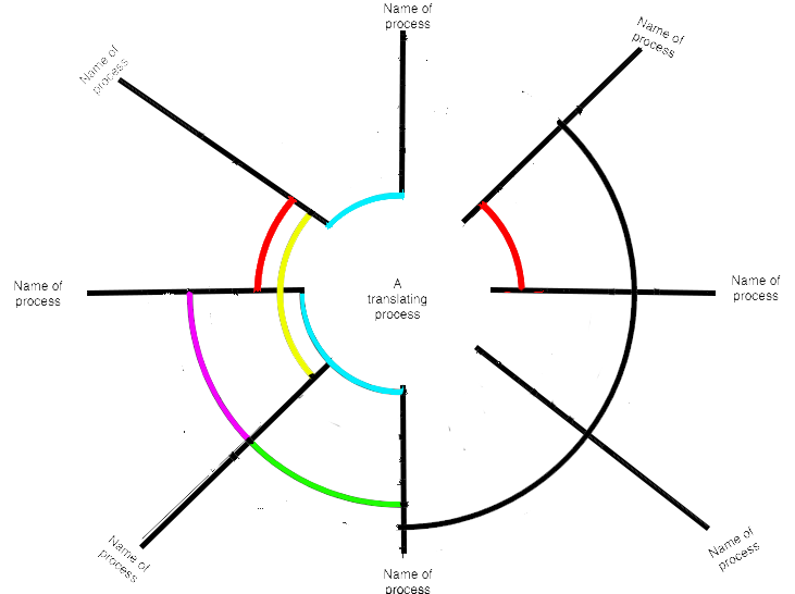
Prototype 3. Heather to Laura figure description via email:
… most diff from your sketch, maybe too complex, but recursive. Instead of being organized on an x axis to show the "complete" translation process, this diagram is a circle, which illustrates the recursiveness of the process. Translation processes like researching, etc are represented through pie shaped slices. Translation moments are represented by arcs—I've colored them differently here to illustrate 1) translation moments that overlap across processes and 2) discrete translation moments to show how many diverse moments might happen in one process.
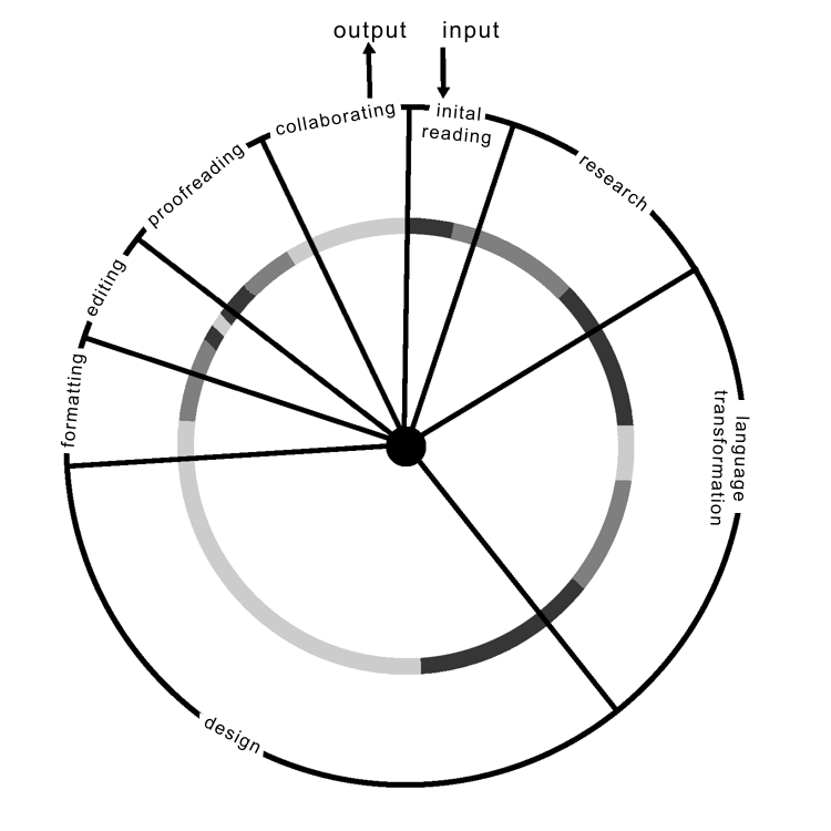
Published version. Laura's description of revised Version 3 from Sites of Translation:
Figure 3 illustrates how translation moments fit into what might be considered a typical translation workflow in a professional context (Dimitrova, 2005; Gonzales & Turner, 2017). In the diagram, the “input” segment on the right-hand side represents the beginning of the process, where a client submits an initial translation project or when a translator first opens a document to translate. The “output” segment on the left-hand side represents when the translation has to be delivered, returned to a client, or published in a particular venue. Thus, figure 3 emphasizes that translators are typically working with the understanding that they will have to deliver a translated product based on a predetermined timeline; there is always an exigency and expectation for translation work, pushing professional translators to make informed rhetorical decisions for particular audiences in specific moments in time. (Gonzales, 2018, p. 21)
Interactive visualization of translation activities
Based on the original translation moments visualization introduced above, the interactivity of the data visualizations below require you, the reader, to engage in a moment of translation by using your physical body to tap, select, click, drag.
The data visualization below is an interactive version of the published translation moments diagram, presented in the form of a stacked polar chart that allows readers to see what different strategies occur during translation moments across the intake process at the Language Service department. Polar charts are a form of graph that allows a visual comparison between several quantitative or qualitative aspects of a situation. When charts are drawn for several situations using the same axes (poles), a visual comparison between the situations may be made. Although every translator's process is slightly different (Dimitrova, 2005), the interactive visualization below includes the most commonly used processes for translators at the Language Services Department, and there are multiple ways to read this data visualization. For example, focusing on individual strategies like use of digital tools (color coded lime green, #9bfc4f) occurs at every stage of the translation process, forming a complete circle across the axes, while sketching (color coded pale blue, #4894ec) occurs during design, formatting, and collaborating, forming three related, but visually unconnected wedges. Alternatively, a reading of this visualization could focus on a specific translation stage like the initial reading stage, to learn that translators combine and move between the following strategies: use of digital tools, deconstructing, reading aloud, repeating, and intonation as they move from reading an original text submitted for translation and formatting the final document in preparation to deliver a translation to a client. Such an interactive data visualization paired with our contextualizing case study allows for more complexity, both in the visualization itself and in the ways through which readers can engage with their understanding and reading of translation work.
Interactive moments of translation
The axes or poles represent the translation process from receiving a text at the Hispanic Center's Language Service Department to sending a completed, translated text back to a client.
The stacked segments represent the combined strategies translators used during translation moments across a typified translation process.
Strategies are color coded to visualize the presence of one strategy at multiple points across the axes.
Clicking or tapping the strategy labels in the legend allows you to toggle a strategy off, removing it from the visualization. For example, to focus only on storytelling, you could click or tap the other strategies in the legend. Alternatively, to investigate the relationship across strategies, you could toggle as many or as few off. This allows people with a background in translation to adapt the visualization to better represent their own experiences and practices.
The multi-layered understanding of translation presented through the data visualizations in this section illustrate our collaborative research with translators who engage with visual practices and processes in various ways. By sharing both our visualizations and the broader stories about how these visualizations were collaboratively developed, we present a model that can help writing studies researchers to continue learning from complex cultural–rhetorical practices like translation by considering visualization as a set of integrated rhetorical strategies embedded with rhetorical decisions, negotiations, and ethical considerations.