As we begin to work with larger data sets and play with visualization as a research strategy, we cannot let the unknown prevent us from experimentation. (Gries, 2017)
DESIGNING VISUALIZATIONS
In this section, I present two visualizations before turning toward a discussion of the process associated with transforming data into visualizations that illustrate the richly networked, multimodal literacies that firefighters mobilize within work activities. My hope is that readers explore and investigate what the visualizations might reveal before reading through the remaining sections of this page and webtext. Please note that the data visualizations are optimized for viewing using either Firefox or Chrome, as the navigational icons within the visualizations will not function in Safari. To better understand the basic design of the visualizations, including some of the ways that I've built interactivity into the visualizations, I recommend that audiences view Figure 17: How to Interact with the Data Visualizations before interacting with the visualizations. Figure 17 explains the relationships between nodes and links, as solid links represent practices or tools scaffolding communicative activity between nodes and dashed lines represent practices or tools scaffolding mediational activity between nodes (for more discussion of the difference between communicative and mediational activity, see Spinuzzi, Hart-Davidson, & Zachry, 2006). Figure 17 also shows how readers can turn the text labels on and off and isolate practices and tools by modality by clicking on the colored icons. Once readers have interacted a bit with the visualizations, they might wish to explore the discussion that pertains to one of four topics covered below: (1) negotiating methodological decisions about which aspects of practice to model; (2) picking a visualization platform or framework; (3) cleaning and organizing data; (4) styling the visualizations and building interactivity.
Figure 17. This video outlines basic design features of the data visualizations, and it provides an overview of how audiences might interact with the data visualizations. Figure 17 transcript.
The two ecologies I have selected to present juxtapose observational and interview data and illustrate work from an individual and team-level perspective. More specifically, Figure 18 (below) represents the multimodal literacies that Chief Burke described using to manage a structure fire during an interview, whereas Figure 19 (below) represents the multimodal literacies that I identified from observational data from a Special Hazards Company practicing primary searches during a live-fire training evolution.
Chief Burke: Structure Fire
Figure 18. An interactive depiction of relationships between genres, objectives, tools, and modes Chief Burke described using while managing a structure fire. Those who wish to isolate genres by mode may click on icons within the view box. View and interact with this visualization in a new browser window.
For those who would like to listen to an audio description of the ecology in Figure 18, I have provided an audio description in Audio Recording 3.
Audio Recording 3. An audio description of the ecology shown in Figure 18. Transcript description of this ecology.
Orderville: Structure Fire
Figure 19. An interactive depiction of relationships between genres, objectives, tools, and modes within Orderville on-scene practices. Those who wish to isolate genres by mode may click on icons within the view box. View and interact with this visualization in a new browser window.
For those who would like to listen to an audio description of the ecology in Figure 19, I have provided an audio description in Audio Recording 4.
Audio Recording 4. An audio description of the ecology shown in Figure 19. Transcript description of this ecology.
NEGOTIATING METHODOLOGICAL DECISIONS
Scholars in rhetoric and writing studies have long turned toward visualization to represent or model aspects of theory and practice. Notable examples of the use of visualization within the field include Gilbert Austin's (1806/1966) sketches of oratorical gestures and postures, C. K. Ogden and I. A. Richards's (1923) semiotic triangle, and Linda Flower and John R. Hayes's (1981) maps of cognitive processes involved in composing. More recent examples include Clay Spinuzzi's (2003a, 2003b) genre ecology models, Liza Potts's (2014) actor–network diagrams of networked writing activity during disasters, and Laurie Gries's (2017) use of actor–network maps to trace the memetic circulation of the Obama Hope image. My approach owes much to the Spinuzzi, Potts, and Gries, as their scholarship has demonstrated that visualizations can function as a useful tool for illustrating and analyzing elements of networked literate activity that are difficult to describe. Moreover, the visualizations that Spinuzzi, Potts, and Gries have offered reveal that the methodological and designerly choices scholars make when modeling data highlight specific elements of practice. Whereas Spinuzzi's (2003a) genre ecology model, for instance, highlighted relationships computer- and text-based genre software developers mobilized in work practices, Potts's (2014) actor–network diagrams emphasized which actors have the most suasive force on the ways that information circulates following a disaster. Like Potts, Gries's (2017) work also emphasized the relationships between actors but offered a more expansive mapping of circulation as it unfolds across events.
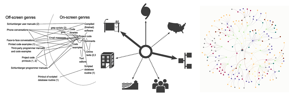
The visualizations I've developed borrow from those scholars in the following ways. Following Spinuzzi (2003; Spinuzzi et al., 2006), I've sought to account for the the ways practice is supported by both mediational and communicative activities. That is, I've sought to take stock of how firefighters mobilize literacies that span a spectrum ranging from personal (mediational) practices to interpersonal (transactional) practices. Following Gries (2017) and Potts (2014), I've attempted to account for the many types of actors—including the environment itself—that shape firefighters' situated literacy practices. Yet, my approach also deviates from these other approaches, as I've developed visualizations with the aim of highlighting which modalities firefighters are mobilizing within specific practices. I've found that accounting for modality requires a detailed and thorough approach to coding and analysis, as it forces a researcher to question whether a physical process in a data set is scaffolding epistemic or communicative work.
One point I'd like to briefly note is that I selected a segment of data from a segment of Chief Burke's interview and observations gathered from an Orderville Fire Department training evolution because the data surrounding the events are relatively similar. That is, the models are built around data from a structure fire (Burke, personal communication, March 10, 2013) and a simulated structure fire (observing at Orderville) where primary searches occured. My purpose for doing so was to facilitate analysis that address the following questions:
- How might visualizations of observational data differ from or reveal different aspects of practice than visualizations based on data collected through interviews with subjects?
- Do rank, role, and assignment influence what types of practices specific firefighters utilize? If so, does rank, role, and assignment influence which modalities are mobilized more frequently?
- How might visualizations of individual practice compare to or differ from visualizations that represent multiple teams working in a highly coordinated and distributed fashion?
SELECTING A VISUALIZATION PLATFORM
Having decided on the elements of firefighters' literacies I sought to emphasize, I turned toward identifying a visualization platform. My initial vision was to construct genre ecology visualizations similar to Spinuzzi's (2003a) but to account for multimodality. I tried mocking up visualizations using drawing tools in Apple iWork's Pages and Adobe Photoshop—and these tools are great for basic data visualizations—but I quickly realized that utilizing a platform built to visualize data would be more responsive. At the time, I had seen a number of really stellar data visualizations appear in the New York Times (e.g., Bostock & Carter, 2013; Bostock et al., 2013), so I investigated the visualizations and discovered that Mike Bostock had developed an open-source data visualization framework, Data Driven Documents (D3). I began exploring the site, and I found a network visualization that Bostock had developed that seemed like a good starting place to build from. What I like most about D3 is that it's an open-source platform and the D3 site offers robust documentation to help newcomers. I've also found Scott Murray's (2017) Interactive Data Visualization for the Web: An Introduction to Designing with D3 and his blog, Aligned Left, especially useful. One of the reasons why I opted to utilize D3 rather than other platforms such as Kumu and Arbor is that D3 is open source and built around a stable design language. Although many platforms are available for data visualization, they often are proprietary, closed-design frameworks not as open as D3. Consequently, from a sustainability perspective, it makes sense to avoid using frameworks or platforms that could break if those sites/platforms were taken down or no longer supported. There is also an extensive community of D3 visualizers who have composed robust support documentation, which could support other scholars who would like to refine or build upon the data visualizations I've provided here.
Next, I spent some time familiarizing myself with the data structure and noticed that nodes had a source and target variable as well as a type class. There was also a good deal of JS and CSS that impacted how the visualizations would render. I'll return to that aspect of the discussion later, but I decided on using D3 because I knew I could manipulate the CSS and the data structure made sense.
var links = [
{source: "Microsoft", target: "Amazon", type: "licensing"},
{source: "Microsoft", target: "HTC", type: "licensing"},
{source: "Samsung", target: "Apple", type: "suit"},
{source: "Motorola", target: "Apple", type: "suit"},
];
CLEANING AND STRUCTURING DATA
After deciding on a visualization framework and a visualization type to adapt, I began the task of cleaning and organizing my data to align with the structure depicted in the example above. One of the immediate realizations I made was that I couldn't simply use a single type of agent (e.g., a company) to function as nodes, and I also would be limited in terms of representing modality to two modes per relationship. That is, source and target nodes could be assigned to two links, and I could adapt these using CSS to designate different modalities, but I couldn't account for more than two modalities in node-to-node connections. To adapt the data to the D3 data structure for this type of visualization, then, I began experimenting with identifying nodes, relationships between nodes, and classifications for modes. For example, drawing from Chief Burke's description of practice, I selected practices such as reading smoke and identifying the building construction to serve as nodes. As I dwelled with the data, however, I began to see different ways of thinking about Chief Burke's practice. In the iteration of the visualizations offered here there is one overreaching objective at the center of Chief Burke's practice with three main branches that facilitated this work: a planning branch, an observational branch, and a communicative branch.
var links = [
//Key Branches//
{source: "INCIDENT MANAGEMENT", target: "OBSERVE", type: "branch"},
{source: "INCIDENT MANAGEMENT", target: "PLAN", type: "branch"},
{source: "INCIDENT MANAGEMENT", target: "COMMUNICATE", type: "branch"},
//Observing and Information Gathering Segment//
{source: "360", target: "OBSERVE", type: "Mvisual"},
{source: "OBSERVE", target: "360", type: "Mkinesthetic"},
{source: "radio communications", target: "OBSERVE", type: "Mcognitive"},
{source: "OBSERVE", target: "radio communications", type: "Maural"},
{source: "radio communications", target: "evaluate reports", type: "Mcognitive"},
{source: "evaluate reports", target: "radio communications", type: "Maural"},
{source: "message tone", target: "radio communications", type: "Mcognitive"},
{source: "radio communications", target: "message tone", type: "Maural"},
];
Thus, most nodes link to these branch nodes, although there are segments within the key branches. I also made value decisions, when the links could be classified as more than two types of modalities about which two were the most predominant or influential. For example, radio communications make use of cognitive, oral, aural, alphanumeric, and tactile modalities, but Chief Burke's description of practice emphasized (1) listening to and (2) developing plans from radio messages communicated by dispatch and crews. Consequently, I assigned these links between radio communications, observable as “type” in the D3 data structure below, as cognitive and aural. Moreover, I developed type-codes “M-[modality]” for practices that were more personal/mediational and type-codes “[modality]” for practices that were more transactional/communicative.
STYLING VISUALIZATIONS AND BUILDING INTERACTIVITY
Having structured the data, the next step involved adding style to the links and nodes as well as making the visualization interactive. In terms of the CSS, I opted to select bold colors, although having nine link styles meant that I wasn't able to achieve as high a level of contrast between colors as I would have preferred. I used solid lines to designate aspects of practice that were more communicative-transactional in nature and dashed lines to designate aspects of practice that were more personal-mediational in nature. I also identified open-source icons from Google's Material Icon set to function as a key for identifying the link type assigned to each of the colors.
#ecology svg {
width: 100%
position: center;
text-align: left;
padding: 5px;
margin: 0 0 0 0;
}
/*Node & Link Styles*/
#alphanumeric {
fill: #662099;
}
.link.alphanumeric {
stroke: #662099;
}
#Malphanumeric {
fill: #662099;
}
.link.Malphanumeric {
stroke: #662099;
stroke-dasharray: 2.5px;
}
Later, when I began building interactivity, I realized these icons could function as navigational buttons that could enable users to isolate segments of visualization by modality. The added bonus is that this enables users to explore the visualization by modality in ways that they otherwise wouldn't be able to. I've found this function useful myself when exploring the visualizations to verify that the color/link designation I think I see is actually the color/link designation assigned.
Thereafter, I used an iframe to house the visualizations within a larger page and created a directory of HTML and JS files for each unique visualization. Clicking on any of the mode icons populates a visualization within the iframe that exists within distinct HTML page (e.g., burkeaural.html), which calls in a distinct JS file (e.g., burkeaural.js).
Figure 22. The process of removing nodes and links from within the data structure to isolate for spatio-temporal modalities within in Chief Burke's ecology.
There's probably a much less tedious way to call in the data, but my proficiency with JS is limited. In fact, the greatest challenge I encountered in this project was working with the D3.js, as it populates data as scalable vector graphics (SVG) element. It took a great deal of experimentation within the JS to make the visualizations fit (mostly) within a defined area of a webpage. And, I had to get help to make the text associated with a node appear/disappear when a user mouses over it.