Perspicuous Objects: Reading Comics and Writing Instruction
"Perspicuous Objects" puts theorists of visual rhetoric into conversation with comics theorists and practitioners in order to consider the potential of comics and comics principles for teaching students about composition, meaning-making, and critical reading. As Robert Watkins (2008) suggested in Kairos's 2008 "Manifesto" issue, the comics page, especially as described by Scott McCloud (1993/1994), is enticingly full of rhetorical gestures, and composition processes used by comics artists recall processes we tend to present in writing classes. Comics are a complex form with a long history, and they are full of wonderfully complicated sets of relationships between words and images and shapes and lines.[1] It can be challenging, however, to describe those relationships and their rhetorical power, and though we have language for naming the parts of a comics page, there is no obvious, generally established way of guiding students into close reading of comics. With that in mind, "Perspicuous Objects" goes in search of useful critical language for talking insightfully about specific comics texts and how they do what they do. I look particularly at cartoons as focused analytical images, the ways that drawn lines can take on meaning in context, and the extent to which the whole page is necessary to the communicated meaning of any specific visual gesture in a text. This is not an exhaustive look at comics, then, but a close look at important aspects of the comics page from which careful analytical readings may spring and out of which useful teaching exercises might be derived.
Three Threads within "Perspicuous Objects"
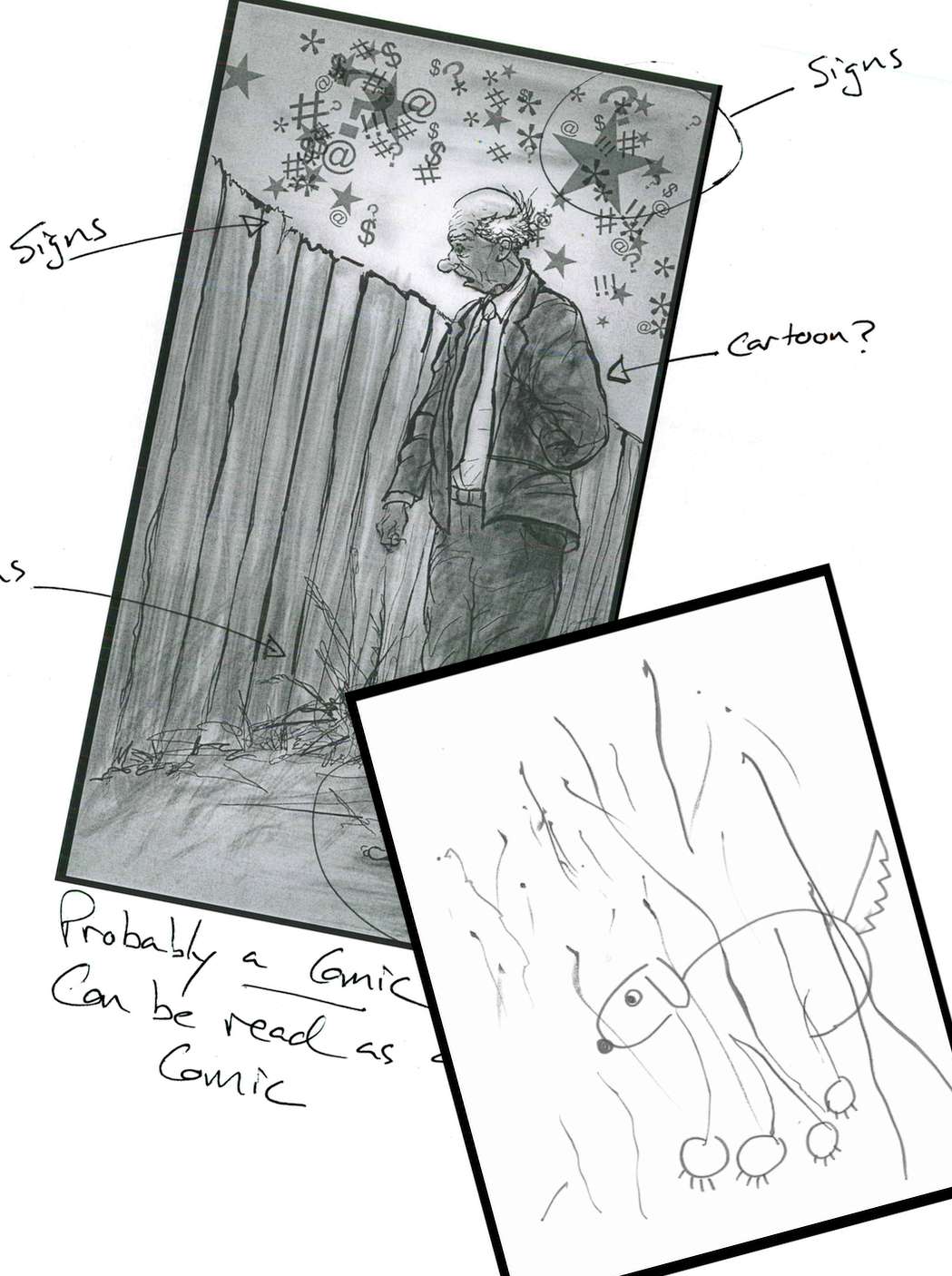
2. Cartoons as Perspicuous Objects
3. Three Cartoon Voices
4. Visual Analytical Focus
5. La Ligne Juste...
6. Teaching Comics, Teaching Writing
7. In Conclusion
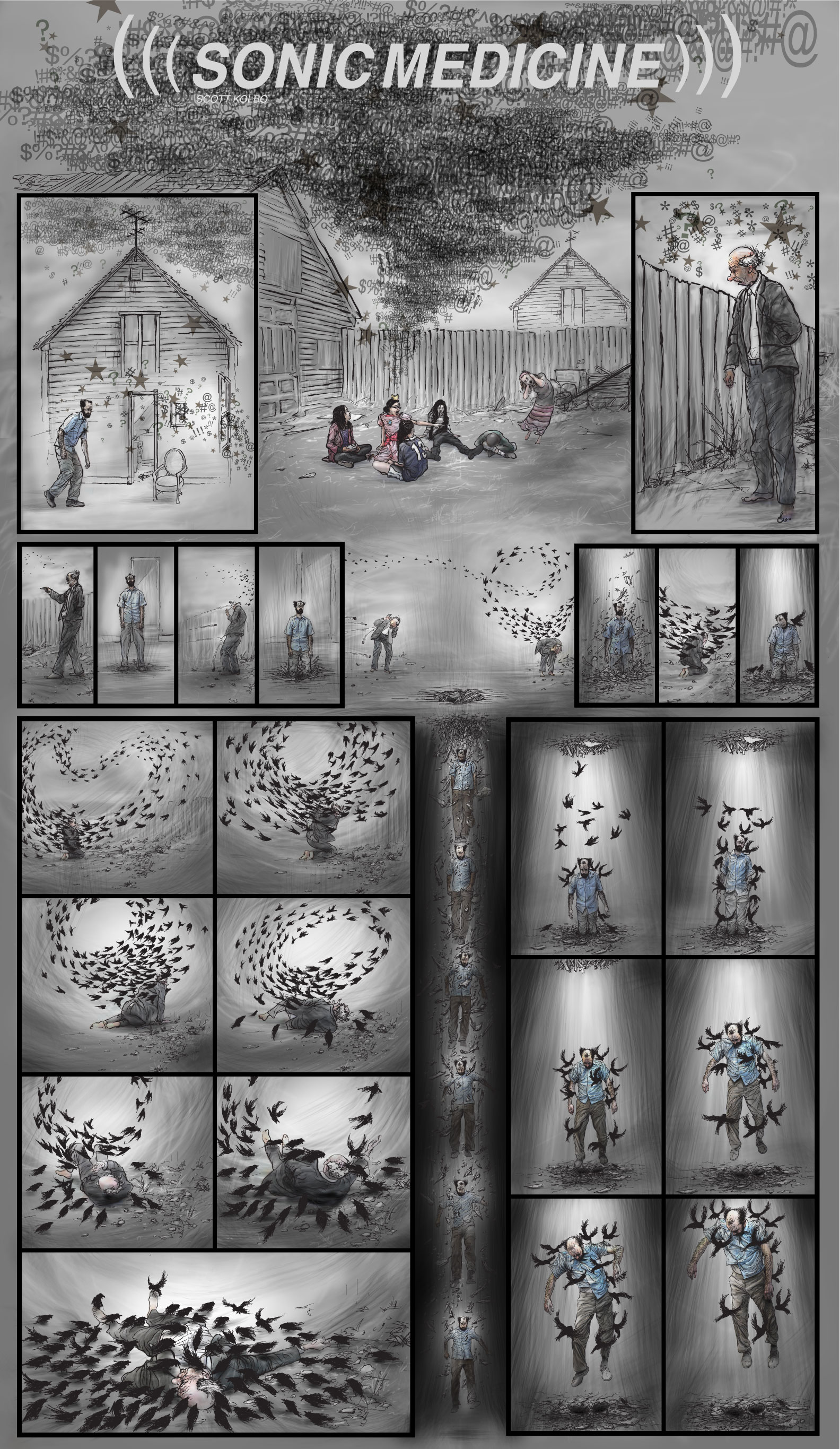
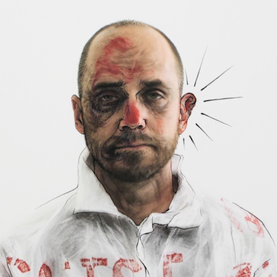
A small online gallery of Scott's art includes both still images and videos from Scott's career since 1997. It also includes a few words from Scott about the relationship between his work and comics.
Fred's extended analysis of "Sonic Medicine" (Kolbo, 2013b) takes advantage of and illustrates ideas about comics analysis explored in "Perspicuous Objects."
A second gallery contains a set of images on which people tried to illustrate the paths they followed as they read and understood "Sonic Medicine" (Kolbo, 2013b).
The text of "The Book of the Grotesque" by Sherwood Anderson (1992) contains Anderson's definition of the grotesque and is included here as an extension of Scott's comments about how the notion of the grotesque informs his work.
In Understanding Rhetoric, a writing textbook in the form of a graphic novel, Elizabeth Losh and Jonathan Alexander (with Kevin Cannon and Zander Cannon illustrating) (2014) have pointed out that comics are appearing more frequently in contemporary classrooms because they are "both textually and visually rich," demanding that readers decode images and text "in tandem" (p. vii). Craig Stroupe (2000) has pictured a "visualized English Studies" in which words on the page "don't simply talk to words, but to images, links, horizontal lines—to every feature of the iconographic page" (p. 618). In contemporary multimodal discourse, he argued, verbal literacy is frequently "layered into a more diverse amalgamation of literacies" (Stroupe, 2000, p. 608). Comics at their best are an extraordinary locus for such "amalgamated" literacy. Comics artists work with close attention to how the elements on their pages affect each other. Comics bring together image and word and representations of time and space and motion, and comics artists use all of those elements and more to achieve narration, poetry, argumentation, and other ends. In short, comics are ripe for reading in what Stroupe (2000) called the "elaborationist" tradition of English departments, wherein we "typically value complexity, irony, connotation, and deferred meanings, achieved through an awareness of the medium itself, whether visual or verbal" (p. 611). Yet to note the rhetorical and literary complexity of comics, or even to name the parts of the comics page, is not to analyze what any individual comic is doing—is adding up to—as literature or as rhetoric.
"Perspicuous Objects" has roots in my frustration with limits I have encountered during classroom discussions of comics. For example, I have read Chris Ware's (2000/2001) Jimmy Corrigan—The Smartest Kid on Earth with several groups of English majors. They always acknowledge the novel's complexity and are impressed with its formal beauty. We tend to do an acceptable job talking about the visual as we consider the novel. But I find myself searching for more effective ways to increase both our analytical rigor and the playfulness of our thinking about the comics form as integral to Ware's storytelling. For example, Ware does something interesting with repeated appearances of a bird in Jimmy Corrigan. That bird on the page is not the word "bird" but a drawing of a bird on a page full of carefully arranged images. What can we say about the drawing itself, about the details chosen or left out? There is a lot of sadness in Jimmy Corrigan, and somehow that bird is part of it, but there is nothing fundamentally sad about Ware's cartooning. Where does the sadness come from? How does the page convey or contribute to it? And can we be more specific than "sad"? Sad how?[2]
Based on our conversations about some of the teaching ideas elsewhere in "Perspicuous Objects," Scott Kolbo (whose art appears throughout this webtext) asked his art students to do a line-style project, drawing themselves in two different styles and observing the differences. Scott's students had some interesting success inventing new expressive modes for themselves by shifting out of their habitual line-style habits. Yet, much like my literature students talking about Chris Ware, when Scott's students wrote about their work they ran up against the limits of their vocabularies. They asserted that particular line styles exuded positivity or calm or melancholy or some other emotion. But how? What made those lines do that? Would they always do that, in any context? I don't want to demand that art students always explain exactly how an image gets at what they want it to get at. It's art; sometimes something just works. On the other hand, I nearly always want to burden my literature and writing students with explaining how a text does what it does. I nearly always want them to be able to say something insightful and precise about how their readings and their composition choices are justified and effective.
Put another way, I want my students (and myself) to move away from a comics version of what Rich Rice called "unremediated schmoozery" (Rice & Ball, 2006) and towards the at and through perspectives Richard Lanham (1993) has identified. Rice said that we might see rhetoric as "organized schmoozery," but, even so, he argued, "Students who use presentation or form" to win over audiences "but do not themselves understand…why they're presenting what they're presenting, limit their opportunity to learn" (Rice & Ball, 2005). As it pertains both to reading comics and to composing with comics-like visual effects, helping students avoid "unremediated schmoozery" means helping them understand and describe their own choices and the choices of comics artists so that students can take purposeful control of their own work and be more aware of how visual composers try to win them over. Lanham (1993) argues readers are conditioned to assume that books can convey thought transparently, containing but neither distorting nor otherwise affecting an author's thought. Thus, typical readers of traditional books have tended to try to look through texts without ever looking at them. Lanham showed how emerging electronic forms make it clear that all "production decisions" are actually "authorial" (p. 5), so that even a traditional codex-form book should be seen as "an act of extraordinary stylization," not only conveying a writer's thought but also affecting and shaping and shepherding it (p. 9). He described a "bi-stable oscillation" between contemplating conveyed thought (the through perspective) and contemplating the way thought has been organized and conveyed (the at perspective), and he suggested not only that both perspectives are important to understanding a given text, but also that both perspectives are crucial to understanding, fundamentally, "how knowledge is held" (p. 24). For Lanham, as for Rice, form must be chosen and deployed mindfully, and must be seen not as incidental to a text but as part of the text's meaning-making machinery.
Clearly texts with conspicuous visual elements lend themselves to discussion of the at and the through as well as the relationship between the two. But it is easy to simply name the visual bits and pieces, instead of looking thoroughly at them. Looking at visual design, we identify traits such as contrast, repetition, alignment, proximity (cf. Williams, 2008). Looking at movies, we identify cuts, pans, framing. In comics we identify frames and panels and (often using McCloud’s 1994 definitions) panel-to-panel transitions. Naming the parts is useful to analysis, and experimenting with styles and effects and visual gestures can be a way to learn how those styles, effects, and gestures work. However, if students are to read any individual text in a way that sees not only the at or only the through, but that also sees the relationship between the two, then we need to do more than name parts and techniques.
No one has been a more skillful, compelling explainer of comics than McCloud, whose indispensable Understanding Comics has made a case for the depth and power of comics art while anatomizing typical comics elements. But Understanding Comics and the volumes that have followed it are not about analyzing comics texts, exactly; they are about appreciating the machinery of the comics form generally, and they are about instrumental processes used by comics artists. The difference matters, partly because McCloud's interest in practitioners means he is often coaching his readers about how to get their potential readers to look straight through a comics text, and partly because his focus on general rules and common denominators means he can skip looking closely at the sorts of idiosyncratic touches that give any specific comics text its style and voice. For example, McCloud identified a series of line styles and the kinds of emotional information they might generally express, but he did not closely analyze any specific line embedded in any specific comics text (pp. 124-126). In Scot Hanson's (2009) Kairos interview with McCloud, McCloud talked about his "endlessly reductive, formalist-wonky sensibility" and how he tends to look for context-neutral formulations that will "always be true." That tendency to seek the universal gives McCloud's work its profoundly useful heuristic power. On the other hand, the generalness of his comics commentary means his texts have not considered the difficulties of analyzing any specific comic closely, and it means he has potentially bypassed some concerns that someone teaching or learning in a literature or rhetoric studies context might find central.
McCloud's (1993/1994) "non-sequitur" panel-to-panel transition may be the most interesting specific example of this difference in perspective. His wonky, reductive, useful, admittedly "inexact" (p. 74) list of six panel-to-panel transitions includes clear categories, such as "moment-to-moment," but it ends with the "non-sequitur" transition, a transition between two images that have "no logical relationship" and which, McCloud noted, the mind tends to find ways to connect in spite of their apparent illogic (p. 72). The non-sequitur category keeps things manageable by keeping McCloud's anatomy of panel-to-panel transitions at that universal level rather than grappling with the many nonlogical ways panels might be connected. It points would-be practitioners toward clear, practical storytelling techniques, and though it does not exactly discourage abstract panel-to-panel transitions, it makes them an exception to be used sparingly. But percolating beneath the non-sequitur lid is the messy, idiosyncratic universe of visual figurative language, where a non-sequitur might turn out to be an instance of metonymy. In other words, McCloud has pushed several kinds of visual complexity to a backburner here at exactly the point where what Stroupe (2000) called elaborationism might begin to ask questions about complex rhetorical and poetic relationships linking together images. Where McCloud says these images have no logical relationship, an English teacher might see the roots of artful poetics and rhetorical wit.
The Art of The Non-Sequitur
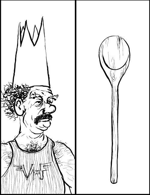
Consider, for example, Madeleine Sorapure's (2006) suggestion that metaphor and metonymy might play a central role in our assessments of new media compositions. Sorapure argued that we might assess the degree to which student-made visuals make figurative turns away from associated written texts. That strategy is as surely a move into non-sequitur territory as it is a productive way to point students toward the complexity possible in image-text relationships. In a similar vein, Stroupe (2000) reflected on the rhetorically productive ways that visual and textual elements might be placed in tension, so that (for example) "the visuals zig where the verbal text zags" (p. 626). Stroupe (2004) associated this kind of composing and reading with what he calls the "rhetoric of irritation," a dialogical, polyvocal rhetoric in which seemingly mismatched terms and discourses and voices are brought together so that (as in Bakhtin's theory of the novel) tensions between them might produce or express new insights and ideas. These zigzagging tensions, Stroupe argued, are not "haphazardly inappropriate" but "coherent inappropriateness" (p. 251). Getting students to notice and analyze those productive mismatches becomes, in Stroupe's argument, a key task for English teachers, who must help students become not just users of language but aware interpreters and practitioners, able to consider not only how signs constitute a world but also how different signs might constitute a different world. In both Sorapure's and Stroupe's cases, we can see college composition teachers becoming interested in a place, this non-sequitur space, that McCloud has considered insightfully but only briefly.
This interest in figurative turnings and irritating discourse friction might enliven our engagements with comics texts. Where does a given comics page go beyond simple representation of the story or explanation of a point? Where are words in dialogic or figurative tension with images, and which image and design choices are in tension with each other? If students are producing comics or comics-like texts, are they moving into a composition space where, as Losh and Alexander (2014) have suggested, "the images and text must be read in tandem" (p. vii)? These are potentially productive questions. McCloud, for good reason, warned would-be comics practitioners against overdoing it: "I see it in comics, these thick, overly layered visual artifacts of style, inking styles, and compositional tropes that really contribute nothing whatsoever…except to clutter the page" (Hanson, 2009). McCloud also identified with Edward Tufte's (1983) fight against "chartjunk," irrelevant decoration used to "jazz up" visuals (p. 107) (as discussed in Hanson, 2009), and he and Tufte have offered good advice to practitioners whose goal is to help readers look through, not necessarily at, their work. If we follow the lead of Stroupe or Sorapure and talk with students about creating productive friction between the elements on their pages, if we encourage them to play with figurative turnings, we do risk having them produce chartjunk and extraneous markings. At some point, a talk about clarity and simplicity must be in order. However, in urging students to experiment we also urge them to grasp the complex poetic and rhetorical possibilities of the page, rather than focusing on absolute clarity as the primary value. The potential reward in terms of learning is greater than the risk of chartjunk.
Wasted Lines?
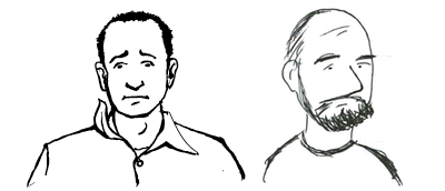
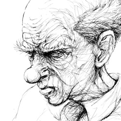
With all that in mind, "Perspicuous Objects" asks whether teachers and scholars in the disciplines are looking closely enough as we begin to unpack the tensions in a given comics text. How close can we press our noses to the glass? How much looking through are we doing when we think we're looking at? We can help students learn about the complexity possible in multimodal texts by having them seek out figurative turnings and discursive frictions, but, alone, those pedagogical moves do not wholly address my concerns about the limits of the discipline's vocabulary for talking about comics. There is more to say about the constitutive bits of the comics page. The interesting tensions and productive rhetorical moves in comics do not begin in the space where a visual is bumping its cartoon shoulders with alphabetic text, or at the point where an artist mixes different drawing styles. The rhetoric of comics begins at the level of the line and includes instinctual choices—including choices that leave behind visual clutter—that artists make as they form the cartoons that fill their pages. To notice that a bird has been brought to the page as a metaphorical representation of certain continuities between the generations of Jimmy Corrigan's family is interesting. But that bird is not the word "bird." It is a drawing, with particular drawn details. To ignore the bird itself, its particularities, is to look through the drawing, rather than at it. For that reason, "Perspicuous Objects" looks at these types of small pieces and considers how they do what they do, not as representatives of a general type of comics-page object but as constituent, idiosyncratic components of specific comics texts.
Comics will work most powerfully for teaching purposes when teachers are looking closely at what artists do with the texts' basic constituent components. Attention to comics fundamentals—line style, abstraction, image selection, and concatenation of images—is not by any means the only way to address complex multimodal rhetoric (or even complex comics rhetoric), but such attention is likely to pay off quickly for students learning to communicate visually. As we ask students to analyze the inner workings of any given multimodal text, whether professionally produced or peer-produced, we ought to give them tools to move beyond loose assertions about the emotions expressed by a line style. We ought to help them to see images as images and to avoid reducing visual artifacts like Ware's (2001) bird (or Scott Kolbo's birds) to words. We should offer them ways to grapple with a given text's subtle concatenation, or joining, of visual and verbal gestures. Comics texts, because they use line and image purposefully, offer excellent exemplars as well as opportunities for discussion. To study the ways that comics artists select their images—even their lines—and then activate those images by placing them into a context is to study how careful selection and juxtaposition can turn visual elements into perspicuous objects that contribute meaning to a composition. It is also to study invention, arrangement, analysis, and meaning-making, so that attention to comics fundamentals has the potential to not only supplement but also become integral to what writing students learn about authoring texts of all kinds. Finally, "Perspicuous Objects" aims to get closer to the at of comics, to build a stronger vocabulary for talking about what we see when we look closely at comics, and to offer some suggestions about how a closer look at the at of comics might lead to worthwhile teaching.
As explained in the sidebar, "Perspicuous Objects" follows three threads. One is the main argument, accessible using the dot navigation header, the "Jump To" menu, or the numbered links at the foot of each page. A second thread is Scott Kolbo's "Sonic Medicine" (2013b) broadside, a one-page comic which appears in embedded images throughout "Perspicuous Objects." The third thread explores both Scott's art and "Sonic Medicine" (Kolbo, 2013b) specifically. Readers might begin with any one of those threads, though my suggestions is that they begin with the "Sonic Medicine" (2013b) broadside, which makes a good mental warmup for the rest of "Perspicuous Objects."
[1]McCloud (1993/1994) pointed to comics-like art appearing in ancient and early modern cultures (pp. 9-19), and Franny Howes (2010) has argued convincingly that we might talk about a "visual rhetorical tradition" that includes forms and techniques appearing and reappearing throughout history, with or without any assistance from Europeans or Americans.
[2] Another famous example is Art Spiegelman's (1986 & 1991/1996) Maus, in which the choice to make Germans cats and Jews mice becomes more interesting when we ask not just "Why are the Germans cats?" but, instead, "Why are the Germans these cats, drawn this way, surrounded by these other drawn objects?"


