
Visual Analytical Focus
XKCD: "Fall Foliage"

Abstracting Scott


Image Credit.
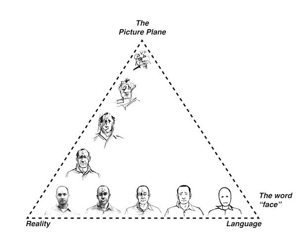
A comics page, like a page of traditional prose, can be too complicated for its own good. The clarity of images at the far right corner of Scott McCloud’s (1993/1994) stylistic pyramid is partly a result of their simplicity; there are no confusing internal juxtapositions, no pen strokes that raise questions about meaning or might cause a reader to pause and ponder. Yet even a simple, highly iconic drawing style can be deployed in complex ways, as in much of Chris Ware’s work. Conversely, a complicated cartooning style, or a style that aims for some variety of realism, may be so detailed that, in the context of a given narrative, it is unfocused and distracting (as Ware, Seth, and McCloud—along with Gunther Kress and Theo van Leeuwen—all, in their own ways, indicate). This might be a matter of making the images less analytical by making them more fussy, or a matter of sublimating swift, clear communication to an aesthetic ideal; it is certainly a matter of lacking focus, of drawing in a style that sends stray signals without contributing artfully to the concatenation of signs that makes up the text. Such lack of focus might be said to lead to the comics equivalent of what, in prose writing, we sometimes call purple prose, or overwriting. For students, learning to to talk about the level of detail in a visual composition can be a bridge to talking about the same in any kind of composition. What details are chosen? How do the included details change the meaning of a text or help it achieve its purpose? Do they ever get in the way? How does the level of detail, or the emphasis given to any one element of the text, contribute to the voice of the text as well as the content? How is the voice of the text, its actual form, inseparable from its content? Comics make visible those elements of style that writing teachers often work to make clear to their students.
McCloud’s (1993/1994) pyramid is useful here, again, for thinking about how any given signmaking choice made by a cartoonist contributes to a given text. While the pyramid appears at first to gauge a cartoon’s level of abstraction, that is not exactly what it does. Part of what makes the pyramid a helpful illustration is the way it eliminates (or at least complicates) the notion that one image is more or less abstract than another. In the right-hand corner, a basic smiley face communicates instantaneously because it is abstracted in a way that makes its meaning nearly unambiguous. Any drawing anywhere to the left of the right-hand corner may contain, within itself, complicating juxtapositions—details and quirks of style that are at least the beginnings of readable significance. But that does not make the more complicated image less abstract, exactly. McCloud (1993/1994) has suggested that as a cartoon’s style approaches that right-hand corner (or any other corner), we should see the artist as having focused her work in a chosen way, rather than as having eliminated details or as having made a simpler statement (p. 57). In this sense, the images at the far right are not the most abstract; they are the most precisely focused, the most straightforward as analytical images, and maybe the least nuanced. Images in other parts of the pyramid are not more abstract but differently abstracted, less focused, and more subject to potentially poetic ambiguities. Drawings that land in the pyramid’s middle—like Theo Ellsworth’s drawings, for example, or even drawings from some out-of-the-ordinary superhero comics—are abstract in ways that say more and maybe take longer to unpack than images at the far right. That complication may make reading the images a less instantaneous experience than reading road signs but still lend itself to a smooth and satisfactory reading experience for a given comic’s audience. Less focused lines may be perfectly fitted to a comic’s content, providing commentary and analysis that simpler cartooning would not provide. Or the complication may be complication for its own sake, tending to distract readers rather than contribute to the text’s meaning. For some artists the latter might be a desirable end. Comics show vividly how style results in part from choices about what to include as well as how to present it.
Many well known cartoonists choose a simplified style that communicates quickly, though few choose anything like the absolute focus of McCloud’s (1993/1994) right corner. As I explore in "La Ligne Juste...," Charles Schulz’s (1950/2004) Peanuts presented a clear example of a simple style that is in some ways quite iconic but is also enlivened by its creator’s personal touch. Randall Munroe’s (2014) web comic XKCD (see images above and below), built primarily with stick figures, pushes almost all the way into McCloud’s (1993/1994) right corner. Munroe’s stick figures are injected with a small dose of gestural meaning but, on the whole, they tend to pose so little obstacle to reading that they point reader attention in the direction of Munroe’s clever text. Munroe’s stick figures have some expressive power and some nuance, though; they do not exist in the far right corner of McCloud’s (1993/1994) pyramid, exactly, and the context provided by Munroe’s words and settings gives them verve.
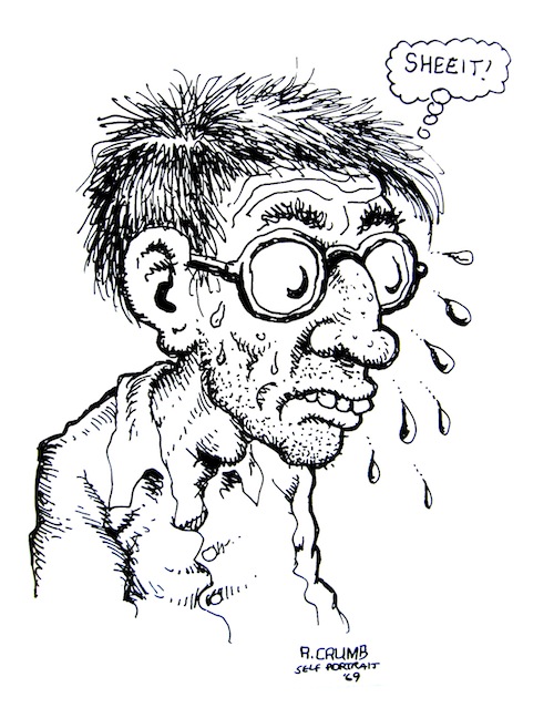
On the other hand, an artist like underground comics legend R. Crumb has created cartoons that are so uniquely stylized—so aptly fitted to the expression of his abundant personal idiosyncrasies—that they do, no doubt, pose a kind of obstacle to readers. And that is certainly the intent; much of Crumb’s meaning-making depends on his arresting (sometimes alarming) style and subject matter. Not to put too fine a point on it, Crumb’s drawing demonstrates a different and richer kind of abstraction than does Munroe’s straightforward stick-figuring for XKCD. It makes little sense to call Crumb’s work “less abstract” than XKCD, but it does make sense to note that Crumb focuses reader attention in unique ways, drawing attention to more and quite different possessive attributes of its subjects. Crumb’s content would not work (or would work very differently) in XKCD’s style, and XKCD would not work (or would work very differently) in Crumb’s style. Where XKCD’s concatenation of significant elements relies heavily on text, R. Crumb’s concatenation of meanings owes much more to Crumb’s unique cartooning than to what we read in his speech and thought bubbles.
Some Batmen
")
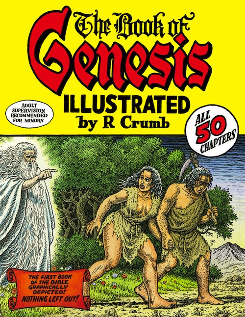
In other words, if Crumb’s work were rendered in XKCD’s style, it would not say what it says. But also, tellingly, it seems impossible that if XKCD were drawn in Crumb’s style, Crumb’s style would still express the neuroses that it expresses; the rest of the content, beyond the style, is still relevant—still part of the concatenation of signs. When Crumb’s graphic adaptation of the the biblical book of Genesis was to be released in 2009, there was some anticipation of the scandal it would no doubt inspire. For example, Susan Jane Gilman (2009), reviewing for National Public Radio (NPR) and familiar with Crumb’s work and reputation, “assumed” his Genesis “would . . . be the funniest, most subversive, most profane ever.” It was not; it was Crumb’s best attempt to illustrate, literally, the words of the text. Said Gilman:
You expect it to be sardonic, but it is not. You may expect it to be psychedelically spiritual — it's not that, either. Rather, it's humanizing. Crumb takes the sacred and makes it more accessible, more down-to-earth, less idealized. And this may be a blessing, or it may be subversion itself.
Married to this new content (and with some restraint on Crumb’s part), Crumb’s style means differently, so that rather than raising questions about blasphemy and disrespect, it raises questions about what is gained and lost by rendering the stories of Genesis in an almost pedestrian way, with no attempts at transcendent grandeur. In contrast, Michelangelo’s graphic adaptation of Genesis (at the Sistine Chapel, and available for viewing in a Vatican-approved online edition, not to scale) looks different than Crumb’s and indisputably gets at different aspects of the stories than does Crumb’s (2009) illustrated Genesis. Meaning emerges from the concatenation of style, focus, and other narrative elements, in this case in a way that defuses some of the scandal that R. Crumb’s followers might have expected from his work.
In Reading Comics, Douglas Wolk (2007) took a swipe at the work of comics artist Alex Ross by, essentially, accusing Ross of including too much detail—working too far toward the left-hand, perceived-reality corner of McCloud’s (1993/1994) pyramid—in a way that Wolk (2007) said did not particularly serve the stories Ross was telling. Ross’s very popular painted comics render superheroes in a superglossy romanticized hyperrealism, much praised by fans for its detail and inspired by the more idealistic elements of socialist realism. (He may be the Norman Rockwell of superhero comics.)[1] Unimpressed, Wolk characterized Ross’s work as “painted upgrades of standard superhero-comics imagery” that “exude grand seriousness” but “are stiff and glossy,” like “inspirational office posters starring Batman or Wonder Woman” (p. 123). He argued that Ross’s paintings “leave too little to the imagination” (p. 123), as if Ross’s paintings were actually photorealistic renderings of superfolk. They are not that, exactly, but they do have an orderly, scrubbed-clean quality that calls to mind things like propaganda posters, promotional pamphlets, romance novels, and televangelist hair. The detailed faces of Ross’s characters look like the faces of specific people, groomed for a photo shoot (in part because Ross painted them based on staged photographs of models). The aging Batman that Ross featured in his Kingdom Come mini-series (co-written with Mark Waid, 1996) may be angry, but he sure is a handsome old fellow, captured in a nice soft focus that highlights his weathered face without making it scary (Waid & Ross, 1996/1998).
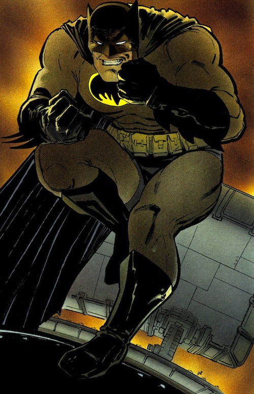
The contrast between Ross’s attractive Batman in Kingdom Come (Waid & Ross, 1996/1998) and Frank Miller’s (1986/2002) Batman in The Dark Knight Returns—grim, somehow out of focus, less closely detailed, sometimes oddly contorted and imbued with pain—illustrates what Wolk (2007) found objectionable in Ross, I think. Where the linework in Miller’s (1986/2002) Batman comics works as a visual analytical commentary on his version of the character and the fictional world the character inhabits, Ross’s (Waid & Ross, 1996/1998) renderings are focused on the grandeur and power of the superfolk he depicts, regardless of the story they inhabit. (An Alex Ross-illustrated Genesis, we can speculate, would not be noted for revealing the pedestrian humanity of its characters.) For a reader like Wolk, who admires the textured authorial voice present in messier drawings, Ross’s images are about as engaging as the images of happy, well-groomed college students in college brochures. They are studio-scrubbed popstar voices when what Wolk wanted was the interesting grain of a folk singer’s voice or the emotive sloppiness of punk rock. Gauged as analytical images, Miller’s Batman cartoons highlight the character’s psychological trauma. Ross’s, even when they reveal the character’s pain or weakness, somehow point to Batman’s physical strength and poise, placing a glossy, hyper-realistic aesthetic above the thematic concerns of the story. Because of his commitment to a style inspired by social realism, Ross’s paintings include detail work that critics call excessive, especially for the comics medium (which depends so much on the swift readability of its images). Why, detractors might ask, does Ross paint characters in a way that makes me pause to consider whether their facial expressions ring true? Sales and critical recognition in the comics industry attest to the success of Ross’s work for many readers of superhero comics; for supporters, he is drawing on just the set of semiotic resources they want him to draw on, adding just the kinds of details they want to see. But for Wolk and those who share his view of Ross, the pedantic detail embedded in Ross’s characters makes the artwork weak as cartooning—an oddly unfocused distraction from the story, in something like the way high definition television, by revealing too many fine details on actor’s faces, can distract. For Wolk, Ross’s Batman is a visual carrier of possessive attributes that detract from his stories. For writing students (whether they side with Wolk or Ross in this particular disagreement), the exploration of questions like these about visual voice may easily be linked to lessons about noting and assessing connections between voice, style, content, and form in other kinds of composition.
[1] The folks at the Norman Rockwell Museum (2012) are open to that idea, and in late 2012 they hosted “Heroes and Villains: The Comic Book Art of Alex Ross,” the first gallery exhibition of Alex Ross’s work (originally curated for a 2011 exhibition at the Andy Warhol Museum). The exhibition featured Ross’s work alongside work by Norman Rockwell, Andrew Loomis, J.C. Leyendecker, and Andy Warhol, and the Rockwell Museum’s promotional materials note Ross’s reputation as “the Norman Rockwell of the Comics World.”

