 |

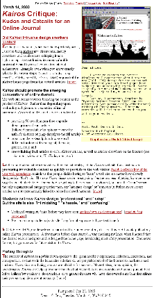
This Version: Shorter, more scannable text. More visible text groupings. Graphic is larger, cleaner. |
After
inviting my undergraduates to critique this site, I made many changes.
The images below are too small to be legible, but placing them side-by-side
clearly shows the differences in organization. Click the images for
enlargements (warning: large files).
 |

This Version: Shorter, more scannable text. More visible text groupings. Graphic is larger, cleaner. |
First posted Mar. 22, 2000
Dennis
G. Jerz