Kairos Critique [ Intro
| Requiem | Formal | Comparative
| Justification ] [About
this site]
Formal Critique of "Old
Kairos"
For
the past few years, I have been analyzing and critiquing Kairos
in classrooms, faculty inservices, and conferences, offering it as an example
of a high-concept site that buries valuable content behind layers of
intrusive design. (Jump down to screen captures;
discussion.)
See also: Undergraduates
Review Kairos; Undergraduates
Review This Site
What,
in my humble opinion, are the main problems with
Kairos? For
the sake of launching a discussion, I'd suggest narcissm and defensiveness.The
Kairos
web site seems less interested in presenting the peer-reviewed content,
and more interested in establishing the institutional identity of Kairos.
The Kairos web site used to be organized in such a way that
a visitor to the home page had to perform seven discrete actions
to get out of the journal's editorial apparatus and read an actual article:
-
On the home page, scroll down, so that the "Current Issue" button comes
into view.
-
Click the "Current Issue" button, loading a "frames or no frames" splash
page
-
Make a selection; or wait a bit and watch as a default option loads. You
will see the issue's "At a Glance..." page.
-
Scroll down a little until the "Features" link comes into view
-
Click on the "Features" link (or, keep scrolling until the features themselves
come into view)
-
Click on the desired article, loading that article's abstract page.
-
Scroll down, so that the "enter the active version of this hypertext" banner
comes into view.
-
Click on the "enter the active version of this hypertext" banner, loading
a completely different web site.
Now, the visitor can finally read an actual article -- which will, of course,
have a completely different navigation system. None of the effort
the visitor has expended on the Kairos web site will make it any
easier to read the article... if anything, the visitor is simply that much
more fatigued. |
Although
I consider myself an experienced web user, I still had to visit and re-visit
the Kairos home page many times -- over a period of months -- before
I finally figured out how to get to the content. I simply
wasn't thinking the way Kairos editors probably expected a typical
visitor to think. I wondered whether the Kairos editors had
ever actually sat down and watched a first-time visitor try to use their
site.
The
overreliance upon flashing banners and pop-up gizmos makes me imagine that
the editors are desperate for attention. Each time I found myself
clicking and scrolling, clicking and scrolling past the dense front-matter,
I imagined the editors saying, "Hey, remember us? See how fancy our web
site is? That means we're just as interesting as the people whose
works we're publishing!"
Screen
Captures
|
Screenshot Potshots
|
 |
This
screen capture (c. 1998) of the Kairos home page is marked with
a red horizontal line, 480 pixels from the top of the page -- to indicate
where the first screen of text leaves off on a 640 x 480 pixel monitor.
The "Current Issue" icon, here circled in green, falls "below the fold,"
which makes it hard to find.
Monitor
sizes and screen resolutions do get more generous each year... but regardless
of the user's screen resolution, the "Current Issue" link still languishes
at the bottom of a stack of hard-to-distinguish buttons.
(1) scroll so that "Current Issue" button
is in view
(2) click |
|
 |
For
issues in volume 2 and volume 3, clicking on "current issue" took the user
to a hard-to-read splash page. The dark red text and the blue linked
text is nearly impossible to read on my CRT monitor at work, although the
contrast is clearer from my LCD monitor at home.

(3a) try very hard to read the dark text
against the black background.
(3b) either click on one of the two options,
or watch in frustration as the screen changes before you can figure out
what to do. |
|
 |
Each
issue of Kairos features a rather busy graphic labeled "cover web".
Once I realized that "cover web" is the Kairos term for "lead story",
I deduced that clicking on the graphic would take me to the story; instead,
it just links to an abstract of the cover story, a little farther
down the page.
(This
particular cover story consists of an impressionistic sketch of 23
numbered heads; clicking on each head is apparently supposed to display
text in a pop-up window, but when I click on them, nothing seems to happen
-- the popup window keeps disappearing behind the main browser window.
Due to the technical problem, I have never bothered to read this "cover
web". Perhaps you'll have better luck.)
(Assuming that you already know
that "Features" is where you will find articles...)
(4) scroll a little bit so that "Features"
link is in view
(5) click on "Features" |
|
 |
Further complicating matters, this
obtrusive
windoid pops up, overlapping my browser's "go back" button. I always
cringe when such little boxes pop up unannounced, because I feel like someone
is trying to shove an advertisement in my face.
This particular box is a cleverly programmed navagiator-cum-toolbox-cum
JavaScript menu. But I hate it anyway -- it's just one more distraction.
My reaction, while perhaps strong, is surely not unique. (See Kill
Clippy!, and fight back against the MS-Word dancing paperclip.) |
 |
Just
as the home page buried the "Current Issue" button, the "At a Glance" page
(at seven screens, it requires much more than a glance) buries its table
of contents. Further, articles and editorial content are distributed
among such subsections as "Cover Web", "Features", and "Logging On".
I'm simply not sure what's supposed to be in each section. I'm sure
that the criteria are explained somewhere on the web site, but I don't
want to hunt through the editorial infrastructure looking for the explanation
-- I just want to find an article.
| (6) Click on article you want (assuming it's
visible -- you might have to scroll even more) |
|
 |
Clicking
on the title of an article does not actually take you to the article, but
rather to an abstract page.
The
idea of keeping a collection of conventional prose abstracts on-site makes
tremendous sense, given the wide variety of hypertexts Kairos publishes.
Nevertheless, this page is one more barrier between the home page and the
article I am trying to read.
| (7) Scroll down to bottom of page. |
|
|
Screenshot
Potshot
|
Every
hyperlink on Kairos seems to lead only to article
abstracts, instead of articles.
-
I wanted to read an article, so I looked for links labeled "more"
or "download full text" or even "click here".
-
I tenatively concluded that Kairos was an online tease, a
mere front for increasing mail-based subscription.
Eventually
I looked, in despearation, at the annoying, flashy banner at the
bottom of each abstract.
Are you
yet?
(Hit "ESC" to stop the animation.) |
|
 |
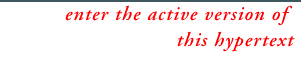
At
first glance, it looked like an ad, so I ignored it. (See Jakob
Nielsen,
Top
Ten New Mistakes, #10: "Anything That Looks Like Advertising [is a
Mistake]".)
At
second glance, I read the message "enter the active version of this hypertext."
But I just wanted to read an article. Once again, I had to learn
another non-standard term provided by the Kairos editorial board.
| (8) Click (on what looks very much like an annoying banner advertisement!) |
Thank you, Kairos, for ditching this graphic. |
Discussion
My
own reactions may or may not be those of other users... I do not mean to
imply that, simply because I do not like or did not understand a particular
web design, that the design is therefore faulty. Some people who took the
time to learn how to use the JavaScript windoid might end up wishing that
every site on the Internet has one just like it... but most sites do not.
Nielsen
observes that increasing
conservativeness of the average web user means that, no matter how
useful the designers may feel a new feature could be, the average user
does not want to spend time learning how to use it.
Nielsen's Law of the Web User Experience: Users spend
most of their time on other sites. Thus, anything that is a convention
and used on the majority of other sites will be burned into the users'
brains and you can only deviate from it on pain of major usability problems.
(Nelson, "Interface
Standards and Design Creativity")
The
paradox
of the active user suggests that web surfers would rather wander around
aimlessly than pull over and study a road map. In fact, "a
website with a help system is usually a failed website". The
Kairos
web site is still too dependent upon HTML gizmos such as frames, flashing
banners, and other gizmos. Too often, these are technological attempts
to solve conceptual problems.
Web
designers should examine their site from the point of view of the average
visitor, not from that of the technically savvy colleagues they wish to
impress. Theorists and experts rarely gravitate towards simplicity.
The result, as one of my students wrote, is that "[s]ometimes when a site
changes for the better, it is actually worse for users."
Dennis
G. Jerz
Kairos Critique [ Intro
| Requiem | Formal | Comparative
| Justification ] [About
this site]


