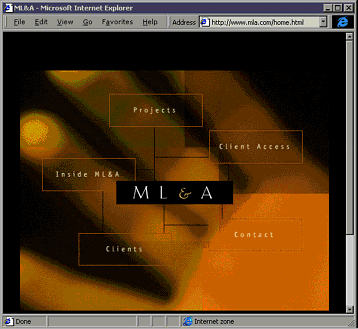
Michael Lee & Associates' site, www.mla.com, isn't the Modern Language Association. A stunning Shockwave Flash animation of the firm's logo leads to this page.
Consider the relationship of text to image, and not just for those who must choose to load your images. Even if folks do, a page's text should be the first thing they'll see. (While using frames sometimes confuses matters, browsers generally load text first.) Be sure your copy takes advantage of this.
 Michael Lee & Associates' site, www.mla.com, isn't the Modern Language Association. A stunning Shockwave Flash animation of the firm's logo leads to this page. |
Give us some indication of whether the image will be worth the wait. (But don't give all away!) Do surfers want to see a snazzy animation of your firm's letterhead? Probably not unless they know something about your firm first. Even then, once might be enough. So it might be a good idea to keep the razzmatazz off your opening page.
Remember, if somebody knows your site and wants to come back, it's possible, even likely, that they'll have bookmarked a page within your site's hierarchy -- so that your site's opening page might well only serve new visitors (and perhaps the smattering of folks who type URLs). Thus, it's probably a good idea to put some sort of introductory text here.
In a beautiful site, Michael Lee & Associates skips introductions and opts for a Shockwave Flash animation of the firm's name on its homepage. What does the firm do, other than make beautiful Shockwave animations? These images exploit the placelessness of the web. Is that mystery enough to drive viewers on into the site? The firm banks on that. You might, too -- provided you know your audience.
Philip Greenspun's photo.net solves this problem quite differently. An amateur photographer, Greenspun includes all sorts of images on his site. Brief captions describe them, but otherwise the images have no connection with the articles themselves. A review of color slide film might run with images from Greenspun's travels in Italy. The photos stand on their own merits. If somebody can't view them, no problem; Greenspun's writing stands on its own.