Think
twice about using pictures of text
Many web sites use pictures of text for navigation bars and buttons. For designers,
image buttons have advantages: they prevent odd line wrapping and ensure that
the site looks consistent no matter what machine it's viewed on. That looks
neat and helps maintain a site's identity. Moreover, these GIF files are typically
small and cached after the first time a user visits the site.
 But
the question remains, can you afford to give preference to repeat visitors
who have already cached your buttons? Repeat visitors already know what great
stuff they can find on your site: that's why they come back. New visitors,
though, don't know. Why make them wait for your buttons to download?
But
the question remains, can you afford to give preference to repeat visitors
who have already cached your buttons? Repeat visitors already know what great
stuff they can find on your site: that's why they come back. New visitors,
though, don't know. Why make them wait for your buttons to download?
Trouble
is buttons are low-information -- and low-value -- uses of graphics. No browser cares whether she's reading "home" in a serif or sans-serif font. And there's not much identity benefit: a site's color scheme and company logo serve as much stronger signifiers of location and credibility.
More
importantly, what do we see while we wait for those buttons to download?
Nothing is more frustrating than having to wait for a page's apparatus to load,
sometimes even before the browser renders the text of a page.
Alternate
text can help this problem. Not if the designers have used image maps, though.
Most browsers display just one line of text for the entire image, not separate
texts for each hot-spot in an image map.
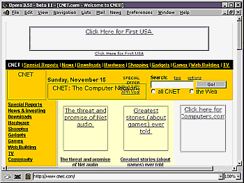
CNET addresses this problem as well as
any site by rendering all of its navigation bars in text. With image display
turned off, we may miss the CNET logo, but there's no question of the navigation
possibilities; unloaded images don't keep us in the dark over what's on the
site. Even better, no mouse clicking is required to reveal our options.