Patterns of Reversal
Enlisting Users Against Themselves
Reversals
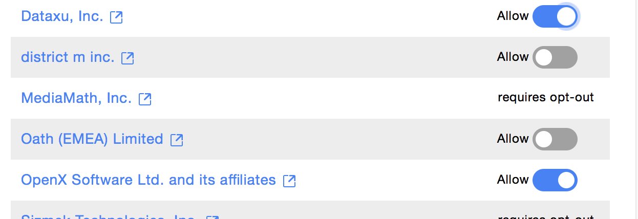
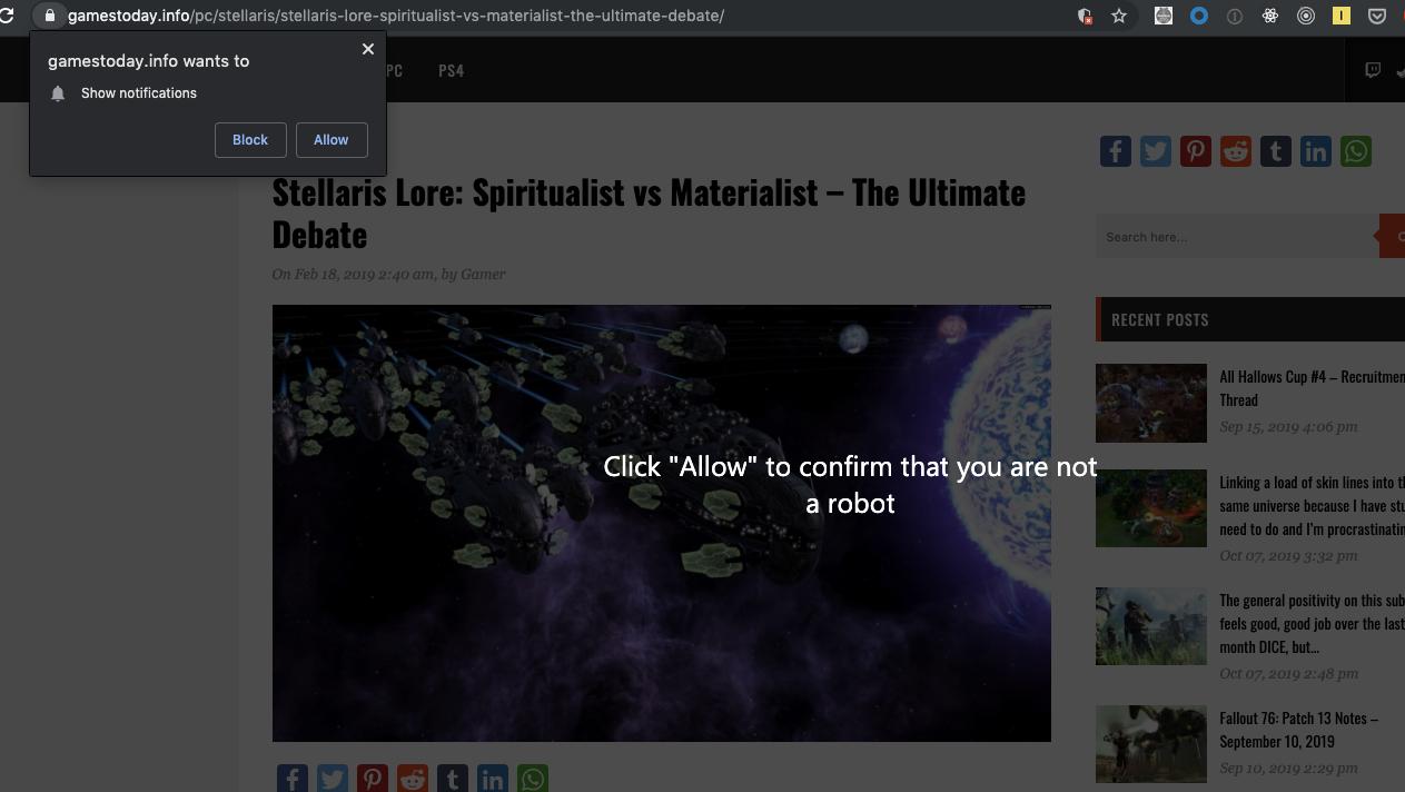
These types of patterns perform their deception in plain sight, as it were, through sophisticated confusion. Interfaces in this category are notable for the fact that the thing being disguised is not an object on the page so much as it is a whole semantic category: in these cases, the meaning of yes and no, red and green, selected and unselected, right and wrong, human and not.

To confuse users, the toggle slider does not work as expected, although it appears to. By convention, a toggle has two states—one end or the other—and functions like a switch in the sense that when it is in the off position, it is toggled off. In these examples, the off position means on, and vice versa.
Extreme Ambuguity
To confuse matters further, in this example the toggle slider does not work as expected. By convention, a toggle has two states: one end or the other, but this one has three states including an ambiguous middle. When one end is selected, however, that end isn’t highlighted, but instead it's completely obscured by the white square, on a white background making it effectively invisible.

Rather than discussing one thing as another, or hiding something in plain sight, this kind of mêtis has transformed the very nature of what yes and no means, and here added what red and green means, what selected and unselected means. Many users could easily misinterpret these form elements and unintentionally enable the whole suite of marketing spam targeted at whatever poor inbox the user enters.
Ambiguous Identity
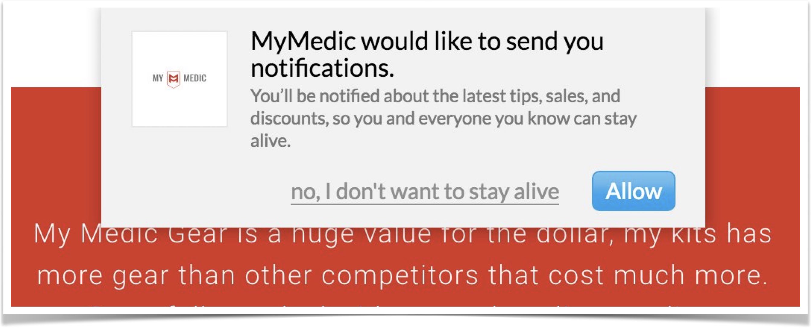
From a visual perspective, this example relies less on concealment and more on generating ambiguity. As in the case of misdirection, a visual hierarchy is established and used, but here it is consistent. The color green, representative of success or safety, is articulated with the yes answer (meaning to opt in), while the color red, representative of warning or danger, is articulated with the no answer (opting out of the marketing spam).
Meanwhile, in these variants, what is reversed is the user's identity. In order to become good, they must become bad, to be smart, they must affirm they are stupid, and so on. These variants turn the tables and set the users against themselves.


Two Choices?
In this final example, even the meaning of having a choice is reversed, and no choice is presented as having options, laughable as they are. Instead of canceling the free trial, the user is given the faux choice to cancel the cancelation either with a "No" or a "No, thanks."
This is a particularly brilliant choice, because the text could be interpreted to mean "No, thanks" to the free trial, and therefore "yes" to the cancelation, or at least there is some plausible deniability there.
