
When Revision Is Redesign: Key Questions for Digital Scholarship
Susan H. Delagrange
Interface
Q: How can the physical and conceptual properties of the interface be balanced to support exploratory manipulation of the digital environment while still meeting scholarly publishing requirements?
It was a simple suggestion. "[I]t would be helpful to have a larger screen to view the piece with, and subsequently the smaller images...need to be larger so that readers can actually see how (and why) they are connected," wrote a Kairos reviewer.
Why, the reviewer asked, had I limited myself to a 650px by 450px canvas? The simple answer is that it approximated the graphic-safe area (640px x 480px) of the first computer monitors and the proportion (4:3) of standard definition TV. The size of the default canvas in Flash (550px by 400px) is similarly proportioned. I was dismayed to realize that I had chosen the canvas size, the foundation upon which the design would be built, not for rhetorical reasons grounded in the shape of the argument, but because it looked right compared to prior technologies and program defaults.
Like the scientifica in Wunderkammern, digital media are "practical inventions" that we may use to multiply, magnify, mirror and otherwise manipulate images and collections of images; and at the same time they are also "philosophical instruments" which give us insight into the objects and concepts we are exploring.
A singular advantage of designing the interface of a scholarly article is the ability to reinforce or enact the argument through the design, an opportunity not usually available with print media. Consciously or unconsciously, the design is inescapably connected to the words and images in making meaning. In her analysis of the design of two CDs that present tours of private art collections, Anne Wysocki (2001) wrote, "The differences between the visual presentations are not differences simply of form or theme or emotion or assistance to memory;... [they] are differences of assertion and thought" (p. 224). On one CD, she points out, the hierarchical navigation, the rote presentation of each work from a single perspective, and the emphasis on the acquisition and cost of the art ultimately focus attention on the collector, Dr. Barnes. On the second CD, multiple screens, navigable in multiple ways, establish a rich context for each work of art in the Maeght collection, including information, photos, and videos about the artist and related work; the works themselves are shown from multiple, mobile perspectives, much as a visitor to the collection might come across them. The focus in this digital tour is on the individual works of art rather than on the collection as collection, or on the Maeghts as collectors.
Each choice a designer makes—size, color, selection of and relations between images and text, use of motion and sound, navigational structure, and so on—influences the intellectual and rhetorical weight of the final outcome. Yet my first decision—canvas size—was made with little thought to its cascading effect on how images and text could be arranged, and where animation and navigation could appear and function.
Interface design is experience design, "the deliberate, careful creation of a total experience for an audience" (Shedroff, 2001, cover). As I designed this project, my cognitive model for the experience was a literal Wunderkammer, and my visual and navigational strategies were composed to simulate the experience of exploring such a space. But the simple question about canvas size called into question every design decision already made, every default setting accepted without thought. Questioning size led to a cascading series of changes. Among the most significant:
- I enlarged the canvas size from 650px by 450px to 720px by 600px, an increase of 48%. Even with new navigation spaces at the top (for overall navigation) and the bottom (for navigation between animations), 32% more space was available for animations and text, and also for more detailed citations requested by the editors.
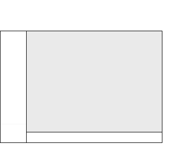
Content area (shaded), 540px x 405px 2006 version |
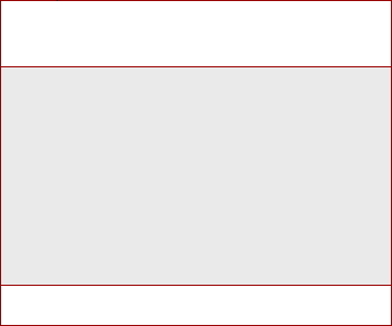
Content area (shaded), 720px x 600px 2009 version |
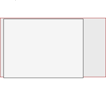 Content area comparison |
- I reduced the number of lexia from 60 to 36, which made the written argument more coherent, while at the same time I increased the total number of animations from 46 to 48, thus shifting the meaning-making emphasis from the textual (30% more textual than visual artifacts in the original version) to the visual (33% more visual than textual in the new version).
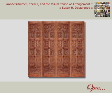
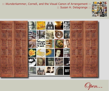
- I added an opening screen—a pair of ornate doors and an invitation to "Open...."—which immediately initiates the viewer into the visual and conceptual experience of a Wunderkammer. With no specific instruction on how to "Open...," the viewer must move the mouse over the screen to discover that the doors are an active link. When clicked, the doors slide open to reveal 36 images taken from animations in each lexia, encouraging the viewer to either follow a conventional strategy and click on the image in the upper left corner, or follow a linked image she or he finds compelling.
 |
 |
Experience design is not only about designing space; it is also about designing time. If I hadn't questioned the size of the interface, what might I have missed about movement and interactivity?