Design Prescripts
Design prescripts are prescripts in semiotic modes the user does not create in. Just to be able to express oneself in digital media may be a huge advantage for many people, but it is even better to be able to express oneself with style.
In my experience, most of my students, friends, and colleagues are more comfortable with writing than graphic design. Although this probably is different in some professions, it seems that quite a few people are happy to find that many professionally created visual designs are available as templates. (Apple seems to have made this a business idea, as the .Mac service as well as the applications iDVD, Keynote and Pages use "professional designs" as a selling point.)
However, the prescribed design may - and will often - collide head on with the text of the user. For instance, a prescribed design may invoke connotations (additional meanings) that do not align to the written text, or the design may set aside areas for text that are too small or too large.
Templates offer more than plain text and a rough edit. All new templates for Web design will also offer good looks. Typography, colors, and layout are added to the user's text (or images). It will dress up the user's text in a coherent style, a visual design. These designs are prefabricated and selected from a menu of templates.
Adding Modes
More generally, we may say that design prescripts are prescripts in sign systems (or semiotic modes) in which the user does not create. If the user provides text, the template will provide typefaces, colors, placement, and even images. If the user provides images, the template will provide the graphic design, and perhaps music. In the editing program iMovie, the user edits his or her movie clips, and may then select from a long list of "professional-looking" transitions and text engines that are provided, as well as sound effects and some brief musical pieces. (That excessive use of these resources result in a far from professional look is another matter.)
We can at least see two reasons why this is desirable for users. If, as is often argued, a home page or weblog is a way to present an image of who one wishes to be, then a coherent visual (or aural) style adds to this. Layout styles, color schemes, and typography bring connotations with them, as do music and editing effects. The aspiring home page or weblog author would want to have a look that matches his or her perception of being conservative or cool, fashionable or geeky, a hip-hopper or a surf dude.
Another reason may be an aesthetic desire of creating something beautiful, or at least almost professional looking, and the pride from achieving this.
I have never seen a template for lay people where the written text is the prescript, and the user adds his or her visual design. Some word processing or presentation applications can suggest set phrases for you (such as the Wizards in Microsoft Office), but they always imply that the user alters the text and adds his or her own parts. Such templates are offered as a help in the writing process, not as a text that is written out and just needs to be styled visually.
In fact, the idea of a prewritten text that the user just styles may seem a little funny, a symptom of the status different sign systems have in our society. As Kress repeatedly has noted, our culture has for a long time become increasingly visual, something witnessed by our desire for nice looks in which to dress up our writing. We are not yet so visual that we educate our children in image making. (Professional graphic design applications, on the other hand, can indeed insert paragraphs of nonsense text, or what is known as "lorem ipsum" to test the typography and layout. The Web site CSS Zen Garden is a challenge for "graphic artists only" (par. 6), with a fixed text that designers give different graphic styles). We teach our children how to write, as we still consider language, especially written language, as the main channel for our thoughts and communication. (Open any parenting magazine and you will find that reading books is good for your kids, while TV may be harmful.) To let others write your text seems immature, but to let others do your graphics less so, even if we do feel the fancy graphics are important. For Kress , this is an intermediate step, we need to educate our children in visual communication and other computer media skills.
A Suitable Style?
What is obvious is that when one has to select a visual style from a limited range of templates, it may often happen that written content and visual style does not match well. Justin Goarcke has for example studied how many members of the "goth" community use the Livejournal weblog system for personal expression. "Goth" identity includes a visual style where black is the dominant colour of hair and clothes, adorned with a little red. This is not a colour scheme that may be found among the templates in Livejournal, so the goth who does not know how to alter the templates will have to accept a somewhat different visual style. Similarly, I thought it difficult to find a visual style in Geocities that could work for the homepage of this research project. (The one I selected may be viewed at http://www.media.uio.no/ personer/andersf/templateauthoring/)
Number of Elements
A coherent visual style requires a certain balance of the different elements. To achieve this, many templates will have to prescribe the size and number of elements. The template shown below is called "spring writing," and is from Apple's .Mac. "Spring writing" is a witty imitation of a print newspaper with a newspaper head running over three columns of text and images. To achieve the three-column layout, the template has a fixed number of text fields and images (three of each), and there is a strict limit to how much can be written in each field. If the user writes more than what can fit in the field, the text will be cut. Each field also needs a title and an author name, and if these are left blank, there will be open spaces in the final layout. It is possible to add three links to other sites, but not more.
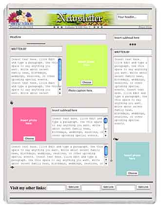
This template proved to be useless to make a homepage for a research project. I also tried to use the "classroom" template, but the number and placement of different areas did not at all fit the text I had in mind.
Interface or Design?
Some systems allow users to change the templates. In my sample, that was true for Geocities, Blogger, Movable Type, Fotolog, and iDVD, while .Mac Homepages and iMovie did not allow altering. Whether the user may alter the design prescript is in itself an interface prescript, in my view. It is not a question of assisting the user in a new sign system, but one of taking away or hiding authoring choices.
The border between interface prescripts and design prescripts may not always be drawn decisively, however. iDVD is an application that allows home video makers to burn their movies on DVD discs. Several movies may be included on a disc, up to a total playing time of an hour. Apple, the maker of the program, takes great pride in the many different style templates ("themes") that ship with the program. Each template sets up a complete menu with background, illustrations, typefaces, and colors. The look is slick and balanced, but the tradeoff is that there is only room for six items in any menu. DVDs can also have "chapters markers," links to certain points in a film. Again, there can only be six chapter markers in each menu.
Whether the limit of six links is a design prescript or a interface prescript may be a question of interpretation. To me, it seems that the main reason for the limit in iDVD is to fit the graphic design, a prescript in another sign system (graphic design) than the author's work (video). In Yahoo!Geocities, there is a limit to four outside links which does not seem to be based in the layout scheme. In that case, I have classified it as an interface prescript, a prescript that reduces complexity for the user by removing choices.
Next: Genre Prescripts >>