

data
Students came into the course with an understanding of data influenced by other courses they had taken. In her reflection on the project, Addy Gutierrez wrote: "When I first began my education at UCSB I was a STEM major. I learned about the different kinds of methods to analyze quantitative data, so examples such as this project [were] not something I got to experience." Like Addy, some other students had encountered data and its analysis in statistics courses as well as in science and social science courses, and they had worked with numerical data that was typically social or scientific rather than personal. No students in the class reported having created or analyzed data in their humanities courses. Indeed, Tess Karls noted that "As a humanities major, I have always felt that my area of study has been somewhat inadequate compared to the sciences. Scientists display data in an intimidatingly mathematical and methodical way that is almost always boring." As she expresses in this video clip from her interview, the sense of data as "boring" may keep students from engaging with it.
big data
Students' understanding of data was also shaped by its most common presentations in popular media, where data is typically represented as big data, compiled by governments and corporations, and in many ways taken from us rather than willingly given. In short, there's a sense of data as disenfranchising rather than empowering. As Maria Popova (2016) wrote in her Foreword to Dear Data, "Ours is the golden age of Big Data, where human lives are aggregated into massive data sets in the hope that analysis of the aggregate will yield valid insight into the individual" (p. vii). The Dear Data project takes an entirely different approach to data, focusing on the small and the personal and, in Popova's words, reclaiming "that poetic granularity of the individual from the homogenizing aggregate-grip of Big Data" (p. vii).
As noted earlier, one key element of the Dear Data project is that students produced data rather than analyzed data produced by others. This shift in perspective offered a kind of behind-the-scenes experience of data gathering and analysis that was empowering for some. Kaylene Truong articulated this perspective when she wrote, "The realization that people know how to track your every move is frightening but at the same time, taking data for yourself and learning more about yourself helps to fight back." Daniel Carroll similarly describes feeling empowered by working on the project in this video clip.
selecting variables
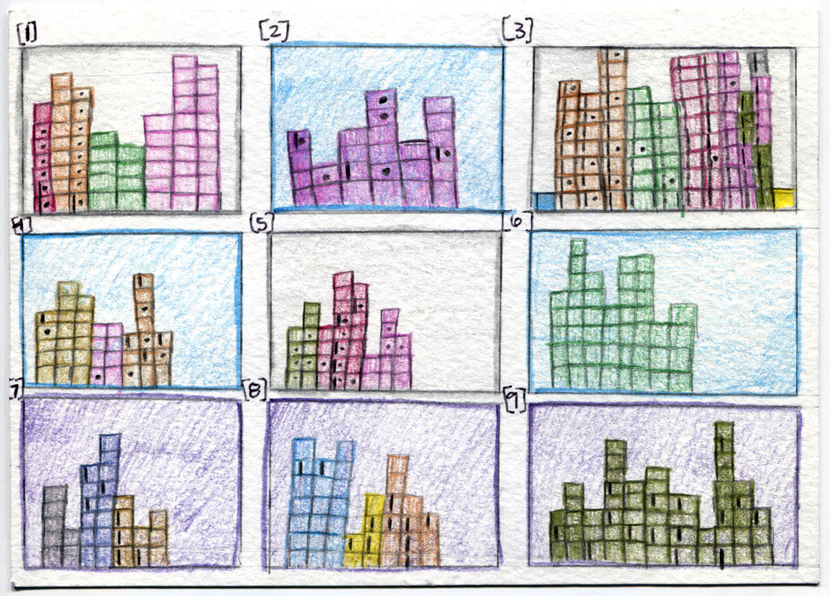
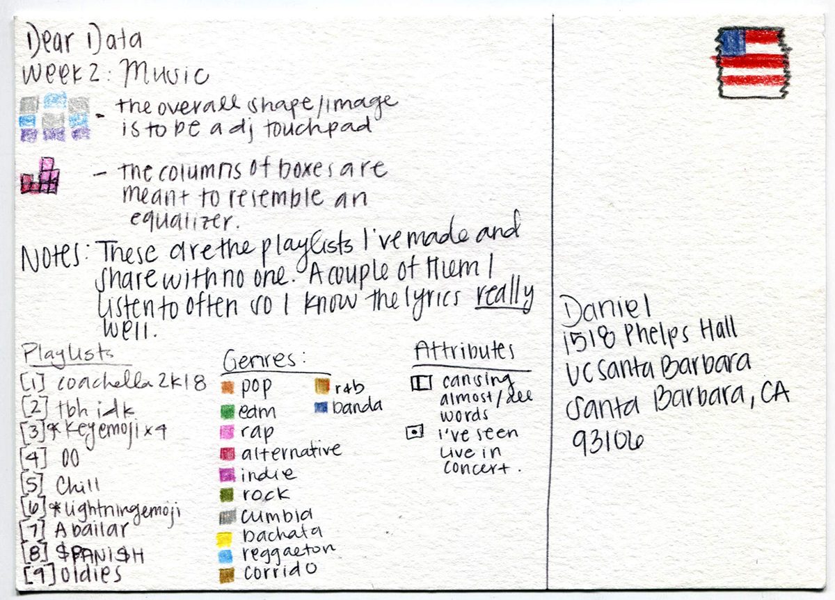
At the same time, as they produced data through their weekly observations, students clearly experienced the complications and tradeoffs involved in observing and recording aspects of their daily lives. After their choice of topic, one of the first key decisions they had to make was the variables they would observe. When they studied the postcards in Dear Data and Dear Data Two, students could see that although the four authors were gathering data on the same topic, each selected different variables to observe, record, and represent. For instance, for week 24 on "doors," Giorgia chronologically charted the location, type, and attributes of every door she passed through; Stephanie chronologically charted the different types of spaces she passed through; in Dear Data Two, Jeffrey plotted the direction and color of doors in his house, while Andy mapped the colors of doors in his neighborhood. An early assignment asked students to work in pairs using this weekly topic comparison form to compare the variables each author tracked and the visual representations each author ultimately used. (This form and the data collection log were both adapted from the excellent materials posted by Chris Ngo at the Teaching Dear Data discussion group.)
For students, the act of choosing variables was often hypothesis-driven. For instance, for his week 2 postcard Meng Su tracked his sleeping patterns, which he realized were unusual and might be causing him to feel tired and unproductive. Several students tracked their use of cell phones to gauge the extent to which they were "addicted." The recognition of multiple and hypothesis-driven approaches to variable selection highlighted for students the essential acts of choice that were at the core of the dataset they ultimately put together.
Students also factored in the ease or difficulty of data collection as they selected variables to track. Although Cindy Thai valiantly tried to record every time she used her cell phone in week 1, she acknowledged that she would "sometimes forget to keep track of those quick instances" when she would just check the time or change her music. Even so, Cindy noted that she "did not end up using all the data as it would be too much and I decided to choose data that repeated a handful of times." In some cases variables were abandoned when students found them too difficult to collect. Victoria Penate switched her topic entirely in week 1 when she realized that focusing on negative thoughts was unhealthy for her and that she should combat rather than record negative thoughts as data. She describes her subsequent choice, a summary of significant events in her past, as "lighthearted but meaningful."
data quality
As they created their datasets, students became aware of the gaps and errors in the data that they ultimately represented in their postcards. While some used the Excel data collection log, others used cellphone apps, scraps of paper, or pen and ink on skin to record data; they relied on their memories after the fact or on the recollections of friends. Although not necessarily evident in the representations viewers saw on the final postcards, these gaps and errors in the data were very clear to the student who produced the postcard. They knew and had to accept weaknesses in the data even as they analyzed and drew conclusions from it. Specifically, they had to choose what to observe and how, and they had to make adjustments on the fly when confronted with difficulties tracking the variables they selected. They saw that the data changed because they were collecting it and that their behavior changed because they were observing it. More broadly, we can say that students grappled with issues of data provenance, which Peter Buneman, Sanjeev Kahanna, and Tan Wang-Chiew (2001) described as the foundation of data quality: it is "the origins of a piece of data and the process by which it arrived in a database" (p. 316). Although data in scientific studies is expected to have clear provenance and a high degree of validity, the Dear Data project revealed to students the potential role that choice and error can play in data collection and perhaps influenced them to bring a more critical eye to other datasets in the future.
Johanna Drucker's (2011) concept of capta, articulated in "Humanities approaches to graphical display" (one of the assigned readings in the course), proved to be very useful for some students as they articulated a new understanding of data gained from their experience as data producers. Evoking Drucker's (2011) analysis, Jordan Metz observed in her project reflection, "It seems ethically necessary that the method of interpretation includes ambiguities and uncertainties in any display of data. Data cannot be removed from the humanist sphere because the act of taking, interpreting or using data is always a human endeavor." Treating everyday actions and events as data made the concept of capta more accessible.
limitations
To be sure, the Dear Data project skewed toward a humanistic approach. Students collected personal data with no outside checks on validity; they analyzed the data with their own biases and blind spots alongside their contextual insights and self-knowledge; their representations were hand-drawn, impressionistic, and designed with visual appeal in mind. The limitations of this small project are clear. Still, if we accept that datasets are artifacts created by humans, the fundamental orientation to question and interpret data is valid, and the project encouraged that orientation. Moreover, the Dear Data project struck an alternative note in the age of big data, opening up the possibility of some agency and personal insight in the context of a data-driven approach. Ultimately, as Giorgia Lupi (2017) suggested in a TED talk, "data is the beginning of the story, not the end, and should be seen as a starting point for questioning and understanding the world around us instead of seeing it as the definitive answer to all of our questions."