A technological journeyWhile Shakespeare’s
Romeo and Juliet provided the rose metaphor for the larger question posed by this webtext, the actual process of building the text can better be described by Homer’s
The Odyssey.
I describe it as such because as motivated as I may have felt to embark on a project like this at the start, composing this text took much longer than expected and was riddled with diversions, challenges, obstacles, and mishaps along the way. Often I felt subject to the whim of the technology gods, and the fate of the project felt somewhat out of my hands as a result of both my own limitations and the limitations of the programs I was using. The project’s fate also relied heavily on the willingness and availability of others, whose technological expertise would help dislodge me from whatever obstacle seemed poised to keep me from finishing my quest.
But before I relate the story of that journey, I would like to make a few points about what I learned throughout the process.
First, composing a webtext takes substantially longer than composing a print text because you must attend to both verbal content as well as the other semiotic modes you are using to communicate meaning throughout the text. In my case, this included still images, layout as well as design considerations, audio segments, and HTML, javascript, and CSS code. Webtexts are able to support multiple layers of meaning communicated through multiple modes. This makes such texts more richly layered than print texts, but as a result, you have to attend to those modes, both individually and as they interact with each other. And rather than just using a pen or word processor to compose these texts, all kinds of other software and hardware technologies are brought into the mix.
Because of the complexity of multimodal texts, it takes a village to compose them, and this fundamentally changes how it feels to be an author. I was responsible for orchestrating and composing the elements you see and read here; however, because I had to attend to so many layers of meaning, I needed to rely on people and already-developed content in ways that I would have never had to were I composing an alphabetic print text. My own self-taught skills with Illustrator and Photoshop were just good enough to know what was possible and that I didn’t always know how to do it. So I needed to find people who could help me with the more technical aspects of the piece, and I needed to rely on Creative Commons’ licensed content that would assist me in designing the piece and finding images to accompany the interview excerpts.
For the first iteration of the interface design, I had the help of a friend who knew Illustrator better than I did, and he was able to help me manipulate the elements and put them together on the screen in a way that worked. But because his role was technical (i.e., he wasn’t invested in the piece creatively or intellectually as I was), the results never felt like any more than rough translations of what I had envisioned. But I had to be satisfied with that because that was the extent of my ability to compose the design and layout portion of the text.
And when I set out to conceptualize the kinds of images that I wanted to accompany the audio excerpts, I again ran into the problem of having to find what I could not myself create. Sometimes this felt limiting, like the potential of this or that part of the project wasn’t being fully realized. However, sometimes this felt exciting, because I would find images that were better than what I had imagined and that, when juxtaposed with the audio segments, engendered what McLuhan would call a "hybrid energy" that would facilitate deeper and more interesting reflection.
This hybrid energy is sparked through the juxtaposition of verbal and “delibrately enigmatic” (Delagrange 2009) visual elements. Delagrange uses this phrase to describe her desire to resist providing an explanation of the visual elements she included in her digital scholarship because preserving the ambiguity of the images enables “the viewer to confront the experience of aporia, of being on the edge of understanding, as well as the Aha! experience of discovery, that ground a heuristic of visual arrangement as invention” (2009). The same excitement I felt at locating or generating an image that interacted with the excerpt in an especially interesting and thought-provoking way would be snatched from the experience of the viewer were I to try to explain it ahead of time. The viewer would be more likely to adopt my explanation as her own without actually experiencing it herself. As Delagrange reflects “By explaining, I undercut my argument that visual arrangement, juxtaposition, classification, and even serendipity are in themselves generative, epistemologically rich and powerful. And by explaining, I also inhibit the opportunity for new, different, and equally productive interpretations of the images to emerge” (2009). Ideally, each excerpt of sound and image would be connected to a mini-wiki of sorts, in which users could provide their own explanations of the juxtaposition, or ideas for what other images they would imagine including to accompany each sound file. Although not possible to link from each excerpt, I have developed a space on the
Digital Rhetoric Collaborative's Blog Carnival where users can post their own reflections of particular excerpts and image pairings, or of their ideas about the larger questions of term use, definitions, and the nature of defining in general.
For those graphical elements I did compose from scratch, tinkering with graphics programs like Illustrator and Photoshop can be hypnotic (like the song of the Sirens) and thus an enormous time sink. For instance, it was not uncommon for me to spend an entire day designing a navigation system that I later had to scrap because when I finally coded it into HTML, the links lined up differently in each browser, which spoiled the whole effort. But all of these experiences were so different (and disorienting, frustrating, exciting) from my usual course of action as author, that any assumptions I had developed about what it meant to be an author were fundamentally challenged.
When I am composing in alphabetic text for print delivery, I regularly engage in a process that includes writing, rewriting, and scrapping parts of what I’ve written in favor of other parts. However, what was different about authoring a multimodal webtext is that the number of semiotic elements to tinker with, not to mention the act of bringing all those elements together to be effectively displayed on a computer screen, far exceeds the number of elements I would have to work with at a sentence or paragraph level in alphabetic text. As author I still had to do all of the verbal wrangling that I would do for a print text, but add to that all the visual and code wrangling as well and I had a barrage of elements to attend to. Having said that, despite all of my trials through this process, I am interested in composing multimodal texts because the results are usually more beautiful and complex than what I would be able to communicate through a single mode.
But the process to get that product realized is nothing short of an epic journey:
I started the journey of composing the text with a pretty clear direction in mind and (what I assumed was) a simple yet dynamic platform on which to travel. Prezi was the program I chose to complete the project, and I was able to envision a detailed picture of how it would be structured. The most compelling aspect about Prezi was its ability to support the entire webtext on a single page, which users would be able to view all at once on a macro scale (e.g. as a rosebush in a landscape), or zoom in on a micro scale to view the details that comprise the larger picture (petals on each individual rose).

Because the text could be viewed both all at once and in detail, Prezi would allow me to capture what I was arguing was the organic, interconnected, and nuanced nature of the way we use and define terms. Using Prezi felt fundamental to being able to show that terms and their definitions are fluid, interconnected, and dynamic. It would "show not tell" as Cheryl Ball has discussed (2004), in a way that new media texts are so good at doing. It would help me avoid having to order the content in a linear or hierarchical fashion, which would have directly contradicted those ideas. It felt beautifully appealing to have the opportunity to capture my argument through the actual structure of the text in this way.

With this structure in mind, the image elements I developed were specifically suited toward supporting both a macro picture and micro elements. I used vector graphics of roses and branches that had clean, simple lines so that they could be used both as part of a larger rosebush, and as part of a singe rose with petals that were clear enough to provide background to a sound file and transcript.
But as you may have noticed, the webtext with which you are currently interacting was not built in Prezi. The reason for this is simple. It never occurred to me that, as dynamic as Prezi is, it is completely unable to support more than a single audio file. This project contains 51 audio files.
The sails of my best intentions were in tatters, but aside from transforming the audio files into movies, which I feared would make the text too cumbersome, I was forced to pack up my vector graphics and abandon my lightweight Prezi sailboat for the luxury promises of a Flash cruise liner.
With help from Madeleine Sorapure, Inventio editor at
Kairos, I boarded Flash and began anew. I knew Flash could support animated graphics and I was imagining all kinds of possibilities that might beautifully capture a complex interaction between audio, text, and image. The mistake I made almost from the beginning, however, was that I had become so attached to the basic design I had developed for Prezi, that I tried to replicate as much of that design as possible in Flash rather than completely re-envision the piece within the parameters of the new program I was using.
Because the project originated in sound, in a non-print mode, I largely avoided being trapped by structures of print that are sometimes difficult to avoid when composing multimodal texts (Selfe, 1999, as cited in Kimme Hea and Turnley, 2010). If I had been moving from print text to webtext, I would have been cognizant of this trap and worked hard to re-envision the piece in an effort to attend to the different affordances of print technologies and web technologies. But because I was moving from one software technology to another, I fell into a different trap of assuming that I would be able to accommodate the same goals in each, albeit a little differently. But moving from the limitless page of Prezi to the very limited window in which to run a Flash movie was a substantial difference that I nonetheless tried to ignore so I wouldn’t have to lose all that I had invested in the piece already.
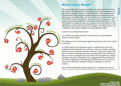
Holding onto my original design and vision left me unable to effectively accommodate the myriad links and segments that I would need to develop for a user to navigate the piece in a smaller space. With the help of a scrolling text feature, I tried to shoehorn all the textual content and all the category links onto a single main page. Needless to say, the design was not as user-friendly as it needed to be. Also, because the graphics would no longer need to be so scalable, the minimalist style of the roses and branches appeared sparse and not as readily identifiable as roses as they could have been.
Finally, because I needed to make it so that the audio, image, and textual elements of the interior excerpt pages could display concurrently and interact effectively, the coding of the piece in Flash started at vexing and ended at bloated. Ultimately, the files were dynamic, but also cumbersome and slow. In fact, when a user would click on a link to hear an audio clip, there occurred such a lag before the audio clip would play that it threatened to sabotage the effectiveness of the text completely.
Serendipitously, around the time that this latest obstacle was emerging, I was working in my role as design faculty advisor to an online literary journal run out of our campus. The student who was in charge of the web delivery of the journal had just finished overhauling the code to make it easier for the other student editors to update and load content. I was meeting with him about some revisions to the design that we wanted to do and I started talking to him about this piece. He suggested I abandon my overweighted Flash cruiseliner and jump aboard the nimble, sleek, and agile HTML5 speedboat, fueled by CSS and javascript.
The student set up the initial structure and I built the pages using that structure, consulting him for technical expertise along the way. Years earlier I had earned my certification as a webmaster, which provided me the basic language to understand what was happening in the code of each page and to better navigate and direct it. However, it was striking (and somewhat sad) to realize just how rusty my HTML and CSS skills had become after not having had to apply them to a major project in so long.
So I appeared to finally arrive at the end of my journey, but I was still holding on to the shoehorned navigation and structure, as well as the original aesthetics, which desperately needed to be reconceived. I had held on to these componants because it would have simply taken me too long to redo them (I wanted to get off these boats already!). But with the HTML5 providing such a clean and beautiful structure on the back end, I felt reenergized to redesign the entire site so that I could provide a better visualization of the rose metaphor and better facilitate the organization of the site and a user’s progression through it.
That is what you see now. And this is where I've decided to dock and leave you to enjoy your own journey through the text.
 Because the text could be viewed both all at once and in detail, Prezi would allow me to capture what I was arguing was the organic, interconnected, and nuanced nature of the way we use and define terms. Using Prezi felt fundamental to being able to show that terms and their definitions are fluid, interconnected, and dynamic. It would "show not tell" as Cheryl Ball has discussed (2004), in a way that new media texts are so good at doing. It would help me avoid having to order the content in a linear or hierarchical fashion, which would have directly contradicted those ideas. It felt beautifully appealing to have the opportunity to capture my argument through the actual structure of the text in this way.
  With this structure in mind, the image elements I developed were specifically suited toward supporting both a macro picture and micro elements. I used vector graphics of roses and branches that had clean, simple lines so that they could be used both as part of a larger rosebush, and as part of a singe rose with petals that were clear enough to provide background to a sound file and transcript.
  The student set up the initial structure and I built the pages using that structure, consulting him for technical expertise along the way. Years earlier I had earned my certification as a webmaster, which provided me the basic language to understand what was happening in the code of each page and to better navigate and direct it. However, it was striking (and somewhat sad) to realize just how rusty my HTML and CSS skills had become after not having had to apply them to a major project in so long.