When Revision Is Redesign: Key Questions for Digital Scholarship
Susan H. Delagrange
Navigation
Q: How can navigation be designed to provide a thoughtful, exploratory viewer experience while still offering enough signposting to prevent viewer frustration?
According to most books on the design of interactive digital media, users (their preferred term) have very specific requirements for navigation. Links must be clear and well marked. Users who click on a link must be sure where they are going, and where they have been, so links must subscribe to an unambiguous rhetoric of arrival and departure (Landow, 1991). Anything else will cause confusion and obstruct communication, and users will abandon the effort.

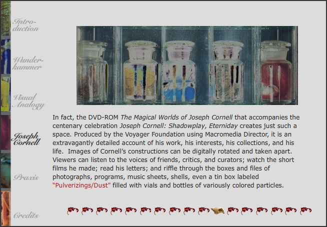
Pulverizings/Dust lexia (2006)
But the purpose of navigation in "Wunderkammer" was not mere functionality and convenience. I wanted viewers to get lost, to open doors without knowing where they were going, to spend time on the journey. The navigation scheme for the 2006 version of "Wunderkammer" was designed to invite exploration through a minimally signposted system of links. The left side of each screen listed the sections—"Introduction," "Wunderkammer," "Visual Analogy," "Joseph Cornell," and "Praxis"—plus a link to the credits. The image at the top of individual lexias changed for each section, and the lettering on the left darkened. At the bottom of each screen, a row of leaf shapes marked the links within the section, and a small shell indicated which lexia the viewer was currently viewing.
A Kairos reviewer suggested "making the subsection navigation [the leaves and shells] a bit more informative," and I agreed that more wayposting was necessary, although not so much that the slight tension of not knowing quite where you are in the images, and in the text, would disappear.

In the 2009 navigation bar (above), I combined sectional and individual lexia navigation into one area at the top of the screen, allowing more space for the images and text below, and included a link back to the opening screen. I also added text below each link that repeated the words called out in each lexia and added a navigation space at the bottom with images as links to animations. These changes preserved the ambiguity of the naming (What might "Pulverizings" refer to?) and seeing ("What is that image a part of?"), while enabling the words and memories of lexia already visited to become part of the experience that guides further exploration and discovery. Why, after all, should we object to the option of nonlinear navigation in a digital environment when nonlinearity (think "walking in the city") is so much a part of the structure of our lives?
Viewers, like the owners of [Joseph] Cornell's boxes, must bring to the work a desire to manipulate and understand the visual on its own associative terms, no less so than they would expect to engage with the persuasive qualities of more familiar written argument.
Shortly before I finished redesigning "Wunderkammer," I was invited by the Digital Union at Ohio State University to present my work in a charrette, an intense morning-long design critique. Faculty from agriculture, architecture, medicine, physics, and women's studies participated, as well as technology and design specialists from the Digital Union. I hoped to get their feedback on the new navigation structure, because the most reliable way to learn if an interface works is to watch and listen as viewers interact with a design for the first time. It was obvious that everyone was enjoying clicking around, stopping here and there to look and read, then moving on, despite the fact that they expressed occasional confusion. But one question clarified my concerns about navigation: Did I expect two audiences for this piece: one of people in my field and the second of people interested in the project as a visual artifact?
This question foregrounded a line that is often drawn between text and image, as though an audience in rhetoric and composition would value the clarity and accessibility of the written argument, while another audience would value the intensity of the visual experience. I refuse to make that distinction. In exploring "Wunderkammer," intellectual engagement and visual pleasure are both essential to the experience. Neither stands alone. And the new navigation supported both, providing both necessary wayposting and generative ambiguity.
Still, interactivity, flexibility, and viewer choice are important aspects of navigation in "Wunderkammer." Viewers should be able to follow multiple paths through the project, and avail themselves of a range of interactions at any point. Interactivity is key, and multiple ways of viewing are equally possible. A viewer might choose to move sequentially through the lexia, activating every animation and reading every word, providing a sense of completeness that some may desire. Or a viewer may move more randomly through the lexias, choosing a phrase or an animation here and there to explore more closely. A viewer might also choose to read only the text, or to view only the images and animations. I expect most viewers use a combination of these strategies, different for each viewing.
