For electronic documents, of course, the "page" size depends on the software we use to view it, the size of the screen, the browser window, or other such factors. While some formats (such as Adobe PDF files) emulate print documents exactly, others, such as World Wide Web pages, allow readers to make choices that affect the amount of text or graphical elements that will fit on a screen. It is essential that authors consider the effects this may have on their reader's ability to access information, understand important points or arguments, and follow the author's intended line of reasoning.
—> Teaching Form, Informing Content
My students, like many others, submit their work electronically. I use Microsoft Word to insert comments which students read by moving their cursor to highlighted portions of the text. We use email or discussion boards to share papers electronically for peer review, and we gather around the computer screens in the classroom to discuss hypertext projects. Some of the features of student texts we discover we must deal with are features that aren't always evident in printed copies.
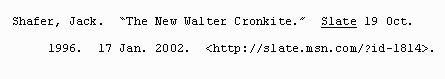
The use of underlining to designate book and journal titles is a case in point, the remnant of a pre-computer print culture that relied on underlining to designate text that should be italicized, which only professional printers could accomplish in the days of hand- or typewritten manuscripts, furthered by the needs of publishers to meticulously translate codes embedded in word-processed documents.The MLA Handbook admits that underlining indicates text that should be italicized in final manuscripts, and yet, by choosing to underline titles in their examples, they continue to foster the belief that underlining is the "correct" format for titles. After all, a picture is worth a thousand words, right? Few people, that is, actually bother to read the style books, instead choosing only to look at the "pictures"—the examples—that they present. In today's culture, however, underlining is a feature most often used to designate a hypertext link (even in a word-processed document).
MLA's use of angle brackets to surround Internet addresses is a similar case in point. The angle brackets, like underlining, designate a specific feature of a text: in this case, MLA uses them to designate a hypertext link.
However, in order to accommodate the use of angle brackets, MLA instructs authors to turn off their word processor's hyperlink feature. In effect, then, just as MLA instructs authors to use underlining instead of italics to indicate text that should be italicized, authors are told to turn off hyperlinks so they can indicate text that should be hyperlinked.... Of course this makes no sense at all in an era when both authors and their audiences may very well be reading their documents on-screen—not on pieces of dead trees.Is it any wonder our students are confused?