Save pictures for punch
Perhaps it's not the case that we need to minimize our images, but instead
that we should maximize them -- that is, maximize the power of the images
we use. It makes little sense to content ourselves with illustrations when
our audience's time is much more valuable than that. We should learn from
the advertisers, and let text do what it is good at -- explaining quickly,
downloading quickly -- and save pictures for punch.
Just this sort of image I'd like to consider by means of an example.
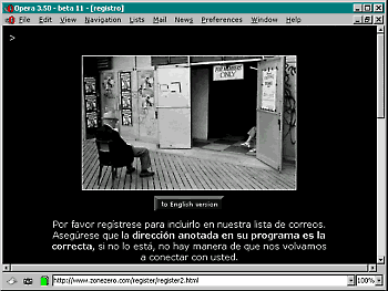 This
image -- a page from zonezero.com,
a web photography magazine -- works on another level. This page asks users
to register for the site, a drab task. But the photograph that accompanies
it is anything but. It also has a much different relationship to its text:
this is no illustration.
This
image -- a page from zonezero.com,
a web photography magazine -- works on another level. This page asks users
to register for the site, a drab task. But the photograph that accompanies
it is anything but. It also has a much different relationship to its text:
this is no illustration.
Yet
it fits. There are thematic similarities between the task of registering and
the members' only sign above the doorway. Too, the fellow sits on the boardwalk
outside, perhaps waiting to register. But the photo does not directly address
any of these concerns. It doesn't illustrate. It's there to delight -- a gift.
For
all the seriousness about download time and bother, for all Nielsen's
contentions that the web just isn't fun, it's tough to look at this image and
forget that the web gives us the potential -- maybe not for every day, nor for
every information task -- but the potential to find new ways of relating text
and image. Advertising is perhaps the best model for this -- a language where
image is not subservient to surrounding text, but one in which text and image
both hold their own.