-
The more primitive a people, the more extravagantly they use ornament and decoration. The Indian overloads everything, every boat, every rudder, every arrow, with ornament. To insist on decoration is to put yourself on the same level as the Indian. The Indian in us all must be overcome. The Indian says: This woman is beautiful because she wears golden rings in her nose and ears. Men of a higher culture say: This woman is beautiful because she does not wear rings in her nose or her ears. To seek beauty in form itself rather than make it dependent on ornament should be the aim of all mankind. (69)
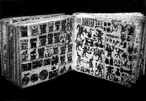
Here is page design being asked to order our attitude towards others. I follow with an earlier example of how the design of books orders us towards certain desires and expectations, desires and expectations developed through the repetition of people seeing page after page of western design: Walter D. Mignolo, in “Literacy and the Colonization of Memory,” describes that when the Spaniards colonized Mexico they were so steeped in the culture of their alphabet that they could not see that the Mexica had any sense of history; the Mexica recorded their pasts not with letters and words but rather in certain kinds of paintings (which they often bound together into book-like objects)—
-
...the Spanish priest accompanying the expedition gave a brief summary of Christian doctrine, denounced Inca religion as invented by the Devil, and demanded that Atahualpa [the Inca leader] become the vassal of the Holy Roman Emperor. While giving his address the priest held a book, either the Bible or a breviary, in one hand. Atahualpa, deeply offended by this speech, ... demanded of the priest by what authority he made these claims. The friar held up the book to him. Atahualpa examined it, but as it said nothing to him he dropped it to the ground. This rejection of the essence of European civilization was the excuse the Spanish needed to begin their massacre. (110)
There has been much criticism of how much power Ong and McLuhan give to the form of the book itself, without considering the material and cultural conditions that shape books and are in turn affected by books. Brian Street, for example, is clear in his criticism of those who hold, as McLuhan and Ong do, that literacy practices alone give anyone who acquires them the qualities of analysis and individuality that McLuhan and Ong describe in the passages I cited. Street argues that those who hold such a position have created an independent or ’autonomous‘ notion of literacy, which looks only at Western, academic, literacy practices and which separates literacy practices from the social practices of which they are a part. Street also argues that the qualities claimed to come from this literacy can be present in societies without written language or with other forms of writing, but that the apparent independence—hence universality—of the autonomous model causes many to label such societies “pre-logical” or “primitive,” ” illogical” or “mystical” ... with the literate culture, in contrast, “intellectually superior” (24, 25, 29).
In addition, recent writings have given attention to the specific historical contexts of the development of the attitude towards form apparent in my many quotes about book design above; rather than see this attitude as coming out of a diaphanous western desire for direct access to the truth, design critics like Robin Kinross, for example, argue that the belief that information can be “” presented, as though page design and typography were invisible, has had two upswells in this century, both related to periods of industrially-tied abundance in the twenties and in the fifties, the latter upswell still strong now:
-
The dream.... envisioned an ideology-free or ideologically neutral world made possible by advances in technology, by an abundance of material goods, by the spread of representative democracy and the eclipse of rival political systems, and by mass education. (27)
Maud Lavin similarly places the emphasis on form in German design of the 1920s (which is still influential in recent design, as the recent reissue of Jan Tschichold’s New Typography shows) in the industrialization that followed World War I:
-
.... geometric form and grid composition in the 1920s German graphics connoted such admiration of rationalization and technology, and a belief in the supreme importance of industry to society (almost irrespective of form of government). The focus on form paralleled the fascination with means of production and both, it seems, worked together to block discussion among cultural modernists about industrial ownership, labor practices, and profits. (46)
Chuck Bigelow, Professor of Digital Typography at Stanford, responding to a page design from 1513 (by Aldus Manutius) of Plato’s “Phaedrus”:
“Did people read more slowly in Manutius’s time? Did they think more in between the words?
“Probably, yes.
“Now we read quickly, as if our books must be freeways with smooth curves and prominent signs.” (27)
from Byrne, Chuck. “Jack W. Stauffacher, Printer, Etc.” Emigre 45 (Winter 1998) (16-29)
-
.... becomes more and more involved in the very mechanics of mass production as a form. ... For the graphic media to function efficiently as the repressive face of a corporate capitalism required the repression of all manner of deviant elements. The clean, hard-edged character of design served as both the instrument of and the image of a smooth, unmarked process of enunciation. (239)
So even though the form of books may not then be alone—as Street and these design critics argue—in ordering us into individuals who desire cool and abstract rationality, the interpretative structures ordered by books can encourage us to desire this to be so, to act as though the form of books ought not to be questioned, as my above examples of burning and massacre ought to argue.