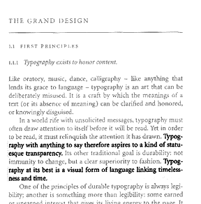
The words on the page are to approach immateriality:

says Robert Bringhurst, in The Elements of Typographic Style (17).
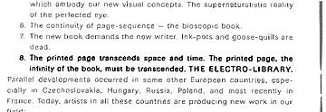
Or:

says El Lissitzky (quoted in Tschichold, 60).
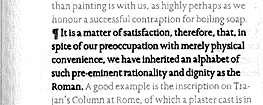
Words are to appear on the page so that they visually convey our sense of what knowledge is:

says Eric Gill in An Essay on Typography (24).
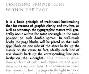
The printed books that result from the desire to see ideally are to have words that melt into even, repeated lines on evenly presented pages:

according to Adrian Wilson, in The Design of Books.
Such repetitions and homogenization of form keep books from calling any attention to themselves.

and

This from The Crystal Goblet: Sixteen Essays on Typography, by Beatrice Warde.
There should therefore be no decoration:

says Jan Tschichold, in The New Typography (69).