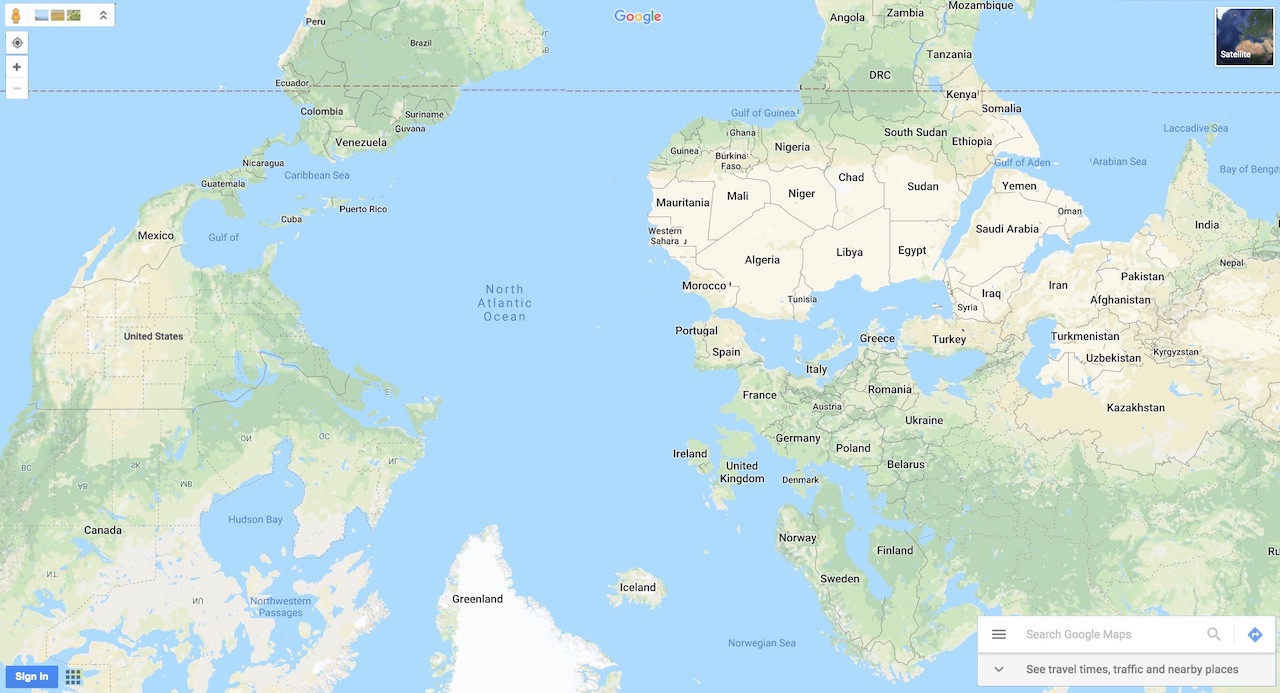
We expect interfaces to be oriented in a familiar way, just as we often expect maps to be oriented in a familiar way.
This topsy turvy interface is intended to emphasize the arbitrariness of orientations. What material, embodied, and mobile experiences are necessary for "getting our bearings" within an interface? To use a geographic map, we need a basic familiarity with spatial orientation and cardinal direction. Some maps require more specific knowledge of streets and city blocks in order to interpret the lines and squares that signify them, or of land and water in order to read the colors that represent them.
What prior experiences and literacies are required to read interfaces? To whom are interface orientations most familiar? Who makes decisions about interface design orientation, and for whom are they made? How do our orientations within interfaces map back onto our orientations within the world?
"If we look at web based design, however, the navigation paths, search and query results, browse features—in brief, every aspect of the web content management and display—embody values that are inherent to the reading process, even if they are largely ignored or treated as transparent or invisible." - Johanna Drucker (2011, p. 11 ), Design Theorist
