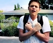
Example #2: Sean Forbes’ “Let’s Mambo”
To demonstrate how designers can reduce the barriers between differences and between modes, I will now turn to Sean Forbes’ (2011) “Sean Forbes ‘Let’s Mambo’ Ft. Marlee Matlin.” Forbes, a Deaf hip-hop artist and drummer, sings and signs original songs to make music accessible to deaf, hard-of-hearing, and hearing audiences. A co-founder of D-PAN (Deaf Professional Arts Network), Forbes has not only opened up music to deaf individuals who have been excluded from auditory musical performances, he has also provided multisensory opportunities for audiences to experience music through the body.
In this ASL music video (see below), Forbes has played with “Let’s Mambo,” which portrayed his attempt to mambo. He artfully played with the song (everyone is dressed in retro outfits) and with subtitles. The brief conversations in the beginning used basic subtitles that do not move, fade in and out, or enlarge in any way. But when he began the song, the subtitles moved to the beat of the music. The words and syllables grew larger and moved up above the other words in the line reflecting the movement of the music.
At a certain point a female dancer (well-known Deaf actress and Academy Award winner Marlee Matlin) appeared and attempted to get him to dance. Matlin vivaciously signed LET’S MAMBO and the visual text that accompanied her signing appeared as enormous, bubbled, and visually vibrant. In contrast with the small white text that appeared on the bottom of the screen when Sean Forbes signs/sings, the enormous bubbled text that accompanied the upbeat Matlin is colorful and lively, reflecting her zestful attempt to get him to dance. The syllables that have been sung/signed are infused with brilliant color, which visually emphasized the energy of the moment.
In response to Forbes’ admission, “I can’t mambo,” Matlin energetically attempted to teach him how to dance. When they count 1-2-3 and CHA-CHA-CHA, enormous numbers and letters appeared on the screen, color-coded to match the sequence of the song.
The video ends with them mamboing successfully in tandem. Forbes concluded by confidently singing “Let’s Mambo” with enormous colorful and bubbled text accompanying him. Reflecting his newfound animation, the line that he had repeated several times in the video now becomes bubbled and colored as well. The visual text reinforced the energy and confidence of the characters in the video. And the lyrics and visuals in this video are undeniably fun, reflecting the spirited nature of their music and dance.
This visually and acoustically engaging video could serve as a guide for those of us who add subtitles to our compositions. Instead of seeing subtitles as a necessary add-on, as lines of text to type in at the bottom of the screen, we could experiment with visual text. We could add color to underscore definitions or concepts, enlarge the font size to emphasize meaning, interpose elements to evoke abstract ideas.
We could recognize how to embody different sensory experiences through different modes, such as recreating the pulses of the beat in pulsating visual text. When we recognize the potential of these modes in improving how they express their meaning in accessible ways, we show the possibilities of differences. We can, as Deaf culture scholar H-Dirksen L. Bauman (2007) stated, “consider new ways of listening, new ways of thinking, new ways of seeing the world through Deaf eyes” (p. 3). Although I’m not claiming that Deaf eyes are any better than other eyes (that would assume one body is better than another!), we do need to consider different ways of perceiving the world and engaging with each other.
The visual effect of the energetic, highly dynamic visual text in Forbes’ video could be explored through Sean Zdenek’s (2011) rhetoric of closed captioning, which analyzed the rhetorical quality of captions. Zdenek argued that scholars should interrogate the rhetorical choices being made in which audio components of the video are being conveyed through textual form and how they are being conveyed. To clarify, Zdenek’s rhetorical quality of captions—the quality of how well and appropriately a line of captions conveys the aural message and the video’s contextual meaning—goes beyond consideration of typographical qualities such as font size and background color. However, Zdenek’s rhetoric of closed captioning can enhance our analysis of the accessibility of visual text in ASL music videos. Forbes’ video is filled with vibrant visual text that bursts out with the music and lively dances along the characters on the screen and that visualizes music.
We can analyze Forbes (2011) in response to Zdenek’s (2011) call for “a scholarly landscape in which captions (and accessibility more broadly) are viewed as natural and necessary elements of our theories and pedagogies” (para. 10). The lively visual text in Forbes’ video reminds us that accessible practices do not have to be plain add-ons, but can improve the rhetorical and aesthetic quality of the composition for audiences. After watching Forbes’ video, try imagining it without the visual text. Certainly, the experience would be different.
The incorporation of visual text and other strategies can improve accessibility across multiple modes, as discussed in Accessibility.
