"It seems very pretty," she said when she had finished it, "but it's RATHER hard to understand!"
(You see she didn't like to confess, ever to herself, that she couldn't make it out at all.)
"Somehow it seems to fill my head with ideas—only I don't exactly know what they are!"
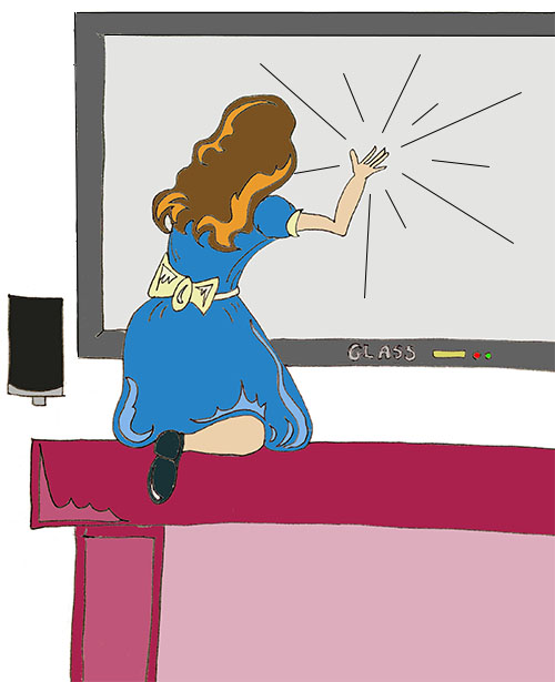
Alice's words (here quoted from chapter one of Through the Looking Glass) are scattered throughout this webtext. This project was born from explorations through a collection of objects and provocations in the Afterlife of Alice & Her Adventures in Wonderland digital collection at the University of Florida archive. I set out to explore Alice's remediations, and the nature of Alice as media, by creating a remediation that spans modalities. While this is not a literary analysis, the building of each node was preceded by close rereadings of the corresponding chapter. As the index of the project reflects, each node shares a chapter, a theme, and in some cases textual ties with a chapter in Lewis Carroll's Alice's Adventures in Wonderland.
The opening musing of Alice is similar to the response of reviewer Joyce Walker on encountering the first iteration of this webtext: "I want to be up front about the fact that I kind of found this text difficult, and I didn't (knee jerk) actually find it all that interesting in terms of its content or argument, but that I loved its innovative and unusual organization visually and multimodally." Walker goes on to add, "the text and the design of the different nodes is perhaps the part of the text that makes its own arguments (just experiencing these as a reader is maybe enough?)." Walker's analysis resonates with my goals (and corresponding struggles!) in building this text: the design preceded the text, and is interwoven with text and just one of many media. The text is never primary, and it alone is absolutely incomplete. It is difficult to provide many of the hallmarks of what we expect from scholarly analysis with a structure and emphasis of this kind.
However, I believe that there is another type of scholarly work that this form is better suited to than the traditional article, and that indeed this muddling of design and argument is part of the challenge and appeal of making (and, hopefully, of reading) scholarly webtexts. As Patricia Webb Boyd notes in her examination of the state of webtexts as scholarship, "I would argue that pulling difference into awareness is precisely the point of these kinds of texts. The gap between traditional expectations of texts and the multiple realities of digital texts pulls readers to question their assumptions about reading and research." While Boyd notes this tendency for readers, I would add that the creation of a webtext also demands the creator to engage differently in research and practice. Another reviewer, Jentery Sayers, observed of this project:
there is no explicit research question (unless you count: "How to express, through media, the medial shifts of Alice over time?"). However, the multimodal approach to enacted arguments is quite compelling—for me, it's Dan Anderson compelling. There's a lot of invisible labor involved in making a piece like this one. I'm personally struck that one person composed it all, especially if you compare it to, say, Vectors (where a critic collaborates with a programmer). I mean, the fact that each section relies on a distinct medium and (in some cases) programming logic. While I'm not exactly a fan of McLuhan, this is more like Medium is the Massage than Understanding Media.
Sayers' remarks reminded me of a contradiction that emerged for me in building this project. While Alice's Adventures in Wonderland as a thing is the center of the work, its "literariness" was peripheral to my core interest. Instead, I was drawn to exploring it as what Craig Mod calls a "future book":
In reality, the book worth considering consists only of relationships. Relationships between ideas and recipients. Between writer and reader. Between readers and other readers—all as writ over time.
The future book—the digital book—is no longer an immutable brick. It's ethereal and networked, emerging publicly in fits and starts. An artifact "complete" for only the briefest of moments. Shifting deliberately. Layered with our shared marginalia. And demanding engagement with the promise of community implicit in its form.
McLuhan's The Medium is the Massage and War and Peace in the Global Village, both collaborations with the graphic designer Quentin Fiore, are two of the media studies texts that serve as core influences for this project. In both cases, each page or spread often seems to function individually: when I teach these texts, we work not so much through an argument as from thought to thought, considering how images, text, and juxtapositions provide a provocation.
These provocations can admittedly seem incomplete, and much relies upon the relationship of nodes and the reader's creation of what Scott McCloud refers to as "closure" (the filling in of gaps, as in comic-panels, that creates a sense of meaning). Joyce Walker further notes:
The author seems to be making claims (or am I imagining this) for Alice as a very special, very "matrix-oriented" kind of narrative. So rather than just seeing the text as an interesting Victorian text that has evolved, we are taking its "unreality" as a fundamentally interesting thing that connects to the robustness and value of its various online permutations. And I can understand this—and perhaps even agree with it. But that argument doesn't seem to come through enough for me (as a reader) anywhere in the text. I had to construct the idea after reading the text (and Geof's and Jentery's reviews) and then, once I had constructed it, I wasn't sure I saw the evidence of this argument in the various nodes of the text—even though the author perhaps sought to use the various media as a kind of productive example of the text's possible variability and intrinsic instability.
This preface (and some corresponding changes within the text itself) are an attempt to anchor these nodes and connect these varying medialities with a governing philosophy. Walker's critique highlights some of the problems inherent in how this text was constructed: it was never composed as an essay or as a singular linear argument. Instead, the text was composed node by node, usually within the medium or application used for the rest of the node's design. It was not composed seperately and then illustrated, and it has no complete life of its own. While the results of the design process are visibile on each page, the intentions and tool behind them—and what Sayers refers to as the "invisible labor" of a piece like this and indeed of webtext work more generally—are obscured by the presence of the text. However, each was chosen as a method for illuminating something about Alice not merely as a character, a text, a book, or even as illustration—but instead as a shifting "thing" that challenges whatever media form that tries to contain it.
As a solo project, "Alice in Dataland" is inherently limited by my own skillset as scholar, writer, designer, illustrator, and programmer. This personal construction in part caused me to reject the current aesthetic of the digital humanities, which tend towards center-hosted and grant-funded projects by collectives, not individuals. Instead, I took my inspiration from the classic web, and particularly from early electronic literature and webtexts. For each chapter, I used different tools or resources to create a node with the media modality I envisioned, while staying grounded in HTML5 and, as much as possible, accommodating a range of potential platforms. I suggest returning to these notes with each chapter as a commentary on the construction.
I: Down the Rabbit Hole is inspired by the physicality of the imagined origin of tales told to Alice on the more mythical than real "golden afternoon." The pages were all hand-written (following reflection, but in pen and with a level of guiding spontaneity appropriate to the act of journaling) in a physical notebook. For this portion, I wanted to consider the physicality of the act of creating the written record and thus digitally build a reflection of that same materiality. I built upon a tutorial from Hakim El Hattab on creating page flips using Canvas animation. My preliminary excavations are perhaps best captured in the text on either side of the "underground" drawn on the pages of this notebook: each adaptation or artifact is one site of Alice or her remediations.
II: The Pool of Tears uses pages backed by an HTML5 canvas, on which the tears I've drawn gradually multiply, themselves echoing the chapter of the pool of tears while serving as a procedural illustration (refresh the page to see the effect and note the increasing numbers of tears as you move from one page to the next). This chapter, which itself is so concerned with Alice's changing physicality and its consequences, is thus anchored on an element that was added to HTML to provide a flexible space for manipulating, pixel by pixel, the images or text we perceive. The Canvas is used repeatedly throughout this webtext as an emerging alternative to Flash for animation and web-based interaction design that, unlike Flash, has the advantage of cross-platform compatibility.
III: A Caucus-Race and a Long Tale is built with a responsive slider, Orbit, which allowed me to take the concept of concrete poetry and build this section along a "long tail." The images in this section are nearly all pulled from Alice in Blunderland or from Tenniel's original illustrations, and the sliding space allows me to represent the connections and motion as the webtext first breaks out of the metaphor of the page and into more dynamic space. The text is hand-placed with the HTML "pre" tag, which allows for preformatted text with very nonstandard spacing—a nod to the same constraints of formatting that accompanied the translation of Carroll's manuscript notations into a printed text. In deference to the palette of the works, this piece (and its accompanying navigation) are designed in black and white.
IV: The Rabbit Sends in a Little Bill begins to consider the relationship of Alice to the medium of photography and transitions into the moving picture and film. While the text is written as a script, the design of the pages is anchored in a jQuery plug-in, Innerfade, which echoes early animation by using fades between different stages of the manipulated photographs. The photographs are all images taken either by myself, a photographer and collaborator, or Creative Commons images, while each is enhanced through "old-school" photo manipulation and literally drawing on the images. As each scene fades through, story is layered on top of the original landscape photograph, taking Alice into a multilayered "moving picture" medium. jQuery is a particularly appropriate starting library for this type of work given its emphasis on easily bringing the features of other media to web programming.
V: Advice from a Caterpillar is formally inspired by the work of Scott McCloud, particularly in his series of web-based, scrolling comics that include the "I Can't Stop Thinking" series. This section is almost fully non-procedural, as the art was hand-drawn and manipulated in Photoshop. The font I chose, SmackAttack BB, is inspired by classic lettering to evoke the Disney comics and other comic explorations of Alice. This section is the most driven by aesthetics and adopts the patterns of Scott McCloud's imagined future of web comics as a way to draw attention to the formal constraints and assumptions of comics as a medium. Comics continually demand a reader to reach "closure" by filling in the gaps from image to text and back again, and are thus a perfect space for considering Alice's relationship to image-text.
VI: Pig and Pepper, planned as a response to the primacy of the Disney animated film in impressions of Alice, is built in a beta version of Adobe's Edge Animate. Edge Animate is an addition to Adobe's Creative Cloud suite aimed at providing a toolset for web animation for HTML5. The flow of the animation was entirely inspired by, and intended to correspond to, the Creative Commons licensed music that accompanies the imagery: "A Tribute to Alice" by BOCrew. It was in some ways the most impossible section of the project to build: in retrospect, voiceover might have worked better than text due to the varied speeds at which people read, so as compensation I added a pause button (found in the center of the drawn screen).
VII: A Mad Tea-Party holds the electronic literature piece that emerged most immediately from this project. The Twinkle Bat generative poem, adapted from Nick Montfort's algorithmic procedural poetry generator Taroko Gorge, is an aesthetic response grounded in exploring the relationship between Carroll's "nonsense" and his own source texts. Placing this exercise into the algorithmic space of an engine that has become such a major space for remixing and adapation seemed perfectly appropriate, offering the possibility of considering words as variables and text as source data for new creations.
VIII: The Queen's Croquet-Ground is the first of two chapters built in Twine, an open-source platform for creating nonlinear texts or games that resemble classic electronic literature webtexts. Originally, this chapter was conceptualized as an interactive fiction game built in Inform 7. However, the barrier to access to actually play such a game (as interactive fiction can be very frustrating to those unfamiliar with it) seemed too high for the content that could actually be incorporated in that space. Along with section IX, this section is the beginning of remediating Alice as a text for participatory media with high levels of reader agency.
IX: The Mock Turtle's Story also uses Twine, but it relies upon the Sugarcane format, which is node-based, rather than the Jonah format, which allows all content to expand within one frame. These two different modes each offer hypertextual elements, but the exploratory format is better suited to examining what McLuhan calls the "electronic age of space-time" (162). Aesthetically, this section is a transition into the space of The Matrix and other cyberpunk heirs to Alice. The animated images that accompany it are all built as animated GIFs in Photoshop, designed to gradually fade into the palette associated with the hyper "digital."
X: The Lobster Quadrille is centered on a platformer game built in Construct 2. The game is inspired by the absurd (and somewhat dark) notion of inviting lobsters to the dance, which holds in it echoes of Carroll's predatory Walrus and Carpenter. Construct 2 is an engine for working in HTML5 for browser-based games, and it works on event-driven building block coding. This game was built on a foundation of platformer mechanics, as the player controls Alice on her quest for lobsters. The two levels of the game—the first a lighter level in which you invite lobsters to the dance, the second a darker game where you find lobsters to build for a feast—share the same procedural core. Alice herself has been the heroine of many game-spaces and works well as a game avatar thanks to her own status as a fish out of water in Wonderland: like a player in a platformer, she dives into a world of new logic systems and masters their ordering to advance.
XI: Who Stole the Tarts? showcases a generative responsive canvas. The ones and zeroes of the Matrix-inspired "cards" accompany an outlined Alice as she falls down a digital rabbit hole. I designed this section using the jCanvas library, which offers an API for drawing that ensures that each time you visit this page, the rabbit hole will render slightly differently. The remaining pages showcase other tools: the visualization of Alice's text was generated using Wordle, a Java applet that weights words based on their occurrence rate within a submitted body of text. This section was perhaps the most difficult to re-conceptualize in a reader-friendly way, as originally the goal was to highlight an encoded and algorithmic mediation through source code.
XII: Alice's Evidence, as the concluding chapter, was conceptualized as a virtual gallery on which the different portraits of Alice might hang for our final reflection. As the goal was to create a sense of movement between each portrait, as if the user was walking between them, the pages load in using a "fadeIn" function implemented in jQuery. Each page design is kept symmetrical to keep the feeling of the content changing even as the portrait frame essentially remains unchanged. While this section was imagined as a unifying node, it is anchored in the same uncertainty that reigns over Alice's trial in the corresponding chapter of Alice's Adventures in Wonderland.

