The Before and After of One Webtext
We're sure that Inventio will evolve as researchers in our field experiment with different kinds of multimedia scholarship and as technology changes to allow for new possibilities in digital communication and interaction. The model we're proposing at the outset involves working with Inventio authors as they produce a webtext and then present it in a way that integrates materials that discuss its production and comment on its meaning.
Let me (that is, Madeleine) use my own Kairos webtext as an example of what Inventio might accomplish. This webtext, entitled "Between Modes: Assessing Student New Media Compositions," won the Kairos Best Webtext Award for 2005. However, the initial draft that I submitted had significant flaws. Using the forum of Inventio, I could show how the project went from pretty bad to much better. Describing and illustrating this process would allow me to highlight what I've come to see as key principles in designing effective multimedia as well as guide readers in their understanding of the new media scholarship at work in "Between Modes."
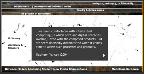
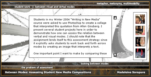
As you can see in these screenshots, the initial version of the webtext looked quite different from the final version.

Screenshot 1 from early version of "Between Modes"

Screenshot 2 from early version of "Between Modes"
In the first draft, I was working with an interface that I had found at ActionScript.org for vertical sliding navigation. I liked the way that this interface worked: clicking on one of four vertical bars created a sliding effect, like a window sliding up and down, carrying with it new content. It seemed to me that the interface remediated a book, in the sense that it gave the illusion of depth, with many pages or screens accessible behind the cover. I got very caught up creating background images for the screens and the bars, choosing a color scheme, and then making the scrolling text, links, and other features work on each individual screen.
The problem, which became clear to me after reading editorial reviews of the webtext, was that the interface had nothing to do with the content of my argument. In essence, the interface and the interactivity it offered to the reader were meaningless. Moreover, the size and design constraints of the interface prohibited me from developing my argument very fully. As one reviewer wrote, "I felt as if I was reading the piece by looking down a straw, with only the tiny hole to look through."
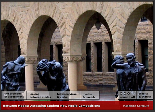
The redesigned interface conveys information that's relevant to the webtext and that recalls the original context out of which it emerged: a presentation I had given at the Computers and Writing 2004 Conference at Stanford University. One of the reviewers of the initial draft suggested that I include references to other speakers and events at the conference in support of my claim that assessment was a key theme there. My revised webtext situates itself in the context of the conference textually as well as through its use of image and sound.

Screenshot from final version of "Between Modes"
The image on which the interface is based is a photograph of the Burghers of Calais sculptures in the Stanford Memorial Court. The sculptures were located between the two main buildings that housed the conference; anyone attending the conference would have seen these sculptures. In the photograph, the sculptures act metaphorically, standing in, as it were, for Stanford and for the conference. I added ambient sounds that people might associate with the conference--a bell ringing, birds chirping, people talking--in order to introduce a metonymic element to the webtext. The use of metaphor and metonymy in the design evokes one of the key points of the article, which is that these two tropes can be used by teachers as they assess students' new media productions.
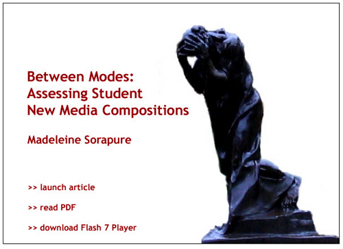
And I even got to inject some humor by putting on my opening page the tortured-looking burgher--shoulders bent, head in hands, exasperated--to visually evoke the experience which was the subject of my webtext: assessing student work.

Screenshot from opening page of "Between Modes"
Like other webtexts published in Kairos, the final version of "Between Modes" stands on its own. If it were an Inventio webtext, though, I would have had the opportunity to explain the process I describe above, and to include relevant materials such as the first draft, selected comments from reviewers, or additional information about the Computers and Writing Conference. Providing this behind-the-scenes look at the webtext would, I think, have helped me help readers understand it more thoroughly and would also have provided an opening to discuss the importance of interface and interactivity in new media scholarship.