Reading the Archives:
Ten Years on Nonlinear (Kairos)
History
| Home | Jim Kalmbach |
A Ten-Year Slice of Kairos
When I started to read the Kairos archives, I quickly became overwhelmed by the sheer volume of work that Kairos has produced over the decade. It is an achievement we should be careful not to underestimate. Journals that endure, endure for a reason. They are too much a labor of love for it to be otherwise.
I needed to find a way to get a handle on the scope of this work. I decided first to limit my examination to CoverWeb texts and Features and to also exclude the reports from town halls and other large collaborative pieces. I was interested in authors' conceptions of hypertext and how those conceptions changed. CoverWebs and Features were sections where I was confident that I could find such work.
Unfortunately, limiting my reading to Features and CoverWeb texts still left me with 231 webbed texts to review. To begin, I created a ten-year slice of Kairos using a random number generator to pick one webbed text from each year that Kairos has been published. I used a random number generator not for any statistical purpose, but to make sure that there was no hidden bias in the construction of the slice. (If you are not a regular reader of Kairos, and you passed on my random walk through the archives, you might want to pause for a moment to browse these webbed texts in order to get a feel of what reading Kairos for the last ten years has been like.)
Browsing this slice suggested several interesting insights that I discuss below. Ultimately, however, the slice analysis was not particularly satisfying beyond suggesting large trends as there proved to be no easy way to drill down from the big picture to more detailed information. Consequently, I completed two additional analyses which you will find in separate pages. First I read through the archive, attempting to identify all the different types of hypertext that I could find, and then I went through and counted how many times these types of hypertext appeared in Kairos' ten years.
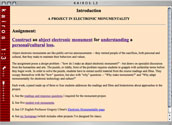
Mauer, Barry. (1996). A Project in Electronic Monumentality. Kairos 1.3 An interesting aspect of Mauer's webtext is that he builds his navigation around a sentence: "Construct an abject electronic monument for understanding a personal/cultural loss." Each word is a link to a different node in the hypertext.
|
|
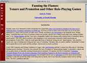
Walker, Janice R. (1997). Fanning the Flames: Tenure and Promotion and Other Role-Playing Games. Kairos 2.1. Walker's webtext is an example of "exploratory" hypertext, the rarest form and the hardest to execute effectively. Rather than providing a matrix, menu, or table of contents, readers are encouraged to click on links within the text and explore the webtext. Walker's webtext includes a number of interesting digressions. See if you can find Kiwi's toes. |
|
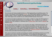
Anderson, Daniel. (1998). Hybrid://Literature/Cognition/Design. Kairos 3.2. Anderson uses an interesting variation of menu navigation. A drop down menu of links frame both bottom and top of the text. Although many of the articles in Kairos use graphics in sophisticated ways, this is the only webtext in the slice that uses visuals in the form of screen shots to support the argument. |
|
Gannon, Michelle Rogge. (1999). Creative Writing Steps Inside a Virtual Jar. Kairos 4.1. Rogge provides a matrix hypertext with the major links listed along the top and bottom of each page and includes extensive external linking. An interesting feature of this text is that the matrix of navigation links suggests a narrative structure: "Exposition and Foreshadowing," "Heart of the Story," and "Resolution." |
|
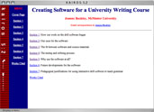
Buckley, Joanne. (2000). Technology and Literacy. Kairos 5.2. Buckley uses a frameset and a static menu to provide access to ten nodes of material. Although the frame and the initial table of contents create a strongly different visual from the other texts in this slice, the individual nodes are fairly plain and linear. Thus the text is less of a break from past work than it may appear at first glance. |
|
Mullen, Laurie; Bauer, Bill; & Newbold, Web. (2000). Developing a University-Wide Electronic Portfolio System for Teacher Education. Kairos 6.2. This webbed text consists of a single linear collaborative argument that includes links to three additional texts (authored by the three collaborators) discussing different forms of the electronic portfolio. The result is that this piece is both a single linear essay and a larger webbed text that exists in the juxtaposition between the four pieces. |
|
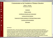
Brooks, Robert F. (2001). Communication as the Foundation of Distance Education. Kairos 7.2. Brooks' text is a single linear page with anchor links to the major sections after the title. This webtext, more than any other in the slice, relies on the metaphor of a seminar paper for its visual construction.
|
|
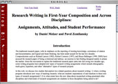
Melzer, Danie, & Zemliansky, Pavel. (2003). Research Writing in First-Year Composition and Across Disciplines: Assignments, Attitudes, and Student Performance. Kairos 8.1. This is a matrix hypertext with links along the top and four major pages. The text includes a number of digressive links to supplementary material within the major pages. |
|
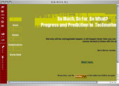
Whipple, Bob Jr., & Dornsife, Robert Jr. (2004). So Much, So Far, So What? Progress and Prediction in Technorhetoric. Kairos 9.1. Whipple and Dornsife present a menued hypertext with submenus built out of layers. The site was built with NetObject Fusion. It has a more sophisticated look than the other hypertexts in this slice, a look that is part of a major shift in the ethos of Kairos texts. |
|
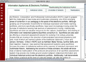
Ellertson, Anthony. (2005). Information Appliances and Electronic Portfolios: Rearticulating the Institutional Author. Kairos 10.1 The only text in this slice to incorporate video, Ellertson's piece uses Flash elements and a tabbed matrix structure. This is an extremely interesting hypertext in the way it combines media elements, Flash, and traditional hypertext organizational structures to reflect on digital portfolios. The videos are not part of the argument of the webtext. They instead serve as sidebars, supplementing the main argument. |
What Does this Slice Reveal or Hide?
On first skimming the reduced screen shots of the ten sample texts,
I was struck by how visually similar they appeared to be—many looked as
if they could have been submitted to a graduate seminar (Ball, 2004, develops
this argument about the dependence of online scholarship on print forms in
considerably more detail). Anderson pushes the visuals of the Kairos webtext
by adding graphic headers and a menu, as does Bowie with her frame and long
menu of topics, but in this particular slice, the first really strong break
from the metaphor of the seminar page is Whipple and Dornsife in 2004. (![]() )
)
This observation shows both the strength and the weakness of a slice analysis. Not all Kairos texts look like seminar papers on steroids. Indeed, the very first webtext in the very first issue of Kairos, Stuart Blythe's "Why owls? Value, risk, and evolution" looks nothing like an 8-1/2 x 11-inch page. It uses a graphic header, short, Storyspace-like pages of text, and a table-of-contents organizational structure that forces readers to keep looping back to the table of contents to find their way. Throughout Kairos' history, there have been many webtexts that included sophisticated designs, strong visuals, and other media elements; and these texts are the ones that I tend to remember (such as any of Anne Wysocki's, Madeleine Sorapure's or Joseph Squier's elegant hypertexts). All the plain pages recede in memory. Thus this slice analysis captures an important insight (and one that I don't particularly want to remember): Texts that remediate (and hypermediate) the seminar paper, without moving much beyond its visual boundaries, dominate the early volumes of Kairos.
The second thing this slice shows us, however, is that underneath the visual similarities of these texts is an amazing amount of diversity and creativity. Every single one of these webtexts uses slightly different visual and hypertextual strategies, representing most of the form of hypertext that I discuss in the next section (it lacks only the relatively rare forms of multi-windowed and timeline hypertexts). Starting with Mauer's use of a sentence to embed his navigation, Anderson's complex use of frames and drop-down menus, Janice Walker's exploratory structure and inclusion of an animated graphic of her toes, Whipple and Dornsife's use of show/hide layers to create complex submenus, and Ellertson's use of Flash and video examples, Kairos authors may remediate print articles but they are doing so in many subtle, fascinating, and creative ways. They are finding new hypertextual techniques, new software, and increasingly sophisticated graphical elements. As I discussed in the previous section on editorial policies, putting authors in charge of the appearance and hypertextual structure of their pieces created a space that has encouraged experimentation and diversity. Although many of Kairos' early authors may have resisted this space and relied on design metaphors from the seminar paper, many others embraced the opportunity.
If you want to learn more about the different types of hypertext I alluded to in the last paragraph, continue to the next section and my analysis of the types of hypertexts that have appeared in Kairos. You can also jump directly to a section where I count these types of webtexts across ten years, but the discussion won't be of much value if you do not understand the categories. Finally, you can always return to the home page.
