Tenth Anniversary Issue Logo Contest Submissions
To promote the tenth anniversary issue early this year, we called for submissions to a logo contest. Below are some of the wonderful entries we received. We asked the designers to provide some explanation behind their creations. We hope you enjoy seeing the range of texts that were submitted.
Tracy Bridgeford: The contest winner
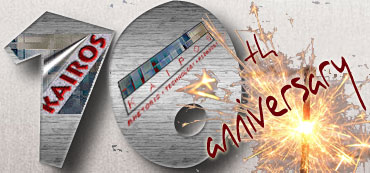
Designing this logo was something I was just doing for fun. I usually can't design anything unless I see it in my head first. When I saw the call for this cover web art, I immediately looked for the materials associated with a tenth anniversary. Traditionally, the material is tin or aluminum, but the more modern materials is diamond. I decided to go with the traditional perspective because I could immediately picture the finished product as you see it. I decided to go with the traditional perspective because I could not "see" the modern diamond in any way that didn't involve the capitalistic expense of a wedding. So, I opened Photoshop and filled a background, applying the "brushed metal" style because it looks like aluminum. I then chose a font that reminded me of someone with good penmanship writing on the side of a cup like that found at an anniversary party. The design of the block style 1 and 0 grew out of an article I just read in Photoshop User that provided instructions for pasting into objects. I search dafont.com for a font that looked like the block style I imagined. At the same time, I was working on my webtext for this anniversary issue and was thinking about the logos used by Kairos during the past ten years. So, I pasted each logo into one of the numbers. As for the sparkler choice, I searched istock.com until I found the sparkler I already saw in my head. This picture worked well not only because it fit my efforts, but also because I don't know Photoshop extremely well, and the sparkler was set against a grey background, which would be easy to capture and delete. When I pasted the sparkler over the numbers, I could practically hear the sparks singe the tin. That's when I knew I was done designing.
Elizabeth Barton
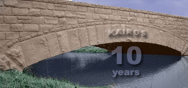
The image of a bridge seemed appropriate for the anniversary theme. I used Adobe Photoshop to desaturate the entire image & add soft layers of color throughout for a clean, muted look. I then incorporated the Kairos logo into the brickwork & the other text into the water using text warping tools, layer opacity settings, & shadow effects.
Grace Bernhardt
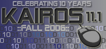
These logos feature a pattern of 1s and 0s as well as the computer mouse to reflect the journal's focus on technology. The adjacent 1s and 0s are highlighted to emphasize the journal's 10 year anniversary. The font chosen is futuristic, looking forward to another 10 years of scholarship in the field.
This logo highlights the journal's ten year history and its focus on rhetoric, technology, and pedagogy. The triangles in the background reflect The Rhetorical Triangle and Aristotle's three appeals. A futuristic font gives the logo a modern feel.
Carla Beard
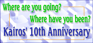
A tenth anniversary calls for reflection and prediction, and I wanted to include those concepts in the design, along with recognition of the digital focus. Flannery O'Conner's short story title seemed to ask the right questions. Fonts and color were selected to emphasize an upbeat feel for the celebration. Congratulations to everyone who has helped make Kairos a success!
Drew Ross
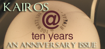
The design took its inspiration from the idea of enlightenment and its embodiment, the light bulb. The image was one I took with an ultra-fast shutter speed, and the text was added in in Photoshop. I prefer very clean, uncluttered design, and this logo reflects my aesthetic well, I think.
CJ Jeney
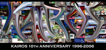
It's been a long time since I did graphic design on a regular basis. When the call went out from Kairos, my first thought was "Do research! Download the previous logos!" I was always a pallette-swisher, more of a colorist and renderer than a sketcher, and the colors were so pretty as I arranged the logos together, I couldn't resist jumping in and swirling them around. Next thing I knew, I was spelling "Kairos" with some Photoshop tools, finger-paint style, because it's one of my favorite words. Kairos. Swirling colors. Celebrating a decade of launching us headfirst into the technological future with eyes wide open. I'm honored to be included in the celebration!
Janine Solberg
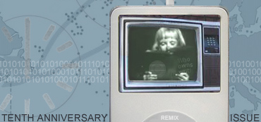
In thinking about how to best (visually) represent an issue of Kairos that explores both the history and the future of the journal, I was immediately confronted with the difficulty of representing (in a 370 x 173 pixel space) the topical breadth and technological change the journal has already witnessed, not to mention hinting at the changes yet to come. So, rather than cast an eye forward or back in time, I chose to focus on our current moment—because where we are now, in 2006, is both a product of what has come before, and a platform for what may follow. Where are we now? What are our priorities? What challenges do we face? Reflecting on such questions seems in keeping with the notion of kairos as "suggest[ing] an advantageous time" (Crowley and Hawhee 37) for action and thinking about what those actions might be in our current moment. This image is an attempt to visually gesture toward some of these questions, and the dialogue surrounding them. I chose the iPod as a dominant element in the logo because I think it symbolizes our current moment fairly well—a moment of sampling and remix, of audio and video, of portability and personalization. It also points to some of the challenges and big questions we face as teachers and scholars of writing and technology: questions about what it means to write, questions about multimodal composition (how to teach it, how to assess it, how to build infrastructures to support it), and questions about customization and community. And that’s just for starters.
Read more about Janine's design process on her website.
Gina Maranto
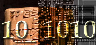
I've been doing collages since I could wield a rubber cement brush, and doing them with Photoshop ever since I got a copy. Longevity, the digital medium, and the roots of rhetoric were three notions that came to mind when I saw the call for entries for the Kairos anniversary logo, so I hunted for images that might embody those. At first, for obvious reasons, I looked for Greek or Roman inscriptions, but then, as I was gathering images of circuit boards, the visual echoes with cuneiform hit me, so those two got paired. Since it was the 10th anniversary, the binary digits worked. Finally, I opted for symbol over legend, and decided against adding any additional text.