CHAPTER 2.3
Visual Exploration
Finding ways of showing
In this chapter, we present our experiments towards visualizing GPS. We give a chronological account of our experiments, the successes and failures, and their iterations. Here we shift from the technical, material explorations presented in the previous chapter towards exploring the communication of GPS.
Light, Photography, and the Invisible
In our Immaterials project we have been using light and photography to show how invisible technological systems inhabit everyday city life. To do this, we have been drawing on a long history of experimental photography.
The technique of light painting has been used for a century to show unseen phenomena such as movement and time (Price, 1989). Light painting is a technique where a moving light source is captured by a stationary camera with a long exposure time. The movement of the light is captured as traces within the photographed scene. Light painting is a pragmatic technique for capturing unseen phenomena in context, but it is also magical and spectacular in its visual qualities.
Light Painting
Frank and Lillian Gilbreth (1914)
One of the first known light paintings: an image of a worker stacking boxes, the lines of movement created by lights attached to his hands. The creators, Frank and Lillian Gilbreth, were management consultants developing ways to increase employee output and working toward “work simplification.”
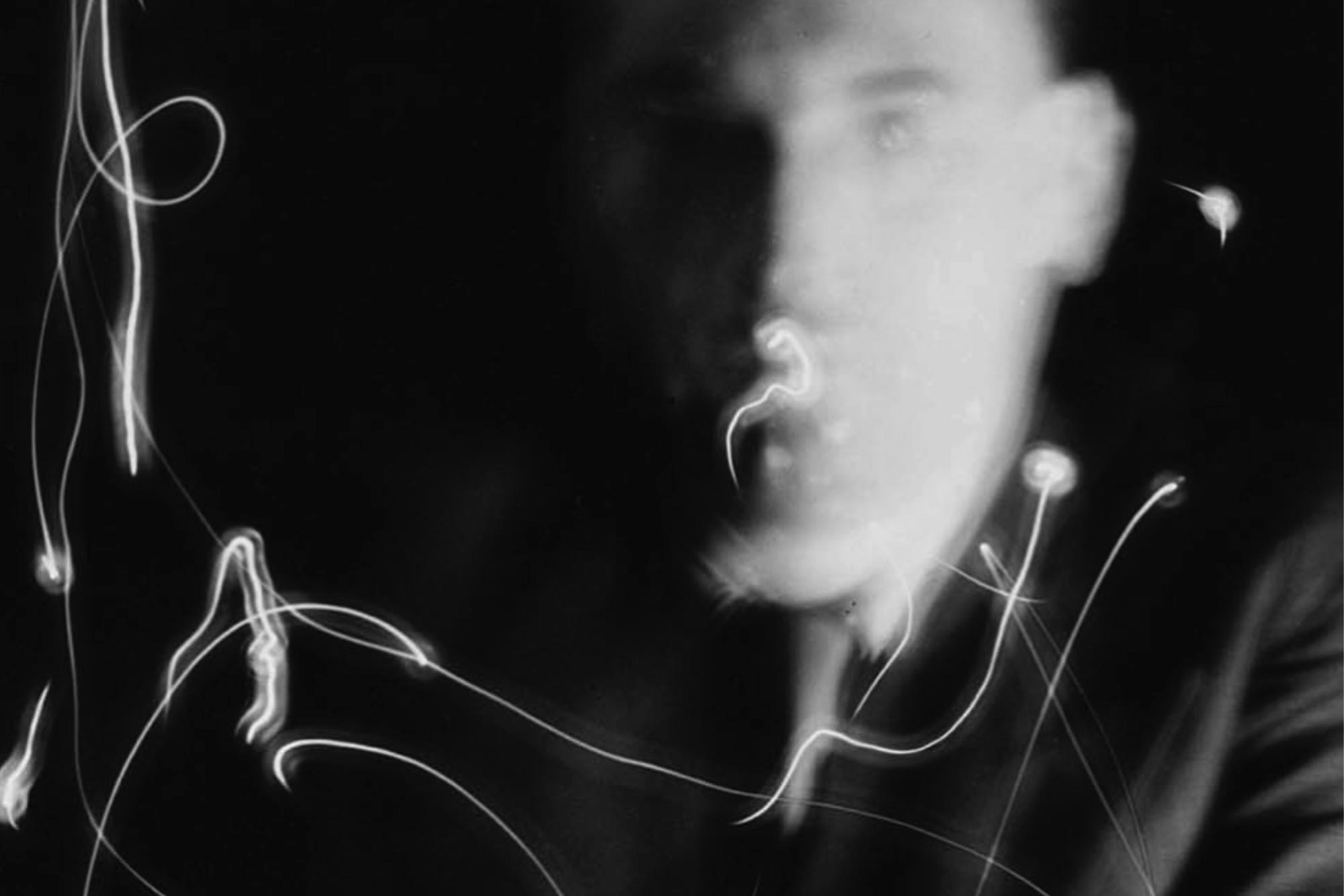
Man Ray (1935)
Man Ray's Space Writings were explorations of photography and light painting: manipulating the photographic image in painterly ways.
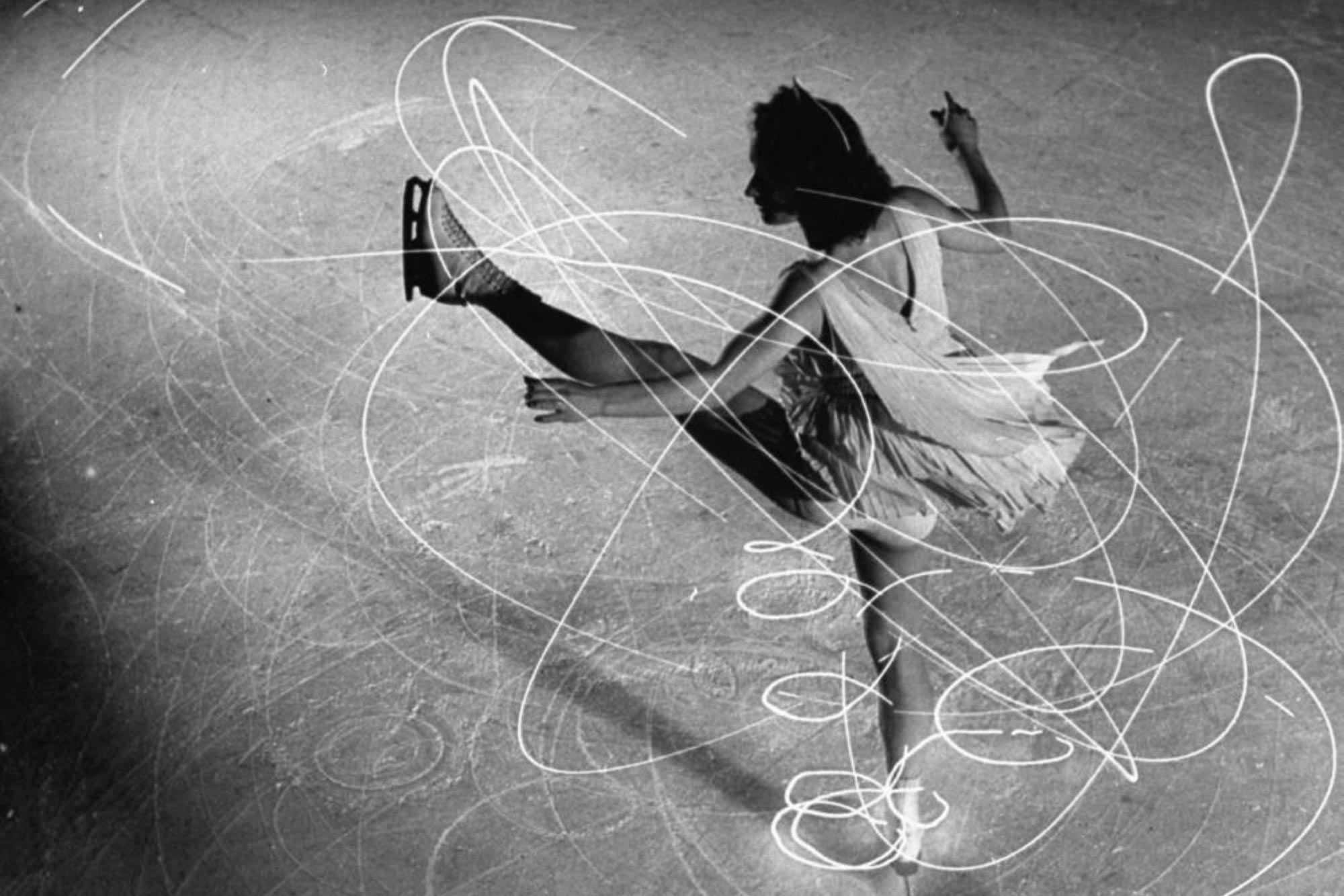
Gjon Mili (~1930)
Gjon Mili worked for LIFE magazine and was fascinated by capturing the movement of artists. He often worked with strobes to freeze motion, but he also worked with lights attached to people, particularly with figure skater Carol Lynne.
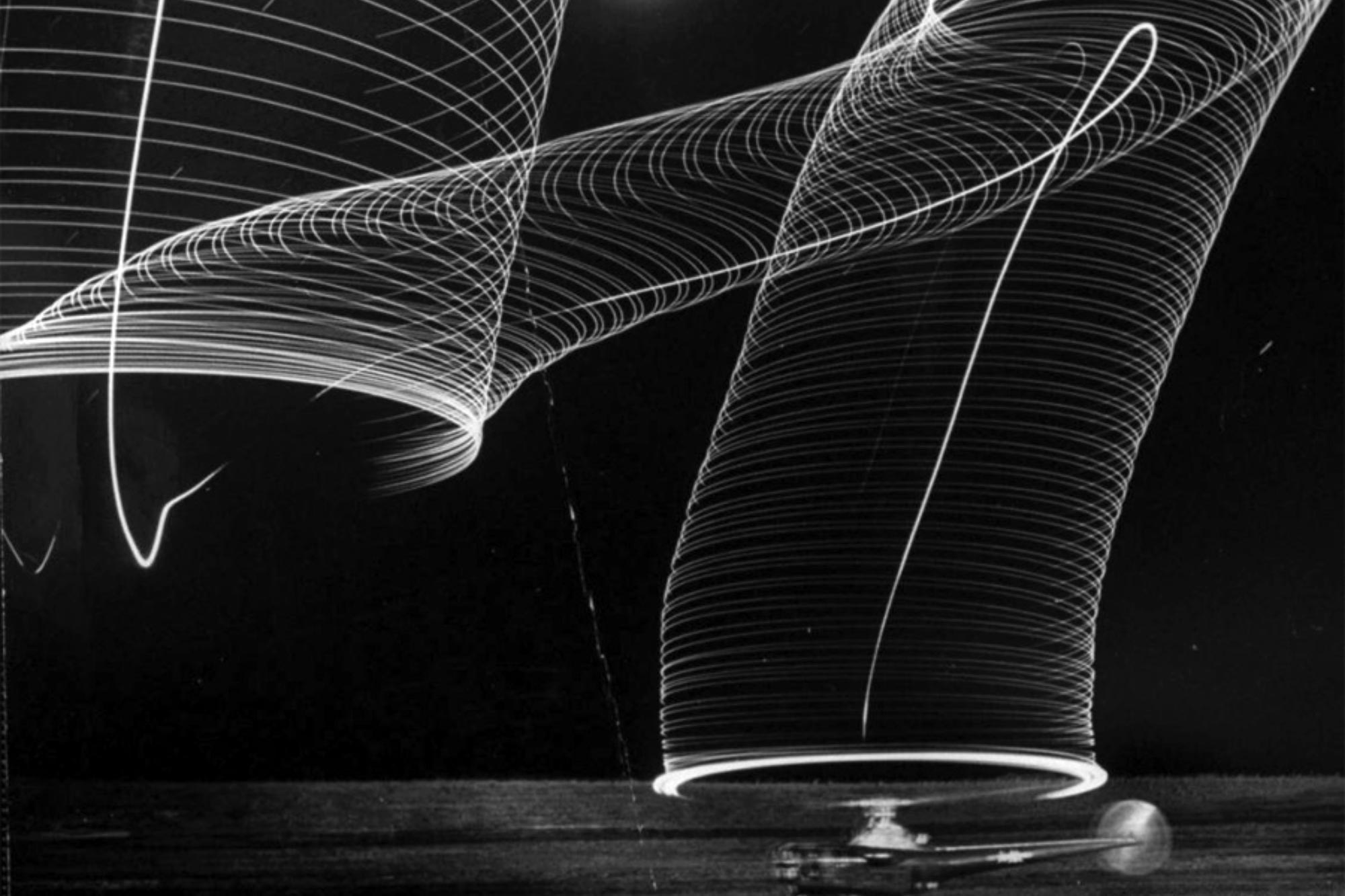
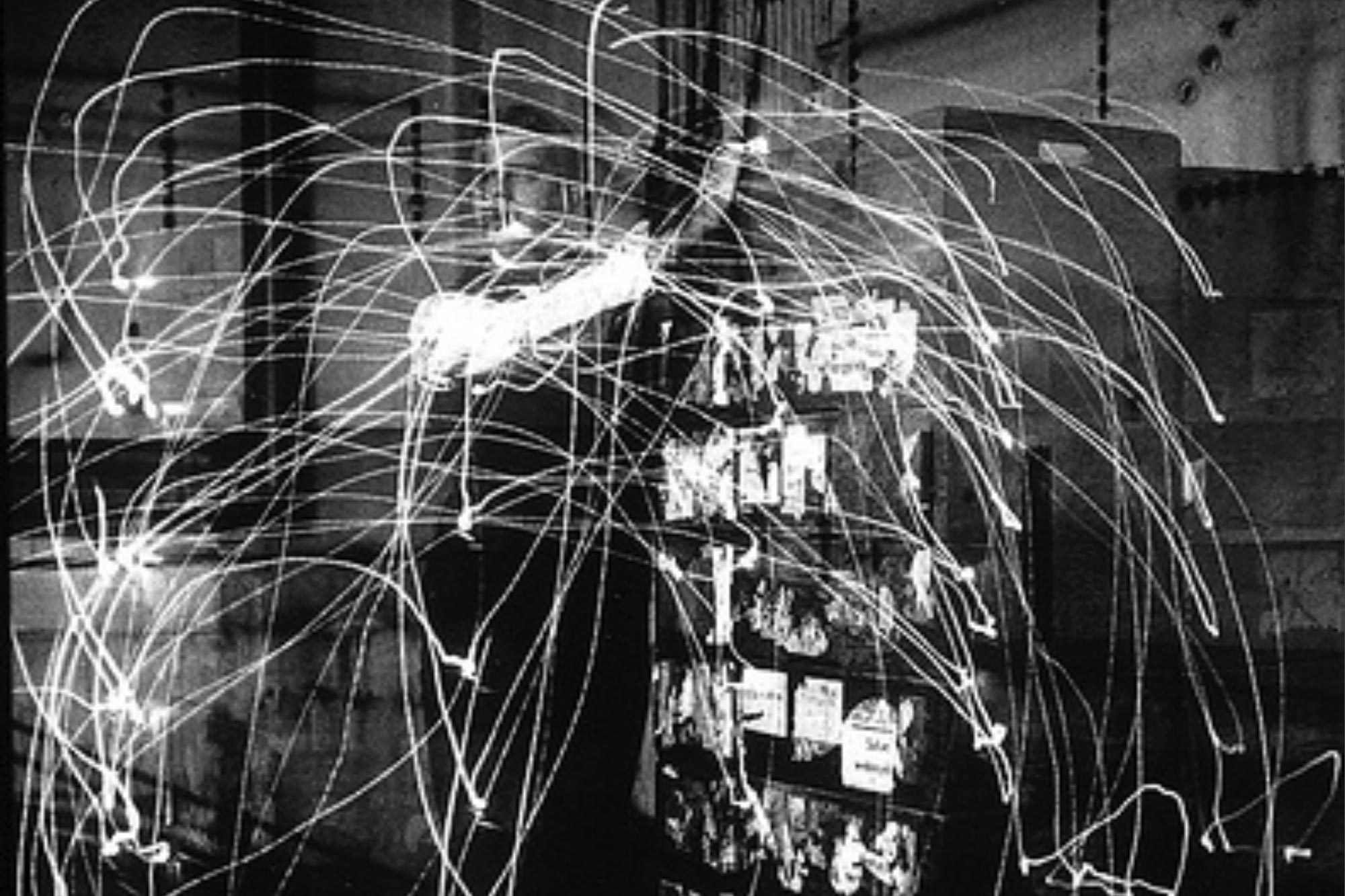
Andreas Feininger (1949)
Another LIFE photojournalist, Andreas Feininger worked as a documentary and science photographer and was famous for capturing natural and scientific phenomena in images. He used light painting to reveal new aspects of new technical objects and environments. Shown here is an image of a helicopter taking off.
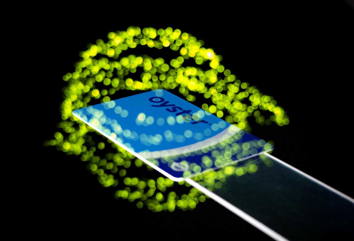
RFID Lightpainting (2009)
In our early work on visualizing RFID, we developed a light painting technique specifically for showing the readable volume of RFID tags (Arnall & Martinussen, 2010).
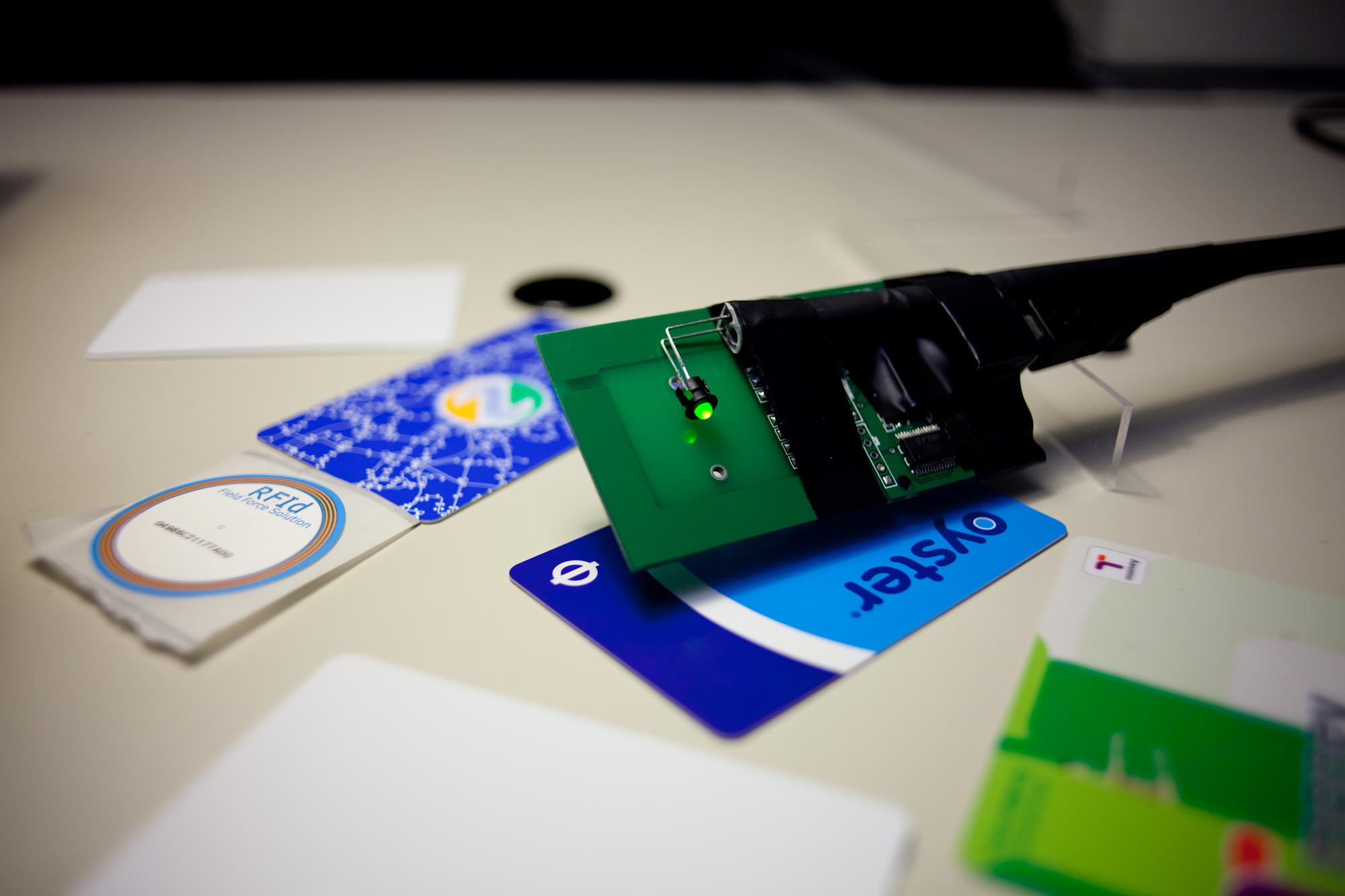
RFID Probe
This is the instrument developed for light painting RFID. The probe consists of an RFID reader and LED that blinks when a tag is detected. By prodding a Transport of London Oyster RFID travel card with this probe we visualized the edges of its readable volume as dots of light.
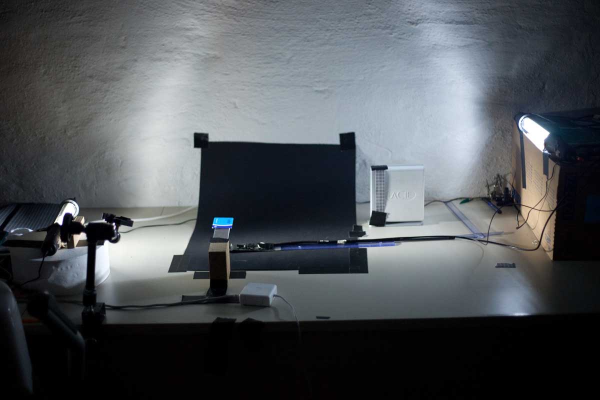
RFID Lightpainting Studio
To perform the lightpainting we set up a small studio with controlled lighting and a locked-position camera. We then spent weeks in this darkened room experimenting with using our RFID probes to get insight into the field shapes of various readers and tags.
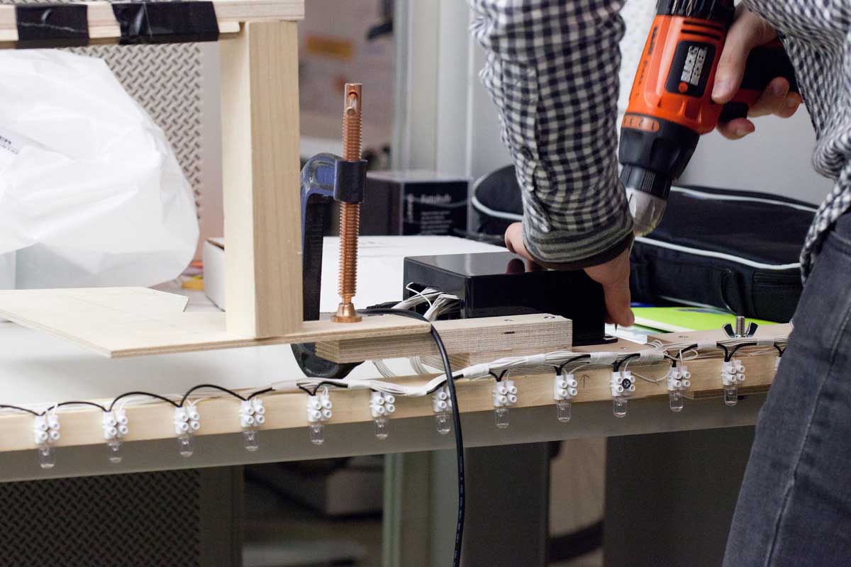
Building a Rod of Lights (2011)
The WiFi measuring rod was built using tools and techniques from interaction and product design, such as electronics, lighting design, and carpentry.
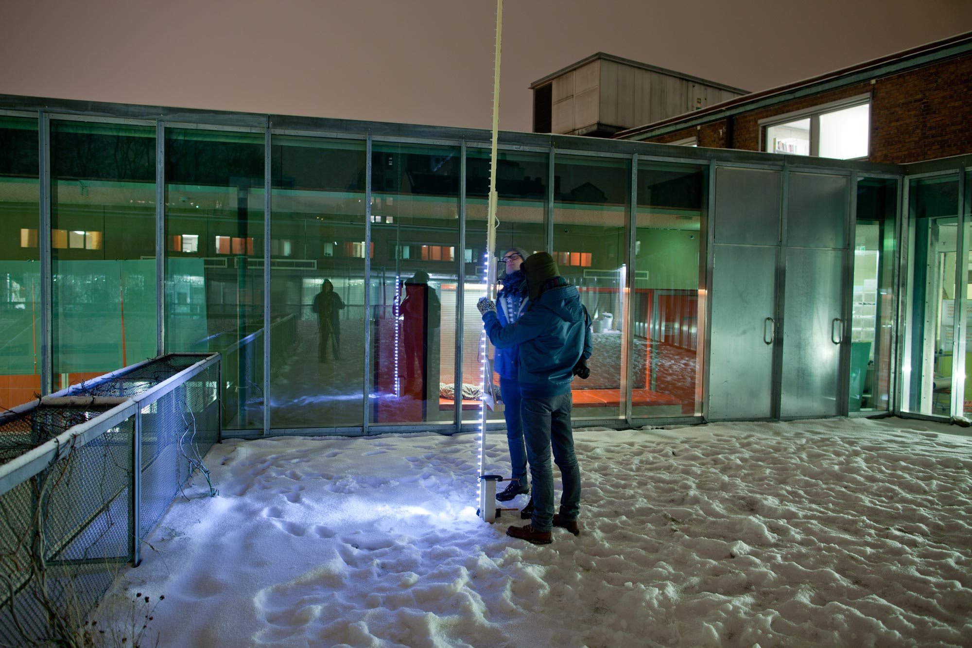
Urban Photography
The wifi light painting project took us into the city, giving us a sense of how WiFi is shaped by various urban environments (Martinussen, 2012).
Our approach of using light painting for showing invisible technologies involved a combination of photographic techniques and designing specialized tools and instruments. This process of building tools for turning data into photographs consisted of both an instrumental aspect, the capturing and showing of data, and an aesthetic exploration toward designing a visual language that is both communicative and expressive (Martinussen, 2012).
Building GPS Instruments
The experiences from our two first projects visualizing RFID and WiFi informed our initial ideas for visualizing GPS. Initially, we wanted to extend these techniques and visual languages to forms that were appropriate to the scale and materiality of GPS.
Our first challenge was finding ways of turning the material explorations, discussed in the previous chapter, into something we could explore in photographic form. As stated in the brief, we wanted to show how GPS takes place in everyday urban spaces—how the urban environment shapes and influences GPS accuracy. The question then became: What are the specific requirements for building an instrument for showing GPS?
GPS operates at a vastly larger scale than RFID and WiFi. In principle, the system covers all outdoor spaces. If we were going to map GPS, we needed to look at the urban landscape, and design tools and rigs that would allow us to experiment at that scale. Our first instruments attempted to address the issues of scale by light painting a representation of GPS accuracy onto the urban terrain. Based on our initial speculations about GPS shadows, we wanted to draw out the differences in accuracy as a carpet of light along the ground.
A Combine Harvester of GPS
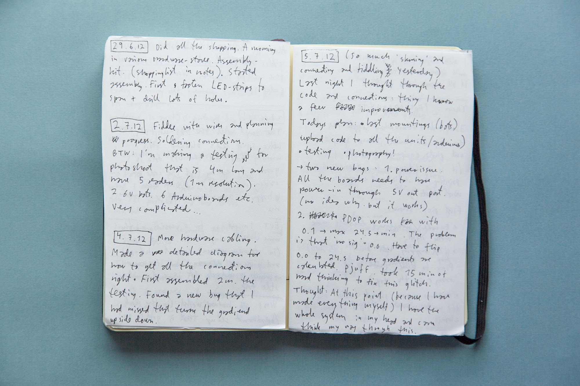
Notebook (2012, June 6)
“To show GPS horizontally over the ground it covers. Cover the ground with GPS shadows.”
A horizontal Light Painting Rig
Our first decision was to make a horizontal light painting rig that would go along the ground on wheels and have multiple GPS receivers along its length. When moved across urban spaces it would hopefully allow us to draw out spatial GPS variations.
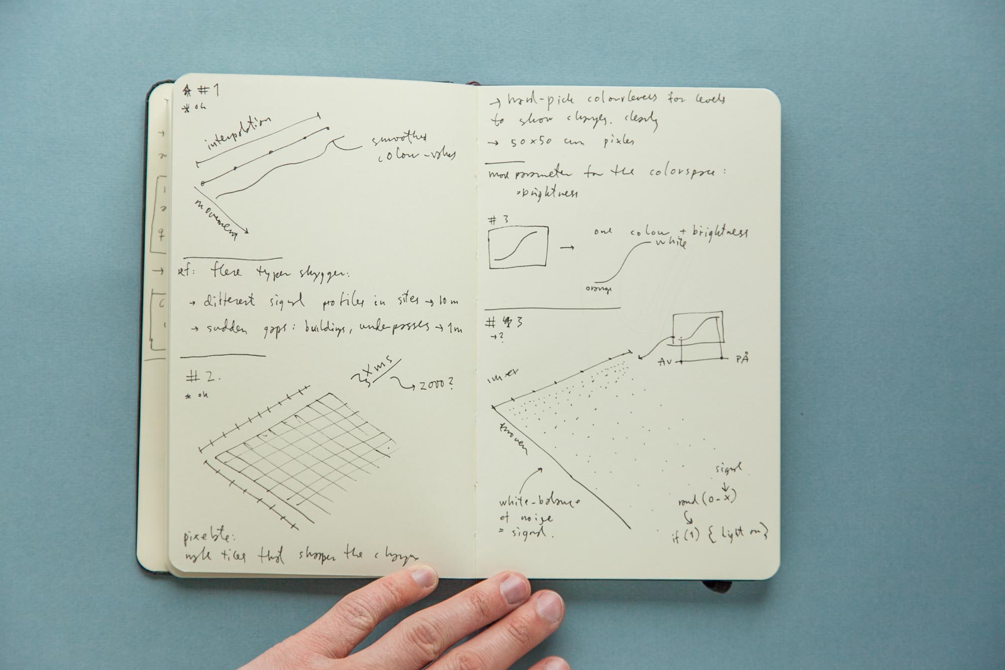
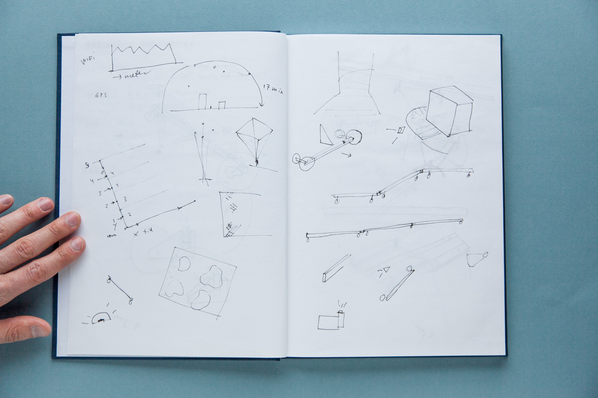
A Spatial Matrix
A long horizontal rig that could be moved along the ground would make it possible to create a spatial matrix of GPS readings. Our early concepts revolved around different ways of using this grid to create visualizations using the spatial resolution of a horizontal rig: “density of stripes, crosshatching, symbols, colors. Each with their own pros and cons” (Notebook, 2012).
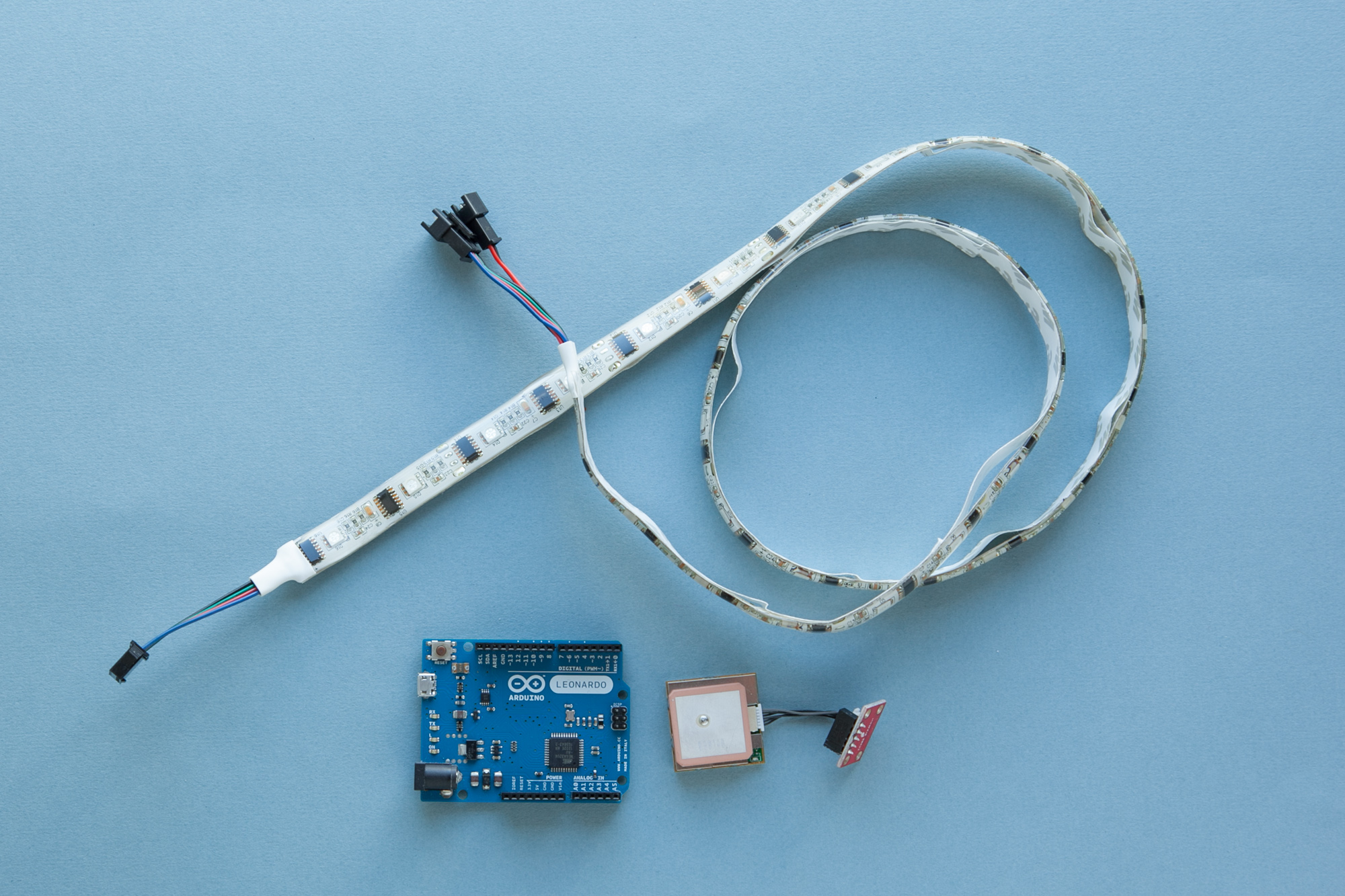
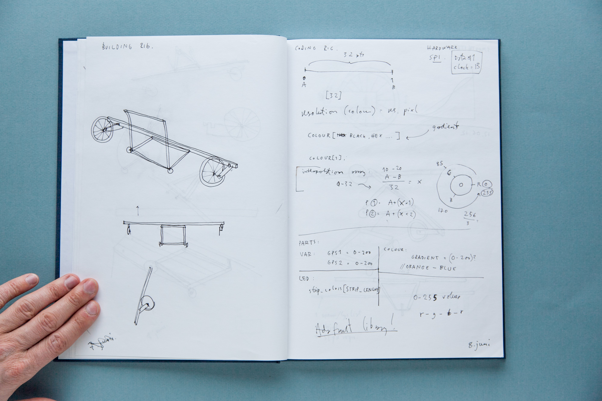
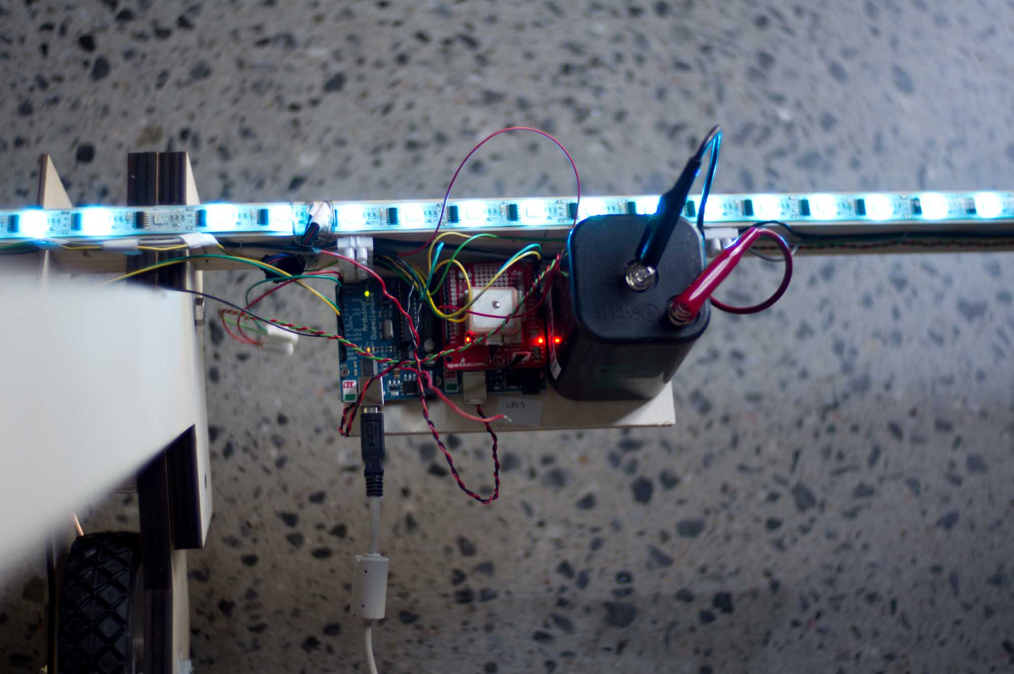
Hardware Parts
The electronics we chose to build the rig around were the Arduino microcontroller and the GPS receiver shown in the previous chapter. These would allow us to get GPS data. For output we worked with strips of RGB LED lights with individually controllable points of light. These forms of LED strips became available for this kind of use in 2011, and in these we saw “a great potential for light painting” (Notebook, 2012).
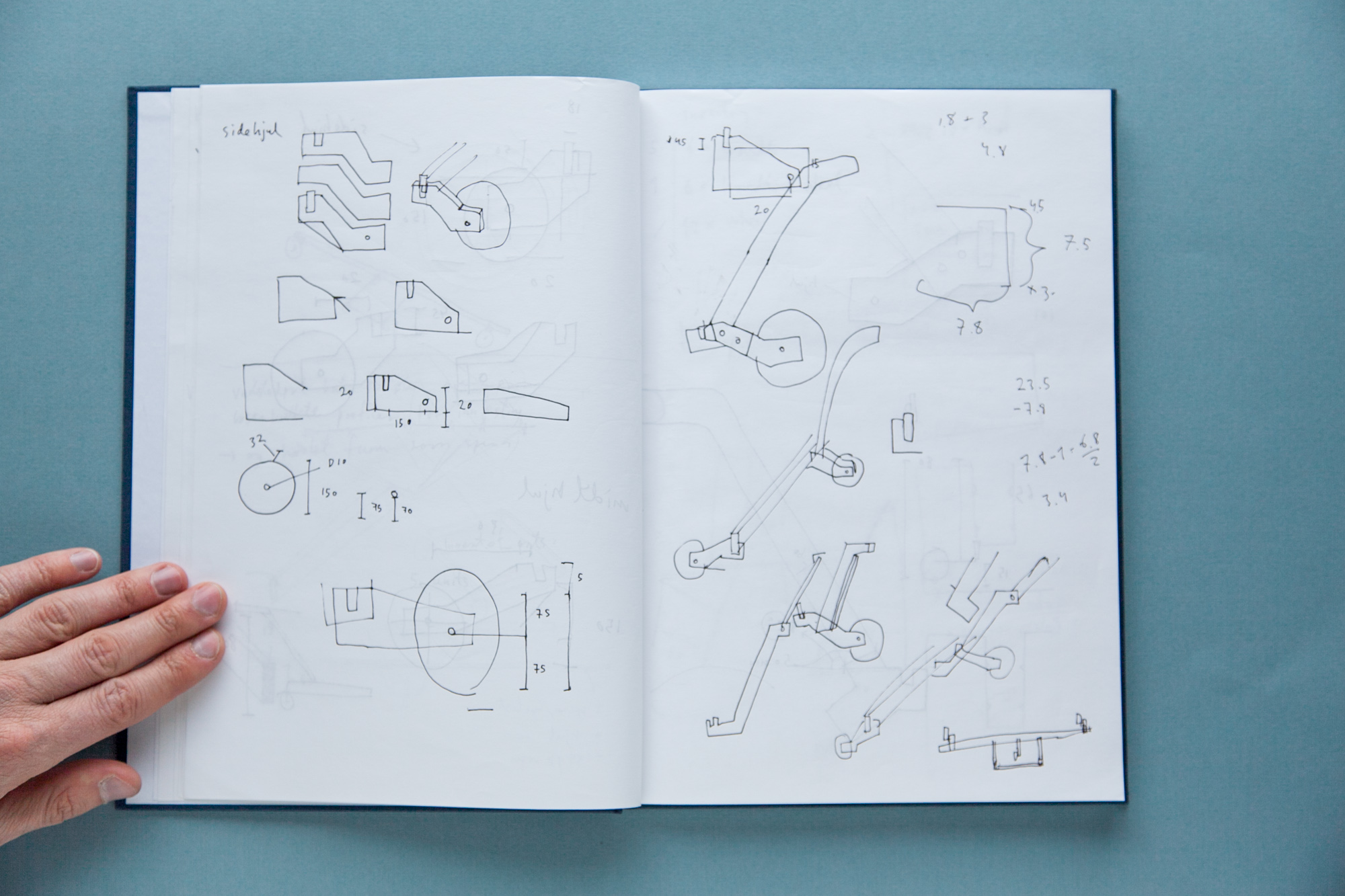
Construction Sketches
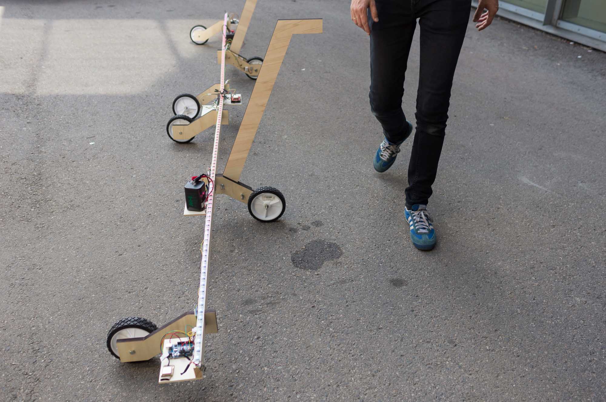
The electronics would be fitted to long wooden sticks on wheels. These would need brackets, fittings, and handles to be pushed smoothly along the ground. We planned to make several units two meters long, and connect these together to make a rig that could be up to 12 meters wide. This would allow us to make small mappings of sidewalks, as well as vast mappings of open spaces such as car parks.
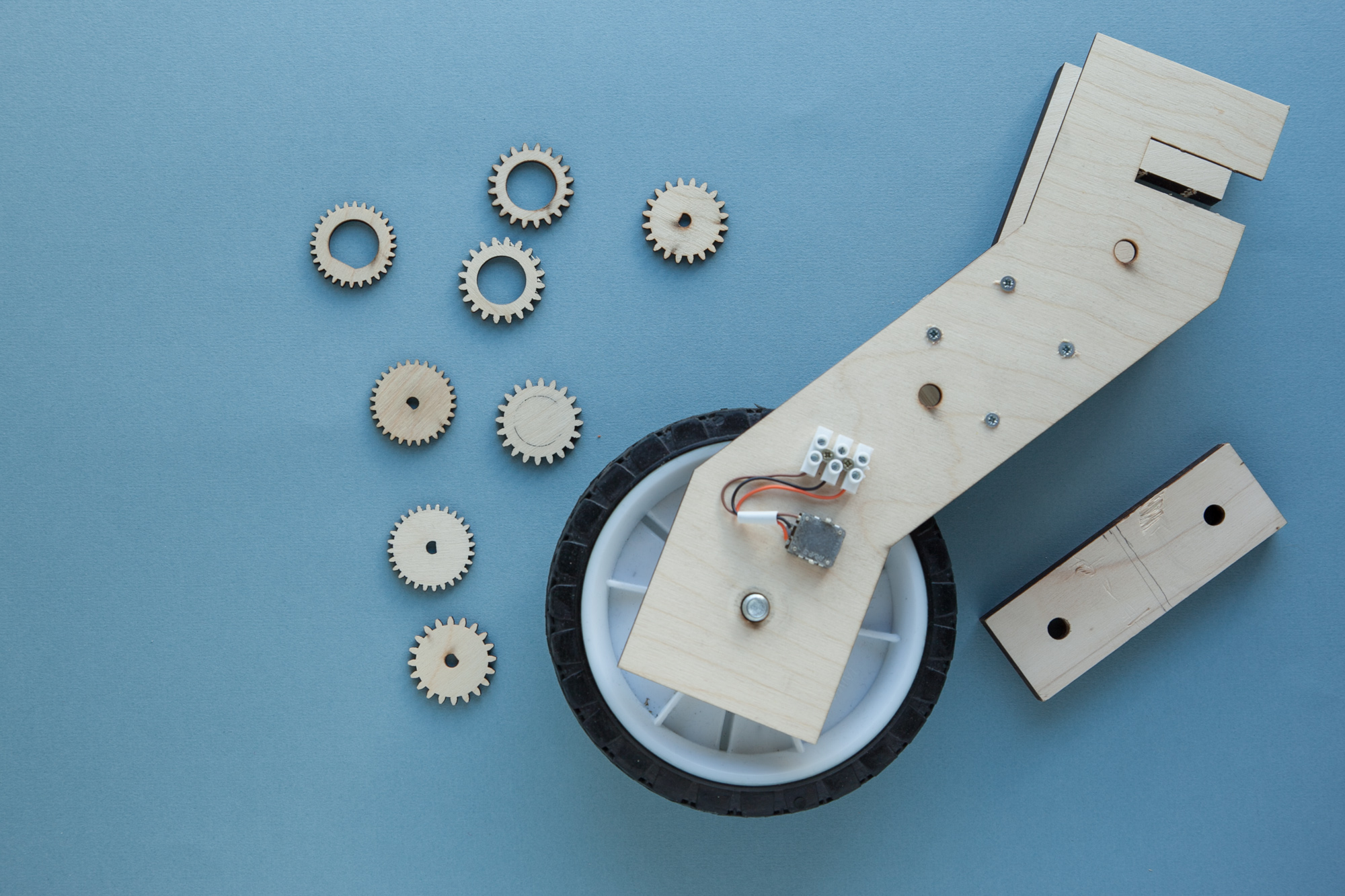
Wheels and Gears
One dimension of the spatial matrix would be created by the length of the rig and individual GPS units. The other, we speculated, could be determined by measuring the movement of the wheels when the rig was pushed. This required implementing gears and sensors. In the end, this turned out to be unreliable and useless.
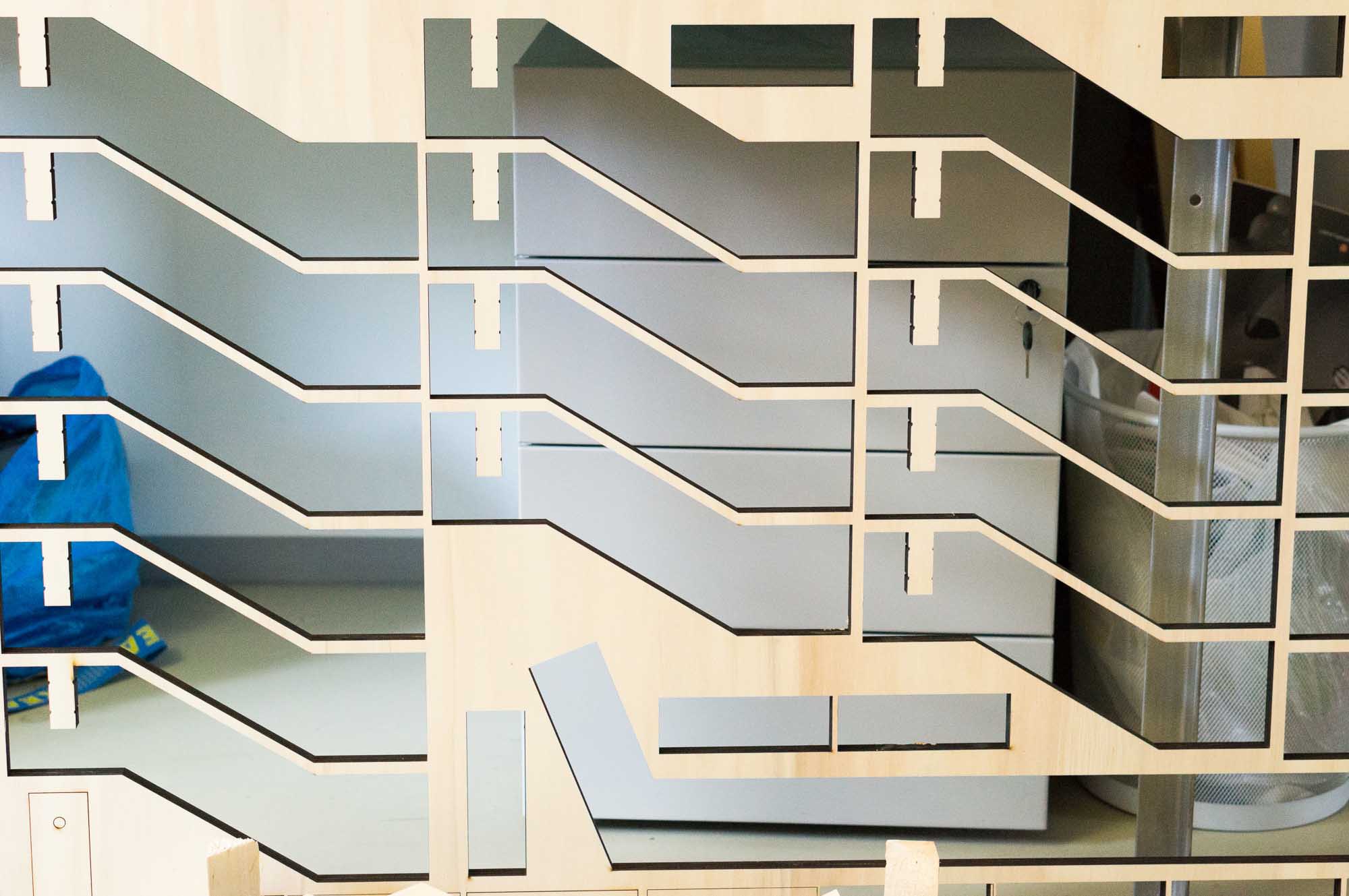
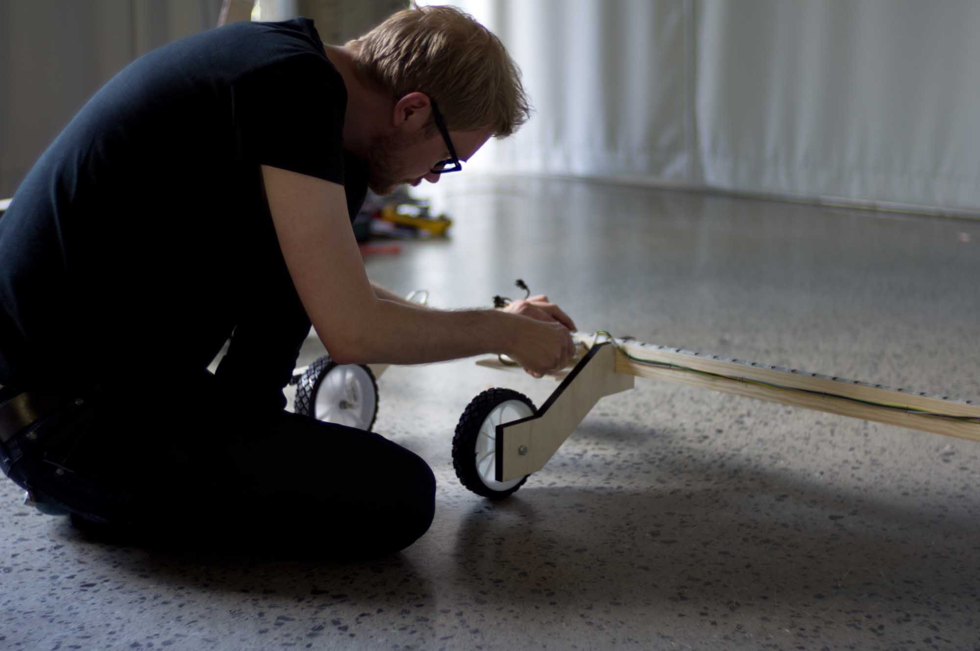
Laser Cutting
All the brackets, fittings, and handles were made using laser cut plywood. This made it possible to quickly make many identical parts that could be assembled as modules.
Collapsable
When designing the laser cut parts of the rig, it was also important for us to make it collapsible, so as to be easily transported and assembled in the field.
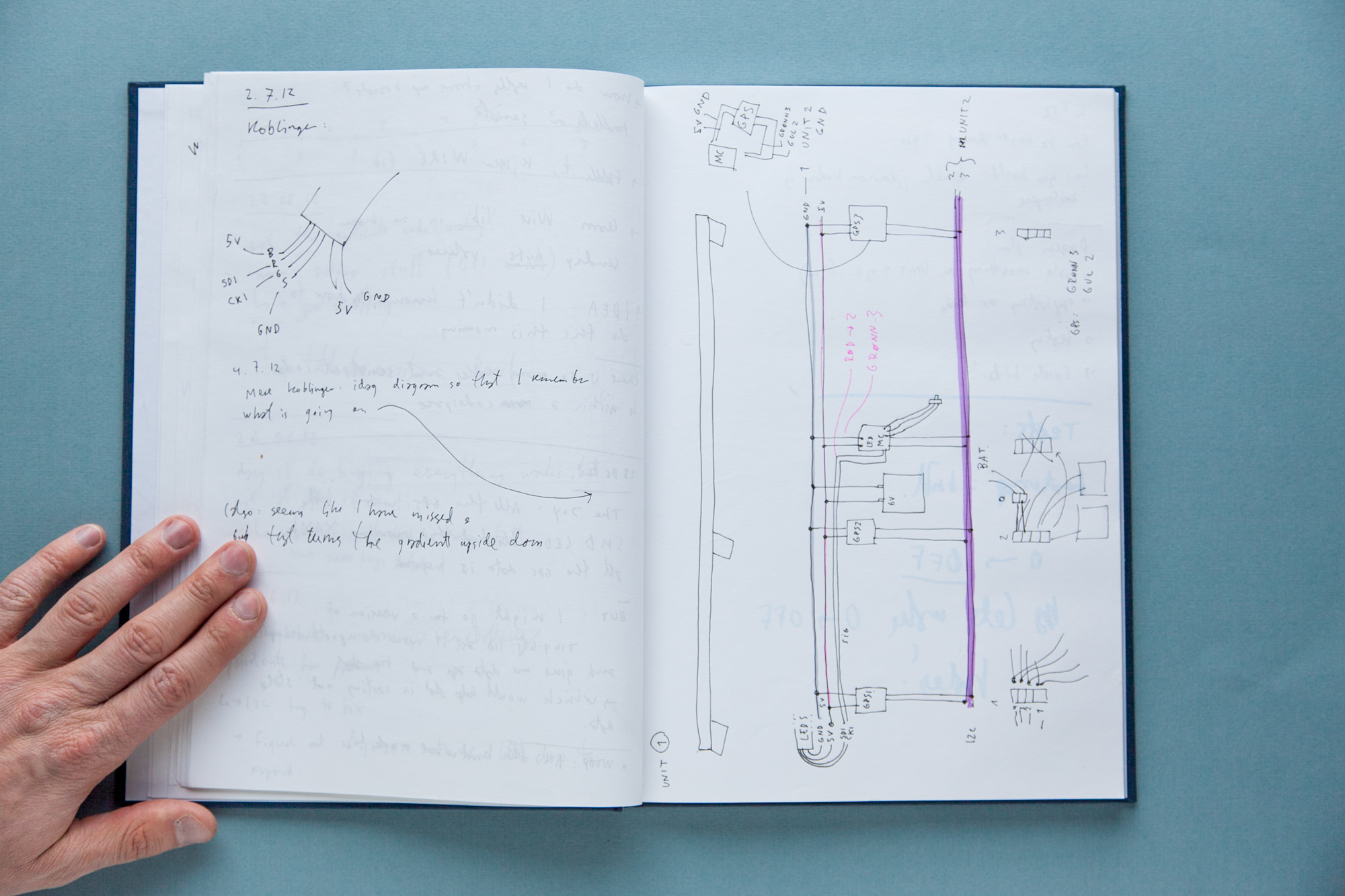
Assembly
This is the diagram for assembling the final electronics of the rig. This was a time-consuming process, prone to error, and required good debugging habits.
Programming
With the rig up and running, we started writing software for translating GPS accuracy into various forms of spatial visualizations. The modular and adaptable layout of the rig allowed us to test many different forms.
Testing
An important consideration for a mobile rig was to balance the opposing parameters of light intensity and battery life. We had to put a lot of effort into designing and sourcing power solutions.
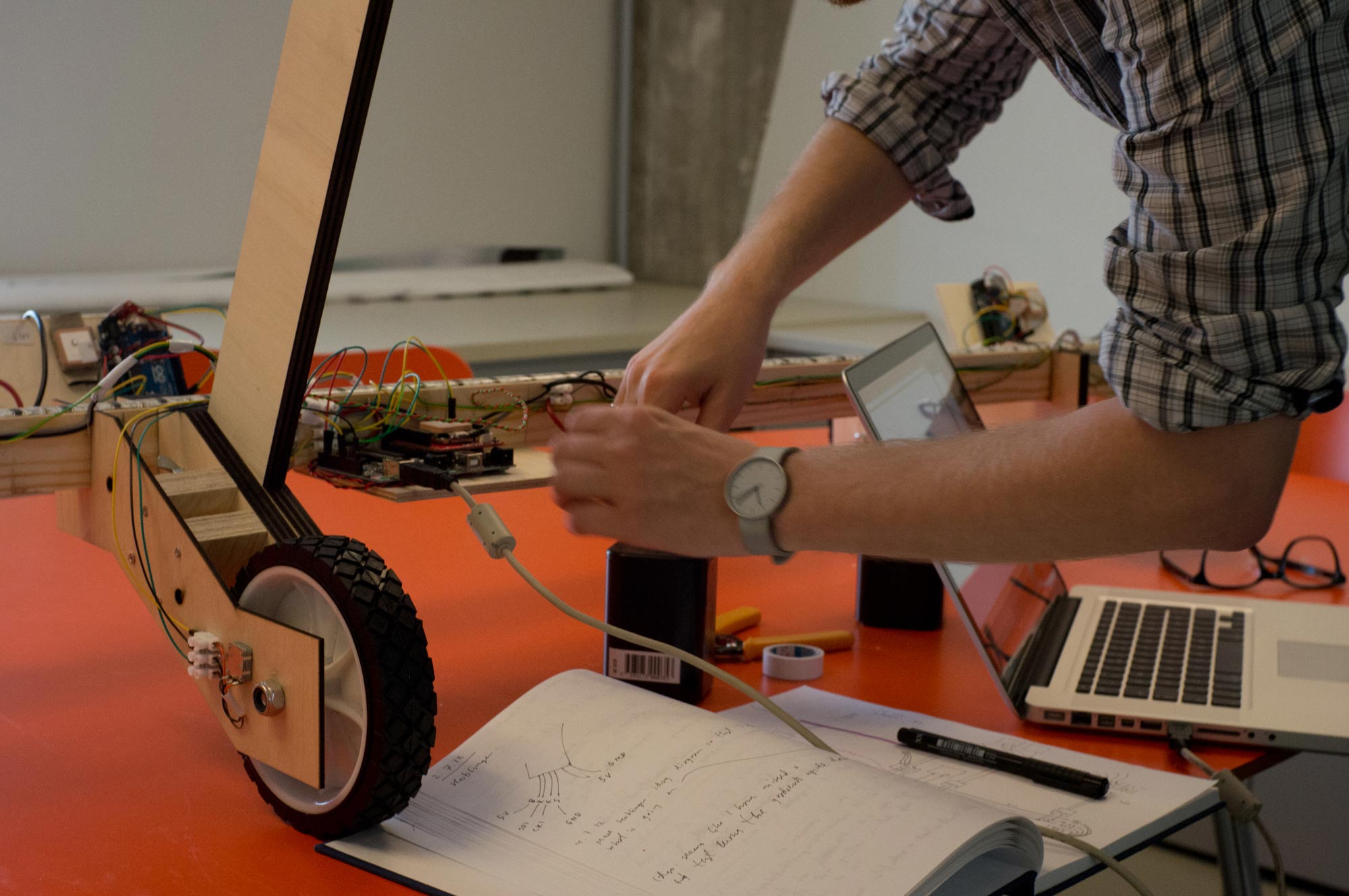
Adjustments
Prototyping with electronics requires lots of adjustments, which in our case was further complicated by a relatively complex, long, transportable, and modular rig on wheels.
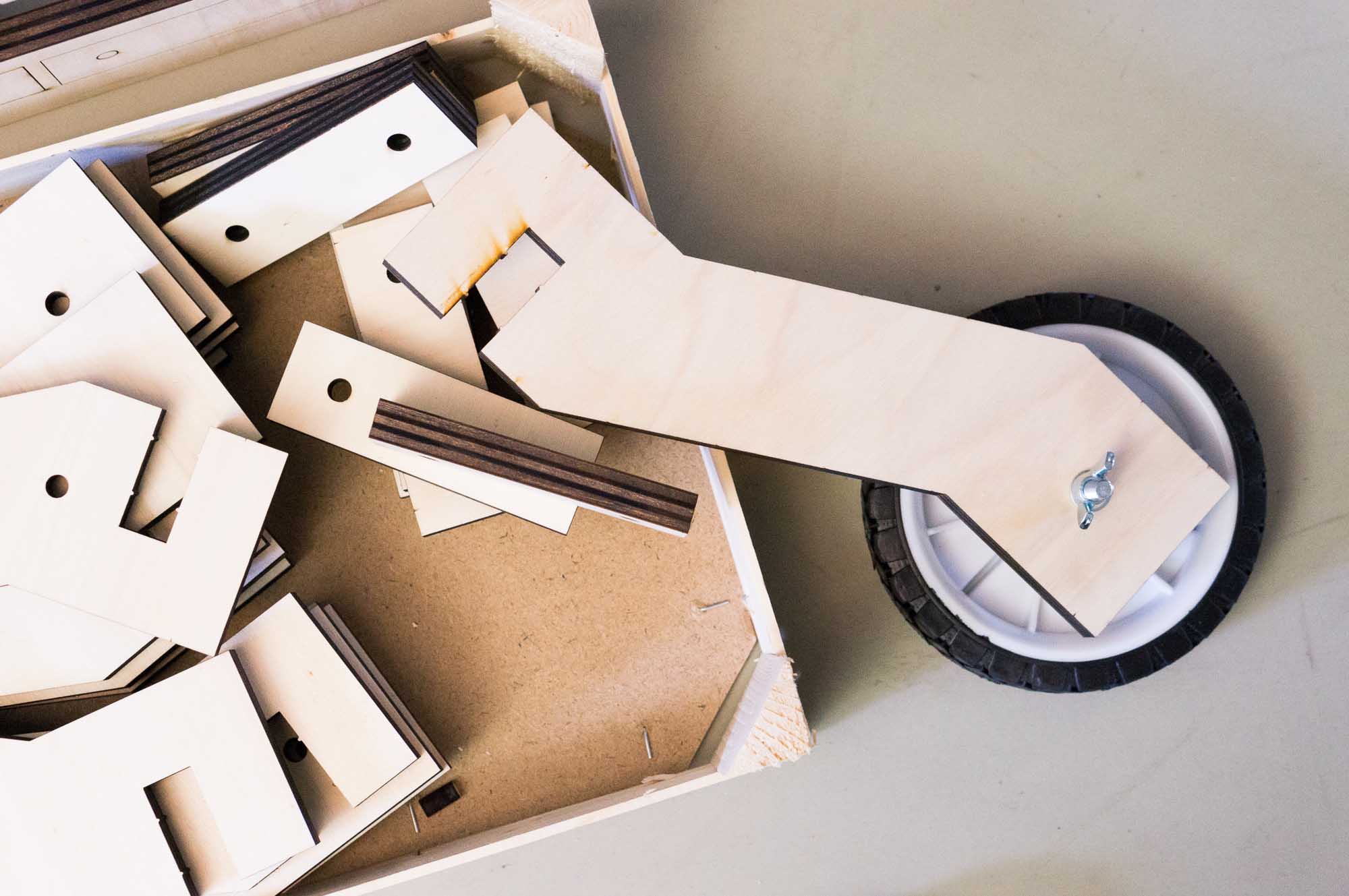
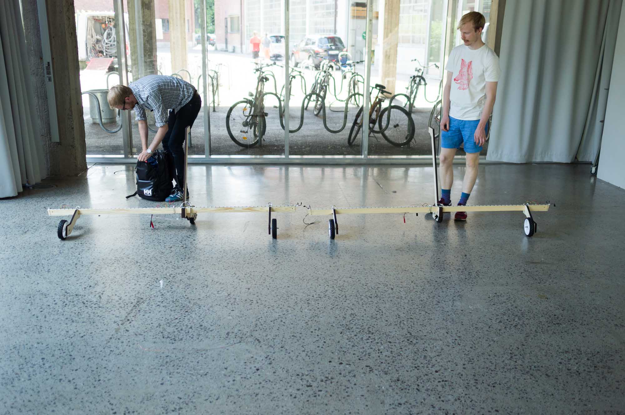
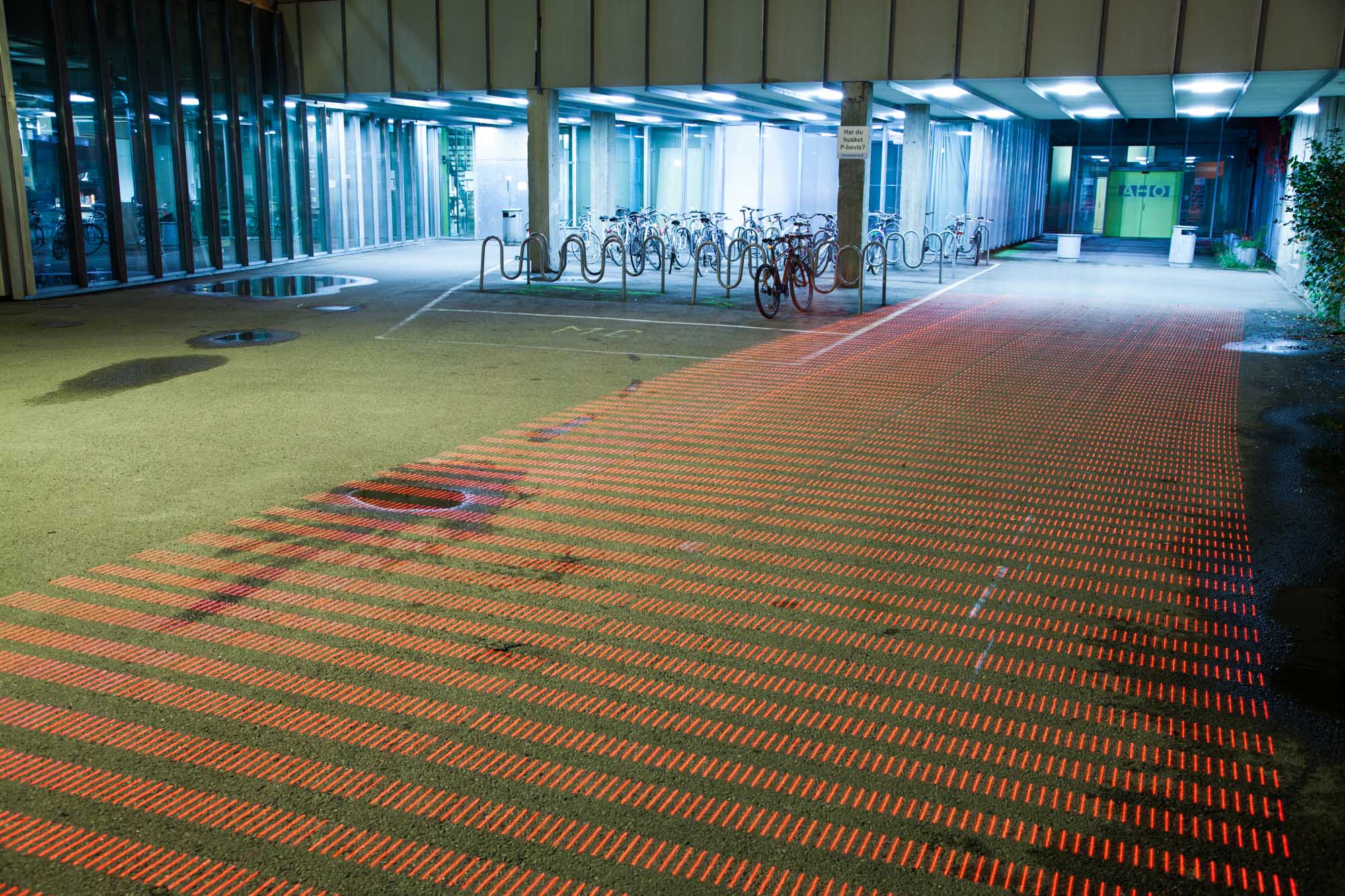
First Unit
Here we see the first assembled unit of the rig. It is two meters long and has three GPS receivers spaced one meter apart.
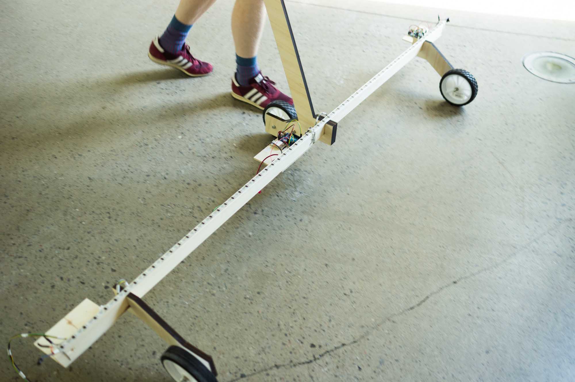
Warming Up
Here we see two connected units brought outside to allow the GPS receivers to warm up. All GPS receivers need some time with a clear view of the sky and strong signals in order to update their internal “almanac” of satellite orbits.
First Lightpainting Test
Here we see the first long exposure shot of the rig. This was taken indoors during the day, with a “neutral density” filter on the camera to reduce the amount of light entering the lens.
This slideshow offers an account of the elaborate and technologically complex process of building a rig to light paint GPS accuracy along the ground. This process is not just exploration of the materiality of GPS, but also involves experimentation with the visual metaphors and languages for communicating the phenomena.
During this process of building and experimenting, we gained new insights and experience about the hardware, the materiality of GPS and the ways of visualizing it. In other words, we engaged with the situation, and the situation talked back (Schön, 1983).
Heatmaps
Throughout these first experiments, we explored the technical and visual possibilities of our first functional, rolling rig. Based on the outcome of these initial tests, we decided to pursue heatmaps as a visual metaphor.
Heatmaps show a two-dimensional matrix, where one variable, like temperature, is represented as shifts in colour. Warm colours like red or orange usually indicate high values, while cold colours like blue indicate low values. Because heatmaps are relatively familiar and visually simple to explain, they provided an existing references that we could rely on.
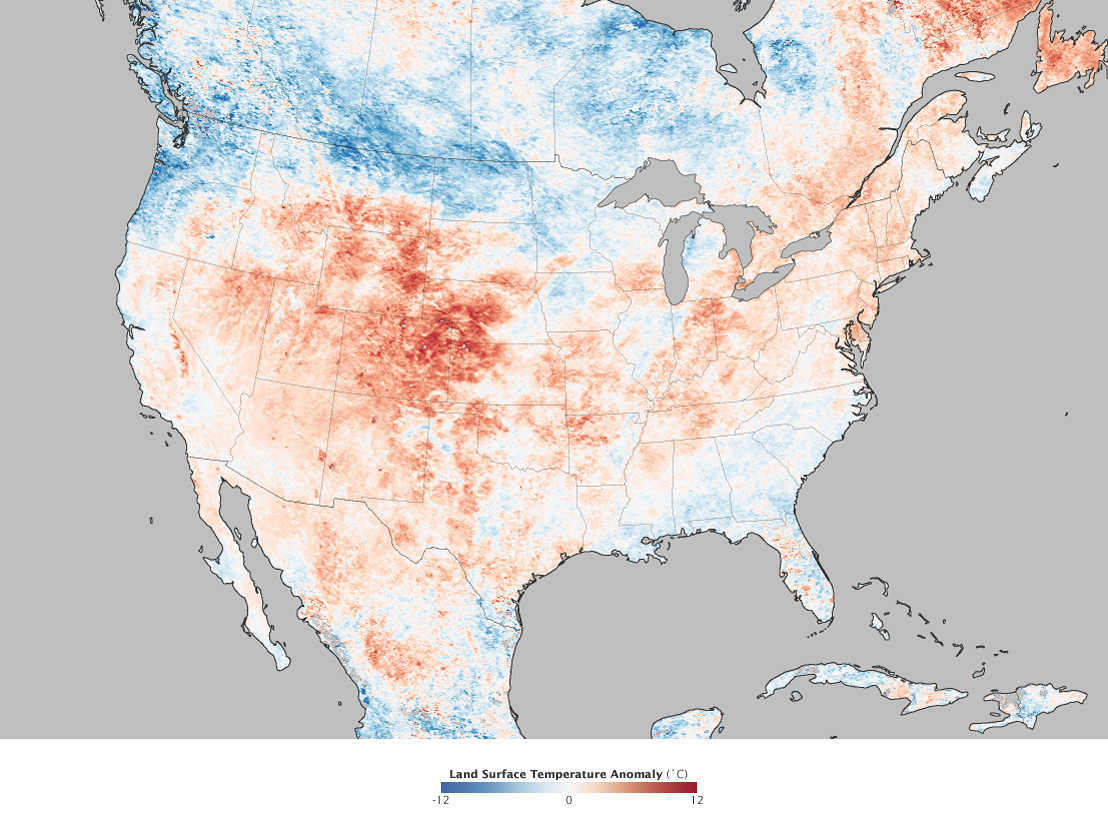
NASA Earth Observatory image by Jesse Allen, using MODIS data provided by Land Processes Distributed Active Archive Center (LPDAAC).
Building a rig for light painting along the ground was a similar to the process we used in earlier experiments with WiFi, but at an even larger scale. What we hoped to do with the rig was to draw out huge heatmaps next to buildings, in car-parks, and across roads. We expected to be able to make multiple images of the same space, and then see the patterns of GPS accuracy move through the space.
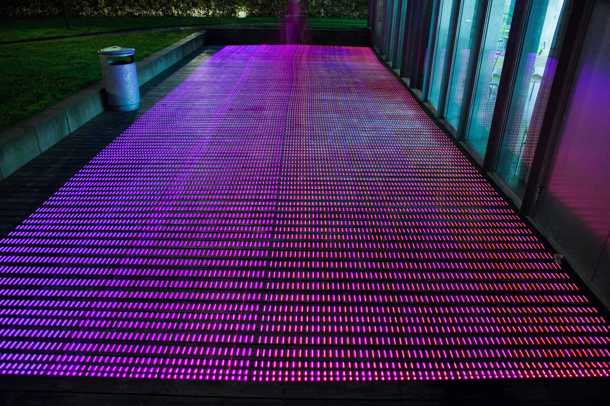
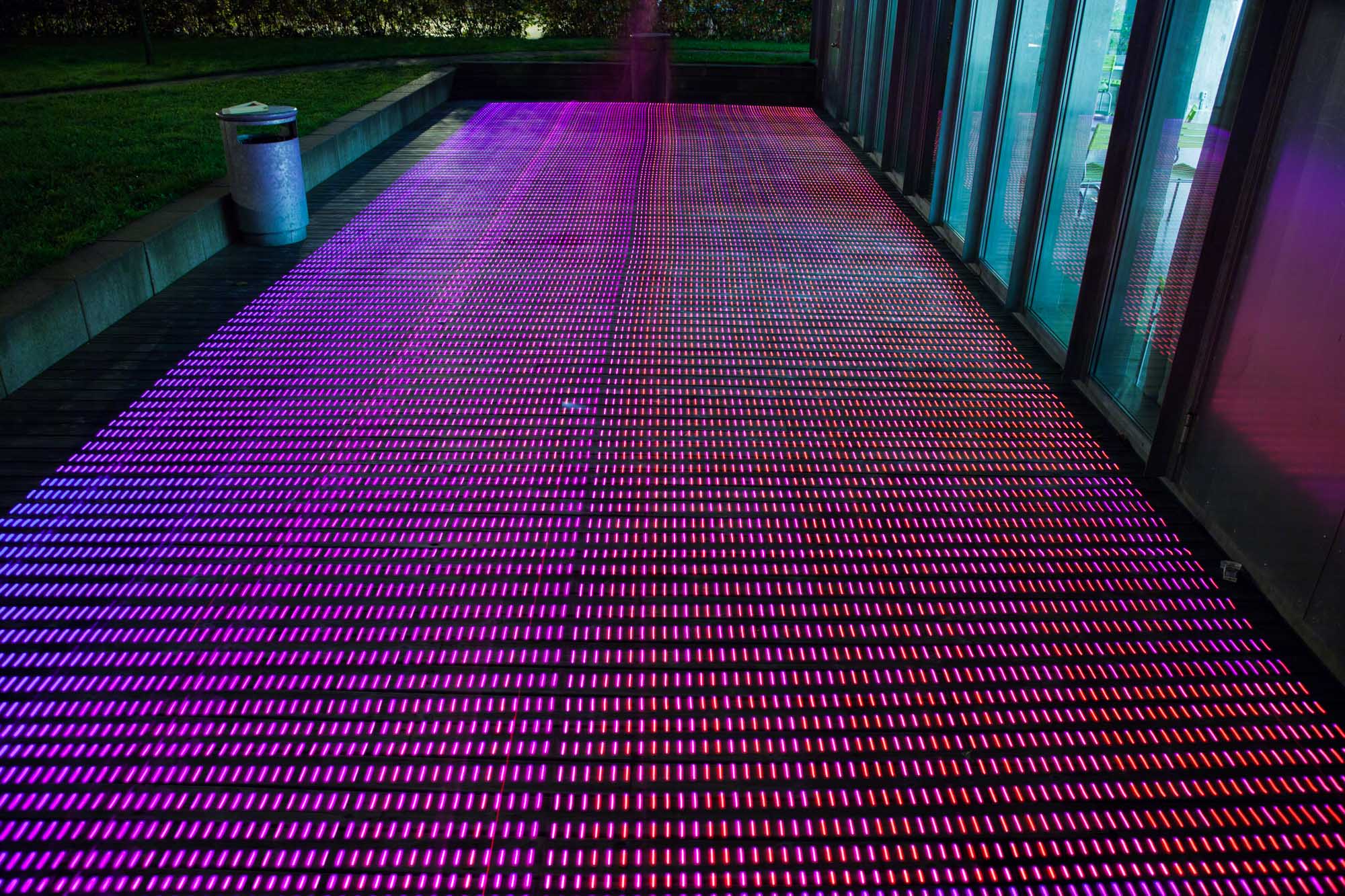
In the following gallery we show our first tests of GPS heatmaps. In these, we map GPS accuracy values (based on DOP as outlined in the previous chapter) to colors between blue (poor accuracy) and pink (good accuracy).
Curtain
shadows
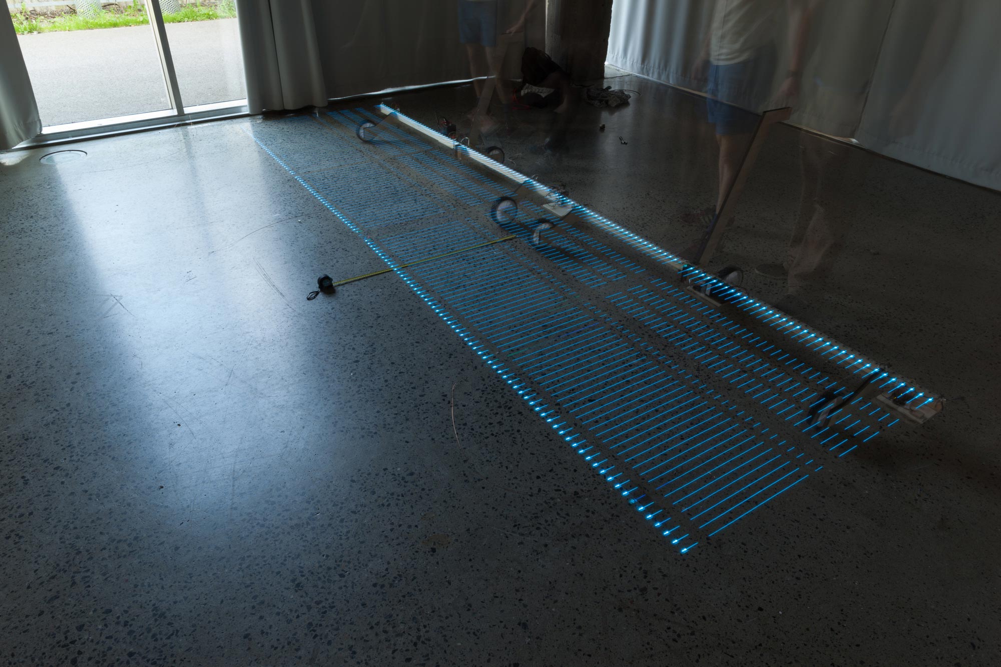
Indoor Testing
We did our first tests of heatmaps indoors during the day in a room with heavy curtains that blocked out the light.
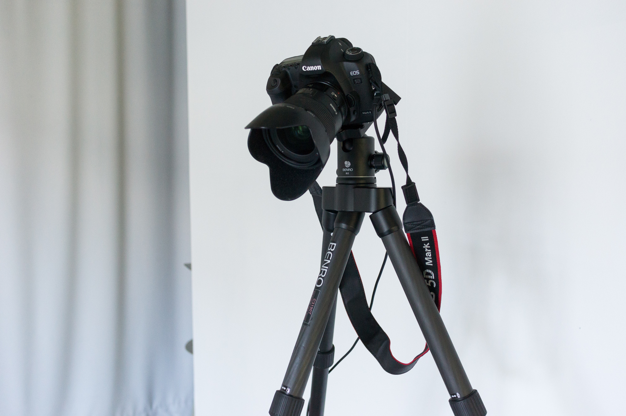
Locked Off Camera
We locked off the camera on a tall tripod to be able to clearly see as much of the floor as possible.
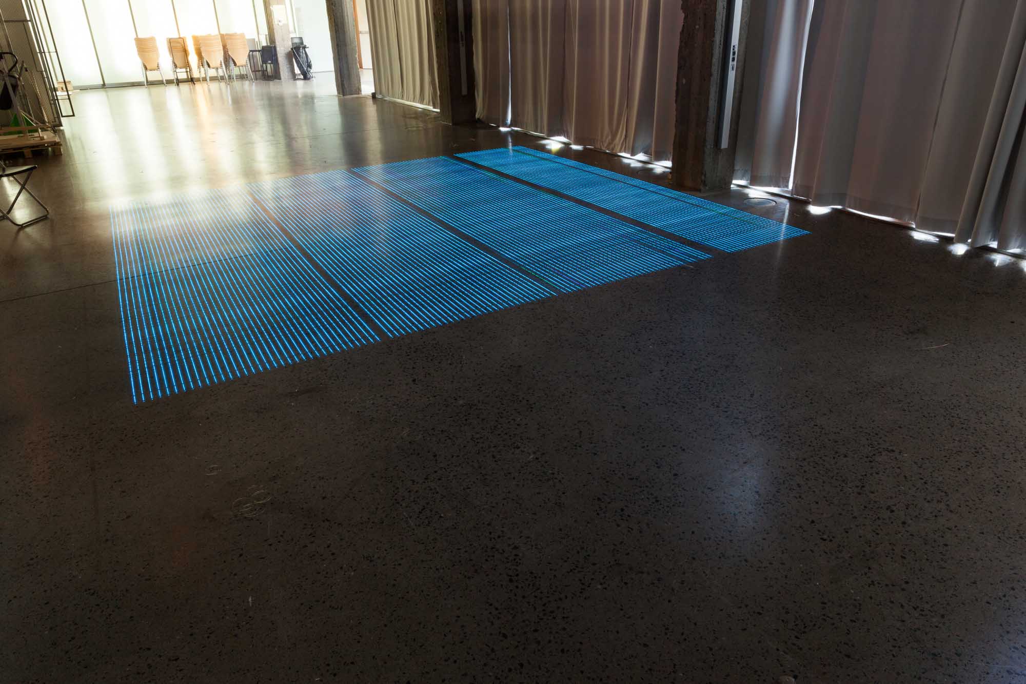
Cold Map
With the rig up and running and the curtain drawn, we took our first long exposure image. It turned out all blue—showing very low GPS accuracy.
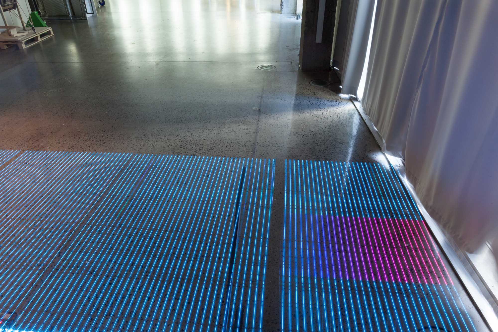
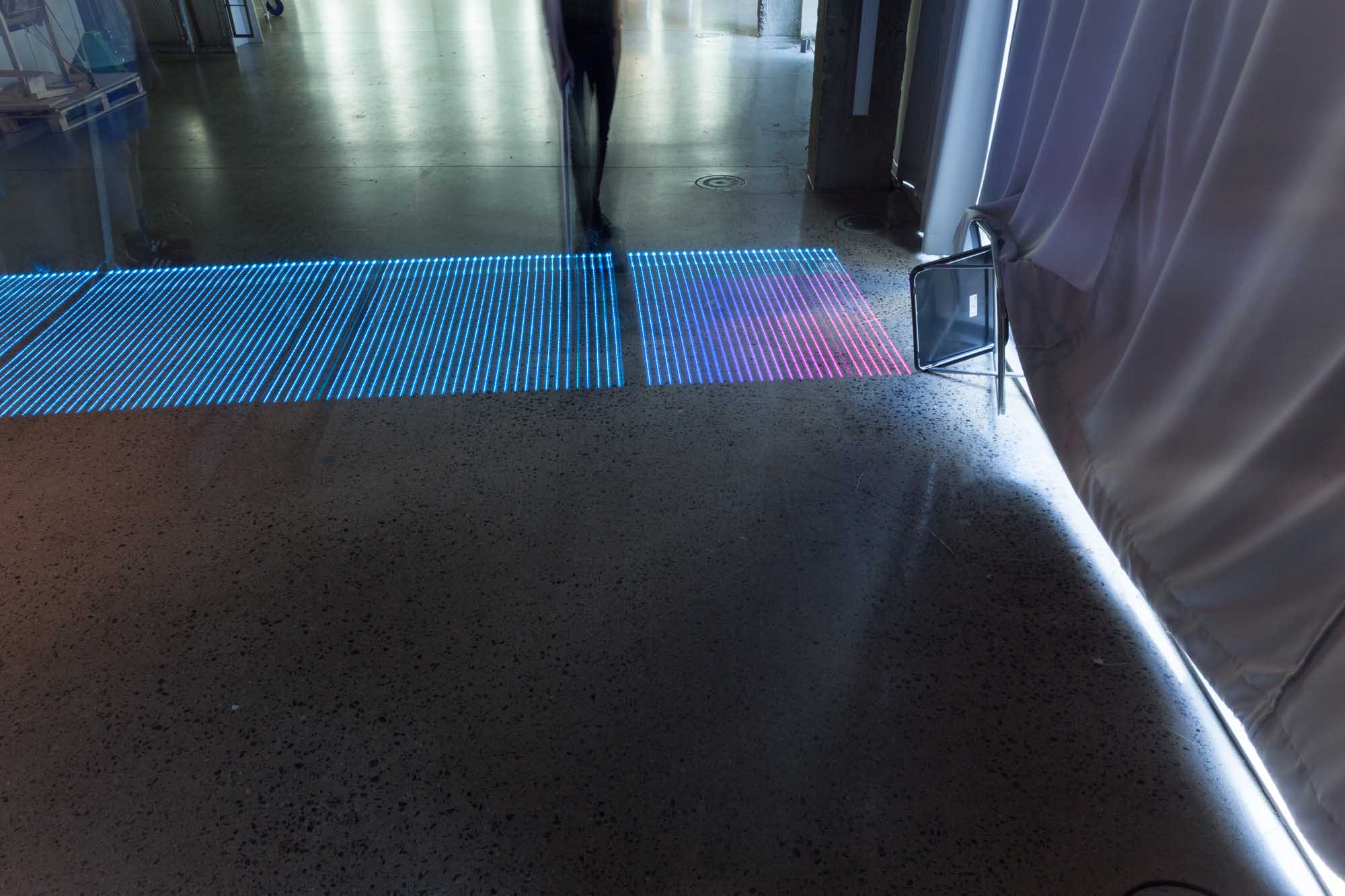
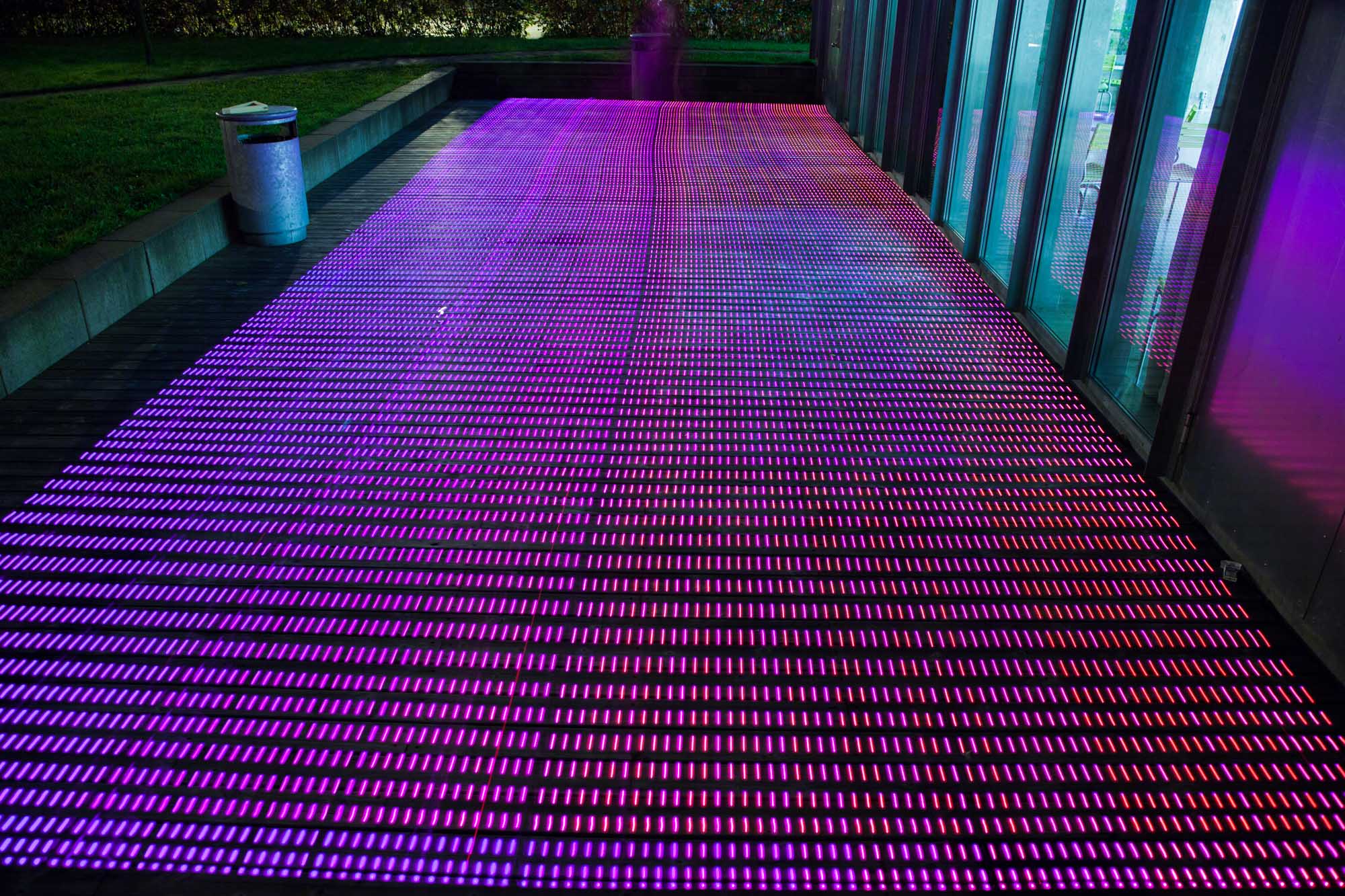
Curtain
In our next shot we passed by a small gap in the curtains where, as the heat map shows, a sliver of GPS signal seeped through. The curtains, we experienced, effectively blocked out radio signals from the satellites.
Curtain Experiments
We continued experimenting with creating gaps in the curtains to see if we could produce the same reading again.
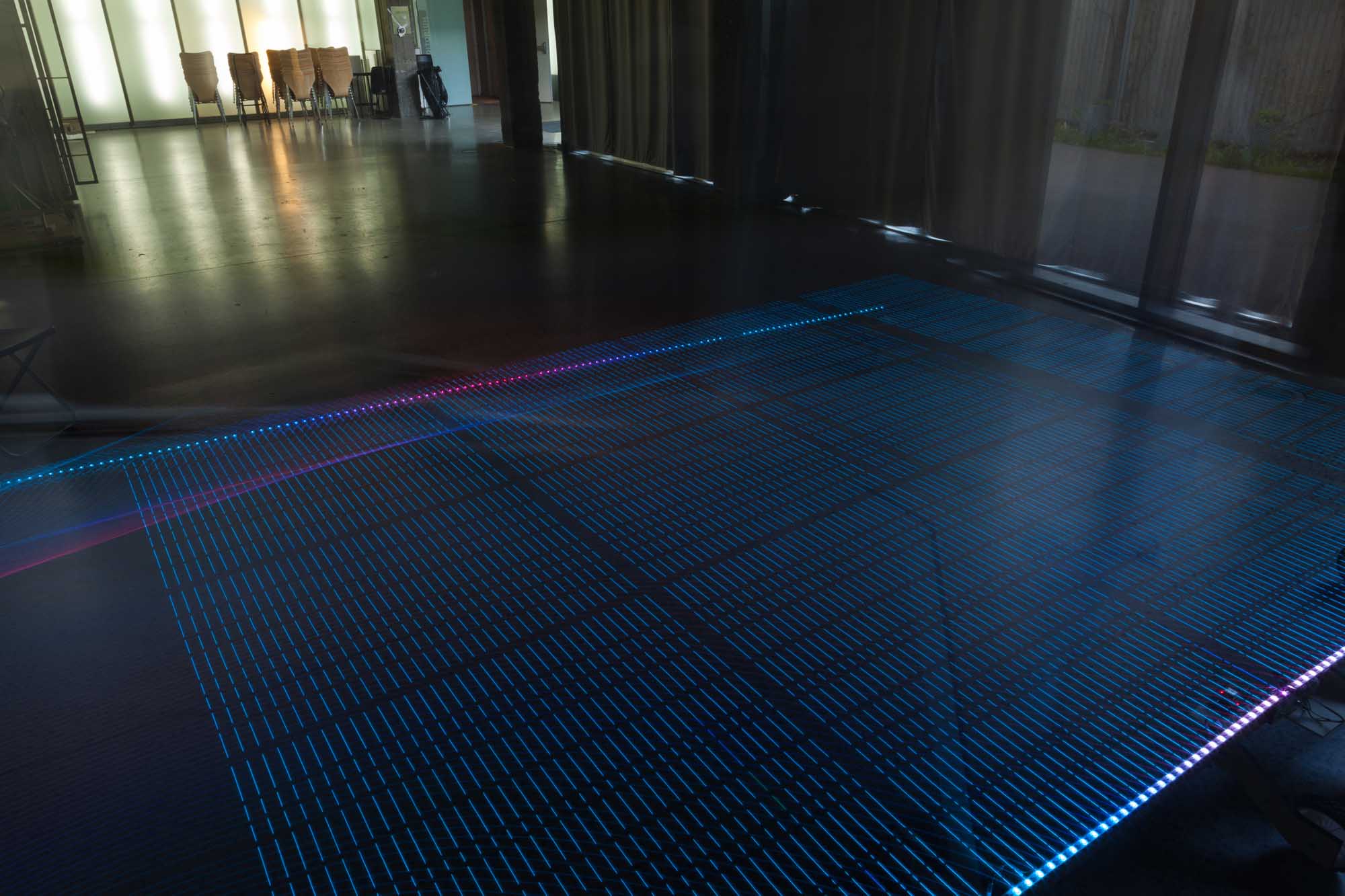
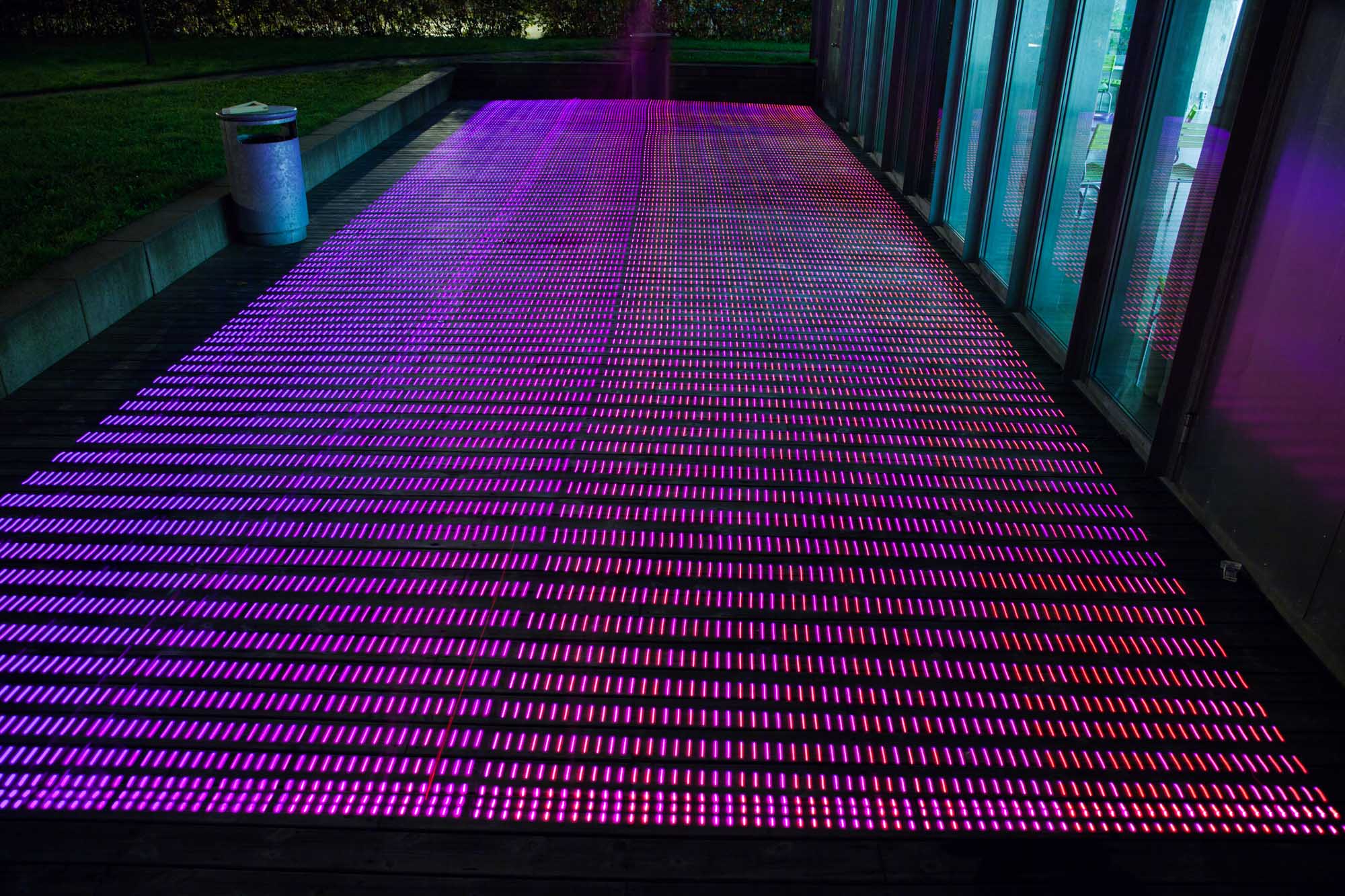
Inconsistency
When trying to reproduce this effect several times, we experienced an annoying inconsistency. Sometimes it worked, others not, and it was difficult to work out where these inconsistencies originated from. Was it the signals changing, or our methods of measurement, or something else?
Notebook (2012, July 5)
“We tested the lightpainting in the AHO gallery with curtains drawn—all blue—no signal. But a gap in the blinds let the GPS signals through and created a glimpse of wonderful pinkish glow on the floor. Just like a bit of light from the sun. . . . Exciting!”
To summarise this experiment, we saw a sharp cut-off in GPS accuracy made by a curtain—a seam between GPS coverage and the absence of coverage. Although we could confirm that the technicalities of the rig worked, and we could glimpse the potential for heatmap visualizations, it was frustrating that we could not reproduce consistent results in our images.
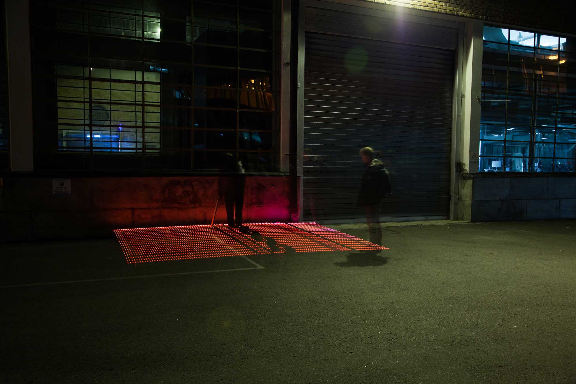
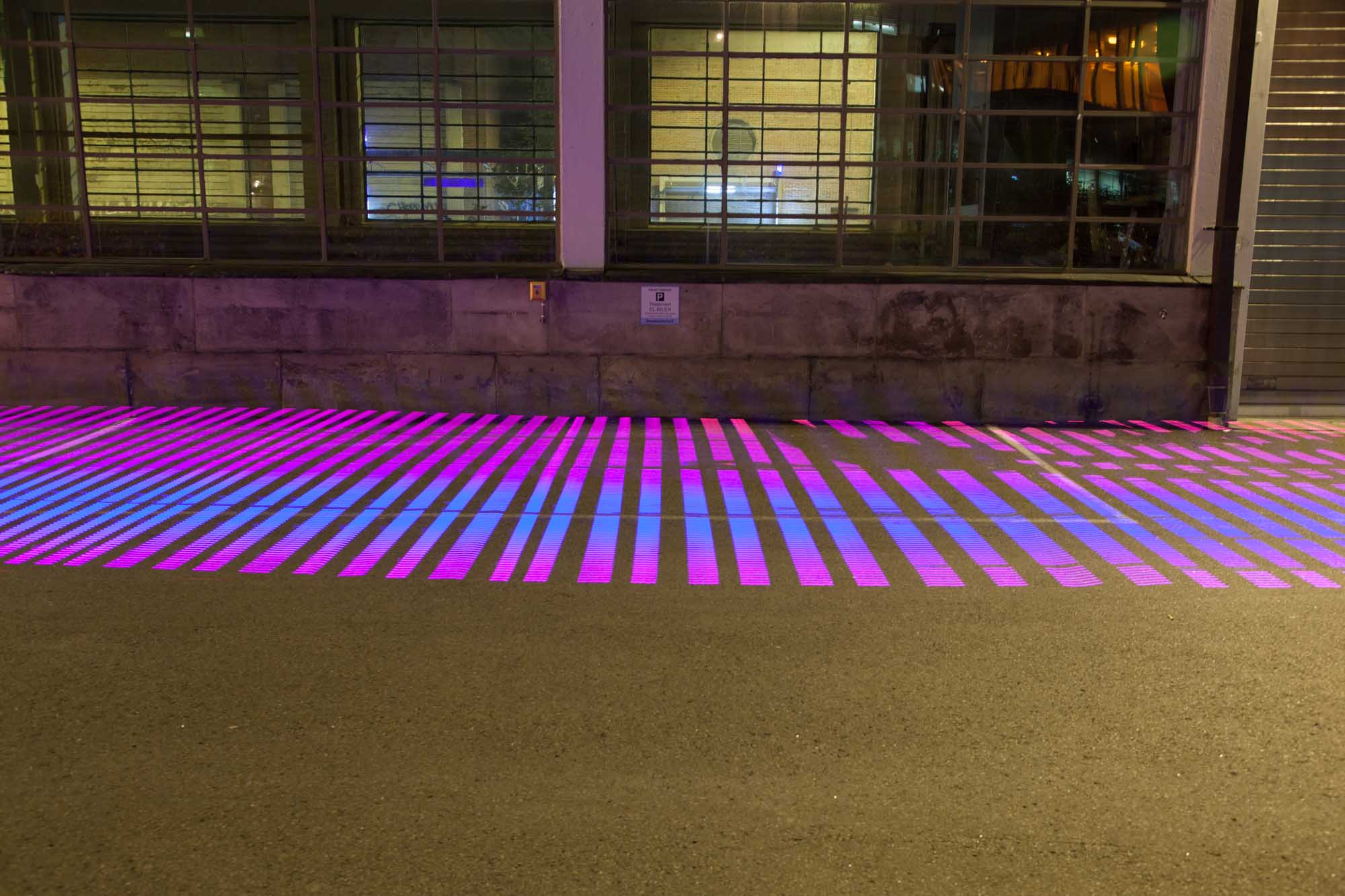
These indoor tests offered us an understanding of how the rig behaved, but we really wanted to to see it working outdoors. In the next gallery, we show our first night-time experiments in drawing out GPS heatmaps outdoors, in the actual context of the urban environment.
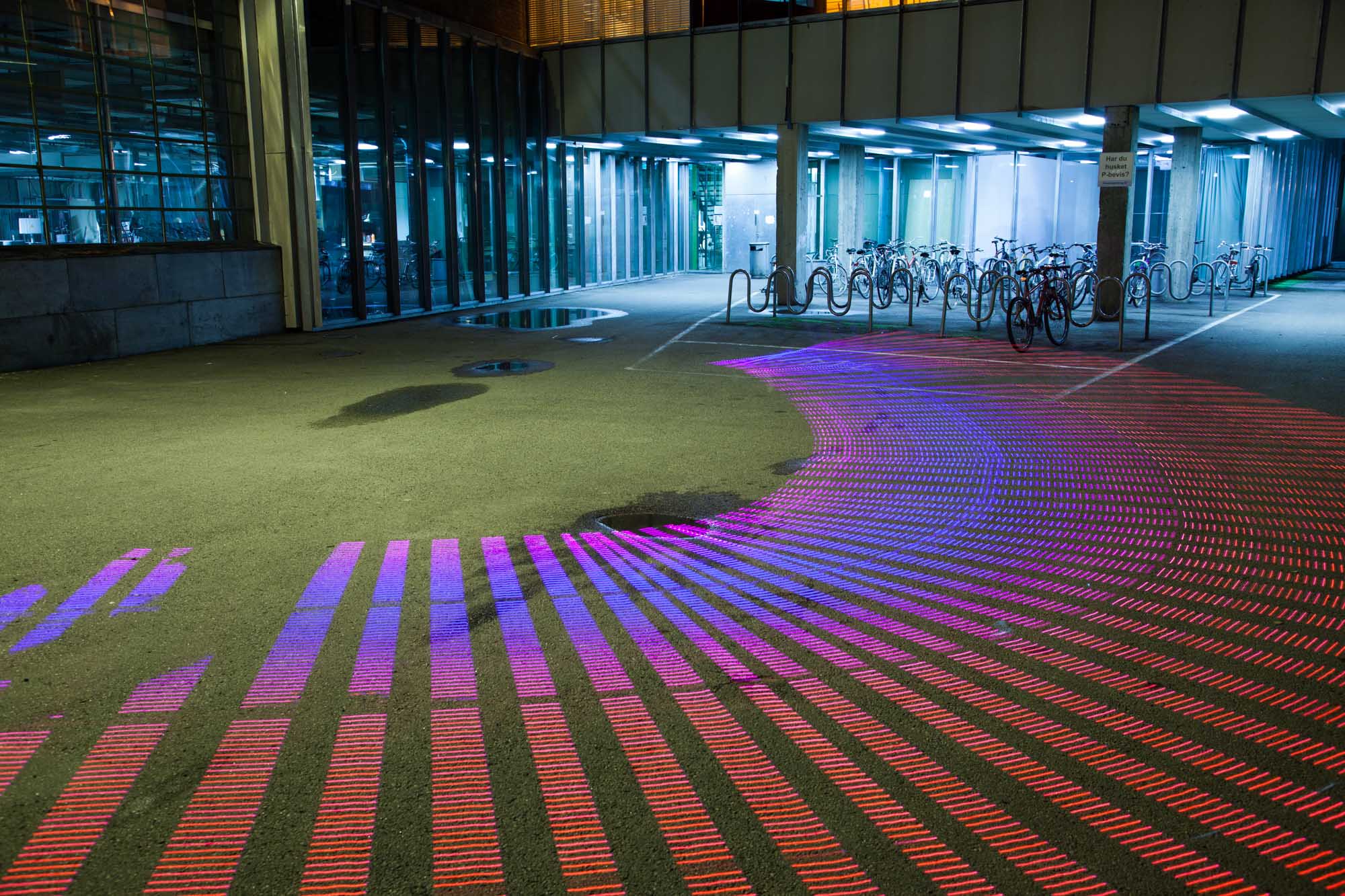
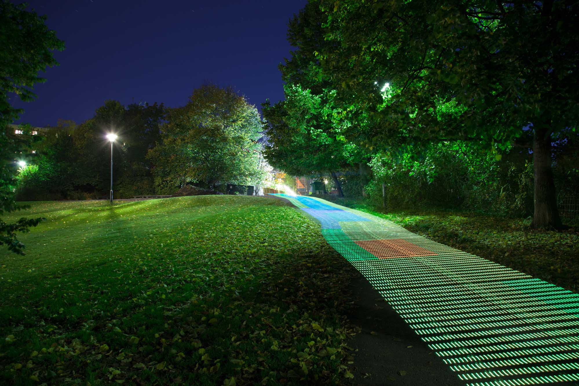
Outdoor
heatmaps
Searching for shadows
In our first test, we pursued our initial idea of representing the GPS shadows around buildings. In this photo, we are prodding the walls expecting to find a drop in accuracy. As the red colors show, we couldn’t find a consistent drop-off.
Inconsistencies
In this image, it seems like the accuracy is shifting randomly, with high accuracy readings along the wall, not to our expectations.
Unexpected Readings
Under this overpass we expected to see a solid drop-off, as we had experienced in the early graphing and probing. Instead, we received a consistently good accuracy, even underneath the overhang.
Timelapse
This is our first experiment of timelapse photography, where we do the same reading in the same location over and over to see how the accuracy changes over a short period of time. Here we got beautiful images, but no clear patterns of change.
Timelapse
This is our first experiment of timelapse photography, where we do the same reading in the same location over and over to see how the accuracy changes over a short period of time. Here we got beautiful images, but no clear patterns of change.
Timelapse
This is our first experiment of timelapse photography, where we do the same reading in the same location over and over to see how the accuracy changes over a short period of time. Here we got beautiful images, but no clear patterns of change.
Timelapse
This is our first experiment of timelapse photography, where we do the same reading in the same location over and over to see how the accuracy changes over a short period of time. Here we got beautiful images, but no clear patterns of change.
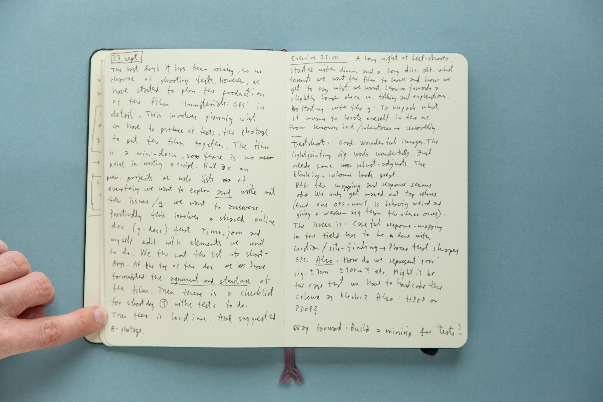
Notebook (2012, September 27)
“Good: The light painting rig works wonderfully. . . . Bad: the mapping and responses seem odd.”
This second experiment with the rolling rig revealed several challenges: First, it was difficult to determine the differences between the peculiarities of the GPS sensors and the signals we were measuring. We theorized that we were dealing with a combination of slightly miscalibrated GPS sensors, sampling a too wide spectrum of DOP values and sites that contained too much direct line of sight to the satellites. We needed to recalibrate the hardware and find new sites with higher buildings and narrower streets.
Second, it was hard to read the meaningful information in the photographic heatmaps. The light painting along the ground was visually disturbed by the patterns of grass and asphalt, and hard to photograph well because of the need for a high vantage point. We wondered how we were going to explain it to people: Did we have to explain everything from light painting, heatmaps, and GPS in order for it to make sense?
Third, we realised that the peculiarities of GPS over time might be confusing our spatial mappings. Perhaps the GPS signals were changing so fast that our spatial mappings didn’t make sense (each exposure took between 15 and 30 seconds). These inconsistencies meant that the visual patterns were incomprehensible and unsatisfying as spatial mappings.
These experiments with heatmaps had shown that we couldn’t produce consistent, understandable or communicable patterns. They led us to consider new ways of abstracting and presenting the data in our visualizations. The gallery below presents our experiments trying to deal with these challenges.
Further Experiments
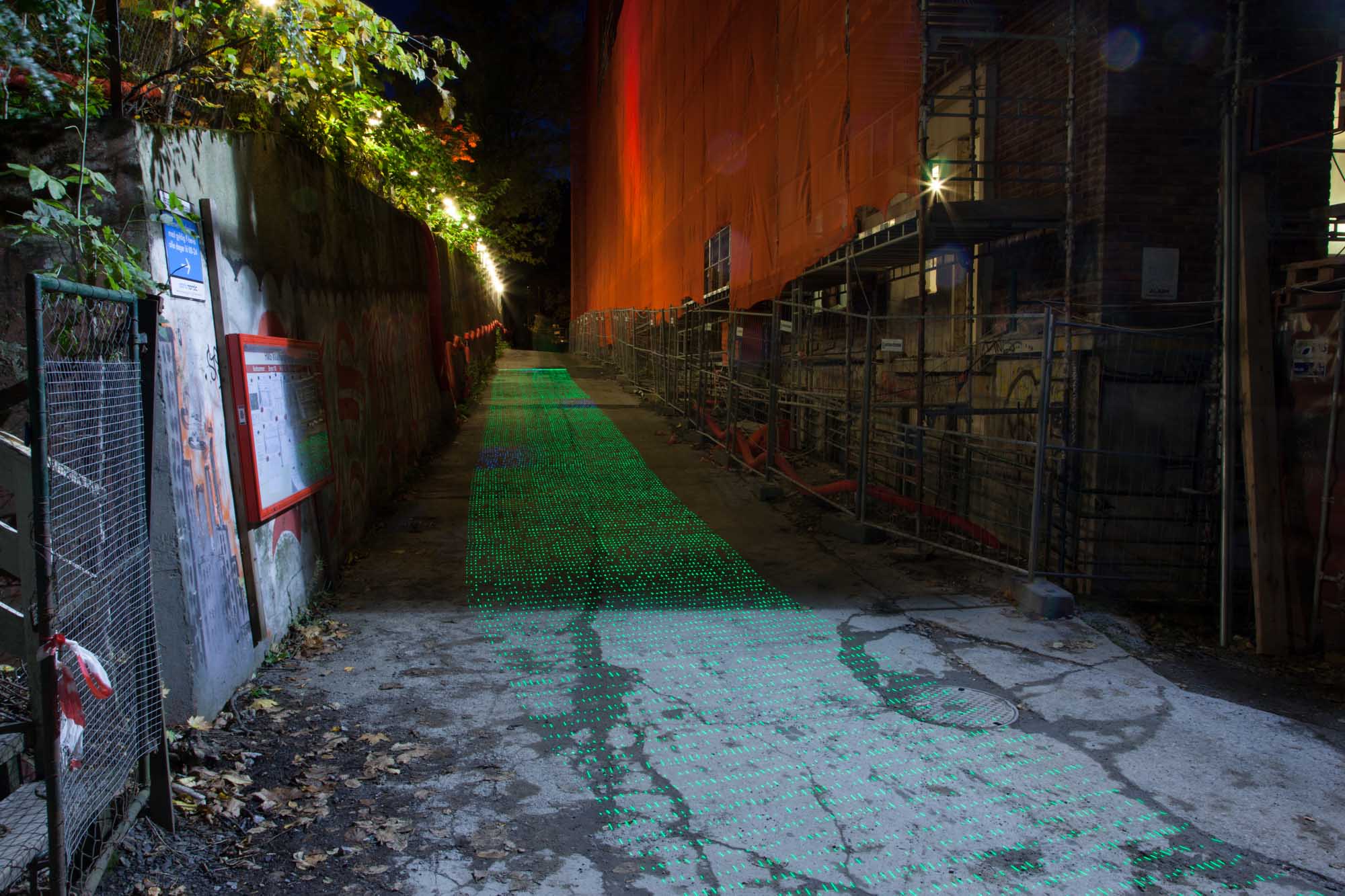
Narrow Streets
In our further experiments, we looked for new urban sites that could give us more dramatic changes in accuracy. We also tested different forms of abstraction. Here we see a combination of a heatmap and scatter plot.
Heatblocks
In this park, we reduced the heatmap resolution to broad blocks chosen from a wider set of predefined colors.
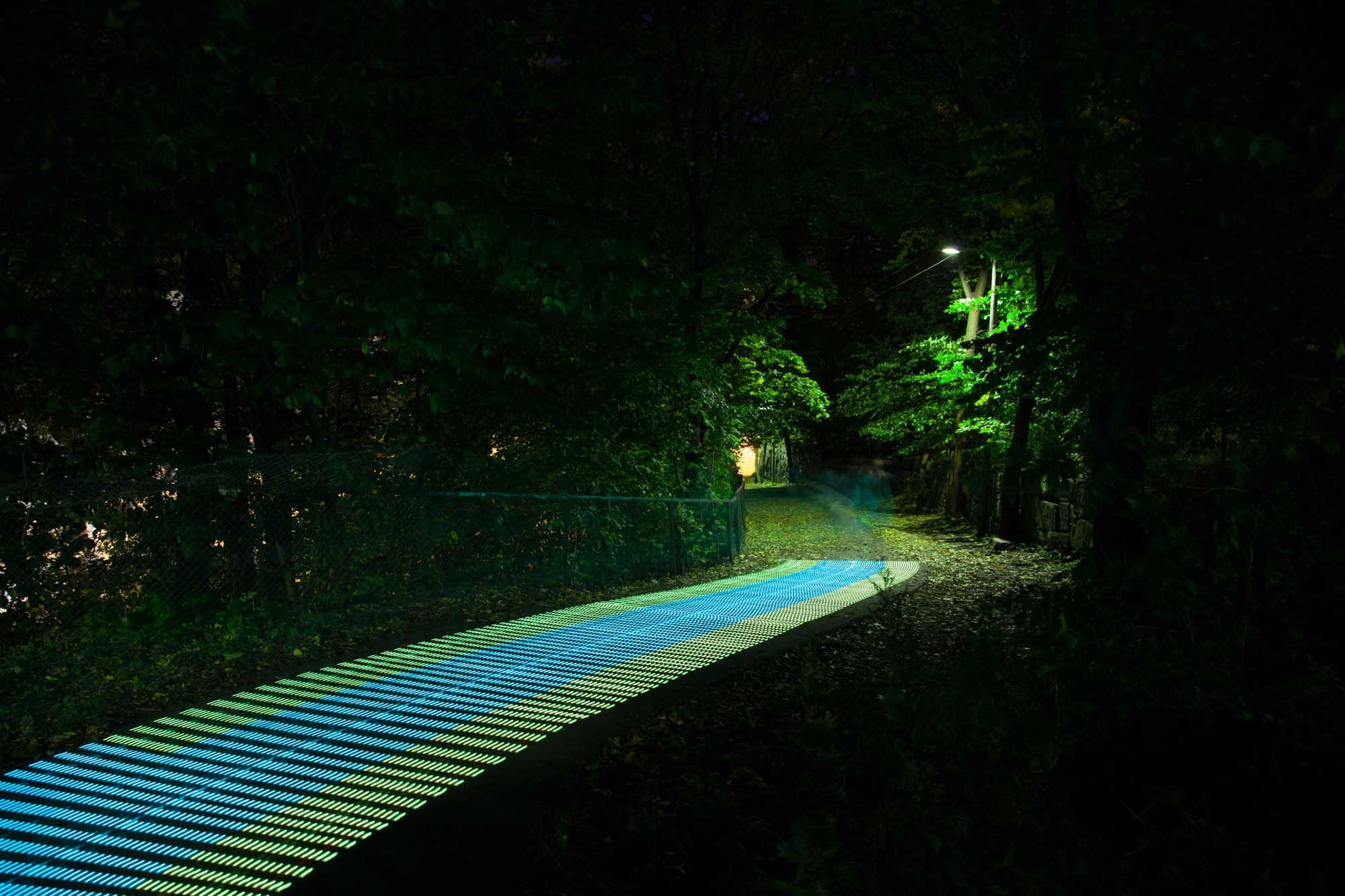
Open Park to Narrow Path
We experimented with moving from open spaces to covered narrow paths, but could still not see any patterns or change in accuracy.
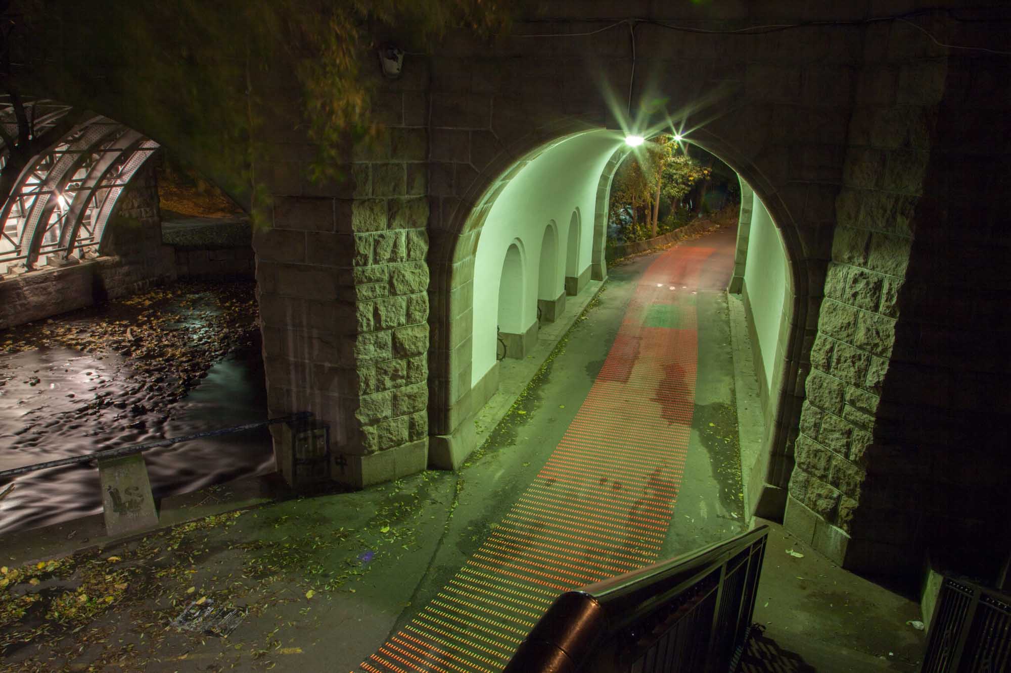
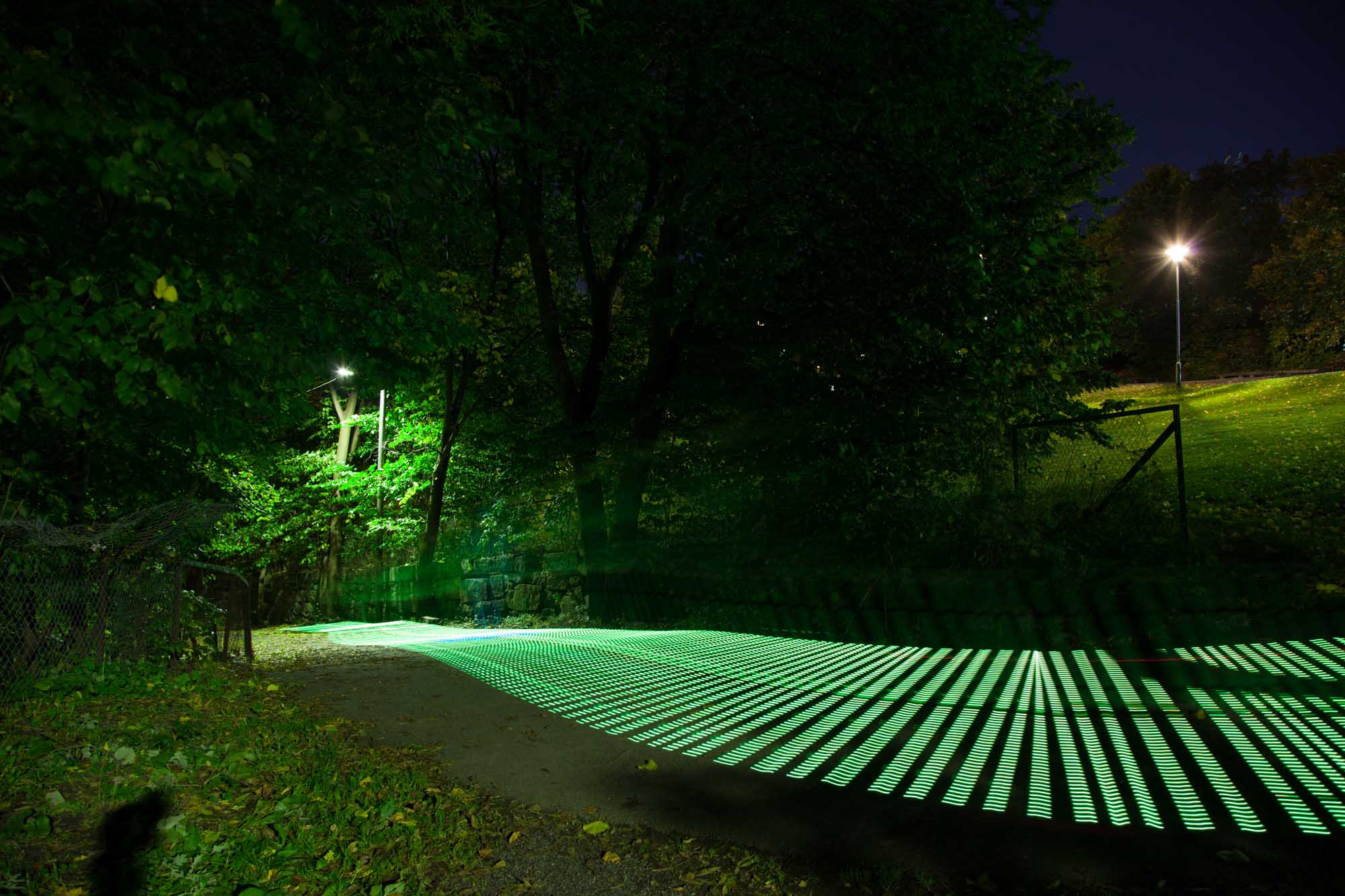
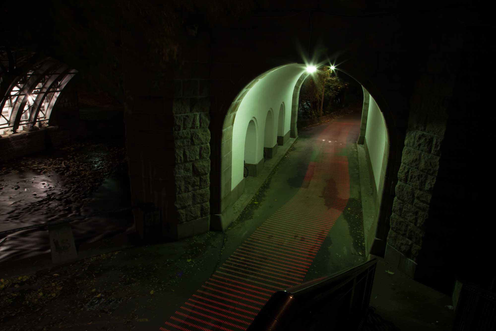
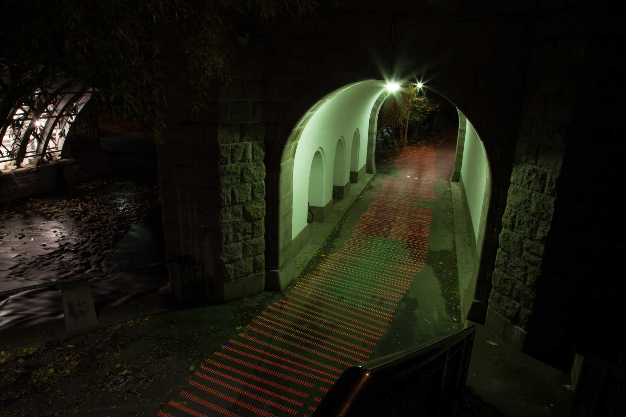
Tunnel
In this underpass, we consistently got weaker signal inside the tunnel, but surprisingly the pattern shifted inconsistently between every shot.
Tunnel
In this underpass we consistently get weaker signals inside the tunnel, but surprisingly the pattern shifts inconsistently between every shot.

Tunnel
In this underpass we consistently get weaker signal inside the tunnel, but surprisingly the pattern shifts inconsistently between every shot.
Tunnel
In this underpass we consistently get weaker signal inside the tunnel, but surprisingly the pattern shifts inconsistently between every shot.
Although many of these images are beautiful, spectacular even, they also brought with them a range of challenges and problems. First, it’s hard to find meaningful spatial patterns in these visualizations because GPS changes significantly during the time it takes for one exposure. Second, it’s difficult to represent the changes in GPS accuracy through color, which is distorted through long exposure times and a high point of view. Third, we showed our images to other people and found that they required too much explanation about the light-painting technique, rig, and heatmaps to be immediately understandable. We realized that there was a need for reducing complexity, both for understanding it ourselves and for communicating to others.
This was a difficult stage. We experienced disillusionment with our process, technical setup, and visual language. We had to step back and reflect on our approach. How could we make communicative images about GPS accuracy in the city? Were light painting and heatmaps the appropriate means to this end? The next section recounts our quest for a more communicative and effective visual language.
PAGE REFERENCES
- Arnall, Timo, & Martinussen, Einar Sneve. (2010). Depth of field: Discursive design research through film. FORMakademisk, 3 (1), 100–122.
- Feininger, Andreas. (1949). Navy Helicopter or Pattern Made by Helicopter Wing Lights [photograph]. Time & Life Pictures. New York, NY, US.
- Martinussen, Einar Sneve. (2012). Making material of the networked city: Research by design and the renovation of practice. In Michael U. Hensel (Ed.), Design innovation for the built environment (pp. 235–247). London, England: Routledge.
- Mili, Gjon. (1945). Carol Lynne Skates with Lights on her Toes [photograph]. Life Magazine, 26 Mar 1945, p. 109. New York, NY, US.
- NASA. (2012). NASA Maps Heat Wave Fueling Wildfires in the Rockies [Map]. Retrieved August 12, 2014, from http://www.nasa.gov/mission_pages/fires/main/usa/20120629-westernUS.html
- National Museum of American History. (1914). Work Simplification Study [Photograph]. Frank and Lillian Gilbreth Collection, 1907-2000 (bulk 1911-1924), Archives Center, National Museum of American History, Washington, D.C.
- Price, Brian. (1989). Frank and Lillian Gilbreth and the manufacture and marketing of motion study, 1908–1924. Business and Economic History, 18, 88–98.
- Ray, Man. (1937). Space Writing [photograph]. Collection SFMOMA. © Man Ray Trust / Artists Rights Society (ARS), New York / ADAGP, Paris.
- Schön, Donald A. (1983). The reflective practitioner: How professionals think in action. New York, NY: Basic Books.